Pret Festive Cup
I mentioned in this post that I had to take a pit stop to defrost in a "Brick Lane cafe". That cafe was Pret. To be honest I picked Pret from the myriad choices I had on Brick Lane just so I could get a chance to have a look at their festive cup this year. Otherwise there were so many other choices of cafes that serve infinitely better coffee than the "Black Amo" at Pret.
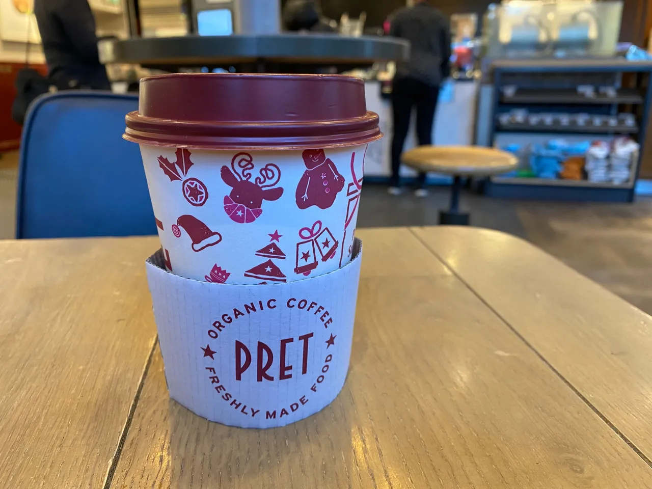
Maybe it's the recession or something, but the coffee shops are taking a bit of a cheaper option with their designs this year. The question is, does it cost more to create a better design? I can imagine the cost is the same since you still have to print on the cups. I don't know. Perhaps they save money with the white background, which could be just white card, and cheap ink already used to print on their regular cups.
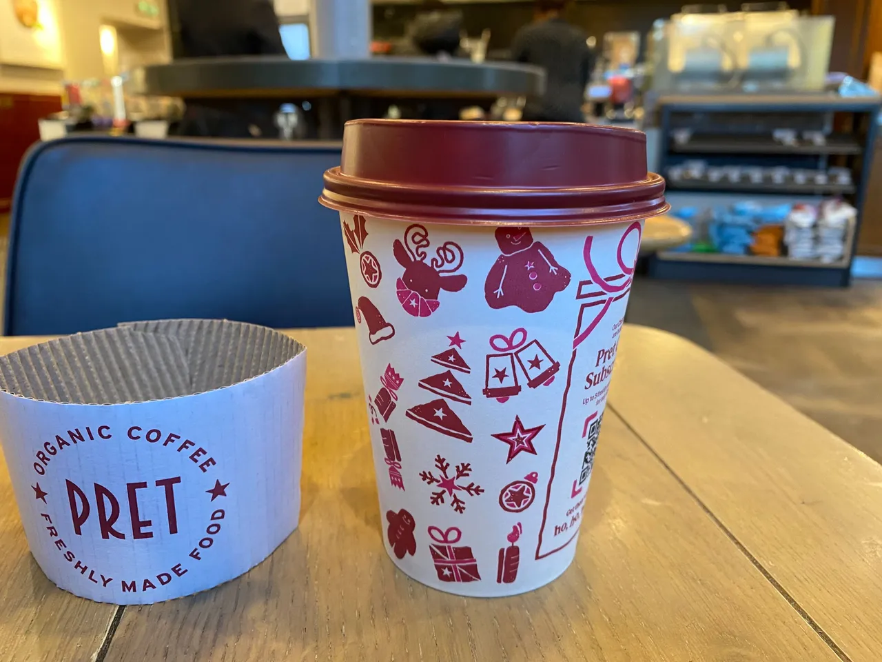
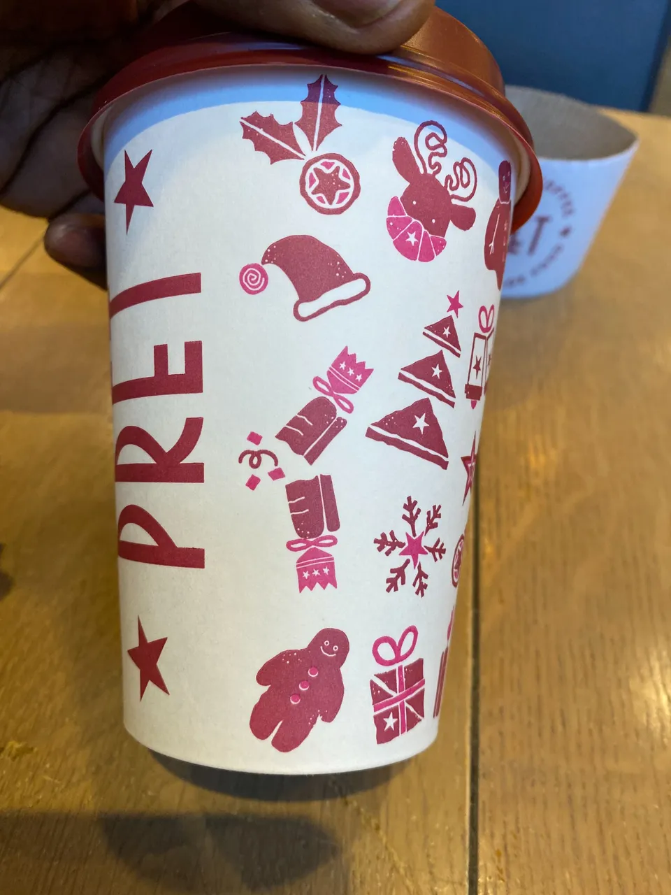
Pret has opted for just two colours which were probably created from the same ink. There is the main wine-colour, which is the standard brand colour of Pret, and the lighter wine-colour, which was probably diluted or mixed with white ink. Who knows. It looks really cheaply made. Not as cheap as Costa's effort, but cheap nonetheless. Last year's effort was a lot better. Maybe it's the global recession.
 |  |
|---|---|
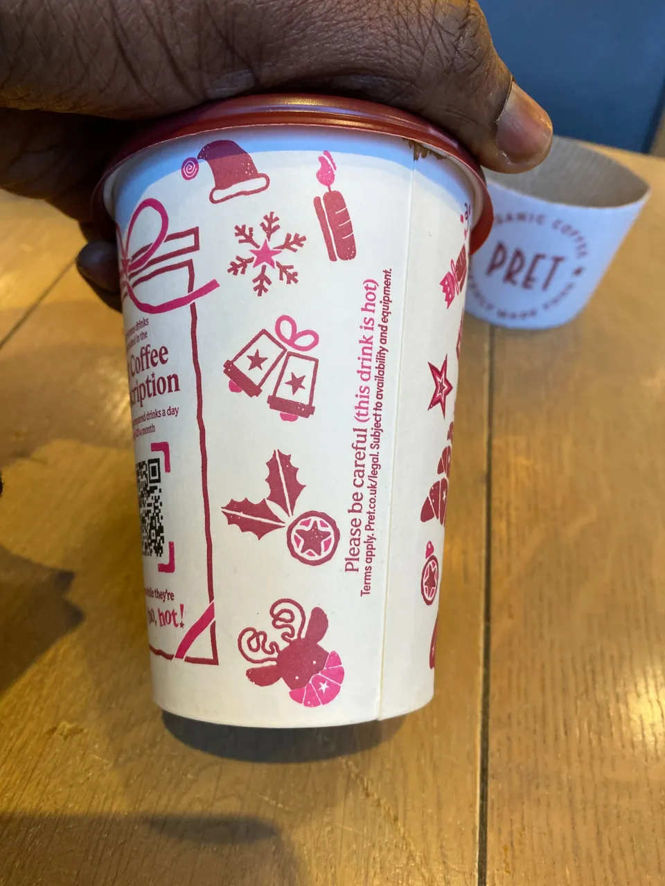 | 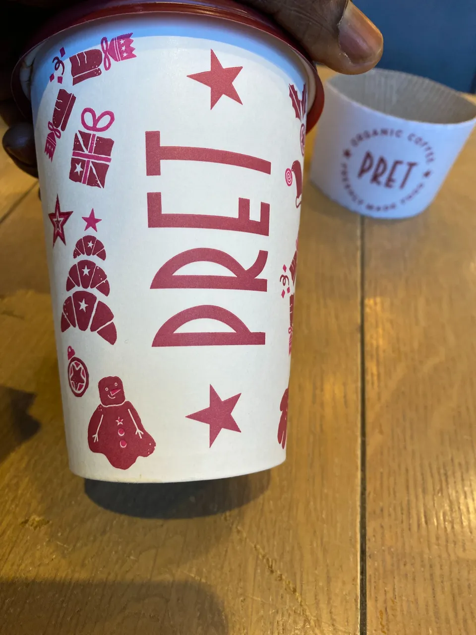 |
Apart from the cheap looking ink, the design idea is actually quite clever. The Christmas icons were created using things you can buy at Pret. The Christmas tree is made of croissants, the snowman is a gingerbread man, the mistletoe is made of two coffee cups, and so on. Very clever. I like that.
They also took the opportunity to advertise their coffee subscription program where you can get up to 5 drinks a day for a month, for only £25. They kicked it off during the pandemic, to boost sales, but apparently they've kept it going. If you like Pret coffee, it's actually a really good deal if you ask me.
In conclusion, I'd say their effort is somewhere between McCafe (MacDonald's) and Costa. Cheap looking, but clever design.
Peace & Love,
Adé