Hi Hivers. How are you?
What two(2) things have peaked your interest lately?
For me, I’d say:
PEAKD.com
I joined the network recently and I realize there is a lot to learn. I find it intriguing and I love the support from fellow-hivers and from community leaders. Now I need to work on networking with more hivers.Zumba
I’ve been doing Zumba dancing. It’s such a fun way to dance and exercise. I now need to be more consistent, dance more often and burn those calories.
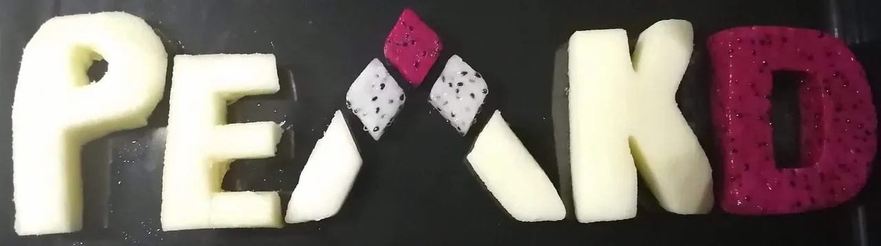
Since I recently tried making an edible ReggaeJahm logo, I thought I’d try making an edible PEAKD logo as well.
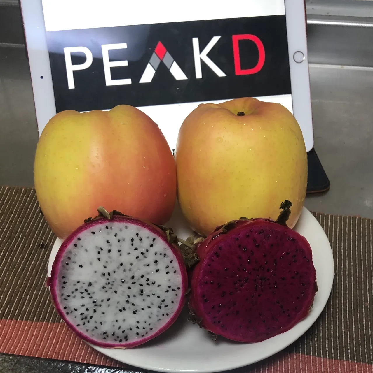
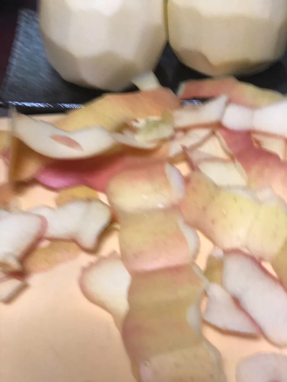
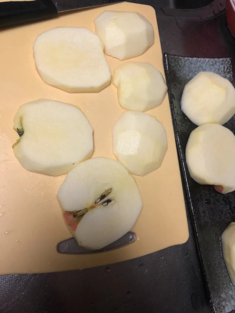
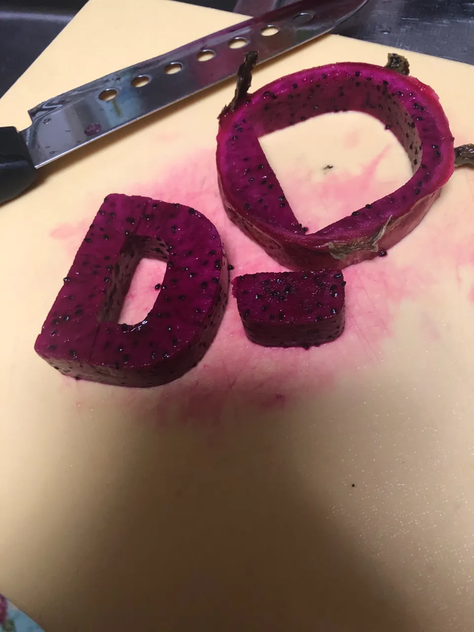
This time I decided to use two big apples and halves of white flesh dragon fruit and red flesh dragonfruit.
I peeled the fruits and cut them in slices then carved and or cut the letters out.
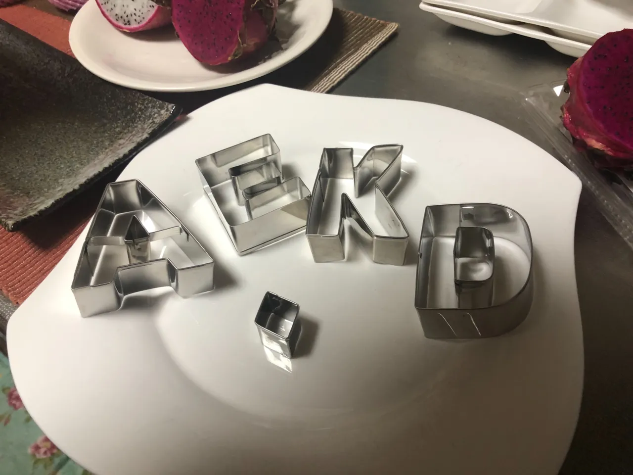
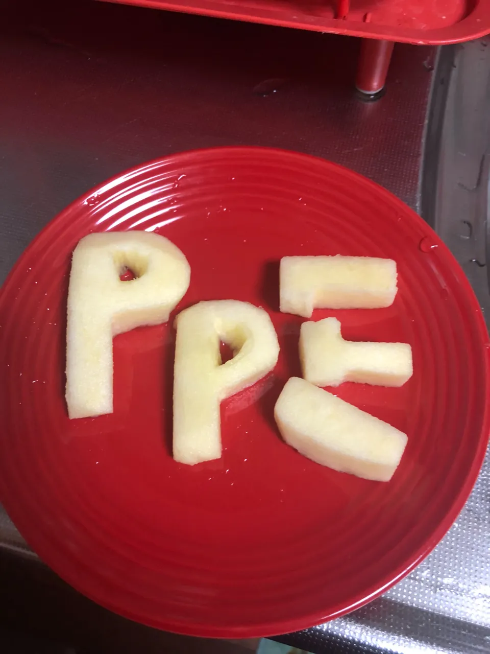
I remember I had some alphabet cutters so I thought the process would have been smooth. I searched for the cutters and realized I had no “P” so I had to carve it. Though I had “A”, it was different from the one in the logo, so I had to do some extra work on that as well. I found a small diamond-shaped cutter I thought would have worked.
I ended up carving two “P’s” and then chose what I thought was the better one. After using the “E” cutter, I struggled to get the apple from the mold. I tried twice and the letter “E” broke on both occasions, though I was gentle with it. I decided to then carve “E” as well. The diamond cutter worked well for the top of the “A”.
The “K” and “D” cutters worked well.
For the black background, I thought I’d use a long, dark grey plate that I really love. The size was okay but it turned out that it wasn’t dark enough. I had to switch the letters to my small, black oven tray.
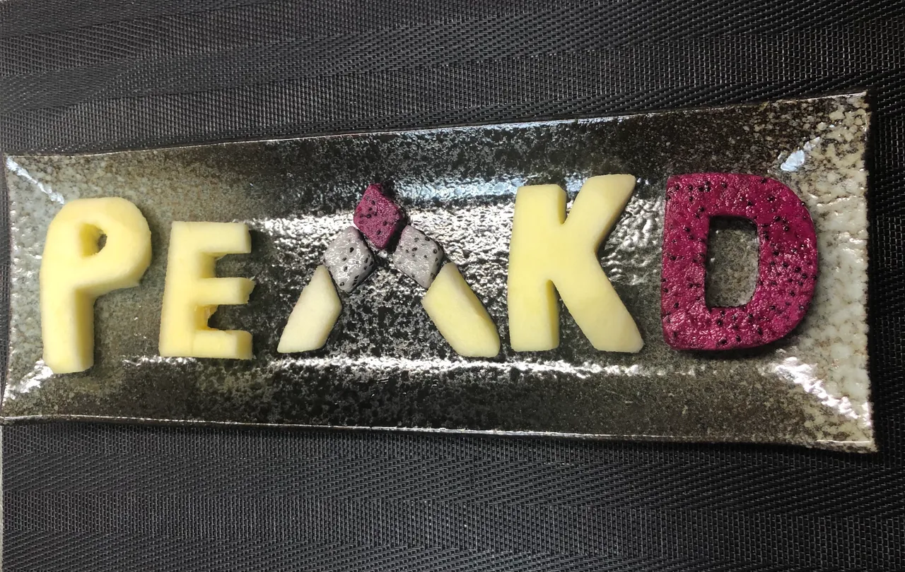
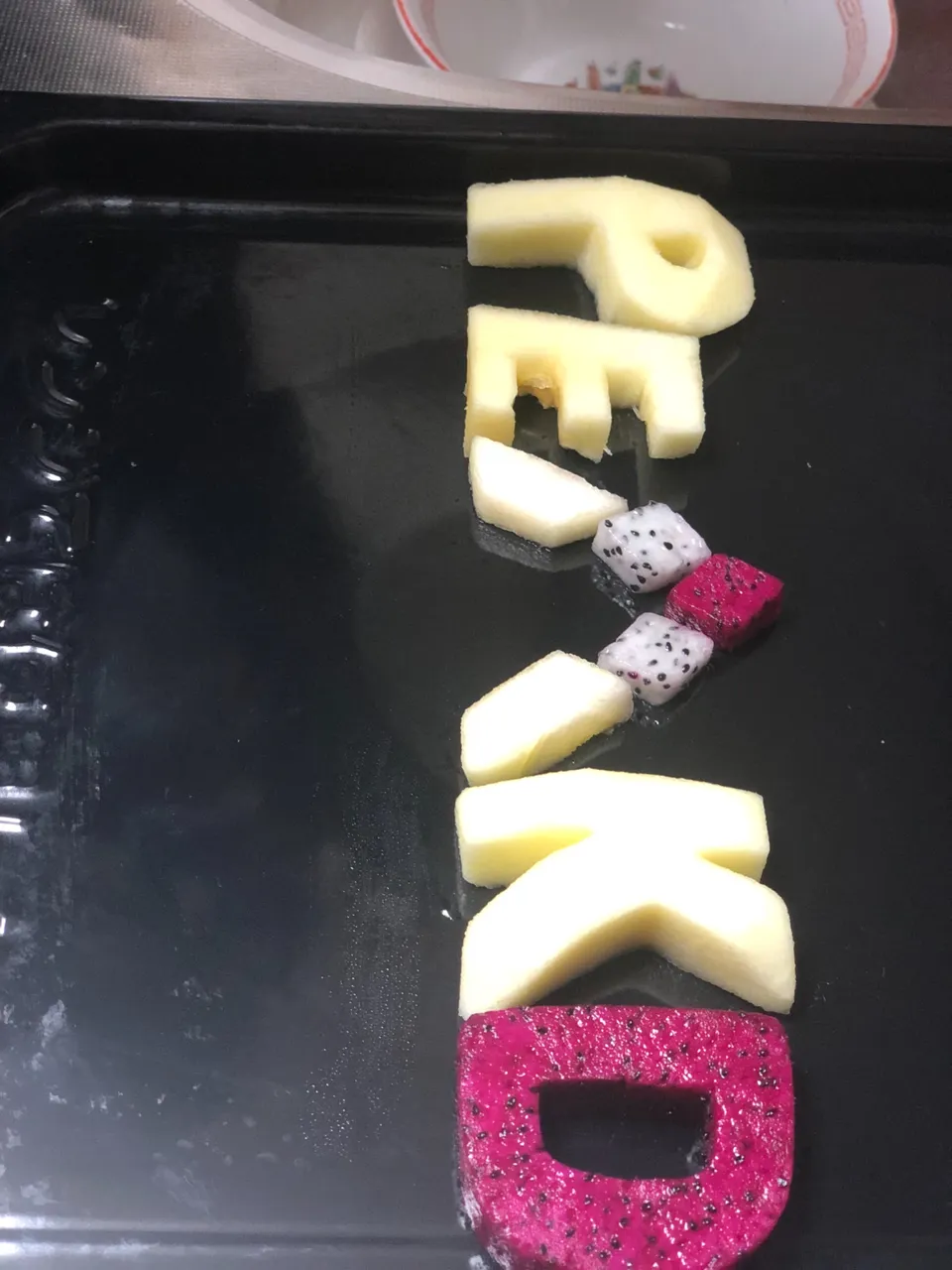
The letters were a bit uneven as the sizes were different.
If I had to do it again, I’d work on the sizing and and the cuts a bit more.
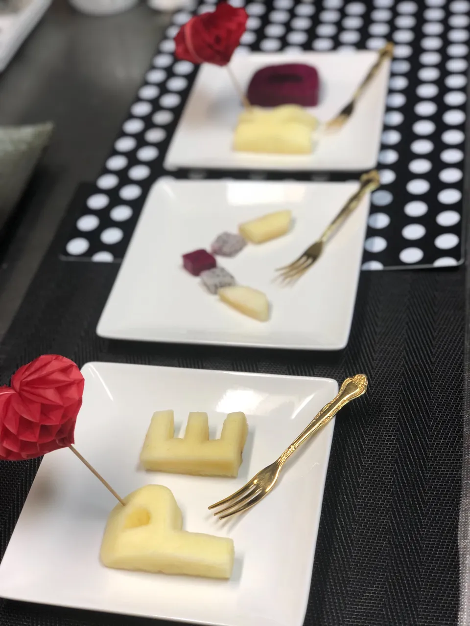
After snapping the logo, I plated the letters and put the plates on black and black and white polka dot place mats. For a pop of color and in theme with the red in the logo, I added two red-heart-headed tooth picks.
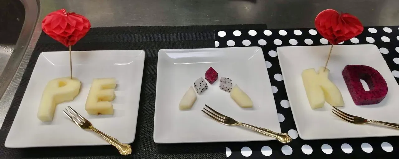
PEAKD was indeed fruitilicious.