Details
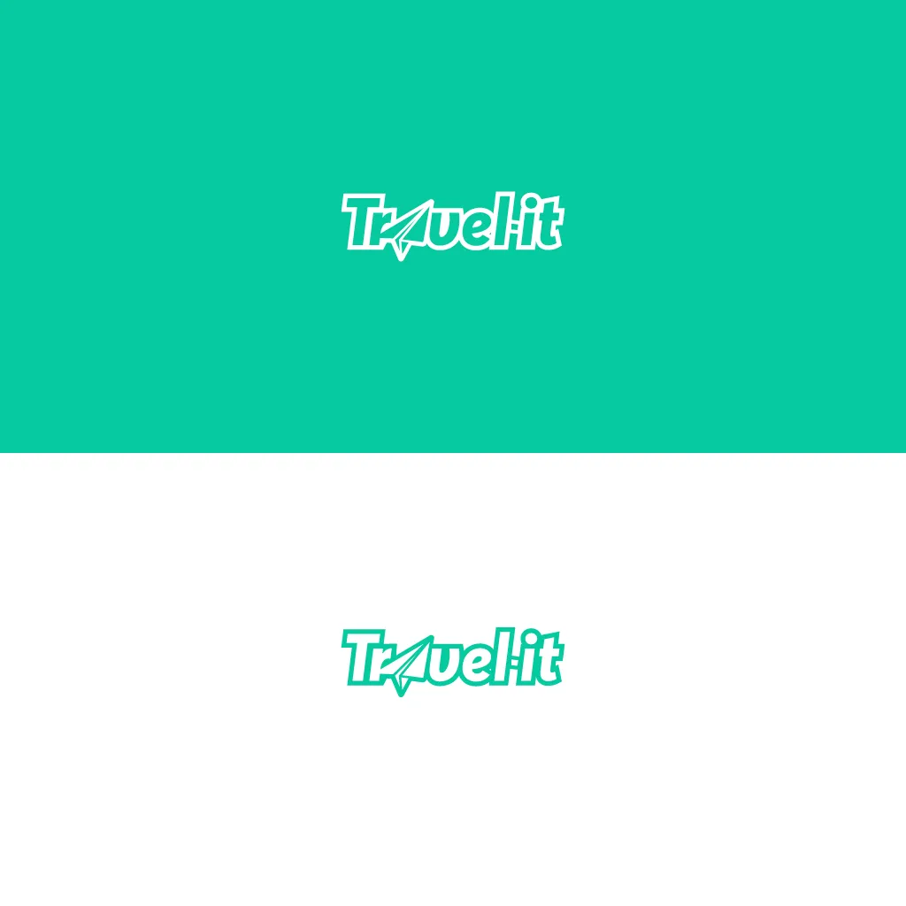
Logo
Fonts & Color
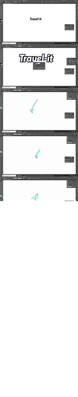
Process
Monochrome
Icons
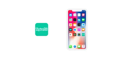
IOS
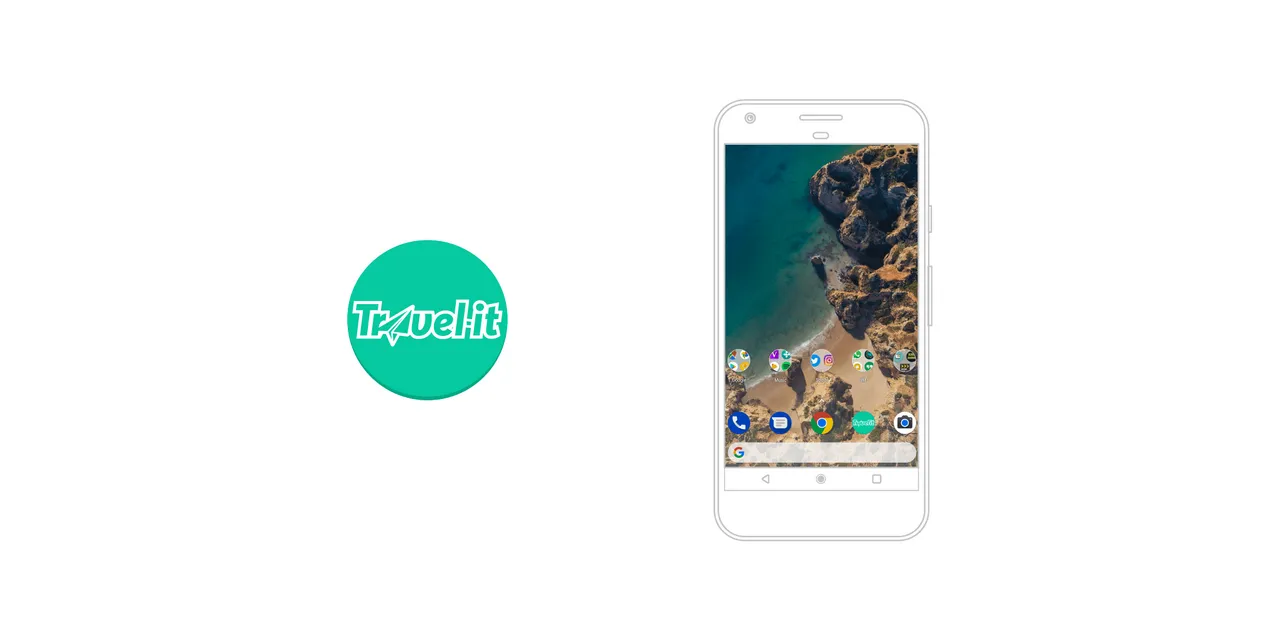
Android
Benefits / Improvements
Based on the brief, i made a friendly and professional looking logo with mobile first in mind which is why i chose to go with a really bold and easy to read type. The color used is the same as steemit , like stated. I think the paper plane suit the goal quite well here, relating to travels/computers.
Tools
Adobe illustrator
Original files
Icons
Others
Posted on Utopian.io - Rewarding Open Source Contributors