오늘의 예제: Lead-Lag Correlation을 이용하여 한 거래소가 다른 거래소 가격을 선도하는 지를 알아봅시다.
전 예전부터 이게 궁금했었습니다. 테더의 본산인 Bitfinex는 이래저래 말이 많은 거래소인데요, 과연 테더가 BTC 가격에 영향을 미치는 것일까, 그렇다면 Bitfinex 가격이 다른 거래소의 가격을 선도하고 있지 않을까 하는 생각에 도달했죠. 그래서 오늘은 1시간 평균 거래 자료를 가지고 이 문제를 다뤄보도록 하겠습니다. 일단 여기서 상대편으로는, 접근이 쉬워서 개인 투자자가 많을 것으로 생각되는 Coinbase를 골랐습니다.
접근법은 다음과 같습니다.
- 최근 1년을 대상으로 합니다.
- 딱 5일간 (5*24=120 time steps) 자료를 가지고 상관계수를 계산합니다.
- 상관계수를 계산하는 5일은 1년 전부터 하루씩 옮겨가며 계산합니다.
- 그러면 약 360개의 상관계수 값을 구할 수 있습니다.
- 이를 +-2 hours 시간을 엇갈려 계산합니다. (Lead-Lag) 예를 들어 Bitfinex(t-2) vs. Coinbase(t+0) 에서 Bitfinex(t+2) vs. Coinbase(t+0)까지 계산합니다.
프로그램에서 기본이 되는 함수 부분은 저번 #03에서 했던 것과 동일합니다. (conv2date, load_csv_data) 아래는 그 외 부분만 가져오겠습니다.
###--- Main ---###

## Parameters
c_name="BTCUSD"
Exchanges=['Bitfinex','Coinbase']

## Input File
in_dir='./Data/'

data=[]
for ex_name in Exchanges:
    in_csv_fn=in_dir+'{}_{}_1h.csv'.format(ex_name,c_name)
    data.append(load_csv_data(in_csv_fn))

    print(ex_name)
    print(data[-1]['date'][0],data[-1]['prices'][0],data[-1]['volumes'][0])
    print(data[-1]['date'][-1],data[-1]['prices'][-1],data[-1]['volumes'][-1])
    print('\n')

### Check consistency between data
if data[0]['date'][-1] != data[1]['date'][-1]:
    print('Time stamp is inconsistent',data[0]['date'][-1],data[1]['date'][-1])
    sys.exit()

### Cut for last 365 days
nt=365*24
xdate= data[0]['date'][-nt:]
## Bitfinex price
data_bf= data[0]['prices'][-nt:,:]
data_bf= (data_bf[:,-1]+data_bf[:,0])/2  ### Mean of Opening and Closing price
## Coinbase price
data_cb= data[1]['prices'][-nt:,:]
data_cb= (data_cb[:,-1]+data_cb[:,0])/2  ### Mean of Opening and Closing price

t_window=5*24  ### 5day window for calculating correlation
dt=2           ### Lead-lag up to 2 time steps (=2 hrs)
corrs=[]
for j in range(-dt,dt+1,1):
    tmp_corrs=[]
    for k in range(dt,nt-t_window,24):
        tmp_corrs.append(np.corrcoef(data_bf[k+j:k+j+t_window],data_cb[k:k+t_window])[1,0])
    corrs.append(tmp_corrs)

corrs=np.asarray(corrs)
print(corrs.shape)
for i in range(corrs.shape[0]):
    print(i-2,corrs[i,:].max(),corrs[i,:].min(),np.median(corrs[i,:]))
sys.exit()
몇 가지 설명
- 여기서 가격은 시가와 종가의 평균으로 정의되었습니다.
- 그리고... 제 느낌에는 그동안 설명 했던 내용이 다 녹아있어서 다들 이해할 수 있지 않을까 하는 생각이... ^^ (댓글로 질문 주세요!)
그래서 (안적은 함수 포함) 위 프로그램을 실행시키면 다음과 같이 나옵니다. (read_csv_data+leadlag_corr1.py3.py)
>> python3 read_csv_data+leadlag_corr1.py3.py
Bitfinex_BTCUSD_1h.csv
Timestamps are UTC timezone,https://www.CryptoDataDownload.com

8 ['Date', 'Symbol', 'Open', 'High', 'Low', 'Close', 'Volume BTC', 'Volume USD']
(15521,) (15521, 4) (15521, 2)
Done to read a CSV file!
Bitfinex
2017-10-09 09:00:00 [ 4575.4  4589.5  4568.6  4585.7] [  6.28890000e+02   2.87889786e+06]
2019-07-18 01:00:00 [ 9617.5  9813.1  9560.3  9748.7] [  5.45670000e+02   5.28719882e+06]


Coinbase_BTCUSD_1h.csv
Timestamps are UTC timezone,https://www.CryptoDataDownload.com

8 ['Date', 'Symbol', 'Open', 'High', 'Low', 'Close', 'Volume BTC', 'Volume USD']
(17919,) (17919, 4) (17919, 2)
Done to read a CSV file!
Coinbase
2017-07-01 11:00:00 [ 2505.56  2513.38  2495.12  2509.17] [  1.14600000e+02   2.87000320e+05]
2019-07-18 01:00:00 [ 9630.    9829.78  9627.08  9795.28] [  7.17030000e+02   6.97910252e+06]


(5, 360)
-2 0.992069721862 0.0442494445184 0.940395510387
-1 0.997139985631 0.0897195711313 0.977425430236
0 0.999924196797 0.0979837386284 0.99684554645
1 0.996445278145 0.00335636925298 0.975921798563
2 0.989438189892 -0.129775182005 0.93815293069
일단 최고/최저/중위 값을 출력했는데, 대부분의 경우 상관계수가 1에 가깝다는 걸 알 수 있습니다. 그리고 중위 값이 가장 높은 건 Bitfinex와 Coinbase가 동시에 움직일 때 군요. 최저값은 꽤 작게 나왔는데, 이떤 경우에 이렇게 두 거래소의 가격이 상관 없어지는 지 그래프로 알아봐야 겠습니다.
위의 프로그램 아래에 이어붙일, 그림 그리는 부분의 코드입니다.
###--- Plotting
##-- Page Setup --##
fig = plt.figure()
fig.set_size_inches(6,10.5)    # Physical page size in inches, (lx,ly)
fig.subplots_adjust(left=0.05,right=0.95,top=0.93,bottom=0.05,hspace=0.4,wspace=0.15)  ### Margins, etc.

##-- Title for the page --##
suptit="{} Price Lead-Lag Corr [{} vs. {}]".format(c_name,Exchanges[0],Exchanges[1])
fig.suptitle(suptit,fontsize=15)  #,ha='left',x=0.,y=0.98,stretch='semi-condensed')

cc=['r','g','b','y','c']
abc='abcdefg'
##-- Set up an axis --##
ax1 = fig.add_subplot(6,1,1)   # (# of rows, # of columns, indicater from 1)
ax1.plot(xdate,pmean,color='k',lw=1.,ls='-')
ax1.set_title('(a) Mean Price',x=0.,ha='left',fontsize=12)
xmin,xmax= ax1.get_xlim()
for i in range(5):
    ax1 = fig.add_subplot(6,1,i+2)
    it=(t_window//24-1)//2*24
    ax1.bar(xdate[it:-it-24:24],corrs[i,:]-1,color=cc[i],width=0.7,bottom=1.)

    ax1.axhline(y=0.,color='0.5',lw=0.5,ls='--')
    ax1.set_title('({}) {} leads {} by {} hour(s)'.format(abc[i+1],Exchanges[0],Exchanges[1],2-i),x=0.,ha='left',fontsize=12)
    ax1.set_xlim(xmin,xmax)
#ax1.xaxis.set_major_formatter(mdates.DateFormatter('%m-%d\n%Y'))

##-- Seeing or Saving Pic --##

#- If want to see on screen -#
#plt.show()

#- If want to save to file
outdir = "./Pics/"
outfnm = outdir+"{}_price_llcorr2.{}vs{}.png".format(c_name,Exchanges[0],Exchanges[1])
#fig.savefig(outfnm,dpi=100)   # dpi: pixels per inch
fig.savefig(outfnm,dpi=180,bbox_inches='tight')   # dpi: pixels per inch
몇 가지 설명
- 첫번째 패널에 가격을 선으로 그리고
- 아래 5개의 패널에 순차적으로 lead-lag 결과를 bar chart 로 그립니다.
- 대부분의 값이 1에 가까우므로, 1에서 시작해서 아래로 향하는 막대 그래프를 그려봅니다. (bottom=1, height=corr-1)
- 가격은 1시간 단위로 자료가 있고, 아래 상관계수는 1일 단위로 자료가 있으므로 서로 시간을 맞추는 게 쉽지 않습니다. 여기서는 제일 위 패널의 x축 범위를 알아낸 후 (get_xlim()) 아래 모든 패널에 동일하게 적용시켰습니다.
이 프로그램을 실행하면 다음과 같은 결과가 나옵니다.
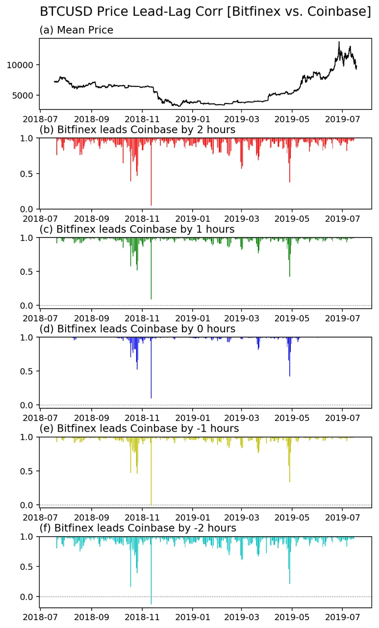
어떤가요? 이 그림으로 어떤 유의미한 결과를 생각해 볼 수 있을까요?
일단 확실한 건 대부분의 경우 1시간 자료에서 Bitfinex와 Coinbase는 같이 움직입니다. 그런데 가끔 따로 놀 때가 있어요. 따로 노는 구간이 가격과 눈에 보이는 관계가 있어보이진 않습니다.
그리고 거의 모든 구간에서 서로 동시간일 때의 상관계수가 더 큽니다. 이건 이렇게 확인했어요.
for i in range(5):
    if i==2:
        continue
    else:
        idx=corrs[i,:]>corrs[2,:]
        print(i-2, idx.sum(), np.where(idx)[0])
이 부분을 추가해 보면 다음과 같은 결과가 나옵니다.
-2 0 []
-1 2 [280 281]
1 3 [91 92 93]
2 0 []
즉, 2시간 이상 차이 날 때는 더 큰 상관계수는 아예 없고, 1시간 차이 날 때는 Bitfinex가 1시간 빠를 때 좋은 결과가 이틀, 그리고 Coinbase가 1시간 빠를 때 좋은 결과가 사흘입니다. 1년 중에요. 280일 근처는 아마 가격이 오르고 있을 때일테고, 90일 근처는 가격이 내리고 있을 때 일 것 같습니다. 그런데 이게 얼마나 의미가 있을 지는.. 지금은 확실치가 않네요.
그래서 현재가지의 결론은 1시간 거래 자료로는 동시에 움직인다고 보는 게 타당할 것 같습니다.

관련 글들
Matplotlib List
[Matplotlib] 00. Intro + 01. Page Setup
[Matplotlib] 02. Axes Setup: Subplots
[Matplotlib] 03. Axes Setup: Text, Label, and Annotation
[Matplotlib] 04. Axes Setup: Ticks and Tick Labels
[Matplotlib] 05. Plot Accessories: Grid and Supporting Lines
[Matplotlib] 06. Plot Accessories: Legend
[Matplotlib] 07. Plot Main: Plot
[Matplotlib] 08. Plot Main: Imshow
[Matplotlib] 09. Plot Accessary: Color Map (part1)
[Matplotlib] 10. Plot Accessary: Color Map (part2) + Color Bar
F2PY List
[F2PY] 01. Basic Example: Simple Gaussian 2D Filter
[F2PY] 02. Basic Example: Moving Average
[F2PY] 03. Advanced Example: Using OpenMP
Scipy+Numpy List
[SciPy] 1. Linear Regression (Application to Scatter Plot)
[SciPy] 2. Density Estimation (Application to Scatter Plot)
[Scipy+Numpy] 3. 2D Histogram + [Matplotlib] 11. Plot Main: Pcolormesh
Road to Finance
#00 Read Text File | #01 Draw CandleSticks | #02 Moving Average
#03 Read CSV data | #04 Lead-Lag Correlation