Good day fellow members of Steemit!
This post is my first feedback on this platform. It's feedback on a photo by @ansonoxy. I don't know if @ansonoxy is a man or a woman, so I'll continue by saying him, haha:).
He made some very nice autumn pictures of a trip to Sweden. I'm impressed by the colors in his shots and I really like the overall quality of his pictures (especially when considering they are shot with a 3 year old smartphone). Please visit @ansonoxy's feed to view the full album and leave him some upvotes!
There's one picture I would like to review in particular:
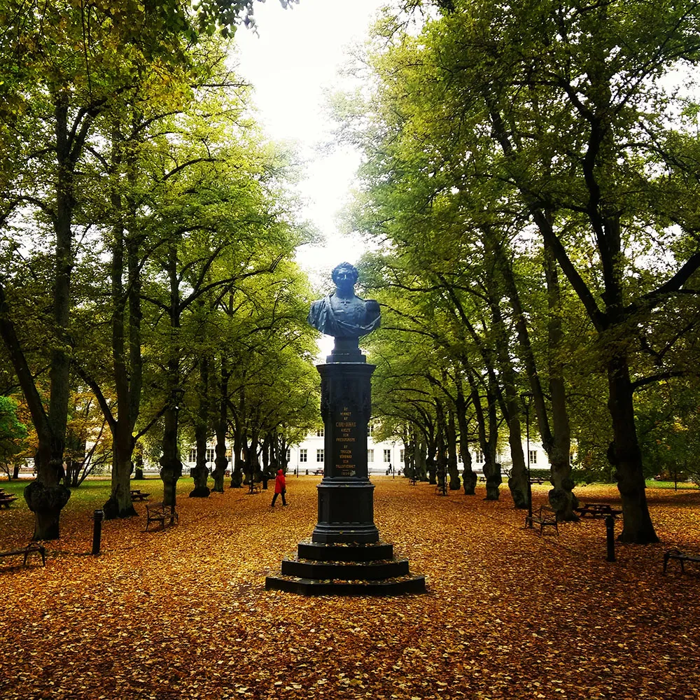
Some first impressions:
- I really like the composition of this shot. The statue clearly is the subject of the photo and it is positioned exactly in the middle of the picture. The lines created by the park benches and the stems of the trees lead my eyes from the foreground to the background. The background consists of a beautiful building. You can see that this picture is perfectly symmetrical by looking at the windows of the building on both sides of the statue. Great job!
- The horizon looks like it is falling to the right a bit. This will be easily adjusted.
- The colors in this picture are gorgeous. I really love autumn photos! The orange and yellow leaves look beautiful and I think it would pop even more by adding some more color to the leaves. The green in the trees contrasts nicely with the yellow.
- The statue is the main subject of the picture, but it looks a bit too dark to me. By upping the shadows a bit, the subject will be better displayed.
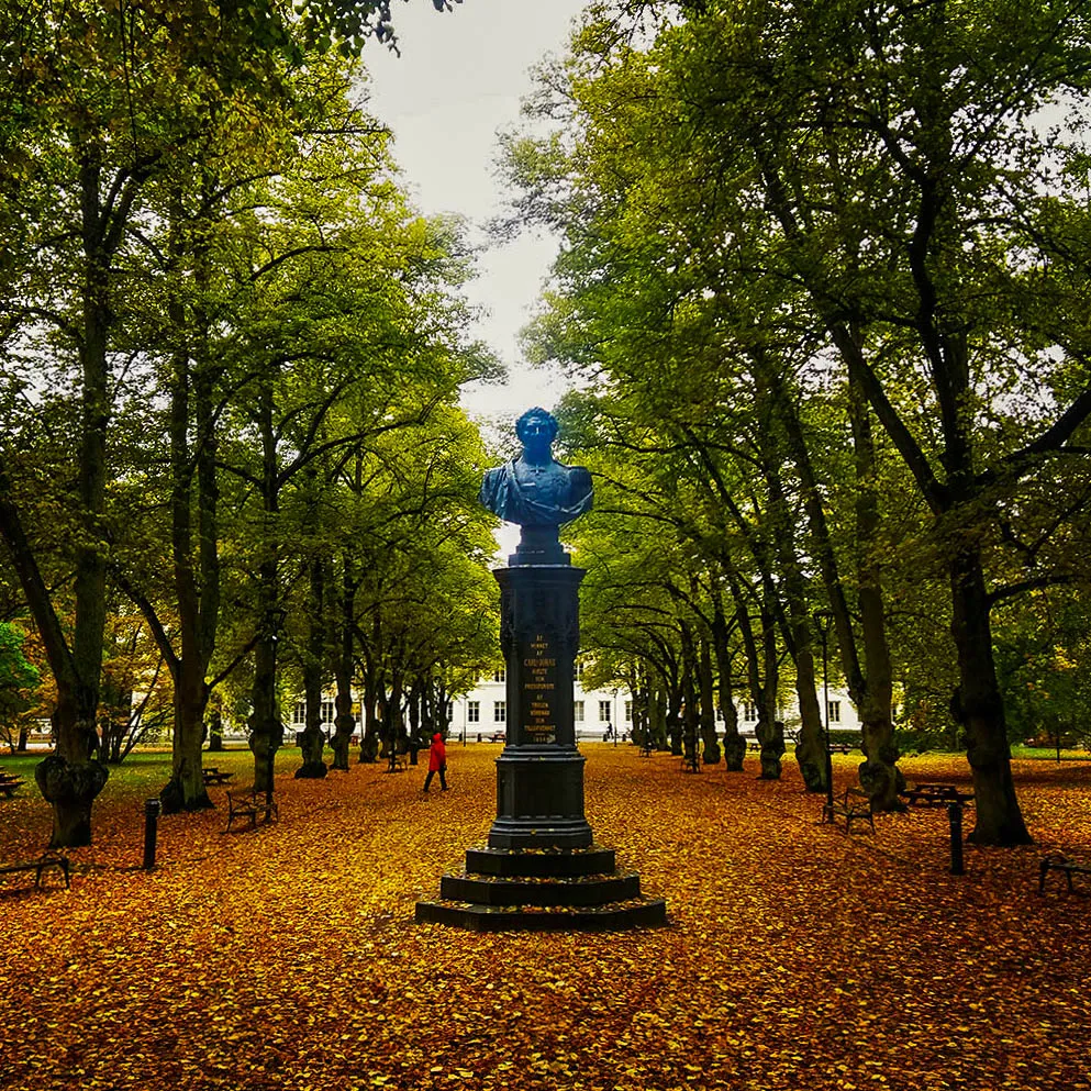
I downloaded this picture as a 0.5Mb JPEG from @ansonoxy's feed, so it won't be possible for me to edit it the way I exactly want, but I think I can adjust some minor things to make it pop some more!
Here's the result of my quick edit in Lightroom:
What did I do?
- I adjusted the horizon a bit, to make it straight.
- I decreased the highlights in the whole picture, so that the sky isn't too blown out and the light reflection in the statue is minimized.
- I upped the shadows to make the text on the statue more visible
- I decreased the overall exposure a little bit to compensate for the shadow increase and the blown out sky.
- I added a little bit of saturation to the yellows, greens and blues to make the different colors pop more and emphasize the autumnness (is this a word) in the picture.
I'm not happy at all with how the sky came out in the edit. It's a small size JPEG, so it's impossible to decrease the highlights without creating a gray wash in the sky..
What would I do differently?
I think you shot this picture while standing up straight. Maybe if you crouched, the statue would look a bit more impressive
Conclusion:
I really like this picture. My editing didn't make it a better photo, it just gave it a little more pop. All credits go to @ansonoxy!
I love the symmetry, love the colors and love the overall composition.
I think you did a great job of shooting this picture.