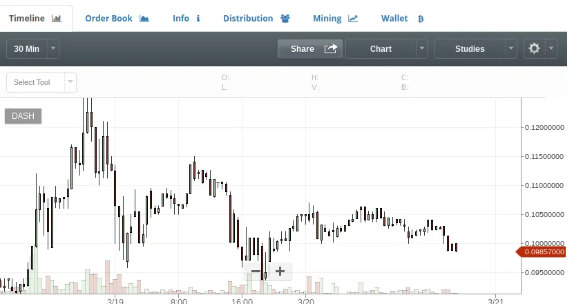
So it has come. I have decided to apply my not inconsiderable analytical skills to the world of Crypto. Specifically trading. Even more specifically DASH.
Its the cryptocurrency that's on everybody's lips, except for those damn PIVX'rs with their node this and Master node that.
So lets cut to the chase. The meat of it as it were.
I have been looking at the charts and using some analytical tools to help me see the underlying trends in the data.
Firstly I applied a fibonacci overlay
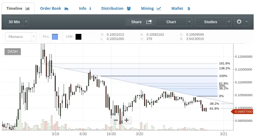
Now whats immediately alarming here is that you can definitely see a 100% marker to the right. Note carefully how everything under that 100% line is below 100% and yet everything above, looking ominously positive it must be said is above 100%
I won't teach anyone how to suck their grandmothers eggs here but it's undeniable that Houston, we have a problem.
However, never one to pour the bathwater in the stew as we say in Scotland. I bought some more powerful analytic tools to bear.
First I overlaid some straightforward plot lines. As you can see, these seemed to suggest a downward trend.
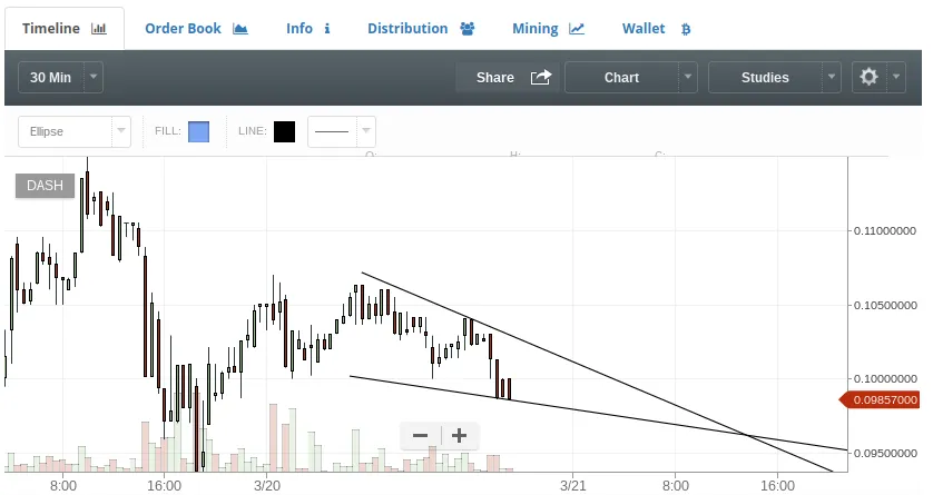
However, that's not the only trick in my arsenal. I quickly applied some ellipse mathematics to the picture and overall I was startled by the results.
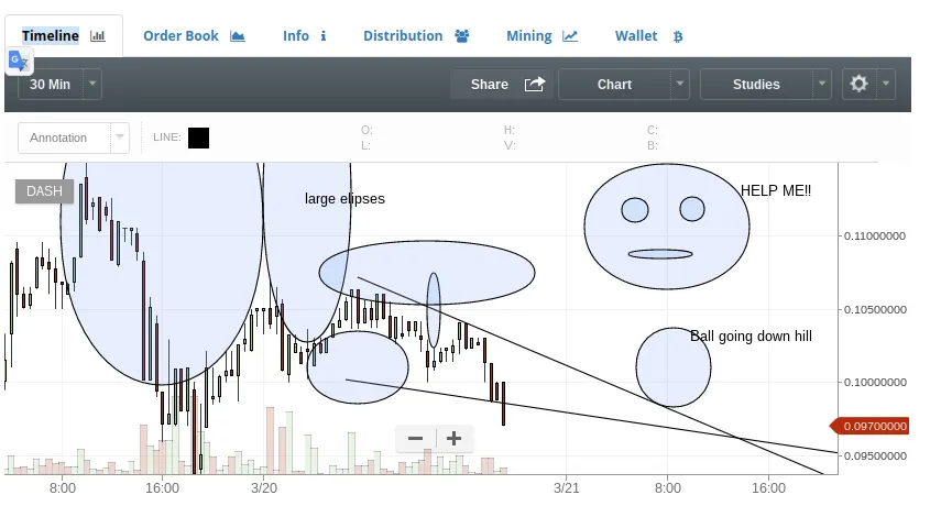
The image of the ball rolling down a hill is a wake-up call to any crypto enthusiast. And that face? HELP ME! What is that all about?
I was a little out of my depth. I knew I was definitely seeing something but could not quite put my finger on it. I called a friend, he has been on the crypto scene for years. I told him what I could see and he sighed before advising me to clear the display.
He then hung up, cursing all the while. I suspect it's the alcohol. He has always had a penchant for the barmaids apron if you get me.
The alarming thing is that after clearing the display, I then re-input most of the analysis from memory and the image that came out is almost exactly the same.
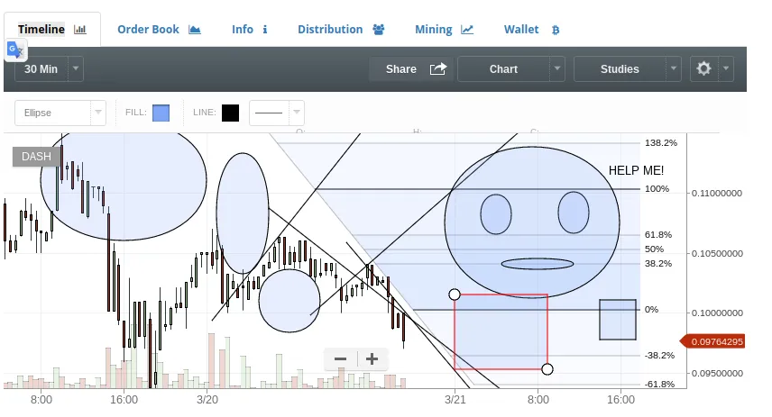
Now, you can't tell me that's just coincidence? So there you have it, DASH is on a slippery slope.
Maybe.
I will be back soon with an in-depth analysis of Monero, otherwise known as the boy beneath the stairs.