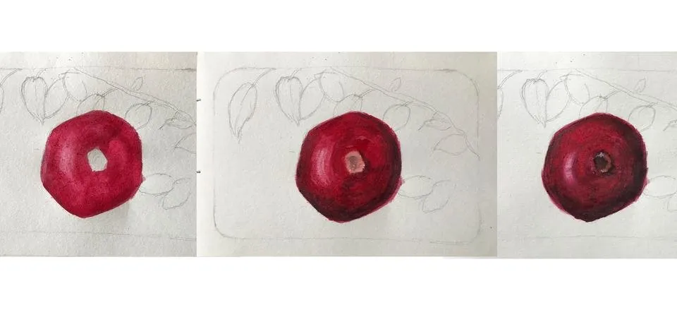
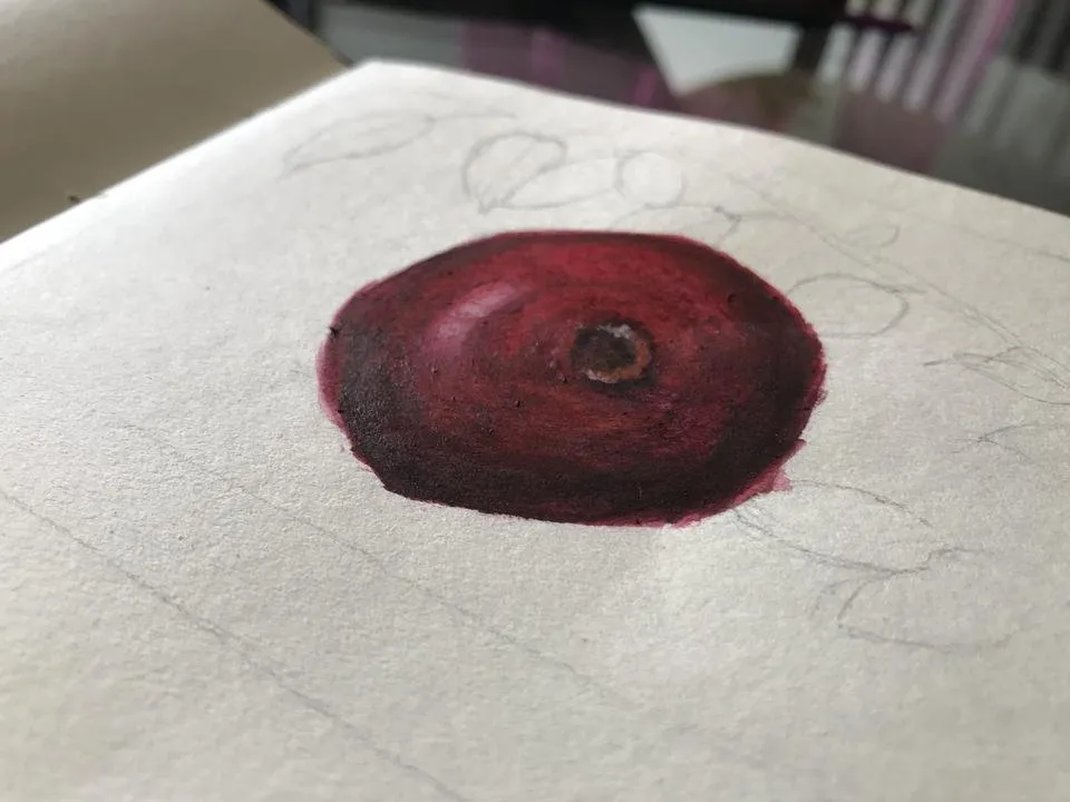
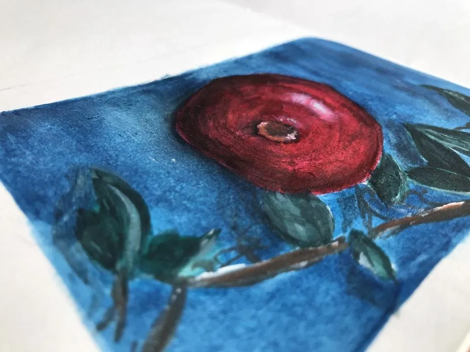
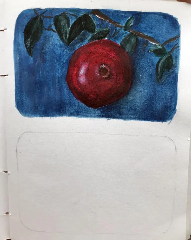
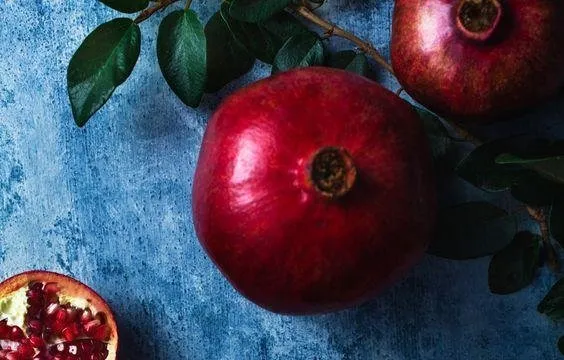
I am back with my second fruit painting with some process images and a small time lapse. From the moment I laid my eyes on the reference, I had a hunch that this was going to have a wide color palette no matter how simple it looked. When I started adding the highlights, I got really confused for a while because it looked like there were at least 5 colors in about an inch of an area all blended together!
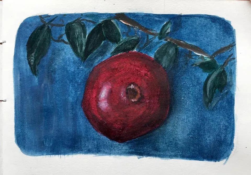
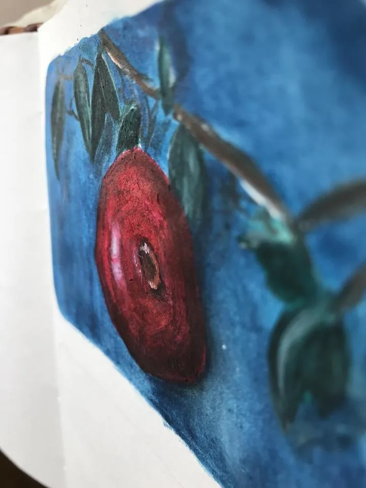
It took me a good look at the picture to figure what the hell was actually going lol :P I think my colors ended up being a little muddy? and darker than the actual photo, where the pomegranate looks a lot more fresh and vibrant. So definitely need to look at that and make sure I don't repeat the same mistake again. I didn't change the background color because I really liked the contrast of the red and the blue. Other than that I made another painting right after this in the frame below, which turned out to be quite interesting and fun! Can't wait to share it with you guys.. but till then.. Stay happy and healthy! :)

Keep Creating
Lots Of Love <3