I don't often do photography "lesson" posts, because, I am not the greatest photographer by any stretch, I am not good technically, nor am I fantastic with editing software, but -
here we are still.
I use Adobe Lightroom mobile (there are plenty out there) for a lot of my edits and I don't know the last time I posted an unedited image to Hive - or if I ever have - because I see the imagery as a support for the writing. I am not the only one of course to care about which images they use, Satan cares too, which is why @meesterboom puts so much effort into pleasing our master, Beelzebub.
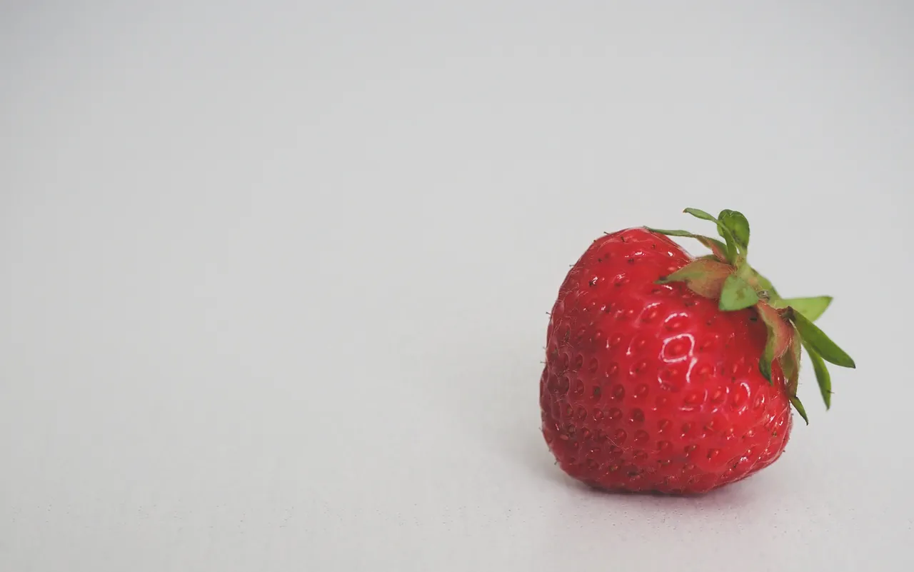
Satan loves this strawberry image, because red is his favorite color to decorate with and he has decked out his mancave in all kinds of hues of blood and fire colors. The rest of the house is decorated by his wife, Lilith.
She likes natural colors and shades of beige.
Anyway - back to the photography stuff.
Scroll through trending and you will see all kinds of images, but there are a lot of the clickbaity type and a lot of people love to use the "free" ones from the pros, because you know, they come from the pros and are good. There are several places people use like Pixabay and Unsplash which are fine, but still...
Isn't it nicer to use all your own work?
I might be old fashioned.
But, I do think that using our own images adds value to the posts, because it shows something about ourselves too and not just where we might visit. There is also a style component to it, a taste and of course, the little things we might get up to. The other thing with using our own photos is, it means that when we go out into the world, we are looking for images to support our work or, work to support our images.
Looking for content topics from our lives is far more personal and probably becomes a lot more authentic than when we trawl the internet and use other people's images to portray our thoughts. I hear many people struggle for regular content, but in my experience, what this means is that they are consuming too much, creating too little. Shift the ratio and suddenly, the consumption takes on a new form, where it becomes source material for content, not content to fill time.
Am I wasting your time?
Back to the photography stuff again.
Right. There are some basics to consider like firstly, if there is a clear horizon line, make sure it is straight or, so far crooked that it becomes a style choice.
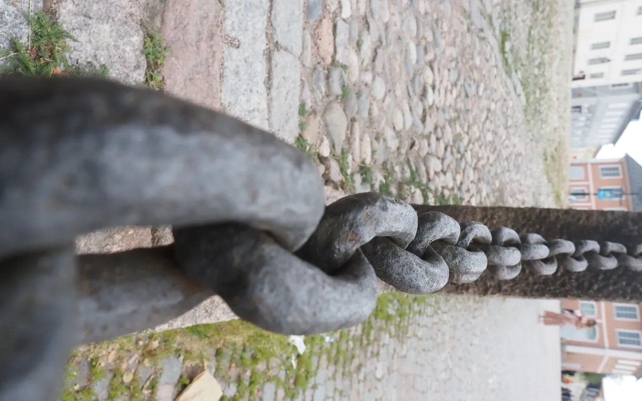
I seem to have one leg shorter than the other, or one leg longer than the other, depending on which way you want to consider it, as a lot of my photos are at a slant. I have got far better at thinking about this for the shot though over the last 20 years and I don't normally make the mistake, but I see a lot of this:
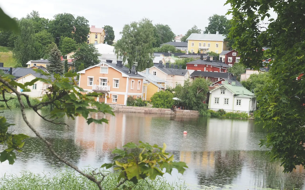
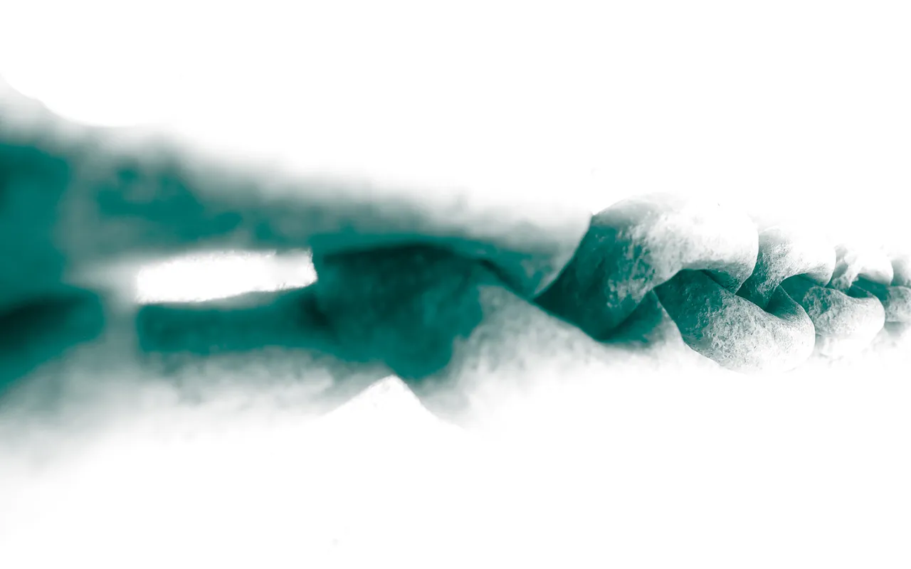
When it should be this:
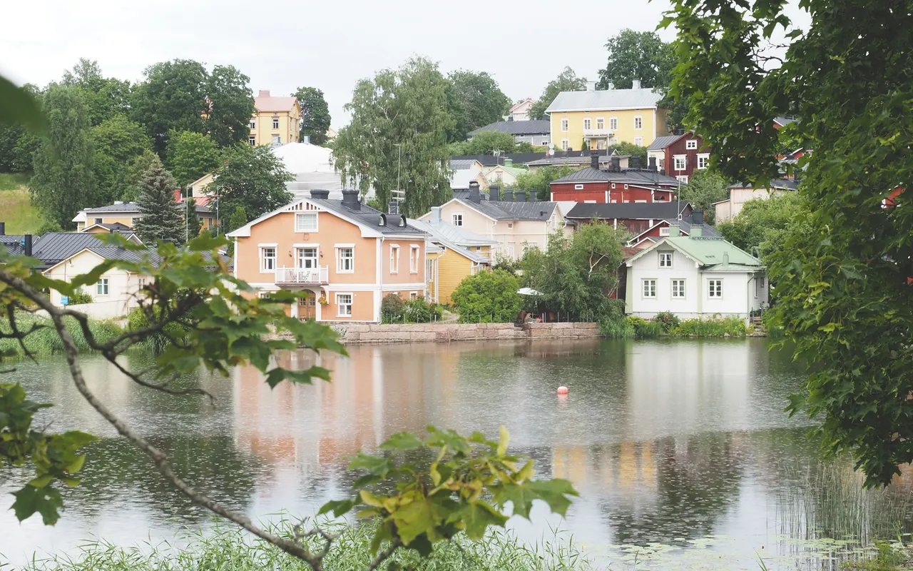
It makes a difference, doesn't it?
Note: I had to fake the first one because I actually took it pretty straight.
It is a tiny little edit to straighten an image and even without specialized software, a phone with a camera will have some basic editing tools. Use them.
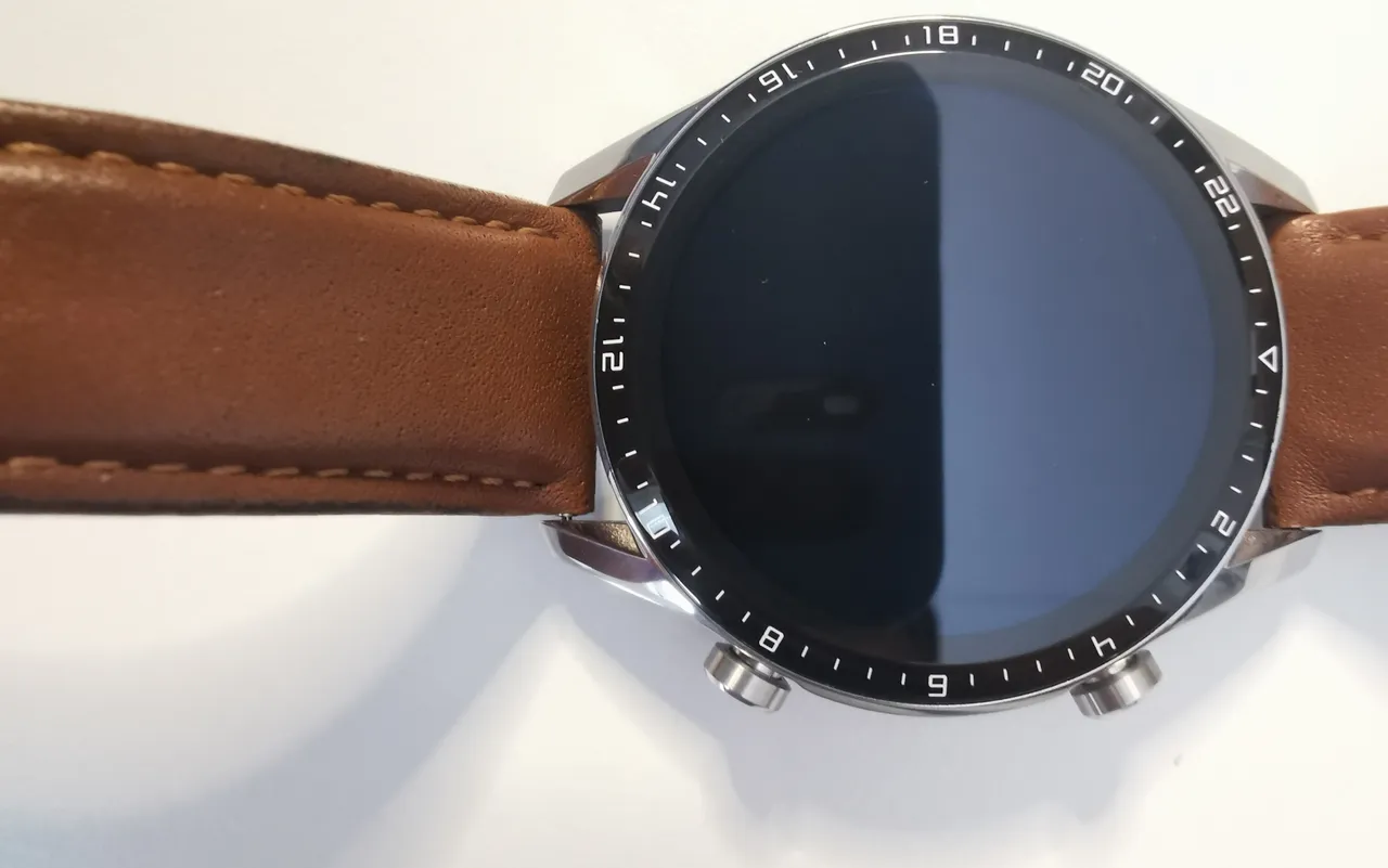
The next "trick" I will mention that is related to horizon lines, is squaring up leading lines where possible. Yesterday in a post I used an image taken on my phone, of a sign at a wings restaurant. I was standing on stairs and it was elevated on the wall, so it gets distorted in the angle. Nothing wrong with distortion, but at least in this case, it didn't make for a very nice leading image.
Does it?
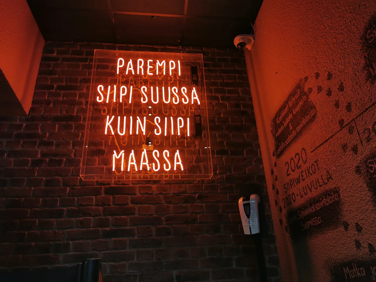
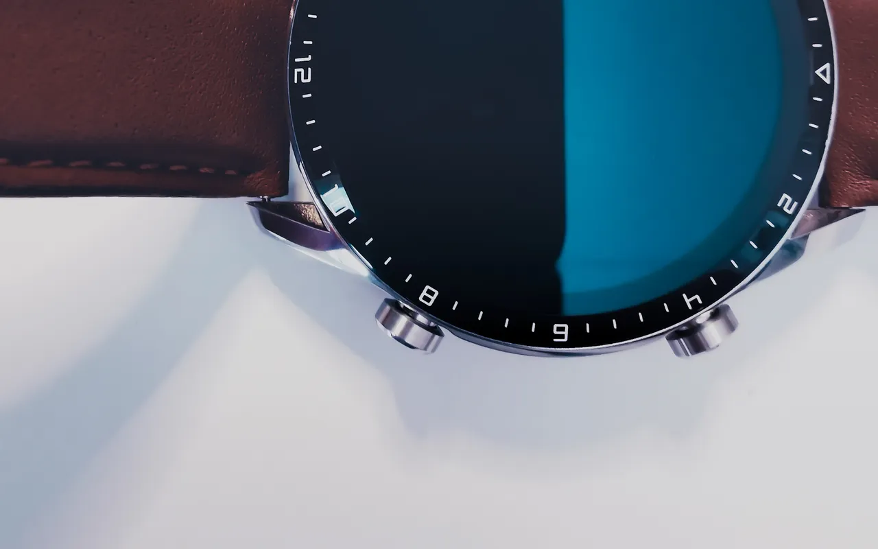
The same image after a quick straighten:
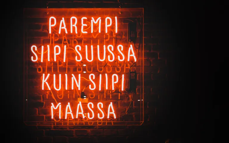
Which feels more like it should be a supporting image for an article?
For the straightening edits, I use guidelines in Lightroom Geometry, which are set up easily like this:
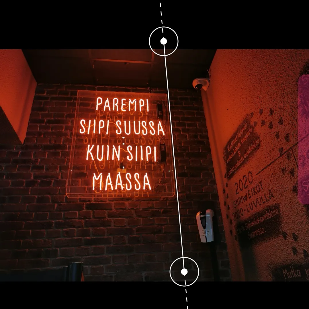
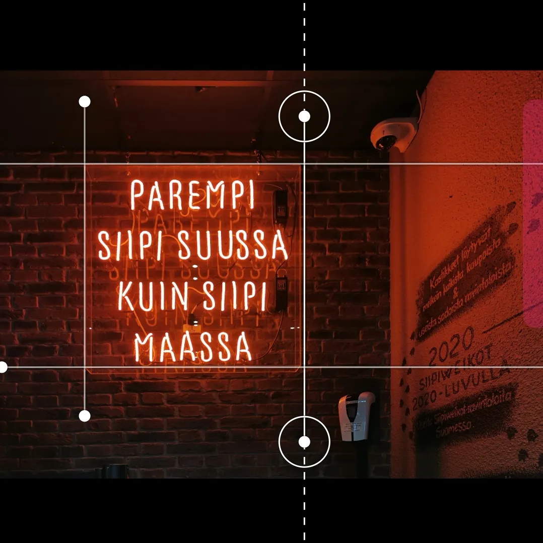
So now it looks like I was standing straight onto it and there is minimal warping due to the angle taken and even after the edit, as all lines were squared up. The bricks too.
Then, I added a couple masks to drop away and fade to black the background I didn't want to see in order to make the signage stand out more. As well as a crop down from 4:3 to 16:10, which is the size I generally use as it feels cleaner for the post and aligns things more nicely on Peakd - normally. If the title is too long and enters into a second line, or I use an older image (I used to crop at 16:9), it all gets out of whack again.
While all of this might seem useless, not seem overly value adding and it deifinitely isn't going to win any prizes for quality - for me, it makes a difference to the way I feel about the content I produce. And I hope that obvious or not, it adds to the audience experience also.
Here are a couple other recent examples, with the first being quite extreme on the editing scale, the second more of a "touchup" kind of job, to make it look less flat and a little more editorial. But remember, I do this on a mobile phone using my finger to draw, so it isn't exactly Pixar Studios here.
A little effort goes a long way and while most people focus on what I write because the images are generally support material, it doesn't mean I don't put effort into them. I believe it does make a difference to the end result and I think that most people appreciate it when it is there and would notice if it wasn't.
And, for those who do take the time and make the effort to improve the presentation of their work, they generally tend to find value in what they do because of the additional effort they have put into it. And, using one's own images and content from local surroundings also means, getting more engaged with our home, our garden, suburb, city and country. It doesn't all have to be glamorous in order to get comments and votes, but if we want attention on our work, we have to pay attention to what we create.
Content is plentiful, content is cheap.
The question is,
what value do you bring to the table?
There is only one you.
Use what you've got.
Taraz
[ Gen1: Hive ]