

The other day I uploaded a number of photographs that I stated I disliked, and how I thought it would be an interesting series in which I intentionally share bad pictures, just to highlight why I believe they are bad and what went wrong with them, and ultimately reflecting on how I have improved over the years as I had managed to grasp techniques and understand strengths and weaknesses behind taking photographs.
In this post, I feel I'll talk about the flat, the uninteresting. The images that don't really offer anything or are simply just downright boring due to a lack of subject or colour. The first photograph isn't all that terrible, and the best of them, but it is slightly overexposed; shot on Kodak Colorplus 200 35mm film stock. The problem is absolutely the colours. Ther colours don't stand out too much and the film stock doesn't really show much definition to the fruit, a slight error in exposure as well as the problem of using the wrong film stock for that type of environment.
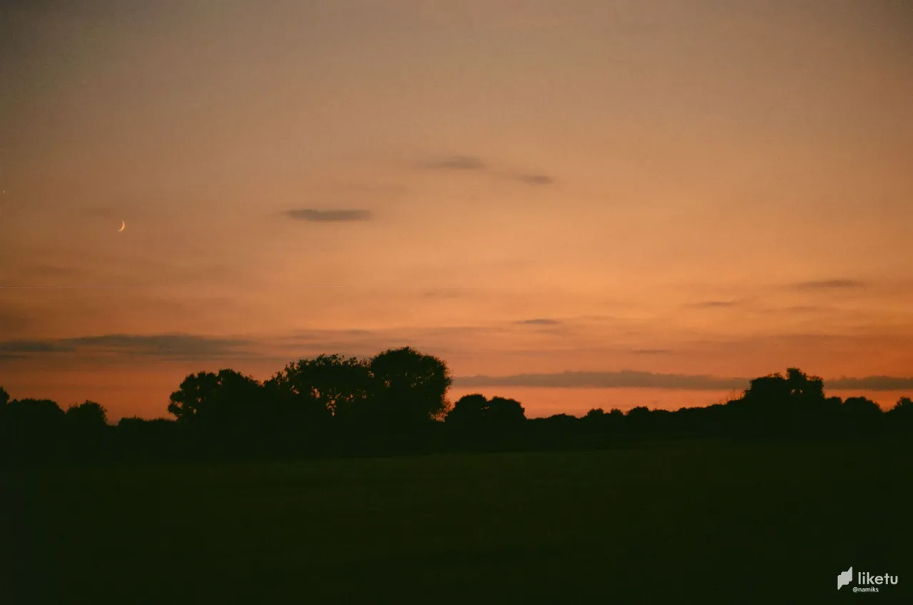
The second image, being the total opposite: the subject is enough to remain interesting, but it is lacking colour and a good angle through the lighting to really display the subject. Shot on 35mm black-and-white film, the main issue is not considering where that light source is coming from and framing it according to the light. The result is an image that could tell a story, but is incredibly dark and ultimately void of much emotion, thus losing that aspect of narrative. With more lighting in the subject, it certainly would've had a much more interesting outcome.
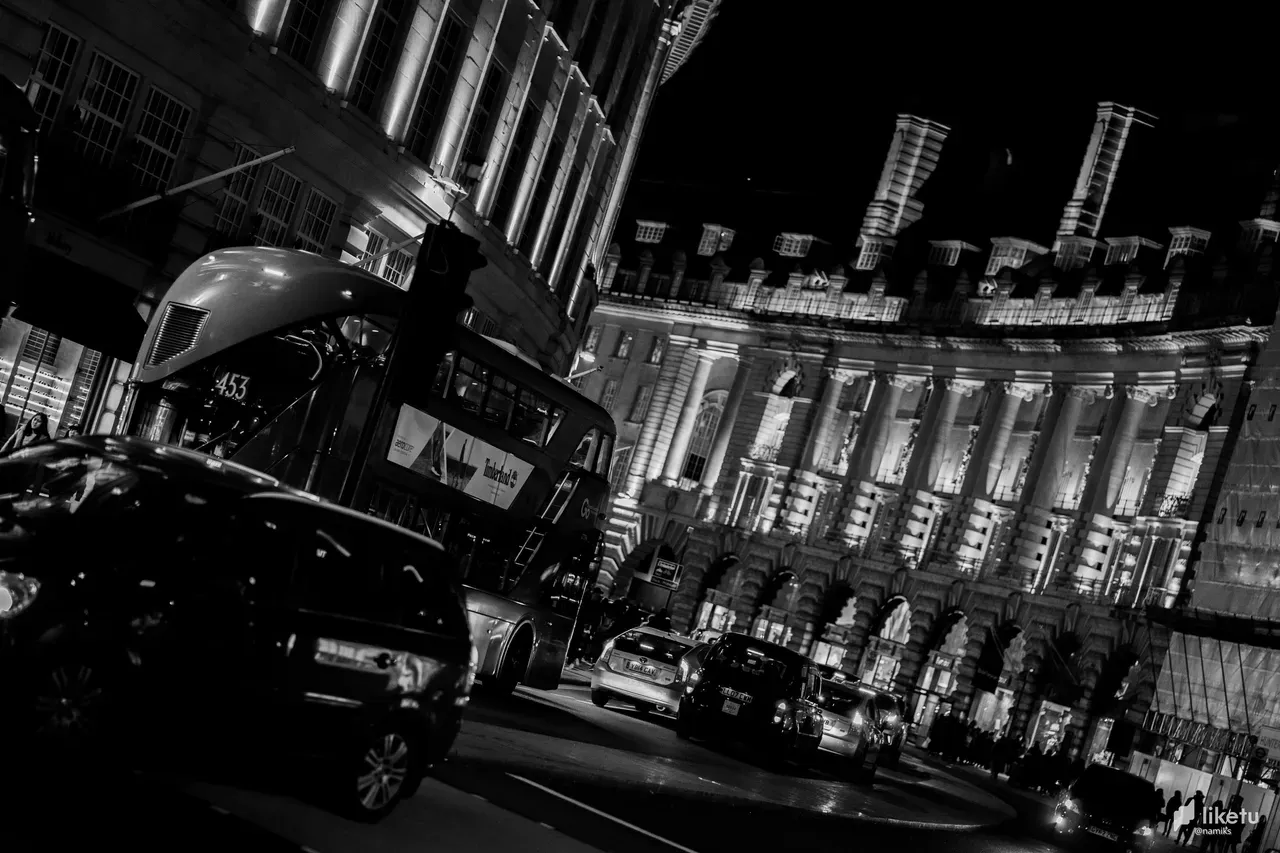
And next we move to another black-and-white photography, this time digital. But this third image is fundamentally wrong in one of the most popular photography errors there is: a titled perspective. This perspective ruins the entire image and makes the photograph almost nauseating to look at, due to its total lack of natural perspective. It makes you dizzy, and generally is unappealing. People do this all the time in photography, particularly in sunset images, not quite realising that they're ultimately ruining the image while thinking they're adding more composition. Though, if you are intending to create a nauseating feeling to your audience, particularly through a drunken or otherworldly perspective, it works great!
Lastly, we have an image that has everything wrong with it: poor colours. An uninteresting location and subject. And a lack of general exposusure. The focal length is wrong, and the film stock was completely wrong. Ultimately, it cannot be saved.