I learned something new about COVID today, and my impression before-hand turned out to be very, very wrong.
tl;dr - People entering the hospital with COVID have about a 45% chance of dying, and that ratio has been constant pretty much since the beginning.
All the talk about improving survival rates or falling IFR/CFR have been due to better testing after March/April when we didn't really know how many cases were out there, and lower hospitalization rates often due to a younger mix of infections.
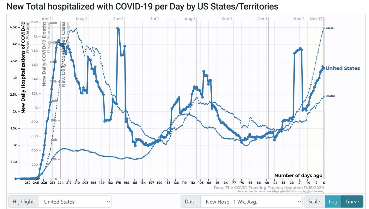
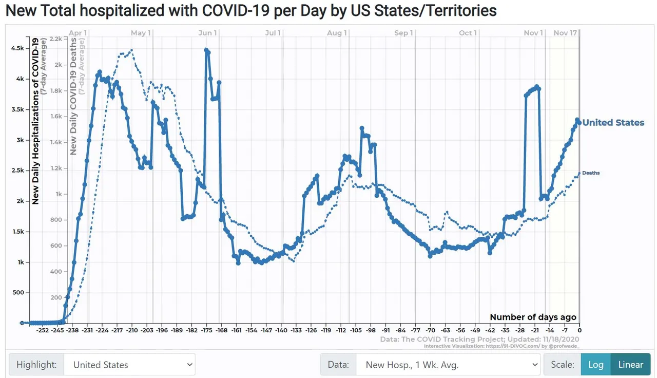
The reason my perception was so far off is that the most common charts show the total number of people in the hospital for COVID, i.e. if you're there for two weeks you show up for 14 days. If you look at the rate of new hospitalizations (admissions), suddenly the deaths start tracking much more accurately after a two week delay.
Note the scales on the graphs - deaths (light line) are shown at about 2.2x higher to match the hospital admission (bold) curve.
On the second graph, I added cases. Notice that in our second wave, the curve for deaths lagged but rose a bit higher than the peak for the cases. If those ratios hold, today's case count already has 2,500 deaths/day baked in, and we're doubling on about a 14-day rate. We're likely to blow right past our first-wave peak of 2,100/day and keep on going.