
What was the big topic on “Cost of a Pixel Color,” you ask? Battery life differences between dark and light app designs. Guess which one was better on battery life? I don’t think you need to me to tell you, but Google admitting that they’ve probably wrongly been pushing developers towards overuse of white was something to see.

The session shows a bunch of fun stats and graphs that all compared a phone with a heavily white theme to one with a dark theme and how each impacted battery life. Look at this shit. If you crank brightness on your phone, a damn dark theme on your keyboard could save you 21%.
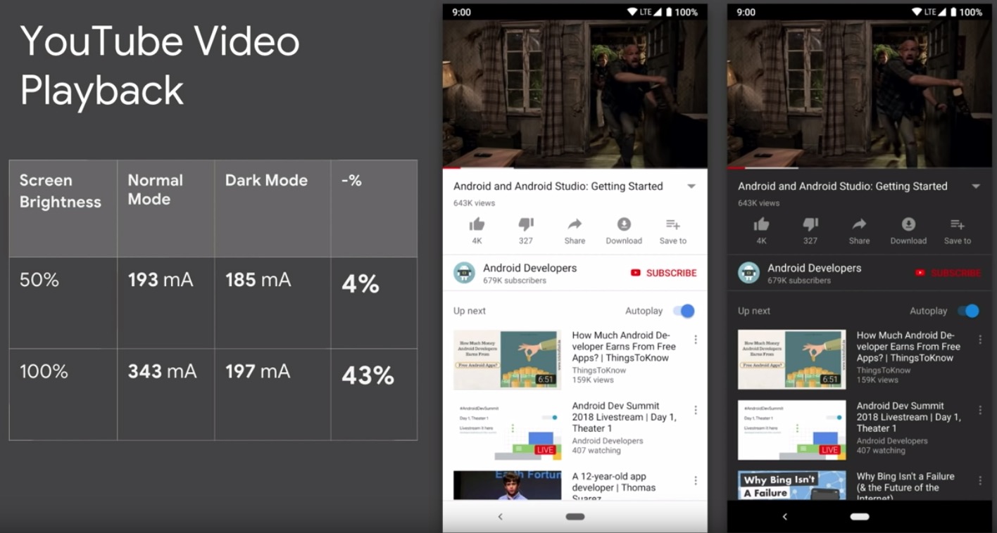
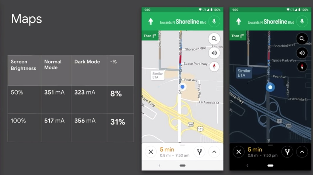
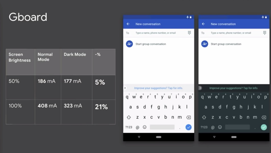
Now, this is all important because Google has spent the past year making all of its apps stupidly, overly, ridiculously white. We’ve made fun of each update, mostly because all-white apps are boring, but this just shows you the level of dumbness here. And this session is also probably why they are starting to offer dark modes and themes foreach and every app they’ve updated.
After admitting that white is bad and dark is good, the session then dove into how developers can easily implement a dark theme, use other colors in themes, theme to dark or black for AMOLEDs, etc. If anything, this should all be good news for those of us who like dark themes and hate the excessive use of white in apps. I’m sorry that it took until 2018 for Google to realize this.