In the late 90's Blogger was a service that helped bring 'blogging' to the mainstream. Blogger services were absorbed by Google later on in 2003. It was freely offering a place for people to write, publish pictures and much more. It was all the rage in those days.
Shortly around this time, Wordpress gathered steam as a highly flexible platform that could be optimized, customized and reconfigured into quite a serious publishing platform for individuals and businesses.
Sure there were other competitors. But Wordpress' Plugins enabled commonplace people to add so many awesome features to their personal websites and blogs that there was just no real way they could keep up.
Plus, the community drove tons of advances with uniquely designed widgets, caching, social media integration and all kinds of other plugins, so that virtually any web design need could be met.
-- We didn't even mention Themes, did we?
Oh and Themes practically sapped the web design industry of the need for talented designers. Places like Themeforest sprouted up showing off amazing, sleek Themes that could be installed with a single click to any Wordpress website. Essentially, WP themes enabled businesses to forgo expensive design costs involved in hiring some Web Design Firm. As a result, Wordpress almost single-handedly put Web Designers out of jobs. Many of them probably work on Themeforest right now.
So with all that, how did Wordpress go wrong? What exactly was Wordpress' downfall? In part, it was the relentless need to optimize.
While it is important to modernize and stay up to date for a blogging company like Wordpress, they overdid it.
Here is what the Wordpress editor looked like in the 'good days':
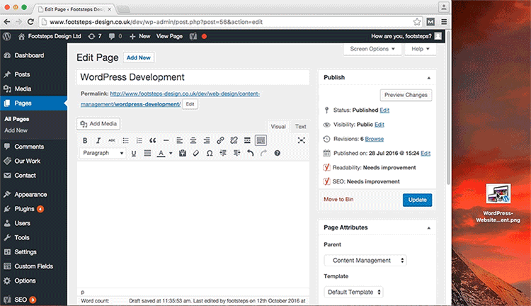
- Drag and drop images worked really well
- The work flow followed the Golden Circle so was easy on the eyes, though had a lot of data displayed in the sidebars on both left and right
- The Permalink to the post was easily accessible
- The Bold, Italics, Paragraph, Image Insertion, URL Insertion were all easily accessible and legible - a truly KISS (Keep It Simple Stupid) approach
- Furthermore, the actual text editor space was easy to edit and access. You could click Visual Mode to see it as it will display and Text to see the HTML back code and edit to your preference or fix a bug or two in formatting
- Already taking a wrong turn, this image does not show the Underline button for text. It was removed as part of 'streamlining' wordpress WYSIWIG editor. Oh dear.
And here is what we have today:
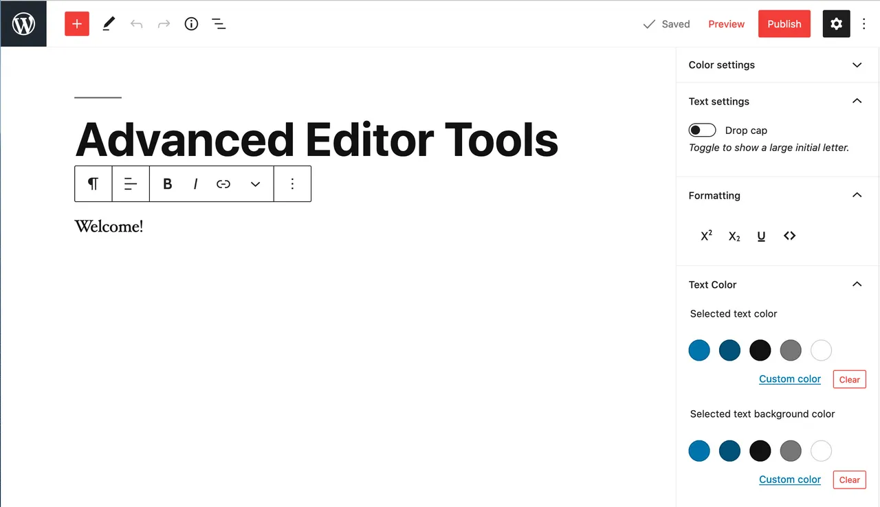
The editor currently used is some sort of newfangled WYSIWIG editor they fashioned for use in the current version of Wordpress. Let's see what the problems are -- that weren't present in the past version:
- Where is the link to my published post? No idea. Permalink? None.
- Where is the text editor itself? It's all that white space, click it and it will display the blinking vertical line that indicates you can type. But it will be monstrously slow, like you're using your mom's old computer from 1998.
- Want a new line, just click enter and wait 3 seconds. That's right, wait a few seconds before you can type a new line.
- Want to move your text easily? You can't... The text lines are individualized modular packets that must be fiddled with endlessly and are heaps slower than Google Docs (which is somewhat slow).
- Want to insert an image? I guess you sort of have to click the down arrow on the hover-over box there? Not sure.
- Want to underline text? Can't do that from the hover-over box of tools. You have it in the sidebar there (if it is visible for you, it might be in settings now).
- Want a hyperlink? You need to select the text, click the appear-on-hover toolbox and click the link icon. But that doesn't make a link, even after you paste in your URL. You have to click another confirmation button and it isn't even clear a link was created.
- Want to easily access your menu of plugins from here? Good luck! It's 'mobile friendly' now, so you can't access them until 10 seconds of load time has passed as the code prepares the sidebar...
- What about centering? No idea. Tell me if you find out where that is.
- What's the red plus symbol? No idea.
- What's with the red buttons to publish, the design seems to yell "don't publish!" "warning!"?
- It seems lots of features have been swept under a rug of obtuse 'modernization' and 'ui-ification' for 'mobile friendly' use. LOL, talk about insane drivel!
To put it nice and plain, this reversal of design and "over optimization" has resulted in one of the most horrendous interfaces for content publishing. Your Text pad has better UI and usability at this point. You'll be left with an unsatisfying frustration realizing there is NO option for that for tons of things that were present in earlier versions of Wordpress.
In 2021 onward, Wordpress is dead, officially dead. The very core of its utility has been battered to death with nonsensical mobile optimization and ui-ification. There is no use case for a content editor like this; it slows everything down that was efficient before. It makes it hard to write, to edit, to insert images, links, virtually anything that Wordpress could do in 2002 -- this cannot do in 2022.
And so, like Flickr, MySpace, Yahoo and in recent years, Twitter, Web 1.0's Wordpress blogging platform is laid to rest.
... It is the worst blogging platform I have ever used, even worse than those included with Softaculous on old hosting sites.