BACK AT IT AGAIN WITH THE WATERCOLORS, Y'ALL!
I've been trying to do at least one watercolor cityscape/landscape a week. This week, I decided to paint the Grand Canal in China! It runs all the way from Beijing to Hangzhou and is one of the oldest canals in the world, but this is the portion that runs through Suzhou, which is where my mom lives. Here's the reference photo:
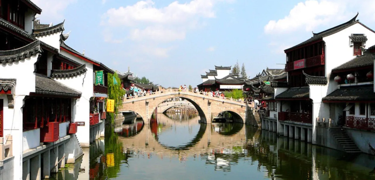
You can see this photo is elaborate, and also full of things I don't like painting, such as: architectural details, perspective, water, and those pesky white spaces you have to paint carefully around or else you ruin everything. To be honest, I don't really like doing cityscapes/landscapes much, but I can FEEL it making me a better artist, and I'm here to Git Gud™ and to Suffer™.
I'll discuss my process a bit as well in case anyone's ever been curious about how I paint! Excuse the crappy photos as usual, I live in a world of darkness and poor lighting.
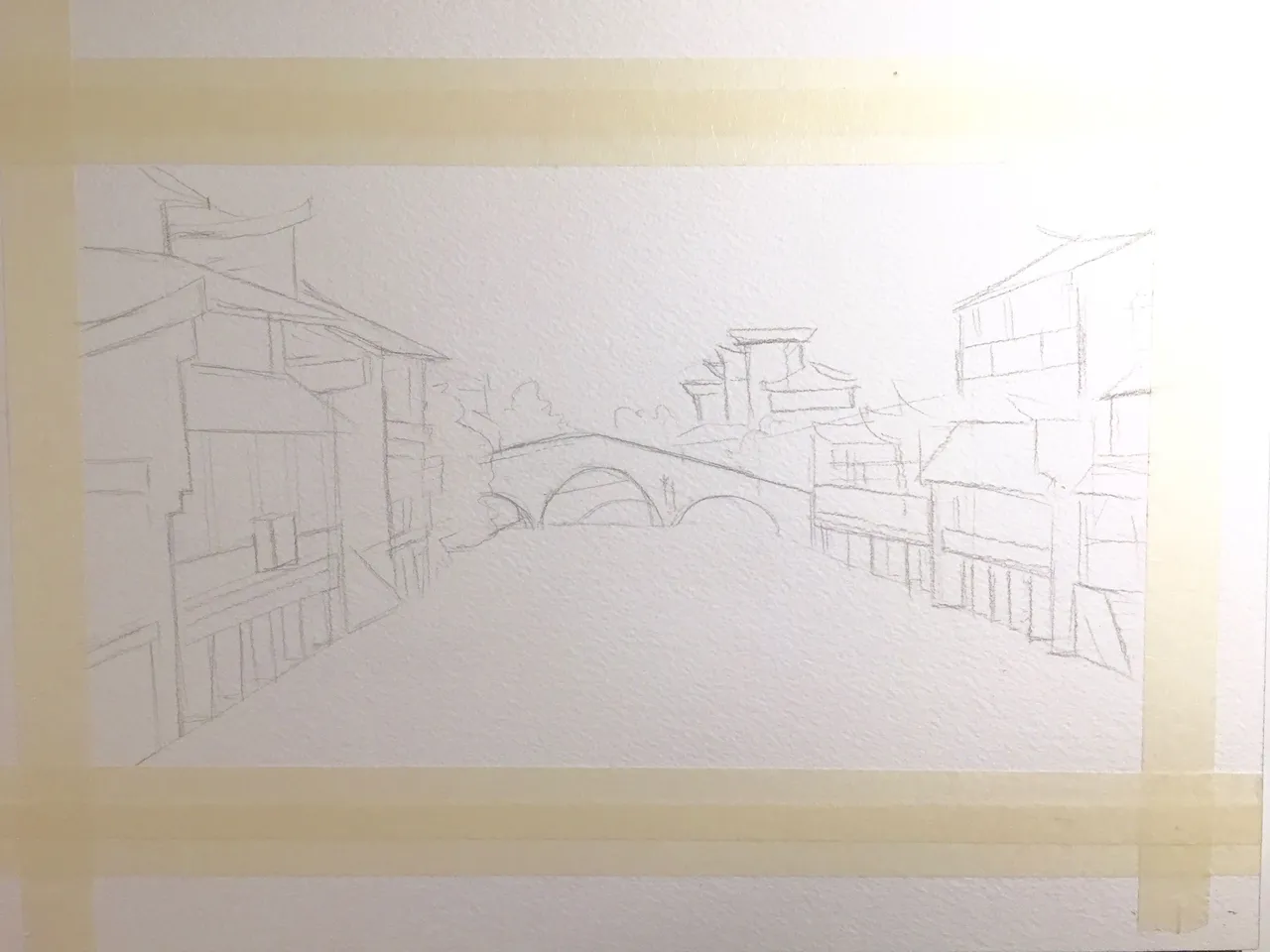
First, I tape down my paper and do a sketch. I usually use hot press when I do illustrations, but for a more traditional painting like this, I go with the cold press. I own two blocks of cold press: Arches (the Good Shit) and Fluid (practice paper). I used the Arches here cause I wanted this to be nice. Also, if the sketch looks wonky and incorrect it is absolutely because I cannot copy buildings or draw straight lines to save my life, so. MOVING ON.
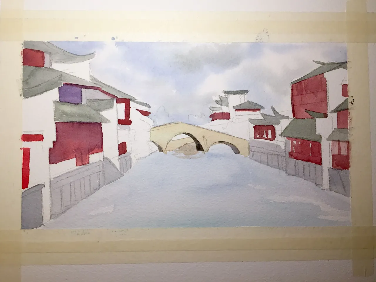
So here's the first wash, aka the most basic colors. I did the sky first, then the water, then the bridge, then the buildings, which is roughly from lightest/furthest away to darkest/closest. At this point, the painting looks stupid. This is the point in most paintings where I most want to give up, because the painting looks stupid. However, you just gotta get over the fact that the painting looks stupid, and you move on, because a watercolor painting only really stops looking stupid at the very end.
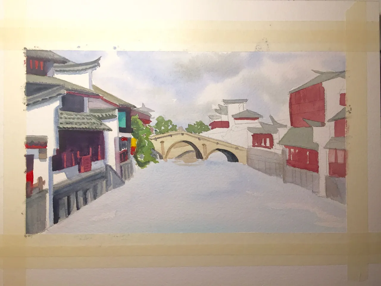
Then I started adding more washes and details. I went section-by-section with this painting since it was so elaborate. I was also far more careful with this painting than I usually am because there's so many small little thingies I had to pay attention to. The shadows I added are mostly shades of purple and grey, with some occasional blue and brown. Not black! Using black to shade is too strong and makes colors muddy.
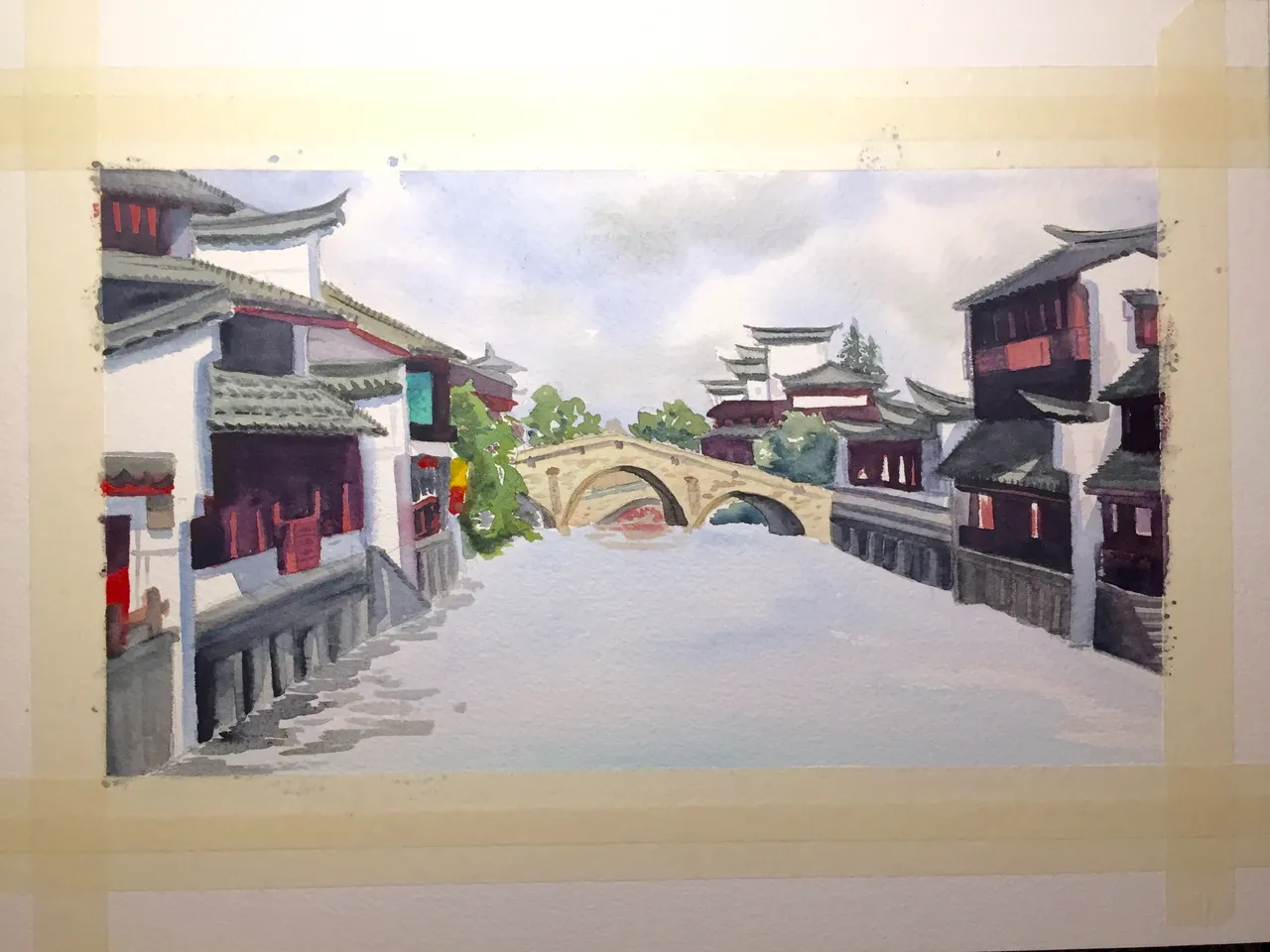
It was at this point I yelled I'VE GOTTEN THIS FAR DON'T LET ME FUCK UP THE WATER!!!!! to nobody in particular and started doing the reflections.
This part was actually not so bad because reflections are very loose and you can get away with making up a lot of it, which I did. The biggest challenge was remembering what colors I used on the buildings so I could also put them in the water. But luckily, the palette for this drawing was very limited, so it wasn't that hard to figure out. I also went in with a little white gouache afterward to fill in some of the white reflections and details that I couldn't paint around, but I'm pretty proud to say the white of the buildings is actually the white of the paper and I managed not to mess those up. Hooray, character development!
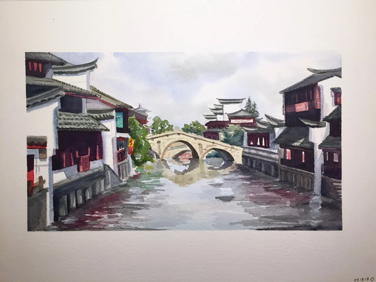
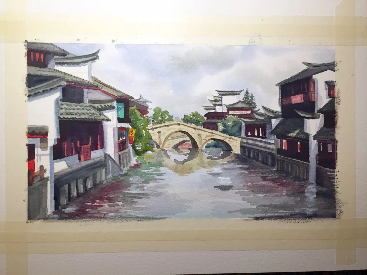
And then I untaped everything and BOOM, painting. It took me probably 6 hours over 2 nights to finish this. Realistically, only 3 of those hours were painting and the other 3 were waiting for my washes to dry, working on other drawings/paintings, talking to my friends, eating & drinking, watching anime, and complaining about how much I hate perspective. So there you have it, the secret to my process: Constantly Being Distracted™.
Hope you enjoyed this little process blog and the painting — next up is a portrait illustration, which is just about the exact opposite of this, so ... stay tuned for that!