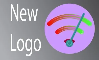
I was using this open source application for android to see how strong my wifi signal is but the logo of this app is too simple. so i created a logo for this, using adobe illustrator cc 2017.
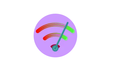
this is the new logo. as you can see that there are two different colors in the wifi line. red and green. the app shows how strong or weak the wifi signal is. so the red indicates really weak signal and the green indicates strong wifi signals. i have added an extra stand to meter the signal. as the signal grows stronger the meter stand moves to the green side.
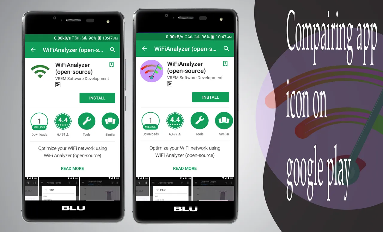
comparing the logo in google play
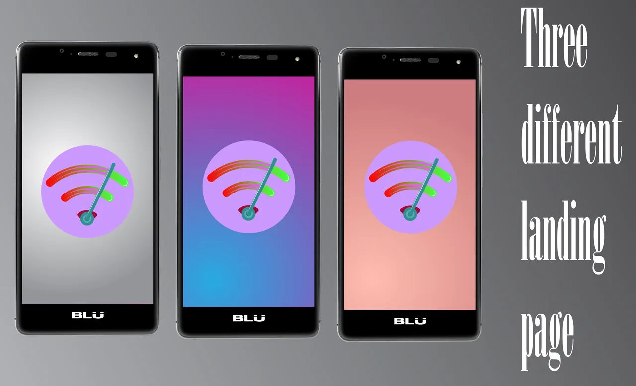
three landing page design. this is how the app would look like at the first sight when the app is launched.
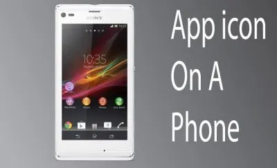
app icon on a phone
png file of the logo
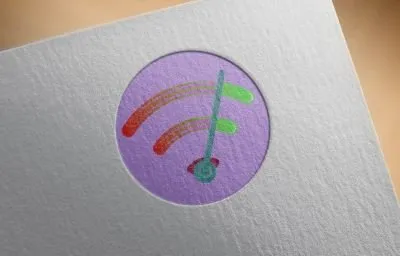
logo in a paper mockup. I used adobe photoshop to put the png file of the logo in a paper mockup.
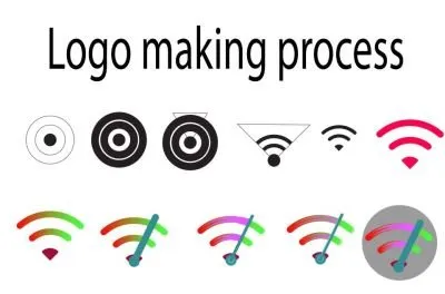
logo making process.
you can see in the image how i made this logo from scratch. i started with a simple circle. then i made the wifi symbol by cutting and deleting the other parts. at the end i used some purple color behind the meter stand to indicate the movement. i used a circle beneath the whole logo too keep it separated from the wallpaper when it is put on a screen.
editable file in google drive
https://drive.google.com/open?id=1uFBHNHpW03XT-aFihZxDXuX6LYTMuNJZ
Posted on Utopian.io - Rewarding Open Source Contributors