
Details
The Algorithms is an Github Organisation, Open Source Book for Newbies to Learn Algorithms and Implement them in any Programming Language, such as;
Python , Java , C-Plus-Plus , Scala , C , C-Sharp, and many others...
Tools
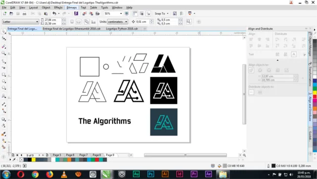
- CorelDrawX7
Necessary Links
- Repository on GitHub
- Conversation with Project Owner
(Notice that I made this logo for an Organisation not for a repository in specific) there fore there would be no Pull Request or merged files.
Just by looking at the conversation it would be enough proof that the logo was accepted and its already being used.)
Logo Idea

Monochrome Version & Outline
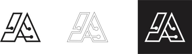
Logo Result
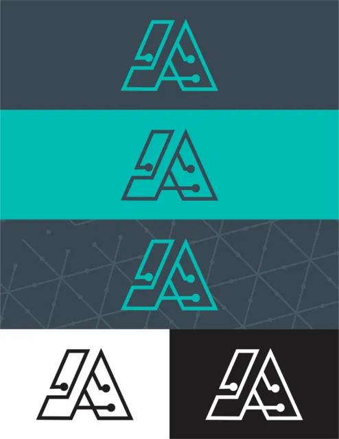
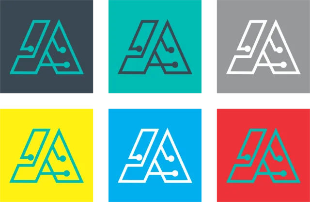
Color Variation
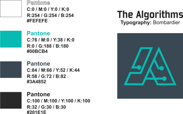
Tipeface / Color Information
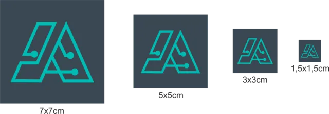
Benefits/Improvements
I contacted the Organisation and got a reply by the project owner who agreed on the idea of the logo proposal I made, I wanted to make a simple to understand logo that represented the organisation, by making the ''A'' as an algorithm shape I was able to deliver that, and project owner and some contributors and members also liked it.
It is original, and it is perfectly related to the organisation.
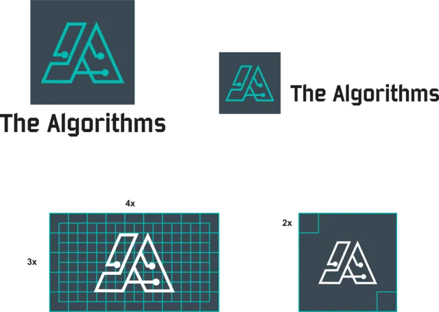
Proof of Work Done
This work is licensed under Creative Commons Attribution 4.0 International License.