SteemMakers is a community which focuses on uniting, helping and rewarding makers and DIYers on the Steem blockchain. You can find more info about us and how to contact us on our website steemmakers.com.
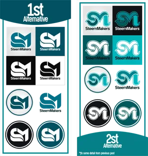
We are SteemMakers, not artists or graphic designers so last week we started a logo & banner design contest. We have received quite some designs which we collected on a temporary overview page.
We are still looking for new entries and all designers interested are still very welcome to help us out and give SteemMakers an identity. At the beginning we did not have a clear vision about what the designs should look like. We gave some very general guidelines and that generated a variety of input. We appreciate all the work done but there is no accounting for taste. We now have a clearer view of what we want and can give you some feedback based on the entries we got. We can now better specify the task for the last week of the contest. Note that the entries used are just a couple of examples and in no particular order.
Flat design
"In flat design, ornamental elements are viewed as unnecessary clutter. If an aspect serves no functional purpose, it's a distraction from user experience. This is the reason for the minimalistic nature of flat design.
However, just because it lacks any flashy design doesn't mean this style is boring. Bright, contrasting colours make illustrations and buttons pop from backgrounds, easily grab attention, and guide the user's eye. The purpose of minimalistic imagery also contributes to flat design's functional character." (source: creative bloq)
Entries we like in this regard:
by @orcheva
by @podanrj
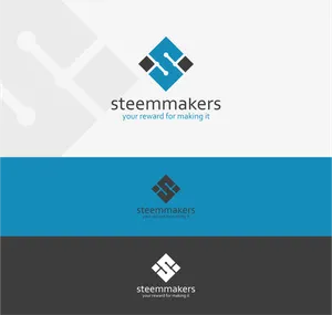
Technology or blockchain reference
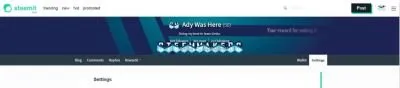
As we discovered ourselves before the contest it is hard to cover all of the audience in the logo. We like some of the designs with tools but they just leave out a big part of our audience. Adding this reference in the logo is realy hard. In the banner we have seen some interesting concepts however. We've seen some with blocks and this design by @ady-was-here. It's bit too busy to be minimalistic but could be reworked a bit to be less 'busy'.

Also note how @orcheva modefied his design to give it a mory techie accent. The right one is the original, which made us think of Coca-Cola and Pepsi, the left one is the reworked version.
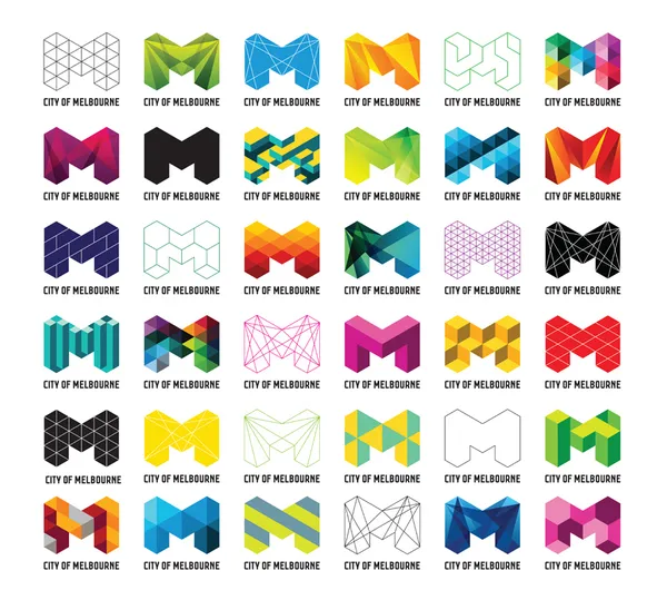
Subidentities
As mentioned before it is hard to cover all of the audience in the design. Just recently a team member proposed to have a logo that allows for subidentities. By changing the logo color or texture we could try to cover several of our audience groups separately. For example in case of contests for a subcommunity. Take a look at the logo for the city of Melbourne below. It can be made to work on dark and light backgrounds. Changing texture could make the logo focus on woodworking, 3D printing, electronics, ...
Banner
Here as well we prefer a minimalist design. We like the banners that have a portion of the logo or the ones which add to the logo. We noted that gradients are allowed and if not too much they can add a nice touch.
By @lowlevel

By @orcheva

A note of appreciation
Even if not featured in this post we would like to thank everyone participating. Only one design will be chosen, but every design helped us get a better understanding of what we need. And every design can be a source of inspiration.
We'd like to give a special thanks to @jefpatat and @plushzilla for coordinating this contest.
Questions
Feel free to comment your questions below in the comments. If possible we will update the post. You can also contact on discord. https://discord.gg/EFGbRuW
Please upvote and resteem to increase the reward for the winner(s).
Good luck!
The SteemMakers team.
Posted on Utopian.io - Rewarding Open Source Contributors