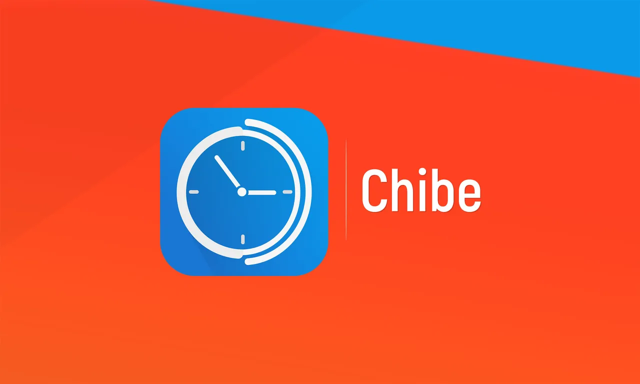
I've proposed a new logo for Chibe that is open source app.
Chibe
In the past, many homes had a chiming or cuckoo's clock, that would make a noise every hour/half hour/quarter hour, Chibe emulates this behaviour in your phone. Instead of making a noise, Chibe vibrates your phone, so that you are reminded of the time, but you don't annoy the people around you. This can be useful during activities, where you want to be reminded of the time, without looking, like sporting or reading, or when you just want to keep better track of your time.
Details

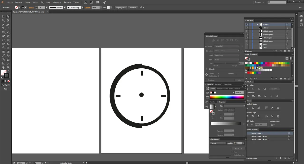
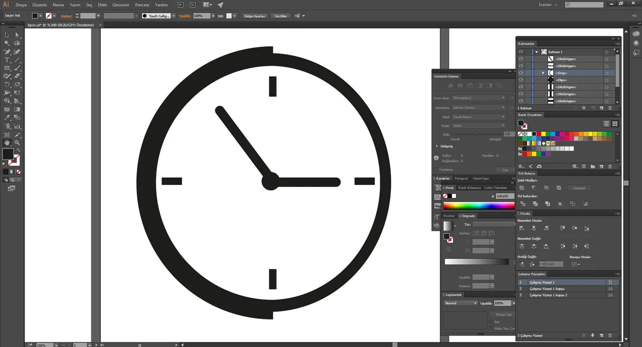
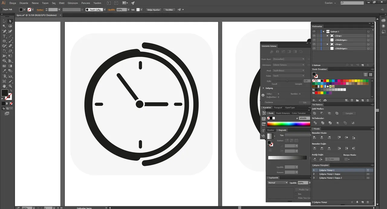
Proof of the Work


Benefits / Improvements
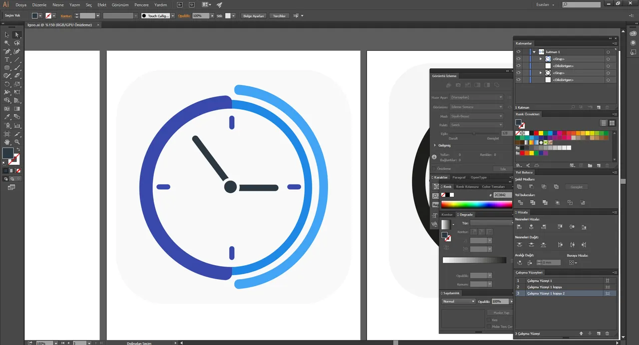
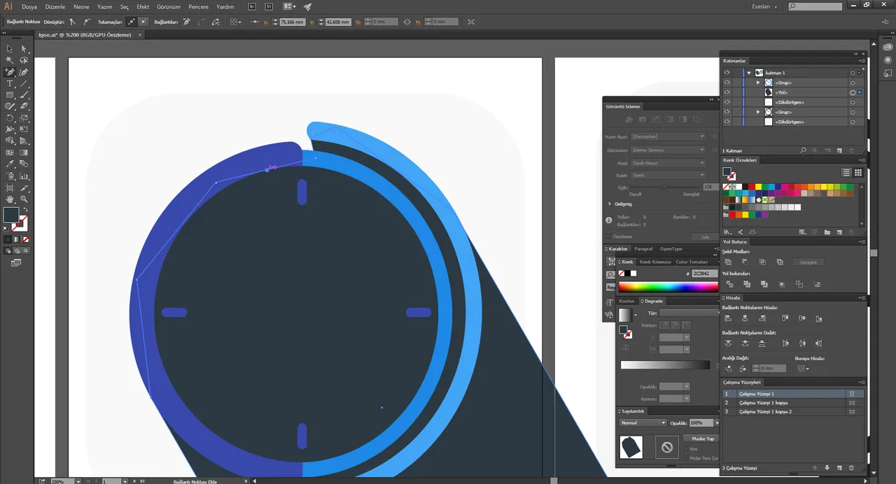
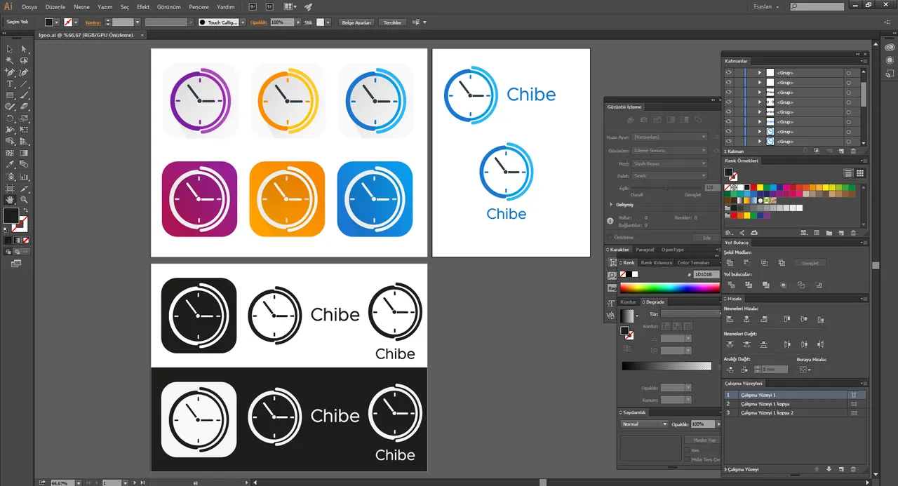
The original logo was not work well in icon sizes. And it wasnt looks good.
I wanted to make a simple and understandable logo.
The half circle of the clock is "C" represents the first latter of the app.
The circles on the other side represents vibration therewithal the rest half of the clock.
Tools
Adobe Illustrator CC
Original files
Posted on Utopian.io - Rewarding Open Source Contributors