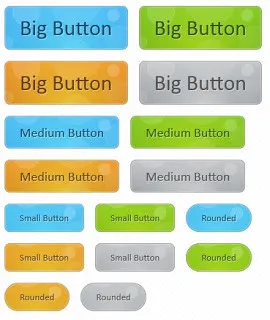
In this tutorial i will show you Animated Bubble Buttons Using CSS3 for Blogger When your mouse hover on the button you will see that bubble effect will appear on the button. These effects are visible only on browsers that support CSS3
HOW TO MAKE ANIMATED BUBBLE BUTTONS USING CSS3 FOR BLOGGER
Go to Blogger Dashboard --> Design --> Edit HTML
Backup your Template before making any changes to your blog
Now Expand Widget Templates
Find the code shown below using [ctrl+F]

Replace the above code with the code shown below
.button{
font:15px Calibri, Arial, sans-serif;
/* A semi-transparent text shadow */
text-shadow:1px 1px 0 rgba(255,255,255,0.4);
/* Overriding the default underline styling of the links */
text-decoration:none !important;
white-space:nowrap;

display:inline-block;
vertical-align:baseline;
position:relative;
cursor:pointer;
padding:10px 20px;

background-repeat:no-repeat;
/* The following two rules are fallbacks, in case
   the browser does not support multiple backgrounds. */
background-position:bottom left;
background-image:url('http://3.bp.blogspot.com/-sA5-EsiGIx8/T0j5R9D0acI/AAAAAAAAADY/hPDrj02PVa4/s1600/button_bg.png');

/* Multiple backgrounds version. The background images
   are defined individually in color classes */

background-position:bottom left, top right, 0 0, 0 0;
background-clip:border-box;

/* Applying a default border raidus of 8px */

-moz-border-radius:8px;
-webkit-border-radius:8px;
border-radius:8px;

/* A 1px highlight inside of the button */

-moz-box-shadow:0 0 1px #fff inset;
-webkit-box-shadow:0 0 1px #fff inset;
box-shadow:0 0 1px #fff inset;

/* Animating the background positions with CSS3 */
/* Currently works only in Safari/Chrome */

-webkit-transition:background-position 1s;
-moz-transition:background-position 1s;
transition:background-position 1s;
}
.button:hover{
/* The first rule is a fallback, in case the browser
   does not support multiple backgrounds
*/

background-position:top left;
background-position:top left, bottom right, 0 0, 0 0;
}
.button:active{
/* Moving the button 1px to the bottom when clicked /
bottom:-1px;
}
/ The three buttons sizes /
.button.big { font-size:30px;}
.button.medium { font-size:18px;}
.button.small { font-size:13px;}
/ A more rounded button */
.button.rounded{
-moz-border-radius:4em;
-webkit-border-radius:4em;
border-radius:4em;
}
/* Defining four button colors */
/* BlueButton */
.blue.button{
color:#0f4b6d !important;
border:1px solid #84acc3 !important;

/* A fallback background color */
background-color: #48b5f2;

/* Specifying a version with gradients according to */

background-image:    url('http://3.bp.blogspot.com/-sA5-EsiGIx8/T0j5R9D0acI/AAAAAAAAADY/hPDrj02PVa4/s1600/button_bg.png'), url('http://3.bp.blogspot.com/-sA5-EsiGIx8/T0j5R9D0acI/AAAAAAAAADY/hPDrj02PVa4/s1600/button_bg.png'),
                    -moz-radial-gradient(    center bottom, circle,
                                            rgba(89,208,244,1) 0,rgba(89,208,244,0) 100px),
                    -moz-linear-gradient(#4fbbf7, #3faeeb);
background-image:    url('http://3.bp.blogspot.com/-sA5-EsiGIx8/T0j5R9D0acI/AAAAAAAAADY/hPDrj02PVa4/s1600/button_bg.png'), url('http://3.bp.blogspot.com/-sA5-EsiGIx8/T0j5R9D0acI/AAAAAAAAADY/hPDrj02PVa4/s1600/button_bg.png'),
                    -webkit-gradient(    radial, 50% 100%, 0, 50% 100%, 100,
                                        from(rgba(89,208,244,1)), to(rgba(89,208,244,0))),
                    -webkit-gradient(linear, 0% 0%, 0% 100%, from(#4fbbf7), to(#3faeeb));
}
.blue.button:hover{
background-color:#63c7fe;
background-image:    url('http://3.bp.blogspot.com/-sA5-EsiGIx8/T0j5R9D0acI/AAAAAAAAADY/hPDrj02PVa4/s1600/button_bg.png'), url('http://3.bp.blogspot.com/-sA5-EsiGIx8/T0j5R9D0acI/AAAAAAAAADY/hPDrj02PVa4/s1600/button_bg.png'),
                    -moz-radial-gradient(    center bottom, circle,
                                            rgba(109,217,250,1) 0,rgba(109,217,250,0) 100px),
                    -moz-linear-gradient(#63c7fe, #58bef7);

background-image:    url('http://3.bp.blogspot.com/-sA5-EsiGIx8/T0j5R9D0acI/AAAAAAAAADY/hPDrj02PVa4/s1600/button_bg.png'), url('http://3.bp.blogspot.com/-sA5-EsiGIx8/T0j5R9D0acI/AAAAAAAAADY/hPDrj02PVa4/s1600/button_bg.png'),
                    -webkit-gradient(    radial, 50% 100%, 0, 50% 100%, 100,
                                        from(rgba(109,217,250,1)), to(rgba(109,217,250,0))),
                    -webkit-gradient(linear, 0% 0%, 0% 100%, from(#63c7fe), to(#58bef7));
}
/* Green Button */
.green.button{
color:#345903 !important;
border:1px solid #96a37b !important;
background-color: #79be1e;
background-image:url('http://3.bp.blogspot.com/-sA5-EsiGIx8/T0j5R9D0acI/AAAAAAAAADY/hPDrj02PVa4/s1600/button_bg.png'), url('http://3.bp.blogspot.com/-sA5-EsiGIx8/T0j5R9D0acI/AAAAAAAAADY/hPDrj02PVa4/s1600/button_bg.png'), -moz-radial-gradient(center bottom, circle, rgba(162,211,30,1) 0,rgba(162,211,30,0) 100px),-moz-linear-gradient(#82cc27, #74b317);
background-image:url('http://3.bp.blogspot.com/-sA5-EsiGIx8/T0j5R9D0acI/AAAAAAAAADY/hPDrj02PVa4/s1600/button_bg.png'), url('http://3.bp.blogspot.com/-sA5-EsiGIx8/T0j5R9D0acI/AAAAAAAAADY/hPDrj02PVa4/s1600/button_bg.png'), -webkit-gradient(radial, 50% 100%, 0, 50% 100%, 100, from(rgba(162,211,30,1)), to(rgba(162,211,30,0))),-webkit-gradient(linear, 0% 0%, 0% 100%, from(#82cc27), to(#74b317));
}
.green.button:hover{
background-color:#89d228;
background-image:url('http://3.bp.blogspot.com/-sA5-EsiGIx8/T0j5R9D0acI/AAAAAAAAADY/hPDrj02PVa4/s1600/button_bg.png'), url('http://3.bp.blogspot.com/-sA5-EsiGIx8/T0j5R9D0acI/AAAAAAAAADY/hPDrj02PVa4/s1600/button_bg.png'), -moz-radial-gradient(center bottom, circle, rgba(183,229,45,1) 0,rgba(183,229,45,0) 100px),-moz-linear-gradient(#90de31, #7fc01e);
background-image:url('http://3.bp.blogspot.com/-sA5-EsiGIx8/T0j5R9D0acI/AAAAAAAAADY/hPDrj02PVa4/s1600/button_bg.png'), url('http://3.bp.blogspot.com/-sA5-EsiGIx8/T0j5R9D0acI/AAAAAAAAADY/hPDrj02PVa4/s1600/button_bg.png'), -webkit-gradient(radial, 50% 100%, 0, 50% 100%, 100, from(rgba(183,229,45,1)), to(rgba(183,229,45,0))),-webkit-gradient(linear, 0% 0%, 0% 100%, from(#90de31), to(#7fc01e));
}
/* Orange Button */
.orange.button{
color:#693e0a !important;
border:1px solid #bea280 !important;
background-color: #e38d27;
background-image:url('http://3.bp.blogspot.com/-sA5-EsiGIx8/T0j5R9D0acI/AAAAAAAAADY/hPDrj02PVa4/s1600/button_bg.png'), url('http://3.bp.blogspot.com/-sA5-EsiGIx8/T0j5R9D0acI/AAAAAAAAADY/hPDrj02PVa4/s1600/button_bg.png'), -moz-radial-gradient(center bottom, circle, rgba(232,189,45,1) 0,rgba(232,189,45,0) 100px),-moz-linear-gradient(#f1982f, #d4821f);
background-image:url('http://3.bp.blogspot.com/-sA5-EsiGIx8/T0j5R9D0acI/AAAAAAAAADY/hPDrj02PVa4/s1600/button_bg.png'), url('http://3.bp.blogspot.com/-sA5-EsiGIx8/T0j5R9D0acI/AAAAAAAAADY/hPDrj02PVa4/s1600/button_bg.png'), -webkit-gradient(radial, 50% 100%, 0, 50% 100%, 100, from(rgba(232,189,45,1)), to(rgba(232,189,45,0))),-webkit-gradient(linear, 0% 0%, 0% 100%, from(#f1982f), to(#d4821f));
}
.orange.button:hover{
background-color:#ec9732;
background-image:url('http://3.bp.blogspot.com/-sA5-EsiGIx8/T0j5R9D0acI/AAAAAAAAADY/hPDrj02PVa4/s1600/button_bg.png'), url('http://3.bp.blogspot.com/-sA5-EsiGIx8/T0j5R9D0acI/AAAAAAAAADY/hPDrj02PVa4/s1600/button_bg.png'), -moz-radial-gradient(center bottom, circle, rgba(241,192,52,1) 0,rgba(241,192,52,0) 100px),-moz-linear-gradient(#f9a746, #e18f2b);
background-image:url('http://3.bp.blogspot.com/-sA5-EsiGIx8/T0j5R9D0acI/AAAAAAAAADY/hPDrj02PVa4/s1600/button_bg.png'), url('http://3.bp.blogspot.com/-sA5-EsiGIx8/T0j5R9D0acI/AAAAAAAAADY/hPDrj02PVa4/s1600/button_bg.png'), -webkit-gradient(radial, 50% 100%, 0, 50% 100%, 100, from(rgba(241,192,52,1)), to(rgba(241,192,52,0))),-webkit-gradient(linear, 0% 0%, 0% 100%, from(#f9a746), to(#e18f2b));
}
.gray.button{
color:#525252 !important;
border:1px solid #a5a5a5 !important;
background-color: #a9adb1;
background-image:url('http://3.bp.blogspot.com/-sA5-EsiGIx8/T0j5R9D0acI/AAAAAAAAADY/hPDrj02PVa4/s1600/button_bg.png'), url('http://3.bp.blogspot.com/-sA5-EsiGIx8/T0j5R9D0acI/AAAAAAAAADY/hPDrj02PVa4/s1600/button_bg.png'), -moz-radial-gradient(center bottom, circle, rgba(197,199,202,1) 0,rgba(197,199,202,0) 100px),-moz-linear-gradient(#c5c7ca, #92989c);
background-image:url('http://3.bp.blogspot.com/-sA5-EsiGIx8/T0j5R9D0acI/AAAAAAAAADY/hPDrj02PVa4/s1600/button_bg.png'), url('http://3.bp.blogspot.com/-sA5-EsiGIx8/T0j5R9D0acI/AAAAAAAAADY/hPDrj02PVa4/s1600/button_bg.png'), -webkit-gradient(radial, 50% 100%, 0, 50% 100%, 100, from(rgba(197,199,202,1)), to(rgba(197,199,202,0))),-webkit-gradient(linear, 0% 0%, 0% 100%, from(#c5c7ca), to(#92989c));
}
.gray.button:hover{
background-color:#b6bbc0;
background-image:url('http://3.bp.blogspot.com/-sA5-EsiGIx8/T0j5R9D0acI/AAAAAAAAADY/hPDrj02PVa4/s1600/button_bg.png'), url('http://3.bp.blogspot.com/-sA5-EsiGIx8/T0j5R9D0acI/AAAAAAAAADY/hPDrj02PVa4/s1600/button_bg.png'), -moz-radial-gradient(center bottom, circle, rgba(202,205,208,1) 0,rgba(202,205,208,0) 100px),-moz-linear-gradient(#d1d3d6, #9fa5a9);
background-image:url('http://3.bp.blogspot.com/-sA5-EsiGIx8/T0j5R9D0acI/AAAAAAAAADY/hPDrj02PVa4/s1600/button_bg.png'), url('http://3.bp.blogspot.com/-sA5-EsiGIx8/T0j5R9D0acI/AAAAAAAAADY/hPDrj02PVa4/s1600/button_bg.png'), -webkit-gradient(radial, 50% 100%, 0, 50% 100%, 100, from(rgba(202,205,208,1)), to(rgba(202,205,208,0))),-webkit-gradient(linear, 0% 0%, 0% 100%, from(#d1d3d6), to(#9fa5a9));
}
]]></b:skin>
Now save your template
NOW THE HTML PART
HTML FOR LARGE SIZED BUTTONS (USE ANYONE BASED ON COLOR)
LINKNAME
LINKNAME
LINKNAME
LINKNAME
HTML FOR MEDIUM SIZED BUTTONS (USE ANYONE BASED ON COLOR)
LINKNAME
LINKNAME
LINKNAME
LINKNAME
HTML FOR SMALL SIZED BUTTONS (USE ANYONE BASED ON COLOR)
LINKNAME
LINKNAME
LINKNAME
LINKNAME
HTML FOR SMALL SIZED BUTTONS WITH ROUNDED CORNER (USE ANYONE BASED ON COLOR)
LINKNAME
LINKNAME
LINKNAME
LINKNAME
Replace LINK with your link and LINKNAME with the name/title of your link
Posted on Utopian.io - Rewarding Open Source Contributors