What Will I Learn?
We can create 2D graphs using matplotlib in python. In this tutorial we will be learning all basic syntax to create a line graph. Because the starting point of matoplotlib is line graph. After learning this we will be learning about how to create graph from any excel or matlab file. In this tutorial we will be learning:
- 1 Anatomy of line graph
- 2 Basic line graph program
- 3 Working with multiple figures and axes
Requirements
- Python 2.7.14
- Matplotlib
- Basic Python Knowledge
- Mathematics
Difficulty
- Basic
Anatomy of line graph
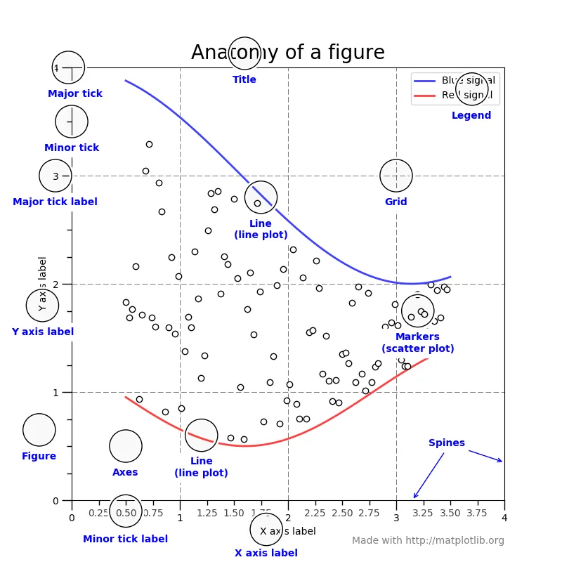
Image Source
In this image you can see all parts of line graph. It helps to understand all, which i have defined below. You can see X and Y axis as well as there are lines which depends upon values which we given to x and y axis. We can also give labels to axis as well as title too.
Basic line graph program
Firstly, We need to import matplotlib to compiler know what files we are using then we need to tell compiler which part of matplotlib we going to use, For example we require Pyplot to create line graph. Then we need to write import matplotlin.pyplot. After all this we need to give it a name to use further in our code. For example
import matplotlib.pyplot as plt
Now, matplotlib.pyplot is know as a plt in our code.
Example
import matplotlib.pyplot as plt
plt.plot([1,2,4,3], [1,3,8,15],)
plt.axis([0, 5, 0, 20])
plt.show()
Result
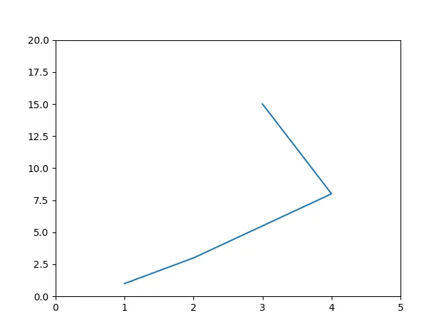
- import matplotlib.pyplot as plt in part we are adding all files which we requires.
- plt.plot([1,2,4,3], [1,3,8,15],) plt we defined it above, plot is mainly use for telling points. Where we have some values. plt.plot([X][Y])
- plt.axis([0, 5, 0, 20]) plt.axis([0,X,0,Y])
- plt.show() it shows the result by executing above code.
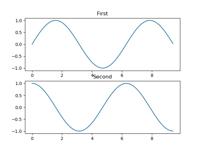
Multiple figures and axes
import numpy as np
import matplotlib.pyplot as plt

x = np.arange(0, 3 * np.pi, 0.1)
y_sin = np.sin(x)
y_cos = np.cos(x)

plt.subplot(2, 1, 1)

plt.plot(x, y_sin)
plt.title('First')

plt.subplot(2, 1, 2)
plt.plot(x, y_cos)
plt.title('Second')

plt.show()
Result
Program Explanation
- import numpy as np It is a new addon in program, Which provide Numerical Python and multi dimensional array objects.
- import matplotlib.pyplot as plt Explain above
- x = np.arange(0, 3 * np.pi, 0.1) giving value to X
- y_sin = np.sin(x) Assign value
- y_cos = np.cos(x) Assign value
- plt.subplot(2, 1, 1) Set the first such subplot as active.
- plt.plot(x, y_sin) Set the plots
- plt.title('First') Title of first plot
- plt.subplot(2, 1, 2) Second subplot
- plt.plot(x, y_cos) Set the plot
- plt.title('Second') Title of second plot
- plt.show() Show the figure
In this program, We have created a Sine Wave Plot, As we can see in above program result. Line going in a wave. But we just give a values which goes positive to negative. subplot() tells compiler about another graph that is how we create multi graph. title('Name') specify the graph by providing it particular name.
Sine Wave Plot (Complimentary)
import numpy as np
import matplotlib.pyplot as plt
x = np.arange(0, 3 * np.pi, 0.1)
y = np.sin(x)
plt.title("sine wave")
plt.plot(x, y)
plt.show()
np.arange(0, 3 * np.pi, 0.1) it is main values to create wave form line graph. In this program we are use sine and giving different values to it for creating waves. Apart from that all things are same. I have already defined it earlier.
This Is My First Tutorial Of Matplotlib. Please let me know for help.
Posted on Utopian.io - Rewarding Open Source Contributors