DETAILS:

DESCRIPTION
Minimal To Do is a very light and useful app, allowing you to add todos easily and quickly. It follows the Material guidelines completely.Minimal To Do Application helps to reduce some clutter and complexity in daily life through reminding:
Source.
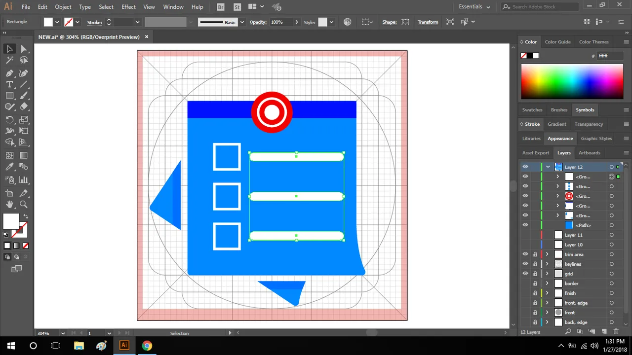
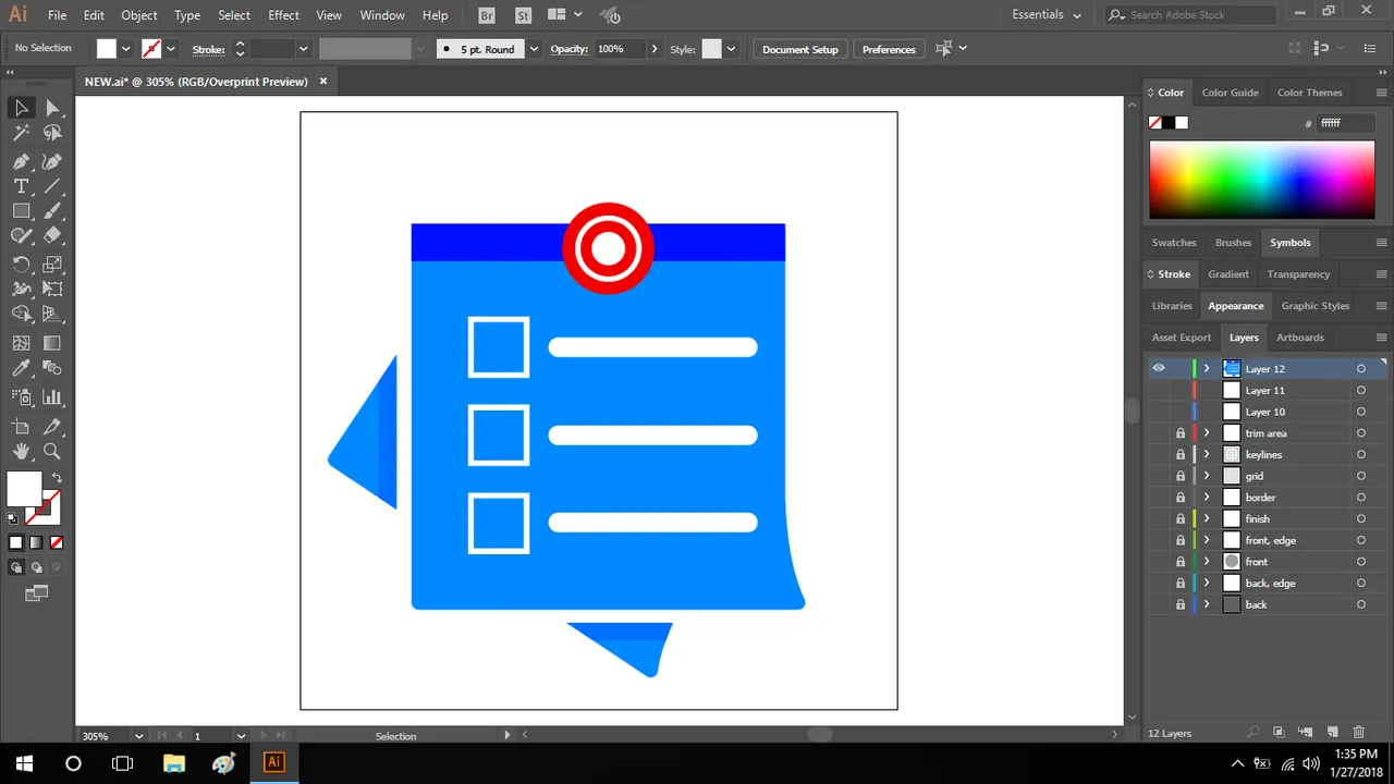
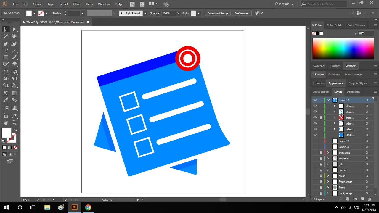
DESIGN CONCEPT
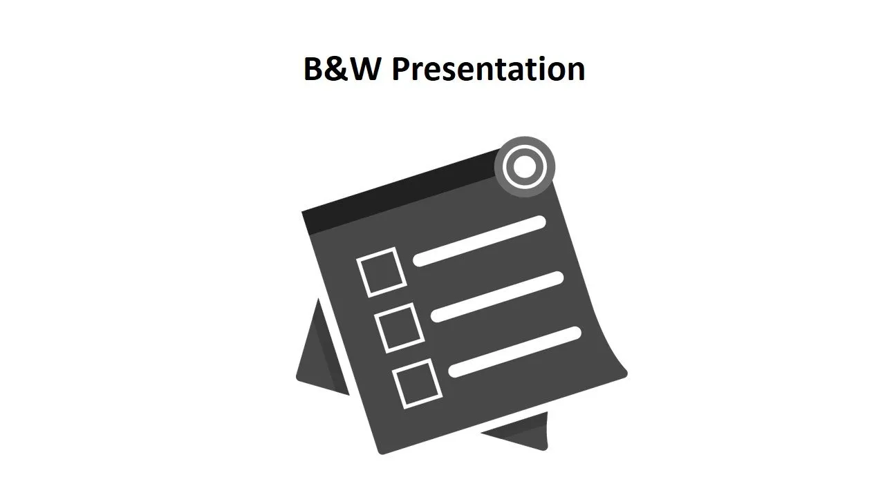
NEW ICON ONE-COLOR VERSION ON BLACK & WHITE THEME
I also made a Black and White version for visibility Check and also to easily notice the unwanted path or outlines.
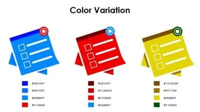
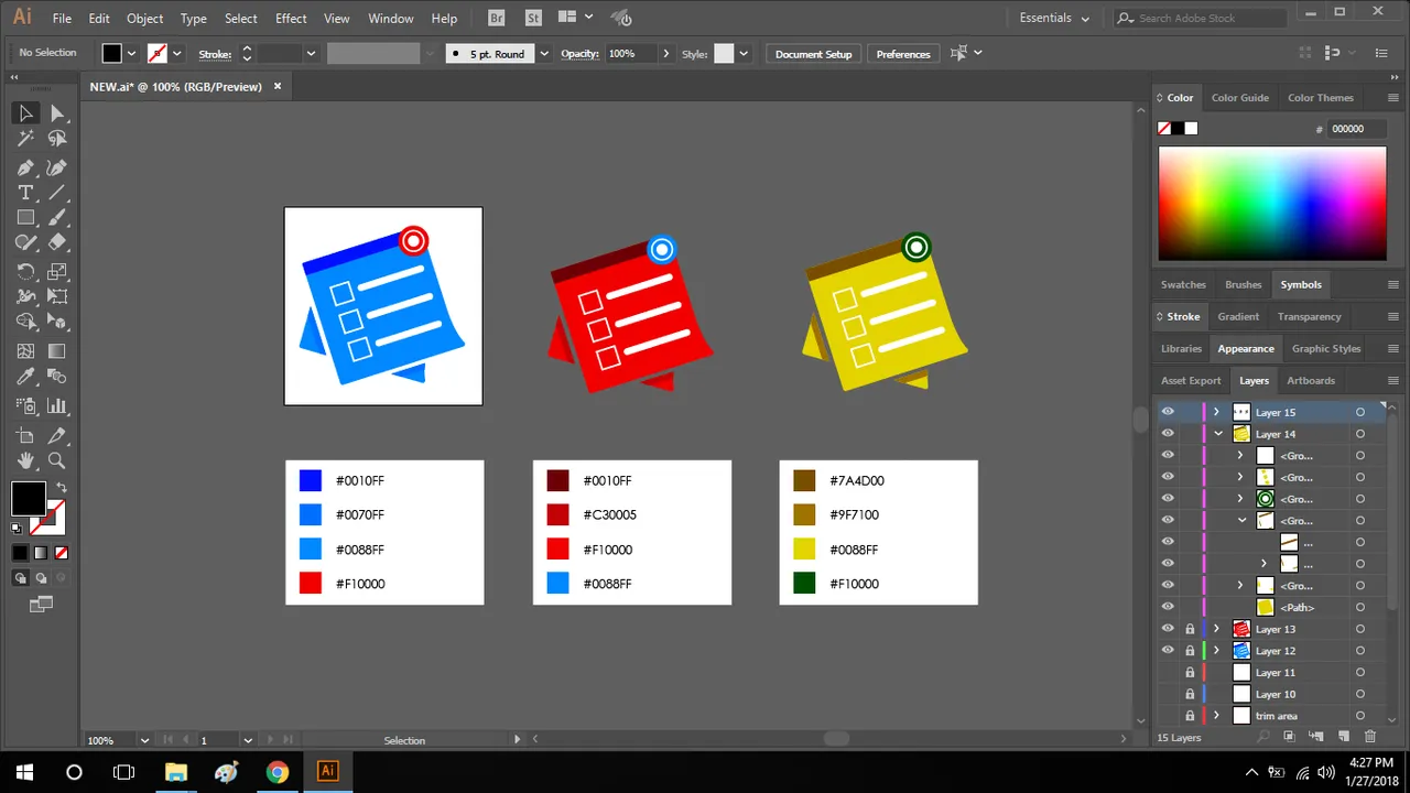
COLOR VARIATION
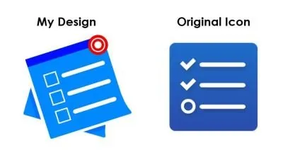
COMPARISON OF MY DESIGN & ORIGINAL ICON
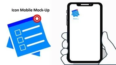
NEW ICON MOBILE MOCK-UP
ICON SIZES
-192 px

-144 px

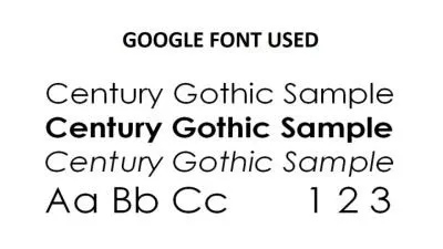
FONT USED
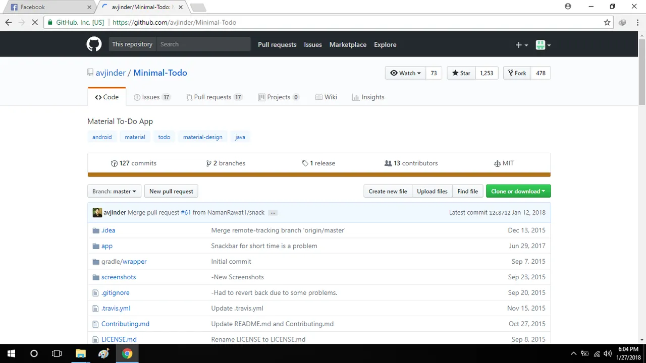
GITHUB REPOSITORY
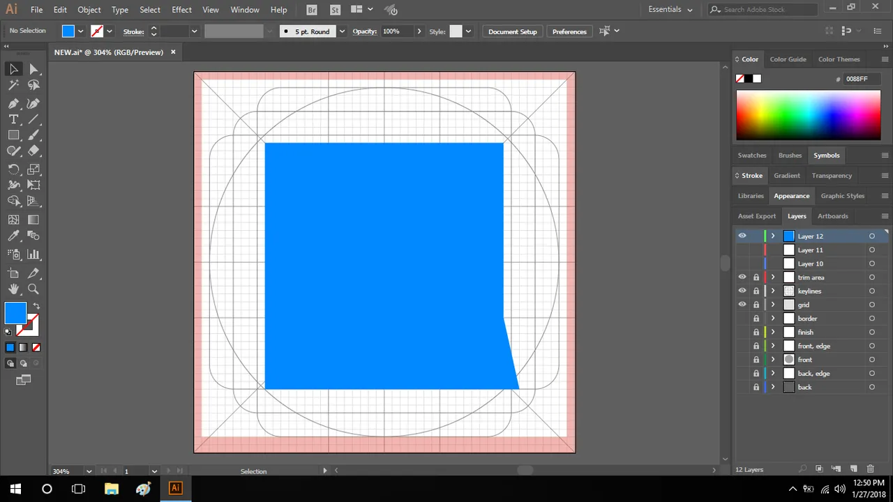
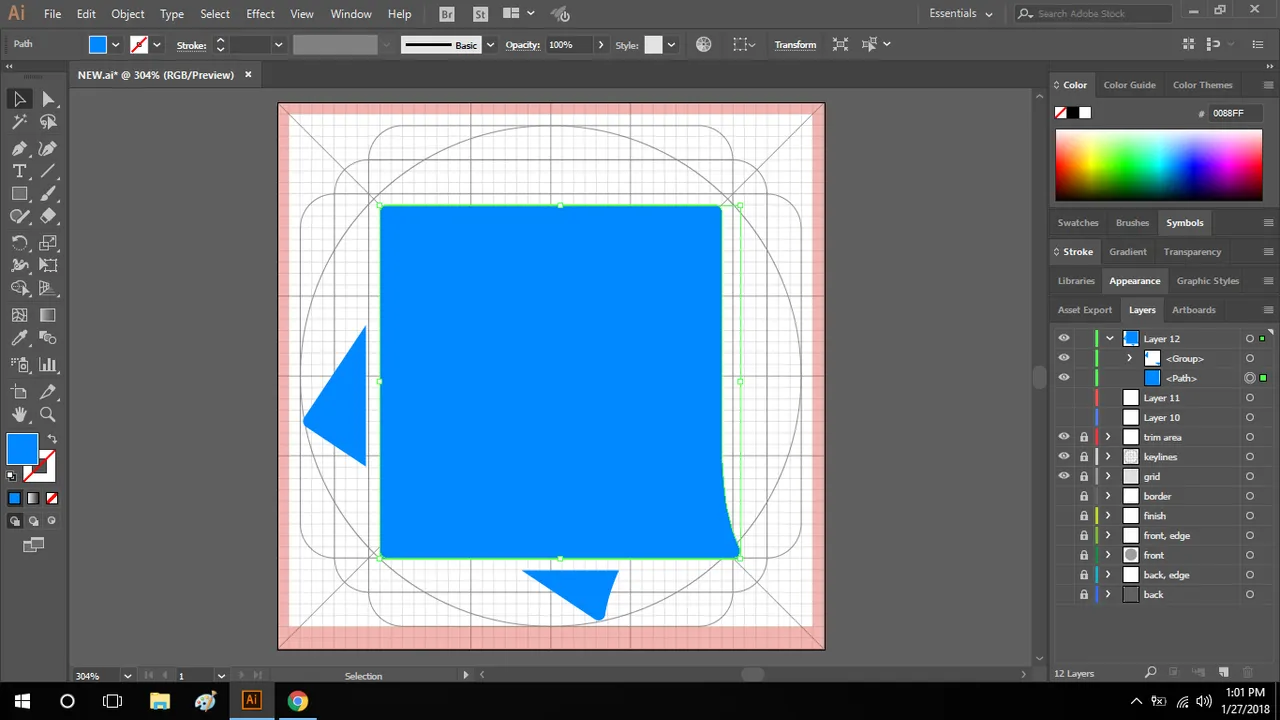
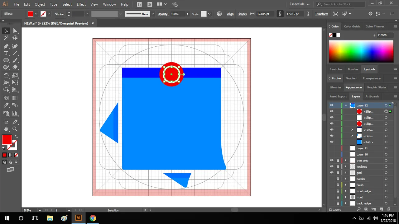
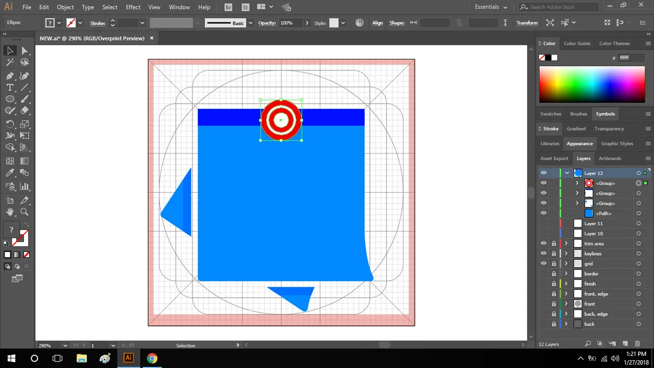
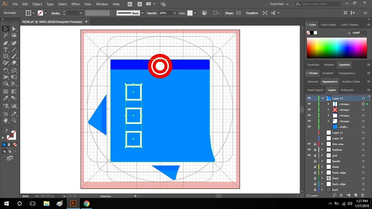
PROOF OF WORK


BENEFITS/IMPROVEMENTS
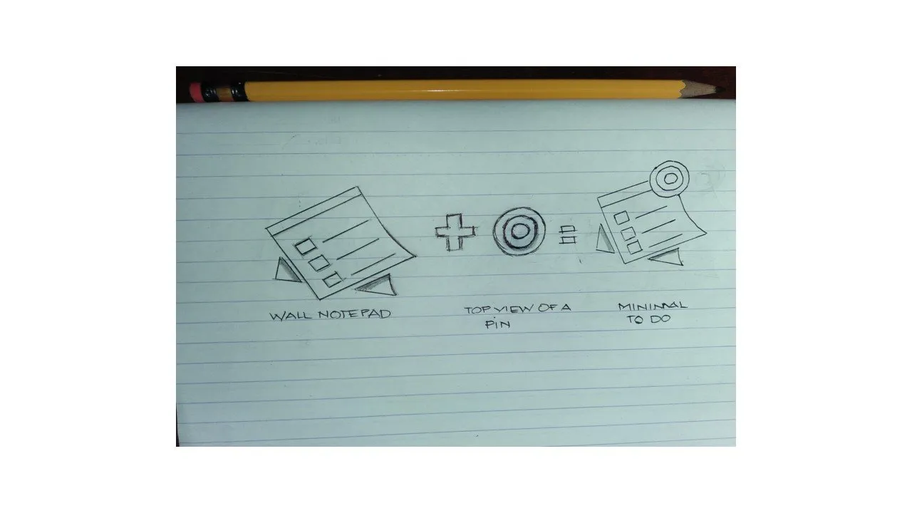
I Share My Idea to help this application to have another concept or options when it comes to its logo or icon.And I improve the existing logo with the Idea of a WALL NOTEPAD and PIN which represents minimal reminder that fit to this Application.
TOOLS
I used Adobe Illustrator CC 2017 in designing this new proposed icon and Microsoft PowerPoint for the presentation.
MY ORIGINAL FILES
You can see and download all My files I used here:
SHAREABLE FILES
Posted on Utopian.io - Rewarding Open Source Contributors