Overview
I am pleased to introduce a lot of improvements to BlockPress, including a great new feature. It is now possible to theme steem post thumbnails separately from the preview text. This allows theme creators much more flexibility and should result in better and more interesting themes.
Other features presented in this blog include a new colour palette, the introduction of generic classes for box shadows and improved display of social menus.
Steem Posts Preview
On our GitHub issue tracker, we had registered a problem with thumbnails not displaying in posts listings. Since my knowledge and confidence with javascript has increased I decided to have a look and fix this problem. There were a couple of things that stood out to me immediately. Firstly the function was called in a HTML template using an embedded onload event. Secondly the function hardcoded specific CSS display and width changes, which could conflict with new themes. These were separate issues not directly involved in breaking the thumbnail display, as far as I know, but were worth fixing.
Debugging why thumbnails aren't currently displaying wasn't easy and I really couldn't see the source of the problem. After consulting @antonchanning about this we decided that the best way to proceed will be to do a search for the first image inside the steem post instead of relying on the thumbnails displaying on steemit.com. This would mean that even if the blog didn't open with an image it could still have a thumbnail.
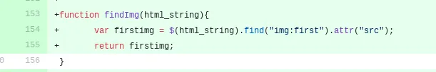
I decided to move the call to the function to the steem.js file instead of calling it from HTML template. The next step was to remove CSS styles from the function. Addressing this gave me an idea of introducing new CSS classes for posts with a thumbnail and those without it. Once I began working this out it became clear that there would be a real advantage to separating styles for thumbnails and text as well.
One obvious advantage of this solution is that theme creator can decide to use one or the other in their previews. I implemented this in responsive design. The posts with class no_thumb display only text while those with class has_thumb show only thumbnails.
Box Shadow Classes
I am working on a new theme for BlockPress in which the menu and the content area display as one element. When I applied colour palettes the styles for box shadows overwrote the styles in my theme making everything look really ugly. I tried separating the color values from offset and size but this creates erroneous syntaxt and simply doesn't work.
The solution to this is creating a set of generic box shadow classes that can be applied to elements in the HTML template and defined in CSS. The user can decide which elements need the class. Palettes
define the look of the box-shadow classes which makes them compatible with multiple themes and avoids conflict.
The idea of introducing generic classes has been on our minds for a while and we would like to define more styles in this way. It will make it much simpler to avoid conflicts and create compatible themes and palettes. We would like to add this feature to BlockPress for Beta Release.
Improved Social Menus
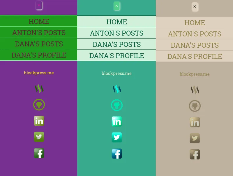
Our social menus had hardcoded links in them which weren't very useful. Also, in trollfell theme, the colour of social media icons was set to purple/pink shade. This was a feature leftover from before we separated themes and colour palettes. I really like the effect of having a custom colour and I found a way of doing it in CSS without a need for a separate image.
I added CSS filter properties to the pallets, which allows you to change a hue, contrast, brightness and many other features present in photo editing software. This way you can have one set of social media icon images and make them look compatible with the chosen colour scheme.
Pistchiocream Palette
Creating new palettes for BlockPress is fun and helps to show off the flexibility and themability of the sites created using it. The new palette is inspired by my favourite flavour of a whippy ice cream. I used to get these lovely cones made out of two flavours which created a colourful spiral. Cream and pistachio were by far the tastest in my opinion. They were very refreshing and looked great.
Chocorange Palette
Last but not least I did some improvements to Chocorange palette. I felt that my prevous attempt was simply not choclatey enough and looked a bit dull. I decided t adjust the browns and I like the effect much better.
Github Commits
- Steem Posts Preview Javascript
- Social Menu
- New Features in Colour Palettes
- Steem Posts Template
- Metaverse Stylesheet
- Trollfell Template
- Metaverse Template
- Pistachiocream Palettte
Posted on Utopian.io - Rewarding Open Source Contributors