Details
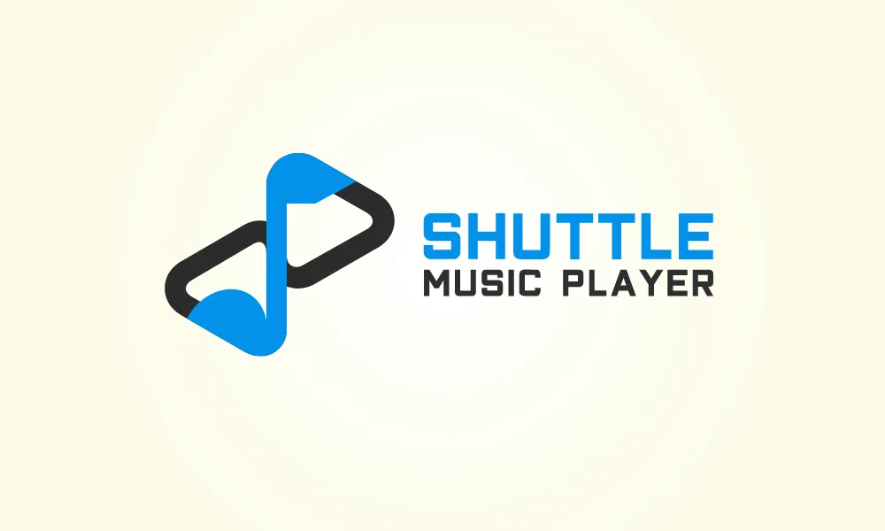
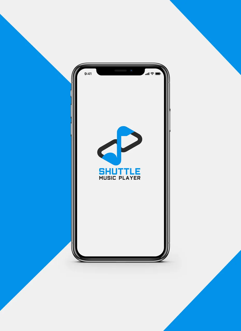
In this great opportunity I would like to continue my contribution in Utopian. I propose a new logo design for Shuttle Music Player
Shuttle is an open source, local music player for Android.
Shuttle comes in two flavours:
- Shuttle (free)
- Shuttle+
The free version includes an option to upgrade via an IAP, which unlocks the features otherwise available in Shuttle+.
Alternative Version
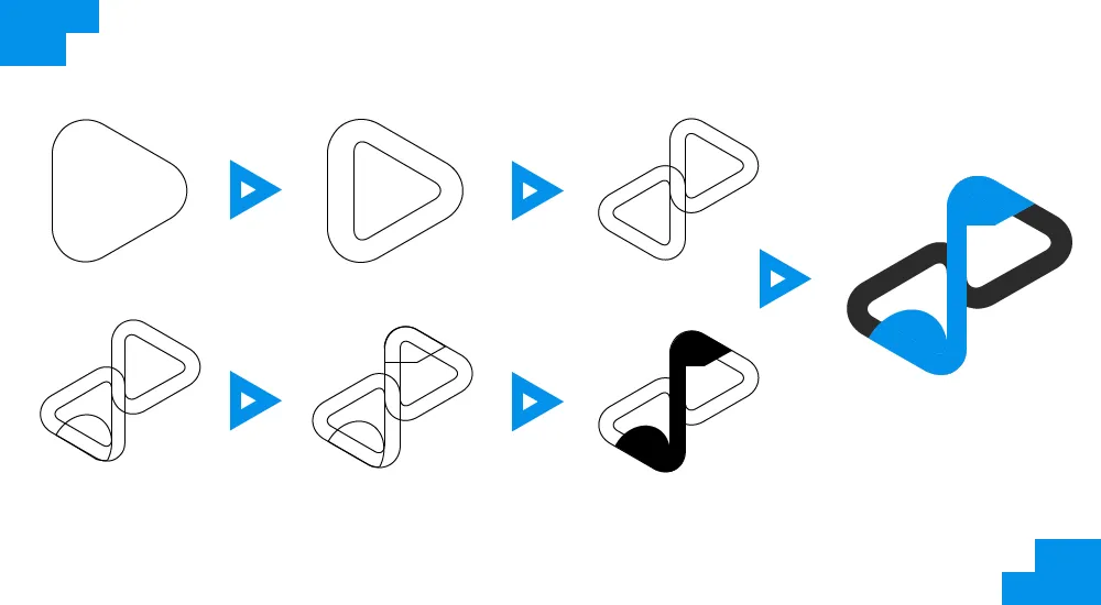
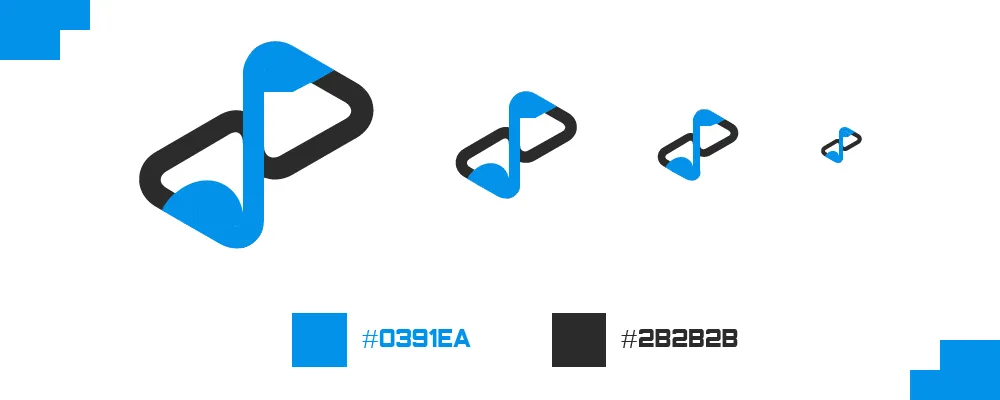
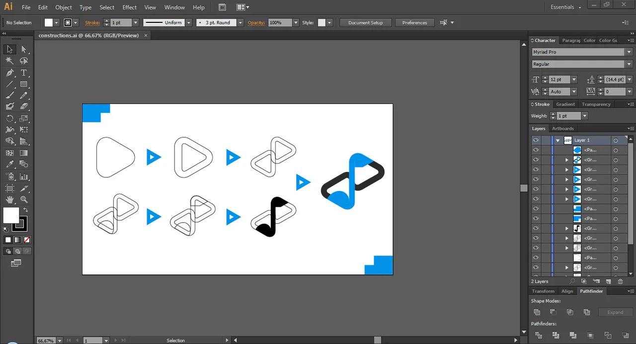
There are so hard to make synchronization and combination for "S" element and note music element, while it must look aesthetic too. So as recommendation of Moderator, I create another version of the logo design. There's no more differences, between head and bottom of music note and "S" element. Both of them looks rounded in this alternative version.
Benefits / Improvements
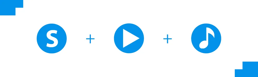
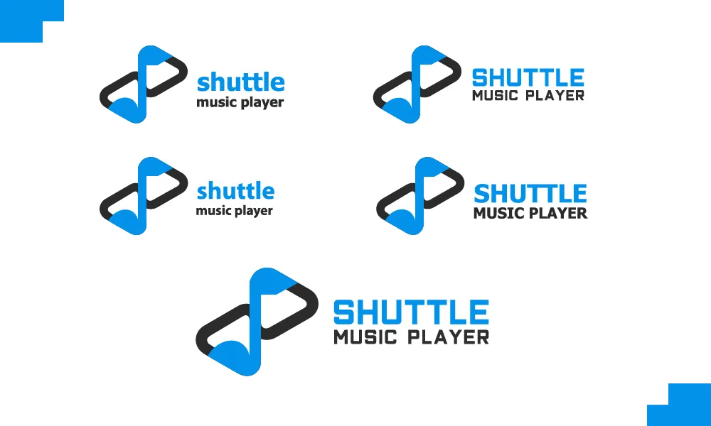
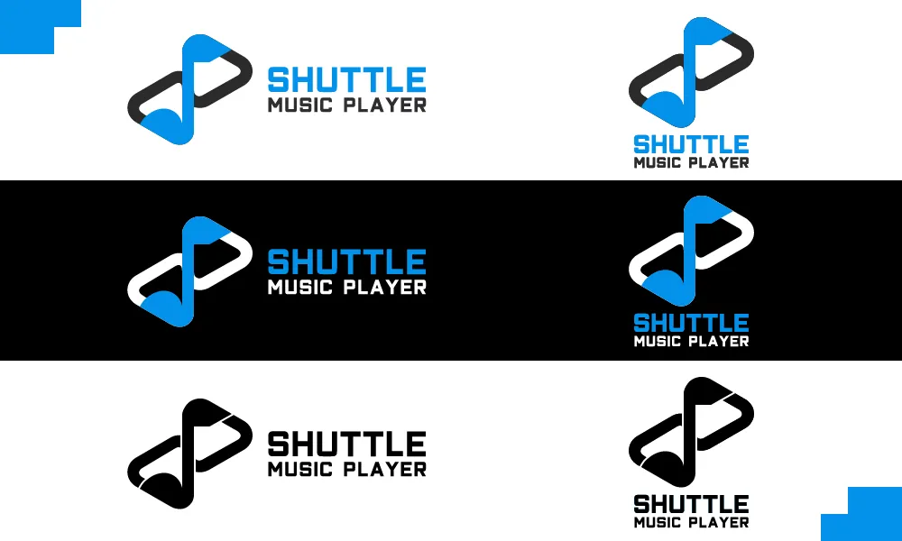
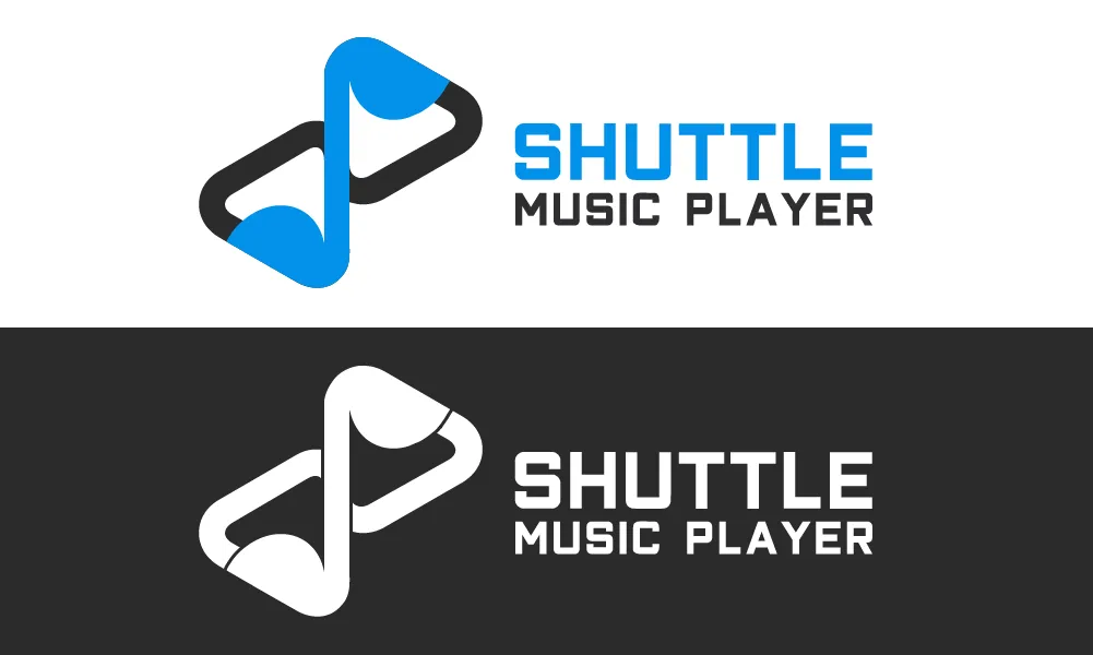
The new logo has many improvements from the previous logo. The new logo showing and combining the "S" element, player element, and music note element. That makes the logo more iconic and more powerful. Also, the logo hide the generic idea of music on the previous logo. The more important, the new logo become more eye-catching and stronger than the previous one.
Tools
Using Adobe Illustrator CS6 to create the logo and presentation.
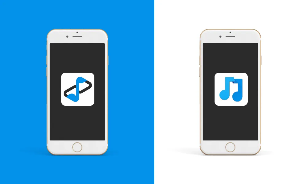
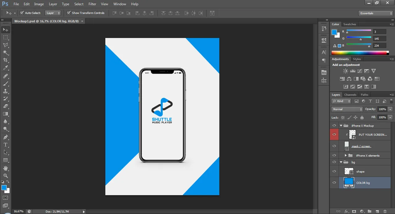
Using Adobe Photoshop CS6 to the mockup
Original files
Posted on Utopian.io - Rewarding Open Source Contributors