Details
ERPNext Mobile will manage our business on the go so we can get the latest notifications, follow up on opportunities, orders, invoices, customer issues and much more while we are on the move - Source. ERP is acronym of Enterprise Resource Planning. ERP management application helps professionals integrated their business management. ERPNext will manage your Accounting, CRM, Billing, Inventory, Purchasing, Projects, Payroll, Customer Issues all in one app.
For more information, visit their website here or download their app here. ERPNext is open source project, github link can be found here.
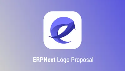
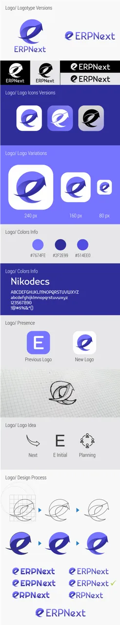
The existing logotype only present their initial name letter, look so general and hard to remember. Here's my new logo proposal for ERPNext.
Benefits / Improvements
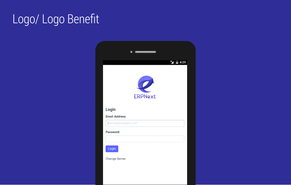
The new logo aims to make it easier for users to directly remember brand. The next arrow can be used as an icon and also a logotype in letter "e". The idea coming from combination of letter E and next arrow. The gradient is symbol of planing and collaboration because ERP is acronym of Enterprise Resource Planning that help user to plan their business. I put same blue color as their identity because it suit their material design.
Tools
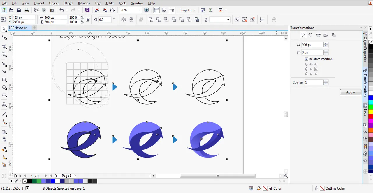
I use CorelDraw X7 as my graphic design tool.
Original files
You can download the editable files here.
Free commercial use font is Nikodecs.
Thank you.
Posted on Utopian.io - Rewarding Open Source Contributors