Green - with a natural color scheme

Knowledge reading

1. green can bring a fresh and natural atmosphere to the APP interface and green is more suitable for white matching
    in the interface.

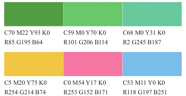
2. often with green color is the same color you can also add some high-quality pink which can improve the brightness
     and freshness of the page giving people a feeling of peace and cool.

3. When it comes to green color matching many people avoid red and green but it is ok to grasp the ratio. Remember
     that red and green should be less red and the ratio should not be too balanced.
There are many colors matching with green. For example the fresh green and black colors can be very dignified. The combination of white and green will look very elegant. The combination of green and royal blue will be more charming. Several shades of green can be matched together. Become complementary or embellished. Although the traditional green color is not wrong it does not make a difference. However it is now popular with color matching. People who are different in their pursuit can also use red pink and geese to match green. However the red and green contrast colors should be dominated by one of the colors and the other color.
Green is originally the color of nature naturally it will bring people a fresh and natural feeling but the color of the match should not be too much keeping the green fresh and tranquility brought to everyone without losing the essence of green.
1 natural color matching case analysis

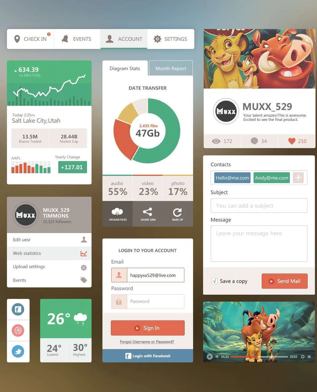
The natural and fresh colors are the combination of tender green and yellow-green. Both are the colors of the germination of the plants in the early spring full of vitality power and hope. Using a white background with colors will make the whole picture look clean and fresh.

2 youth color matching case analysis

Green also represents young people with youthful vitality so you can use emerald green as the main color in the interface design with vibrant orange and sunny blue. The three colors will make the whole picture full of young vitality. The atmosphere of shooting.

3 modern color matching case analysis

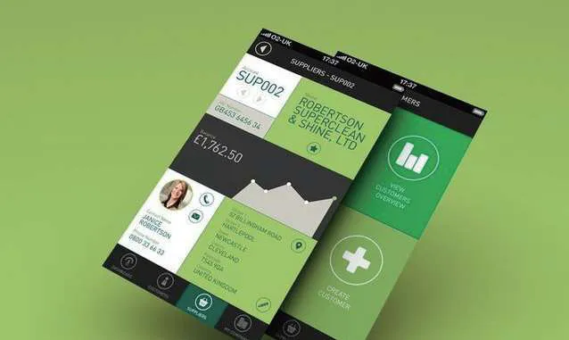
The color matching of the same color system tends to be more stable without losing the color level. In this color scheme the combination of green and olive green and yellow-green gives the entire interface a good layering and the combination of black and white has a strong modern design.

Case appreciation


The use of green in the APP interface is still relatively large because green can give people a fresher feeling and some cold blue-green is also very popular.
Blue-green is often matched with white because blue-green has both pure and cool blue green tranquility and comfort and it is very clean and refreshing giving a high-quality feeling. In addition the blue-green color can also be matched with a small amount of purple so that the entire interface is rich in color.
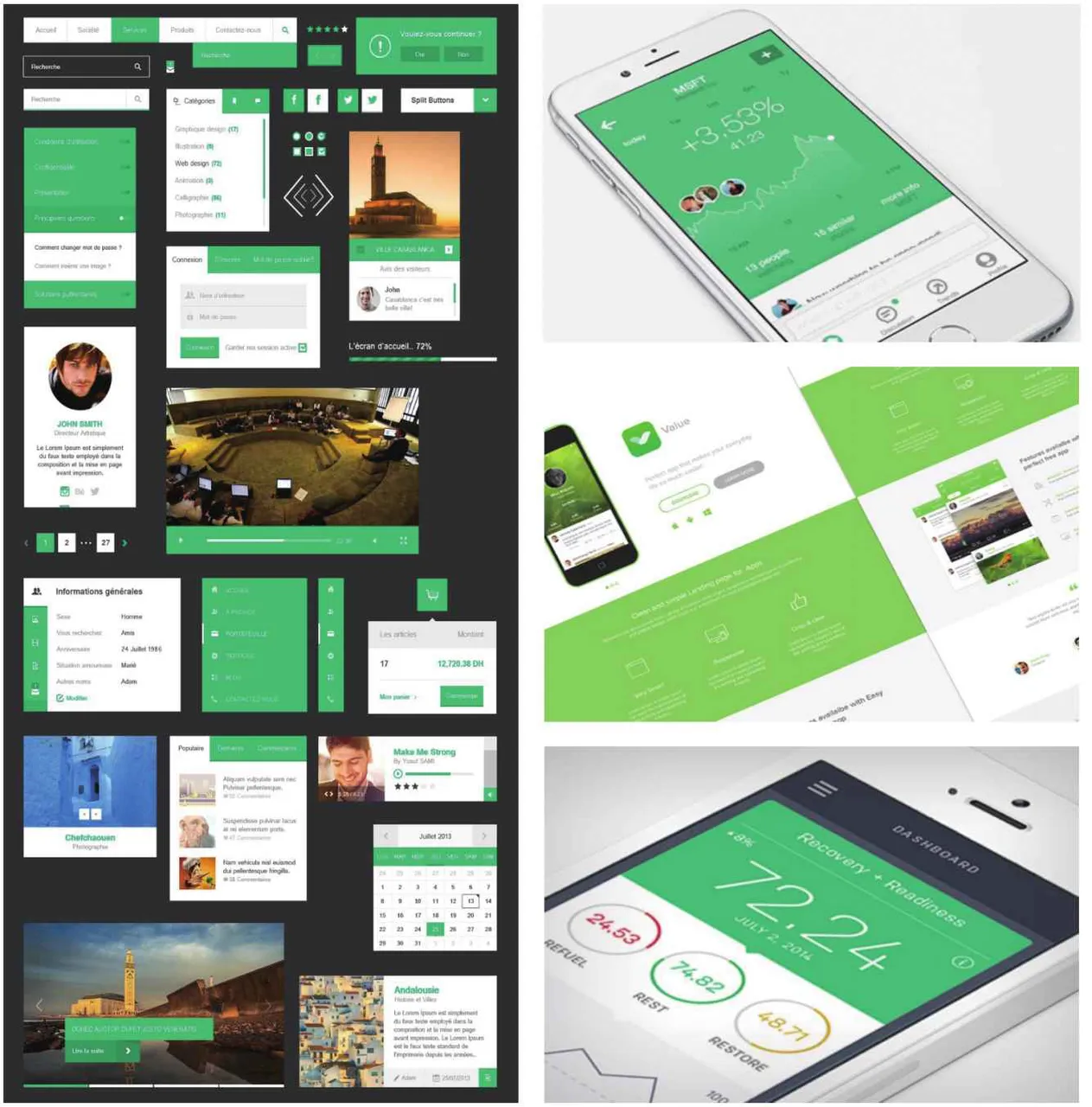
We usually use emerald green and yellow-green (also called grass green). The best match is white and gray. It can make the picture look fresh and comfortable giving people a feeling of tranquility. You can add high-definition red or It is orange which makes the color of the entire interface more harmonious.