Bitcoin has already fallen quite a lot from it's recent high. But is now a good value buying opportunity - or are there yet better value buying opportunities ahead?! Whatever the answer turns out to be after the fact, I thought it might be interesting to discuss some of the current charts.
(1)
Current triangle formation
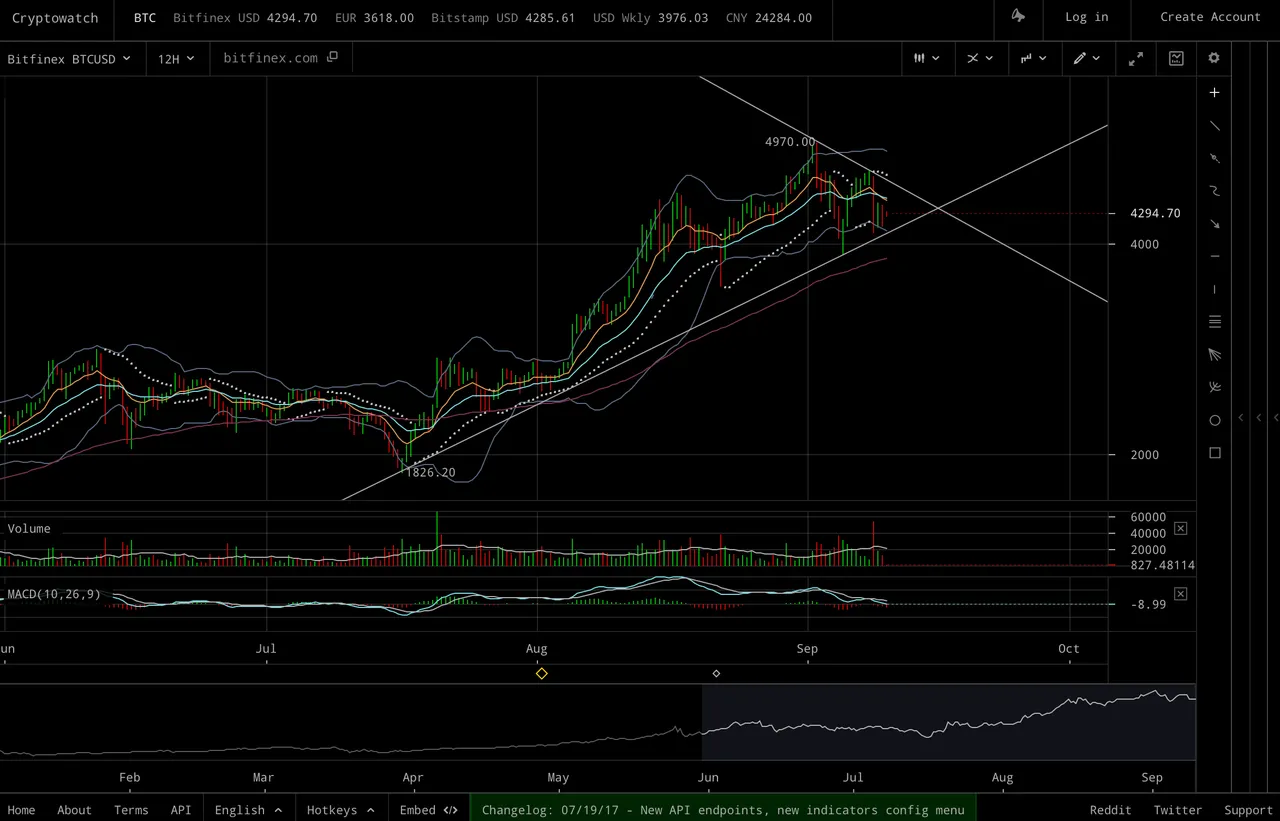
This looks to be a reasonable triangle formation to me (at least in regard to the bottom slope).
(But right as I'm typing this, the price looks to be a bit droopy, so it will be interesting to see whether we stay within the triangle at the time this post goes out! :) )
(2)
Let's look at the previous triangle formation from several months ago for comparison purposes.
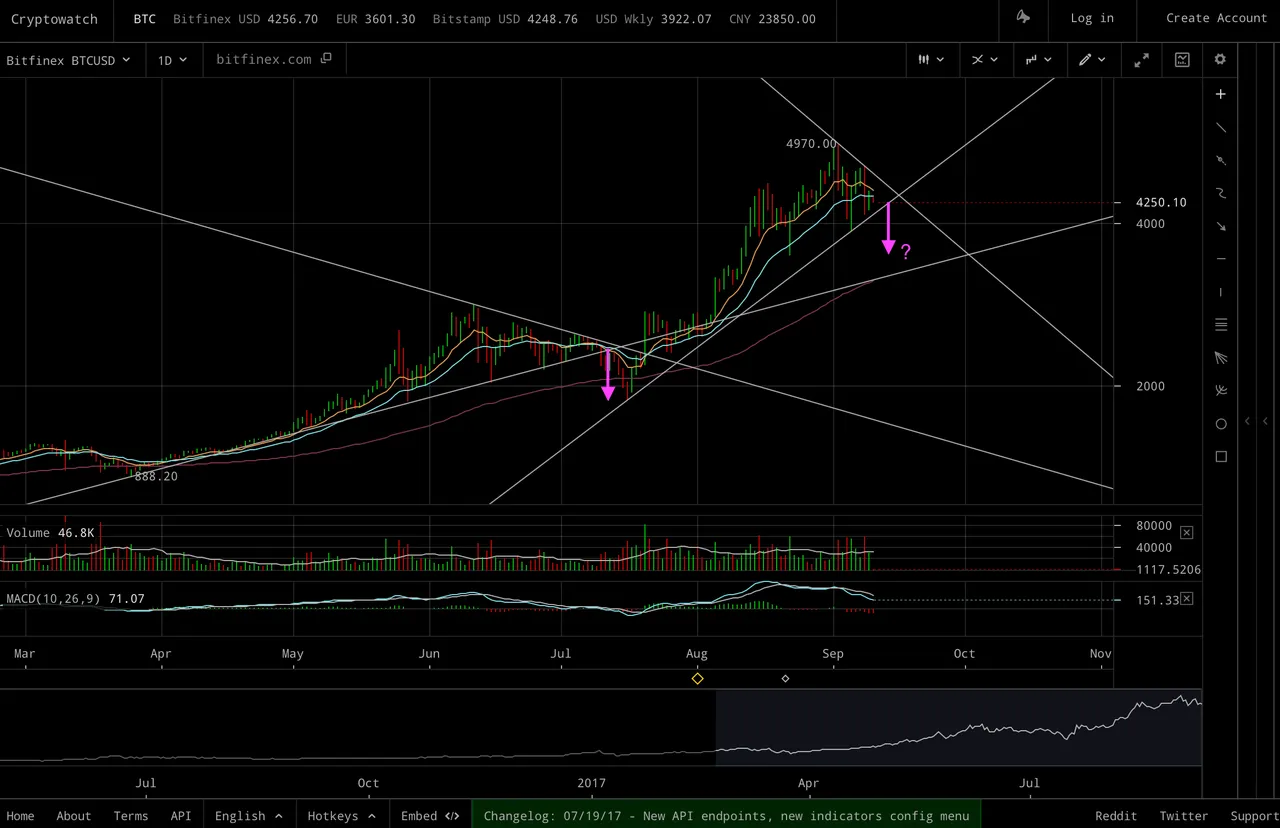
The previous triangle broke downwards. So, if the pattern repeats, then we might expect a downward break at some point (but this is only if it repeats! :) )
(3)
I would say EMA cross-over points are most important thing I use for buying/selling decisions. (Although, often if you wait for the cross-over to actually occur, the price may have already jumped or fallen by large amounts!)
Here's the 12 hour chart, with buy/sell signals marked for this strategy and timeframe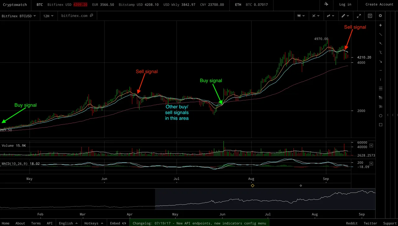
I've chosen this timeframe because on both the previous rise of a few months ago, and the recent rise, we did not get any change-overs on this time-frame. Ideally, for any rise I would like to choose the time-frame that had no change-overs during the whole of the rise - because this means you just have one buy signal near the start of the rise and one sell signal somewhere hopefully close to the top!
As we can see from this chart, we have just had a cross-over in the negative direction, so if you were using this strategy then you might have been looking to sell at an opportune point close to the cross-over.
(4)
MACD cross-overs do not give the same certainty as EMA cross-overs because they are a derivative of the EMAs - they kind of measure EMA difference acceleration/deceleration. But sometimes they can work very well. As we can see from the following chart, the 3 day MACD has turned out to be a great match so far this year for rough times to buy/sell on a longer timeframe:
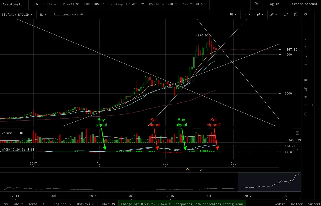
On the current chart it's still green - but it looks like it might be close to going red. So, If you were using this chart for deciding when to buy/sell, then you might be anticipating the colour going red soon and the resulting 'sell signal' implication.
(5)
So, some of the above charts might point to currently having a 'sell' position if you were following them - but if so, how deep could we expect a dip to be? For comparison, lets look at the previous dip we had a few months back.
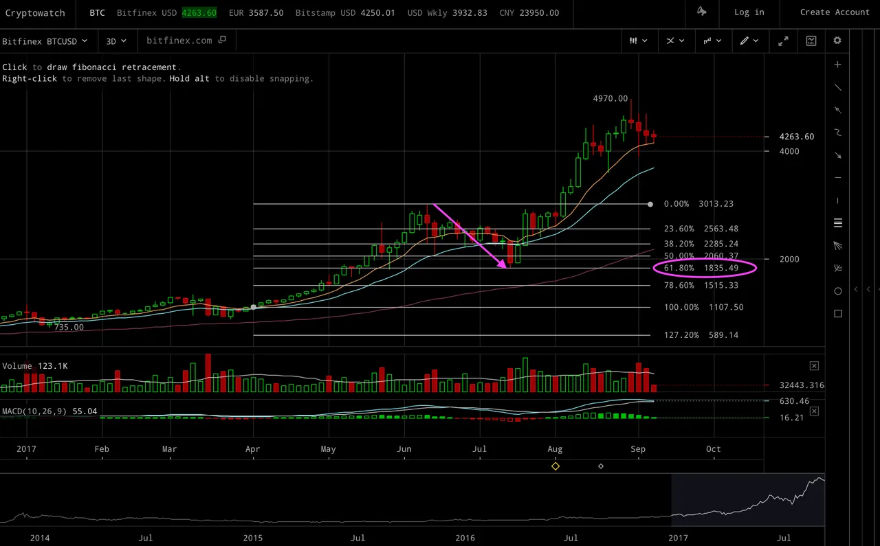
I'm never sure where to place the starting point for a fibonacci retrace pattern, but the top is always obvious at least ;P
Anyway, with the starting point I chose, we ended getting a dip which was pretty close to the 61.8% retrace level.
(6)
Now, lets plot a fibonacci pattern for the current top (again, the starting point is subjective).
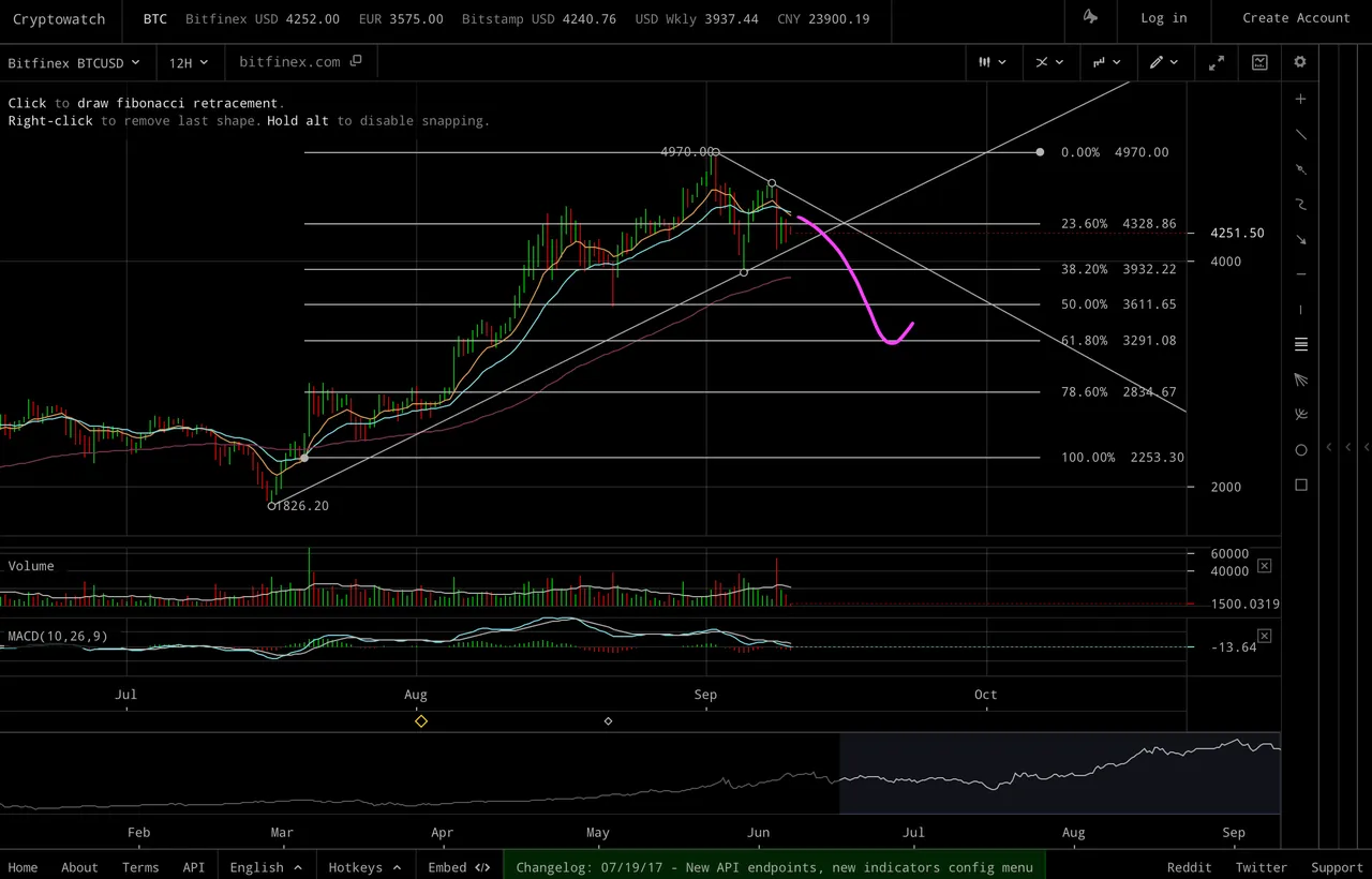
I've also marked a magenta line to indicate the potential scenario if history were to repeat itself and we got another retrace to the 61.8% level (but this a very big if!) Note: This is not a prediction - it's just an example of one scenario. Personally, I can only really guess at which level we might retrace to (if at all)! Generally, I'd be expect at least a 50% retrace though - so I might place a buy order just above this level - followed perhaps by more buy orders all the way down :-)
(7)
Finally, another option might be to consider the whole overall move which started at the beginning of the year for possible fibonacci retrace levels (again, the starting point is arbitrary):
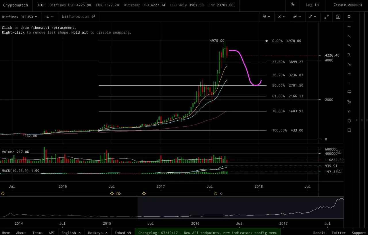
On this chart, for variety, I've chosen to the scenario where we might bounce on the 50% retrace level - but this is in no way a prediction!
Concluding remarks:
Will the price go up or down from here or even stay at roughly this level? Everyone must make up their own mind. Charts can only show what's happened in the past. Personally I'm leaning towards being bearish right now - based primarily on the EMA and MACD charts I presented above. However, these types of chart indicators can flip back very quickly - and if they do, I'll be changing my outlook immediately! And, while some of the charts show a potential dip scenario, please bear in mind that anything can happen - including continuing upwards to $1000 or more instead.
Also, as we saw during the previous dip: As well being a good buying opportunity, it bounced back higher than it started off. In this way, a correction can be a very positive event (provided you don't end up selling at the bottom, and not buying back in!) Also, if you believe long term that the price will be higher, then just holding (and not trading) is a good strategy.
Disclaimer:
I'm not offering and trading advice. Any reader of this post must take complete responsibility for any trading decisions they make. Instead, I've only shown some charts and some possible trading strategies/signals (out of many); and, any signals like these can end up losing money rather than making money. And, other signal/strategies might point to taking the opposite view. (The 'art' is trying to decide which signals to use at any given time!)
Comments welcome [ but please - only related to 'boring technical analysis' :) ]
Anything I could do better (I want to present a balanced/objective view, but still give my personal comments).
Any TA counter-arguments?

Again, thanks to @karensuestudios for my avatar (and the above animation)!! :D