Finally finished (I suppose) this one! I thought I'd post a bit of a process blog about it, so here goes!
I created this image using my Cintiq Companion and Manga Studio 5.
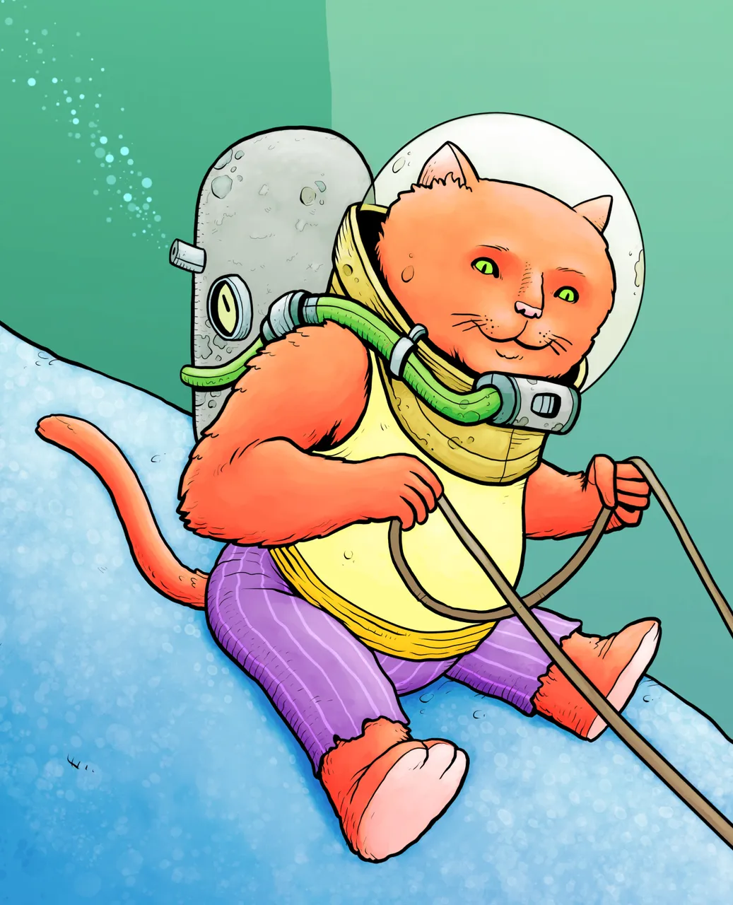
Everything always starts with a simple sketch, something very rough that usually serves as a reminder to me of the idea. In this case, a bath toy belonging to my son sparked the initial concept. I quite often 'see' the image in my mind, but of course it takes a long time to recreate and improve upon something so ephemeral, so you have to start somewhere!
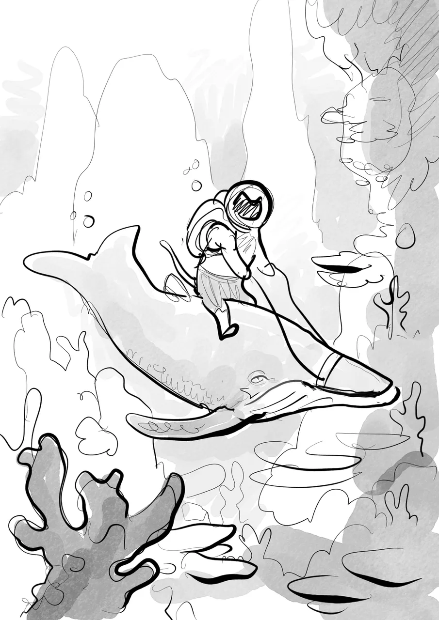
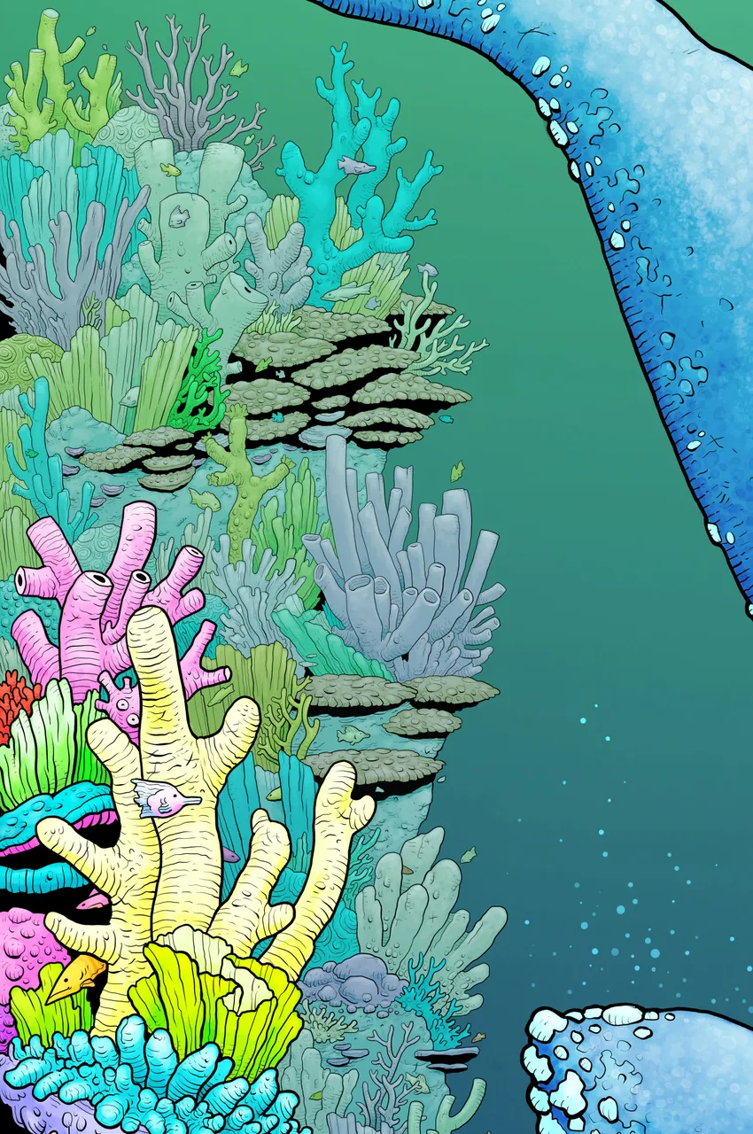
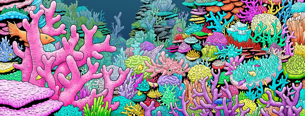
The next step is to refine the initial concept. At this stage I am usually more concerned with composition that anything, although it's also at this point that I begin consulting reference material (if needed). In this case, the bath toy and many photos of coral. Often, I draw straight off the top of my head, but not always.
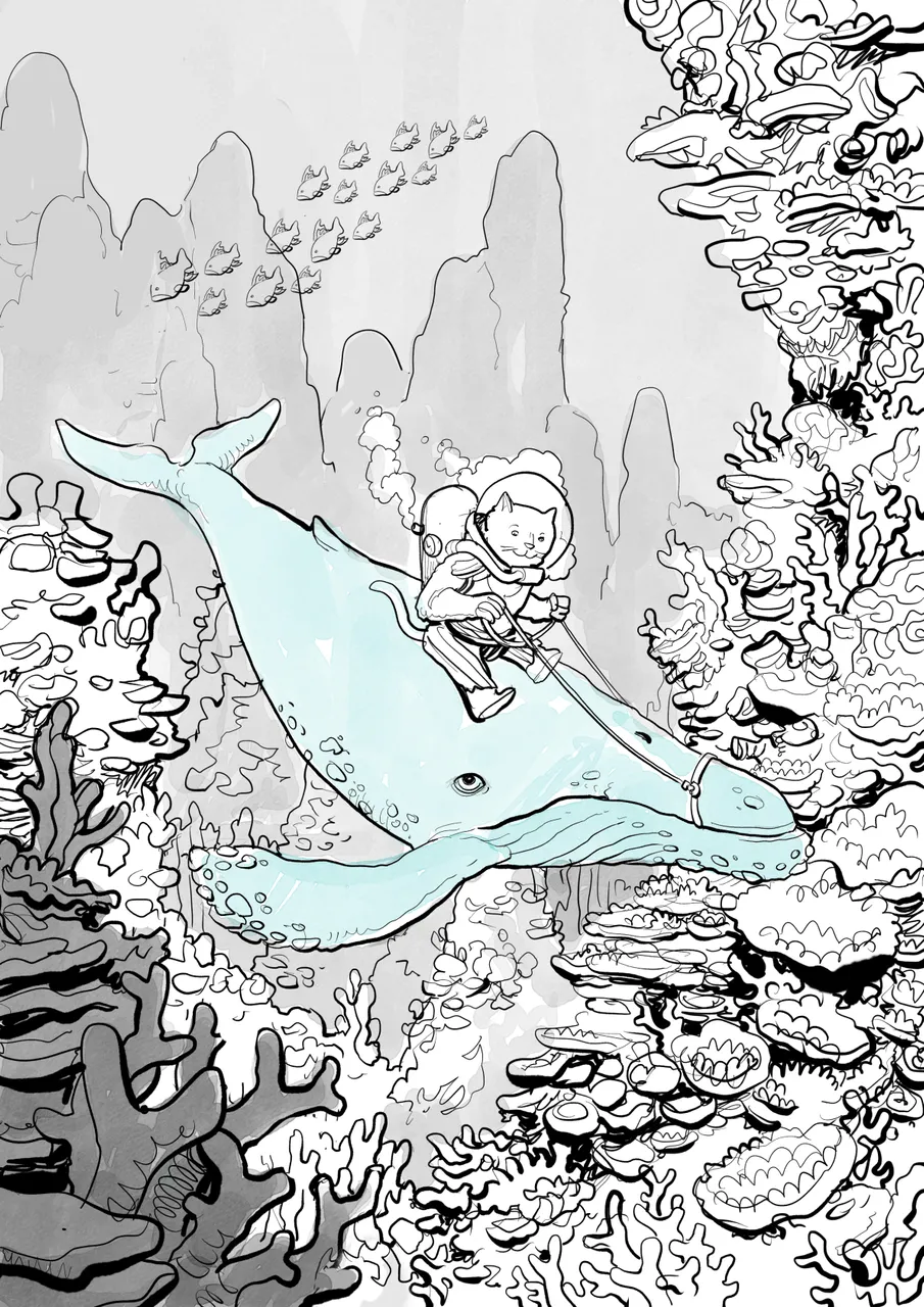
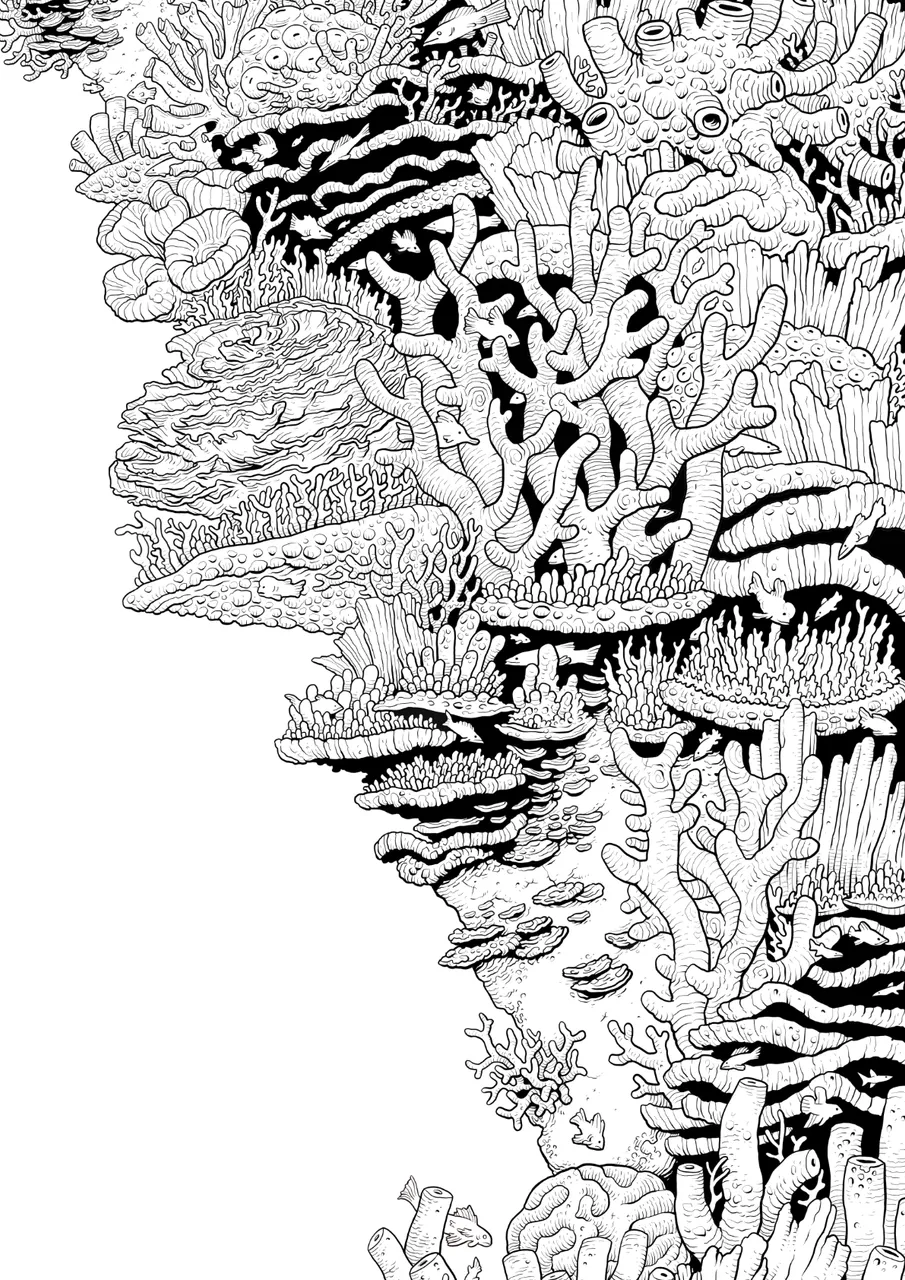
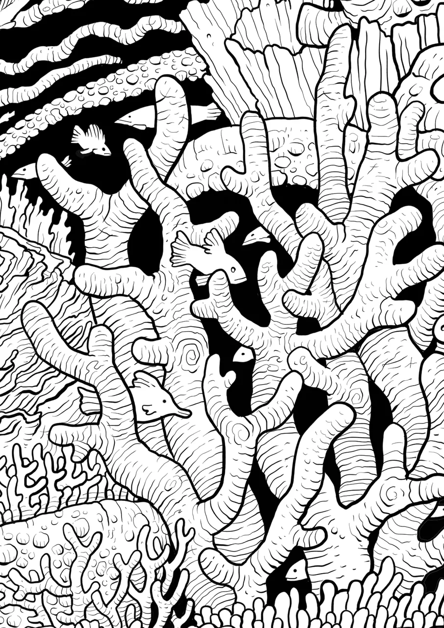
The next thing I did was tighten up the 'pencils' for the coral. I really wanted the reef to be more than just background, and right there at the forefront so it was important to spend the time getting this right!
For each one of these steps I will create another layer and make the underlying layers less visible. I use different colours for these stacked layers in order to make sense of what invariably becomes a complex mess!
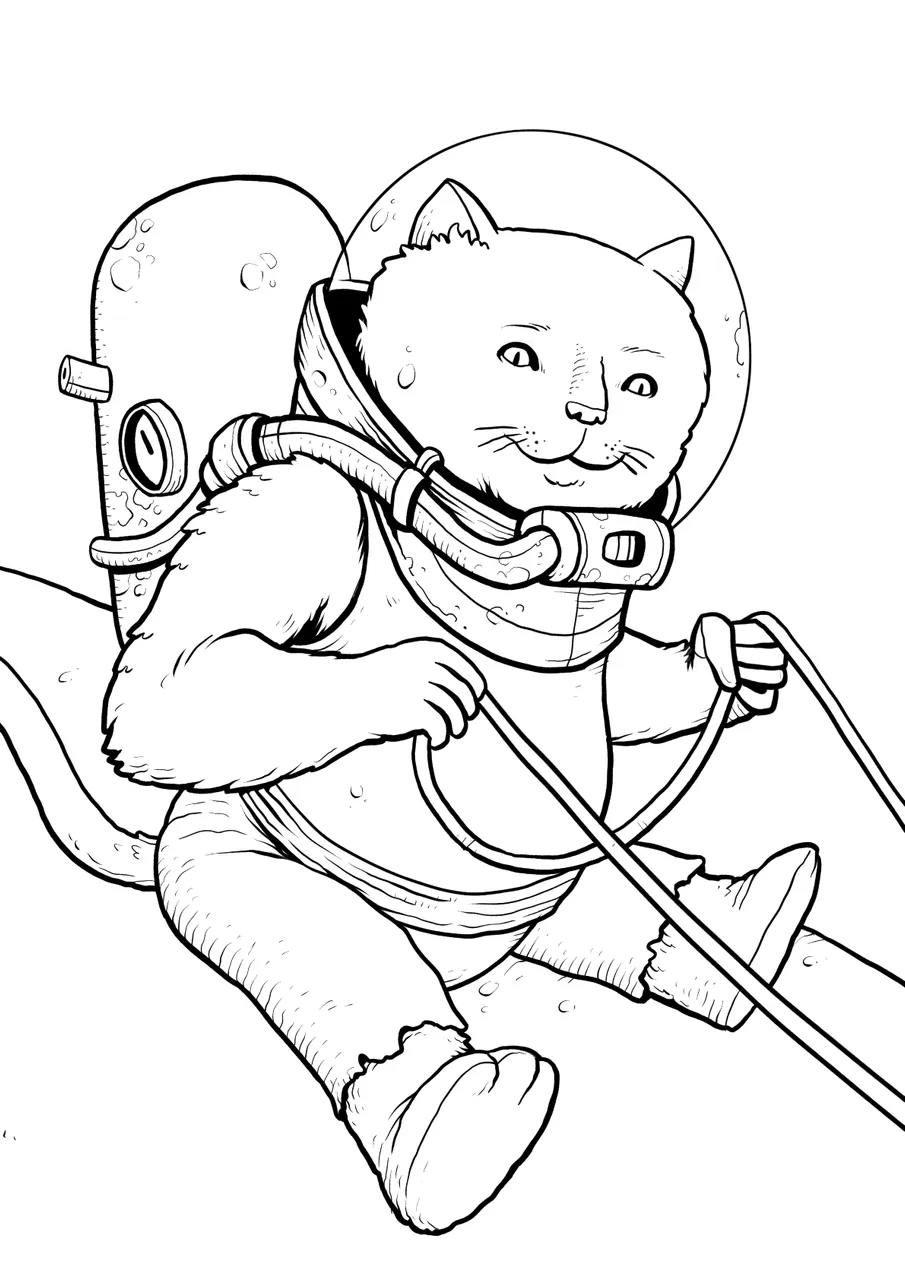
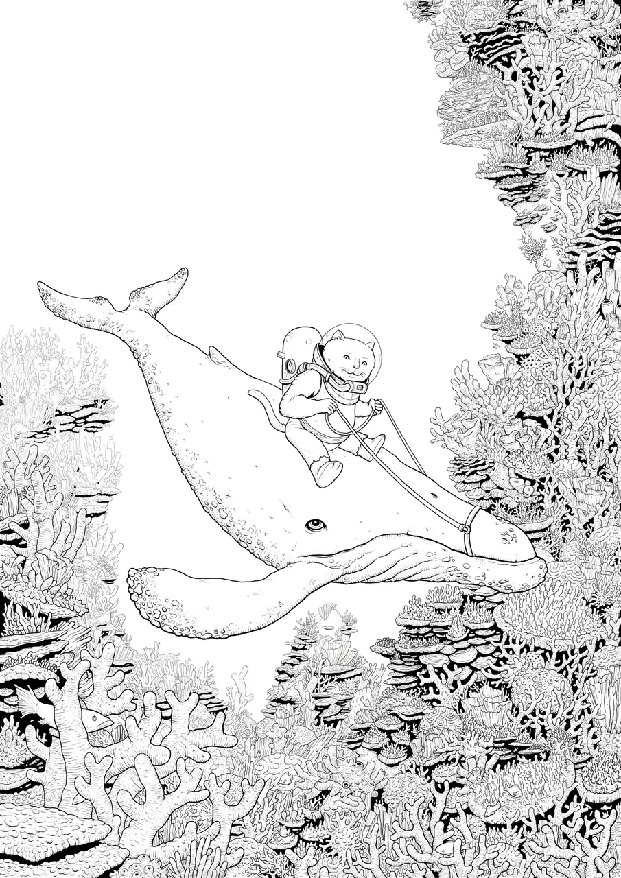
Inking begins, I finalised the Cat and the Whale and then dove right into the coral linework. This took many, many long nights in the studio!
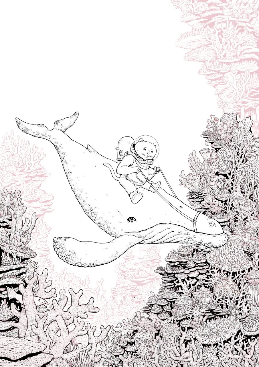
The finished linework. At this point, I will have created multiple layers of linework, so it's usually here that I will collapse them all into one layer.
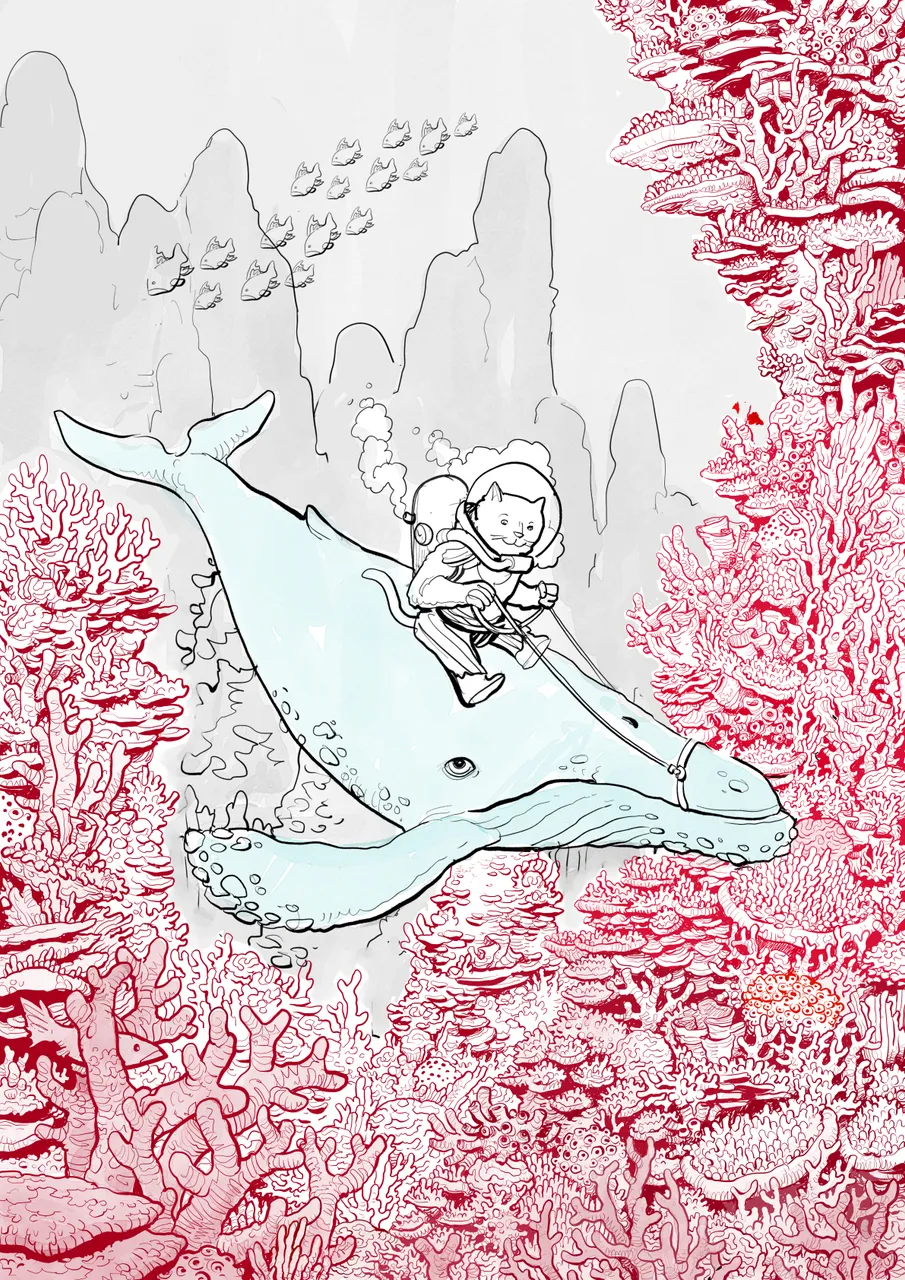
Now we come to a rather mindless part of the process, laying in flat colours. I tend to make different layers for different elements and be pretty random at this point. As long as you have a certain amount of separation, it is easy to adjust different hues to achieve a balance.
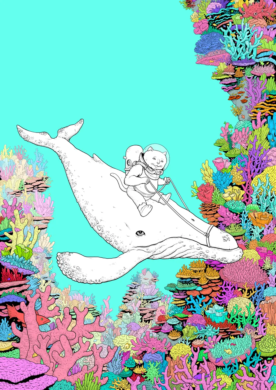
Once the flat colours are in, I'll mess around with opacity and different hues until it looks kinda right, then I'll begin laying in highlights and shadow. I use various wet media tools within the software and different opacity and multiply layers to achieve a bit more depth.
This step is pretty mindless and tedious, so I often work in front of Movies, TV shows or podcasts... or even just hanging out with my wife and chatting over a glass of wine. The Cintiq Companion works just as well in my studio as it does in my lap or in bed, watching a movie on the projector!
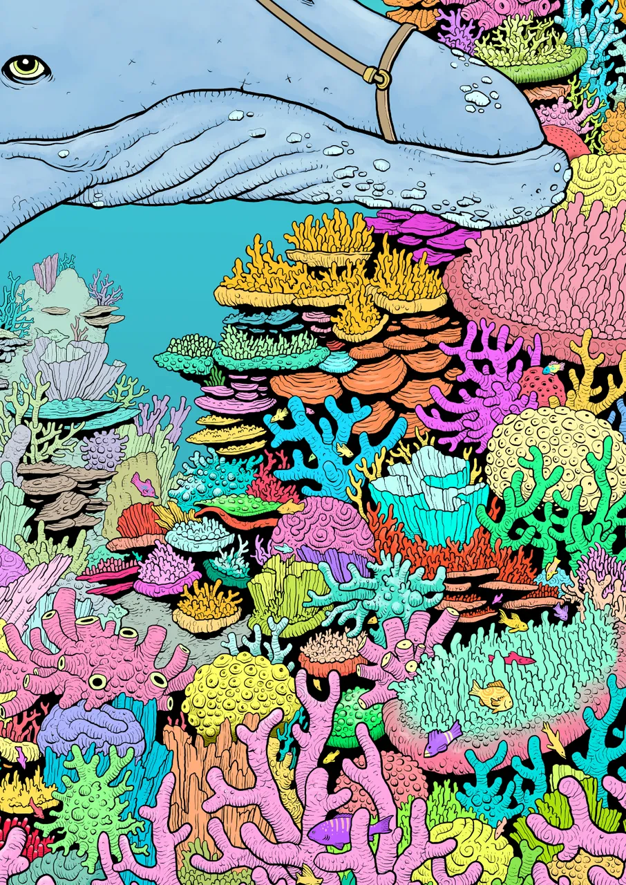
Once all these elements are in place, it's as much a matter of trial and error to get it looking right. Constant reevaluation of every little part of the composition and trying different layers of texture and colour to bind it all together into the final image...
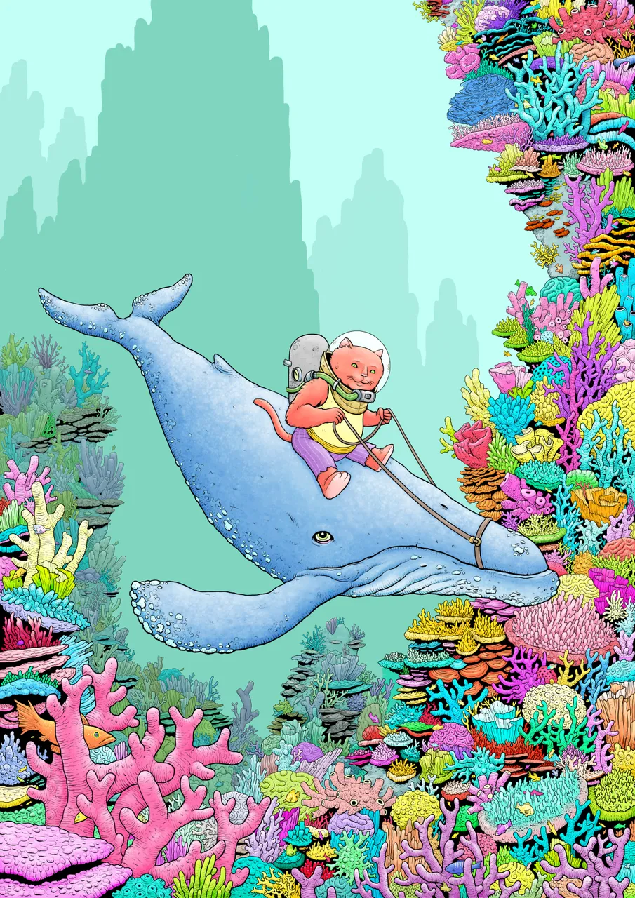
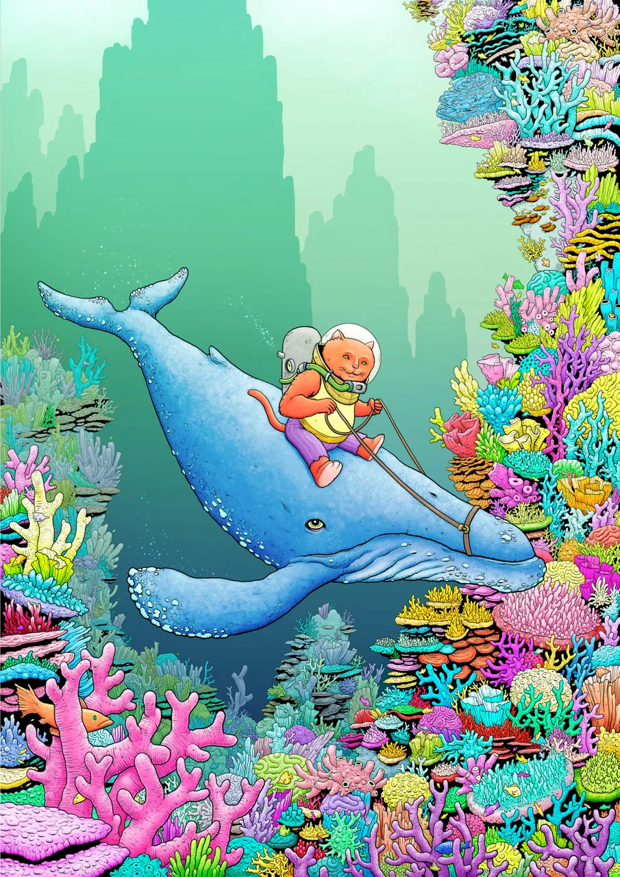
And that's pretty much it! I hope you enjoyed a little basic insight into my process. This piece was probably the most detailed thing I've created, although I'm no stranger to it. If you liked, please upvote, resteem or follow!
Thanks for looking!