Tags: technology css design html graphic
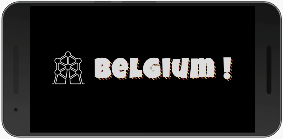
Short post about how to created an Animated Shadow Text Effect such as:
Find the project on CodePen!

We will work in 5 steps:
Global variables
Create a stripe background
Clip stripe background to text
Animate stripe background
Use the background as shadow
Global variables
Using CSS Custom Properties, we define some colors and other stripes properties:
:root {
  --c1: #000;        /* black */
  --c2: #fdda24;     /* yellow */
  --c3: #ef3340;     /* red */
  --c4: #eee;        /* gray */
  --shadow: .04px;   /* width of the shadow */
  --stripe: .01em;   /* stripes width */
  --space: .022px;   /* space betwee stripes */
}
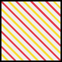
Create a stripe background
A Stripe Background is defined using CSS Repeating Linear Gradient:
repeating-linear-gradient(
    [ <angle> | to <side-or-corner> ,]?
    <color-stop>
    [, <color-stop>]+ )

where <side-or-corner> = [left | right] || [top | bottom]
   and <color-stop>     = <color> [ <percentage> | <length> ]?
I use an angle of 45deg and the following color-stop:
transparent
transparent          var(--space)
var(--c2)            var(--space)
var(--c2)   calc(    var(--space) +     var(--stripe))
transparent calc(    var(--space) +     var(--stripe))
transparent calc(2 * var(--space) +     var(--stripe))
var(--c3)   calc(2 * var(--space) +     var(--stripe))
var(--c3)   calc(2 * var(--space) + 2 * var(--stripe))
Remark how, for each color (or transparent) area, we have two lines. The first line of an area share the same stop as the last line of the previous area. This allow us to have strong color stripes instead of a gradient.
In order to get this stripe background:
I defined the following CSS rules:
:root {
  [...]
  --stripe: 6px;
  --space: 12px;
}
div {
  width: 200px;
  height: 200px;
  border: 5px solid var(--c1);
  background-color: var(--c4);
  background-image:
    repeating-linear-gradient(
      45deg,
      transparent
      transparent          var(--space)
      var(--c2)            var(--space)
      var(--c2)   calc(    var(--space) +     var(--stripe))
      transparent calc(    var(--space) +     var(--stripe))
      transparent calc(2 * var(--space) +     var(--stripe))
      var(--c3)   calc(2 * var(--space) +     var(--stripe))
      var(--c3)   calc(2 * var(--space) + 2 * var(--stripe))
    );
}
Remark: for this sample, I made the stripes thicker.
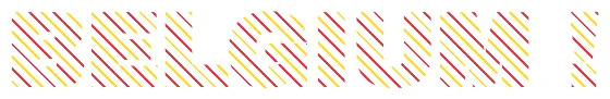
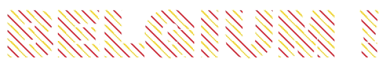
Clip stripe background to text
Now, I will use that background-image and clip it to the text:
With the following CSS Rules:
body {
  font-family: 'Luckiest Guy', cursive;
  font-size: 5vw;
}
h1 {
  background-image:
    repeating-linear-gradient(
      45deg,
      transparent
      transparent          var(--space)
      var(--c2)            var(--space)
      var(--c2)   calc(    var(--space) +     var(--stripe))
      transparent calc(    var(--space) +     var(--stripe))
      transparent calc(2 * var(--space) +     var(--stripe))
      var(--c3)   calc(2 * var(--space) +     var(--stripe))
      var(--c3)   calc(2 * var(--space) + 2 * var(--stripe))
    );
  -webkit-background-clip: text;
  -webkit-text-fill-color: transparent;
}
Animate stripe background
To animate the background, we add the following CSS Rules:
h1 {
  [...]
  background-size: var(--bg-size) var(--bg-size);
  animation: shad-anim 60s linear infinite;
}
@keyframes shad-anim {
  0% {background-position-x: 0%}
  0% {background-position-x: 100%}
}
Defining the background-size is very important to make sure the background pattern properly repeats. But, how to define the pattern size?
Here is the smallest pattern:
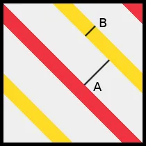
➜ The diagonal is 4 * ( A + B )
➜ The side is `diagonal / √2
In our case, we have:
➜ 4 * ( .01em + .022em ) / √2 = 0.090509668em
We will multiply it by 10 round it up to 0.905px:
:root {
  [...]
  --bg-size: .905em;    /* 10 * 4 * ( --stripe-width + --inter-stripe-space ) / √2 */
}
And here is the result:
Use the background as shadow
Now, to use that as a shadow for the text, I will create an :after DOM element in CSS and, on top of the previous CSS rules, I will add:
.shadow:after {
  position: absolute;
  z-index: -1;
  content: attr(data-heading);
  top: var(--shadow);
  left: var(--shadow);
  [...]
}
We position it absolutely using the --shadow Custom Property, lower it to z-index -1 and use the data-heading as content.
Variants
You may play with
- the colors
- the number of stripes
- using a gradient instead of stripes
- reversing the animation (going from 0% to -100% in the keyframes)
- etc.
References
CodePen for this Tutorial
Atomium Icon made from Icon Fonts, licensed by CC BY 3.0