Where do good ideas come from?
It’s a question that we as designers are continuously asking ourselves, yet in the overall common perception of graphic design it can seem to discounted, which can be curious!
In my experience, I’m reminded that, in most people’s minds, the job of being a designer is mainly a matter of learning a set of computer applications — programs which, when properly operated, presumably do the work of generating ideas on their own.
Some people even go a step further suggesting some version of the Genius Theory: the idea that certain individuals are simply blessed with this special force called ‘creativity’ where they can magically summon remarkable visual solutions to problems where the rest of us see only a blank screen or piece of paper.
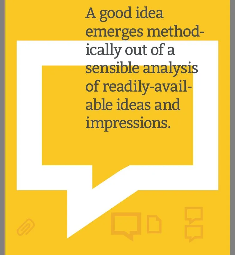
Solutions do not arrive as a sudden flash of inspiration from out of the blue; rather, a good idea emerged methodically out of a sensible analysis of readily-available ideas and impressions.
Good ideas are not created by magic, nor are they generated by computers — the process of developing them is a skill that can be learned, taught and practiced, and, like a muscle, gets stronger the more it is used.
Clichés are hard to banish from our thoughts because their sheer familiarity makes them appealing: they are always at hand, ready to be put into service; and — especially if we are working under pressure — their familiarity offers a certain amount of reassurance, a guarantee that we won’t be misunderstood.
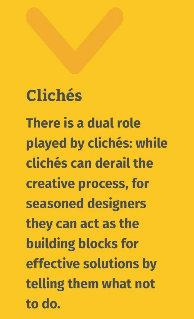
Design solutions that employ clichés are the hardest for myself here to critique in feedback sessions: often, it can be frustrating because the student has done nothing wrong exactly, yet the overall design leaves us wanting more.
Most depressing of all is the fact that clients often prefer clichéd solutions to original ones.
This is the syndrome of the Chinese restaurant owner who wants us to use the same tired chopstick lettering for their sign because ‘that way, people will know it’s a Chinese restaurant’.
The client wants only to be correctly identified, their drawn to the universality of clichés: they have, after all, the same meaning for everybody within a particular culture, which — if only they weren’t so hackneyed — would make them an ideal communication tool for designers.
In a hurry to fit in, the need to stand out has been forgotten. It is our responsibility as designers to make the case that design can serve both ends at once: it can speak plainly while still leaving a mark on its audience.
Concepts
In 1987, the designer Craig Frazier did a poster for this very purpose, a public service campaign aimed at persuading kids to not drive home drunk from their senior high school prom. His poster:
This solution is just right: it communicates its message with appropriate urgency, but also uses surprise as part of the attack.

Frazier himself said “It has an art quality that removes it from the realm of ordinary public service campaigns,”
“It presents a visual riddle that’s almost attractive at first glance, but gets more gruesome the more you study it.”
So, because it’s unconventional we need to spend a split second visually decoding the image, sort of discerning its story... and, in that moment, a connection is formed between us as viewers and the image.
Because it’s quite abstract and original it sort of sneaks past our defences. In Frazier’s words, “it proves that you don’t have to be condescending to convey a deadly serious message.”
Whereas the Stop Sign approach looked down authoritative- ly at its viewer, this design lures the onlooker into a dialogue, and refrains from talking down to its audience (note the quiet treatment of the tagline in the lower left corner).
In sum, by avoiding an overly obvious delivery, the designer cleared the way for a work that leaves a lasting impression.
Putting it into Practice
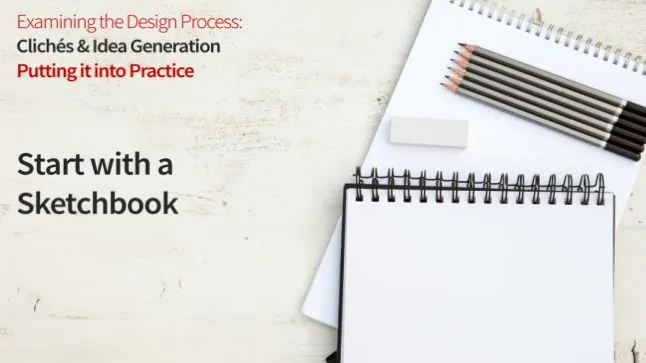
Start with a Sketchbook, not a Computer
The computer is a bad companion to start with because its particular toolset pushes us in certain directions (towards clearly defined shapes and hard edges) and because it tempts us to focus overly on execution (by offering up Filters, Styles etc. ) before our concept has really come together.
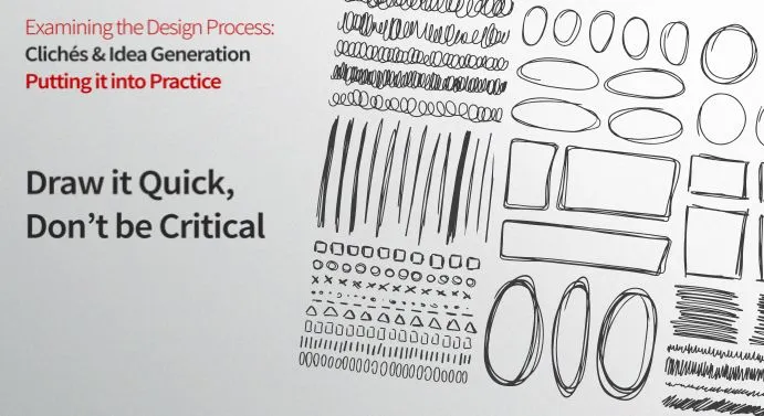
Draw it Quick, Don’t be Critical
Using your sketchbook, start by drawing every association you come up with for the subject matter.
Draw it quickly, and don’t be critical.
At this stage, it’s not about making pretty pictures, and it’s not about evaluating your ideas (in fact, the ability to turn the critical part of your brain on and off is one of the most helpful tricks you can develop).
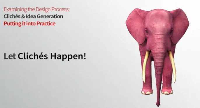
Let Clichés Happen
Don’t try to avoid clichés — let them happen.
Trying not to think of clichés is like the old joke where someone says ‘Don’t think of a pink elephant.’
It’s best to get them down on paper and get them out of your system.
Once you’ve jotted down every association you can think of, take a break, come back and jot down a few more. Then, take a longer break...
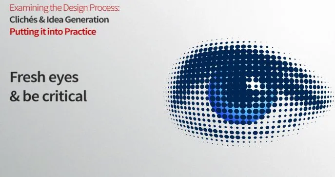
Fresh Eyes & Be Critical
Come back with fresh eyes and look at what you have in front of you. Now is the time to be critical, but also to be fair.
Seeing our own work clearly for its merits, without bias and defensiveness, is one of the hardest things for graphic designers to do.
Conclusion
There is no single answer to the question of where good ideas come from.
Some designs actually do seem to come out of thin air, like the Citibank logo that Paula Scher infamously drew on a napkin during an early meeting with the client.
But many more good ideas come about through the process we described today, of gathering and making decisions about readi- ly-available information.
The viability of this approach suggests that coming up with good ideas is not a matter of genius, but rather simply a challenge of seeing clearly and thinking sensibly.
The good news that this implies is, idea generation is a learnable skill that can be cultivated in many of us, not just in a chosen few.
If idea generation is a process that is accessible to everyone, then what accounts for the fact that it can be so hard to pull off?
Part of the answer lies in our inability to get out of our own way, a condition which stems largely from our ideas about what it means to be a ‘professional’. The term ‘professional’ is generally used to connote a person who is in control of their work process at all times... and, yet, the condition of absolute control is rarely a place where exciting design comes from.
Love
🖤
Katrah