Steemit Home Page Redesign Part IV
Personalization: Personalized Tabs & Personalized Tags, Onboarding 101 & Search Tool Updates.
Once again its your Steemit Community Neighborhood Yeti, coming in with the new scoop for Steemit Home Page Redesign Part IV.
1st Pitch
In the first pitch we addressed pain points and other misleading onboarding things for new users and how they get lost. We iterated, commented, notes were taken and written down and we started this ongoing phase of iterations.
2nd Pitch
In the second pitch more concerns gravitated towards the logged in user, as a returning user and how to best make the page more usable for me once I’ve logged in. Many pain points surrounded the conflict between my “landing home page” vs “my blog page”. Trying to dive deeper here into more usable feature sets that gravitate to user intuitiveness and ease of use as well as allow the platform to be more aware of what I want, when I want and how I want to see it.
3rd Pitch
In the third pitch we focused on tailoring the UI to the user focusing on personalization for top tags and for top followers you want to follow. After much exploration, comments and revisions, I gave a stab at trying to meet the demands of the user, but with all design process, its an iterative process and ultimately felt the design I had was too clunky and too much or a learning curve so I let the design go, and refined it even further in "Redesign IV" below without losing the functionality.
Here were my findings for the 4th Pitch... By George, I think we might have it this time!
Construction Zone! - How should we build a smarter way of personalization? Here was the take-away.
Comments on Iteration 3.
Tags are still a conflict - Consider personalization like - most recent, most frequent, most visited
Deeper exploratory research dive into similar platforms UI reddit and medium and busy.org
Tags and sorting for personalization are still a big concern for the user.
Create tags, shortcuts, or a tag specific to Steemit resources: Steemit, Utopian-io, Dmania, Dsound, Dtube
Add in Notifications for specific areas. I fought myself on this so there isn’t an overkill of notifications to make me rage quit…

image credit to wikibut I think there is notification value to add a sticker to the top of your “replies” section to improve overall engagement with interactions between users for discovery, curation and new connectivity. Everywhere else for my consideration as I continued to contemplate if it would have value resulted in a personal rage quit. lol.
Perhaps an overlay for seeing upvotes on posts. this will be addressed in the “my blog” view. I think its valuable to have a roll over effect on web or a click state pull down on mobile to display upvotes. I think the power user will want to interact with upvoters that don’t leave comments and either add them, explore creep, or just read their content to create an organic connection.
Discussion about having notifications displayed in a group of its own. I squashed this, because it becomes more of an annoyance and intrusive feature that becomes quickly discouraging. I think once I create the “my blog” page and display a notifications sticker on the “replies” that’ll solve a lot of headaches for users. we won’t know until we test haha
Search tool limitations, overhaul, make it smart. it stinks… why is it a google iframe?
These were the new items in review from the last post.
Now lets show off the adjustments to the new build below.
Logged Out - New User Home
Persona: I am a new user accessing Steemit.com for the first time.
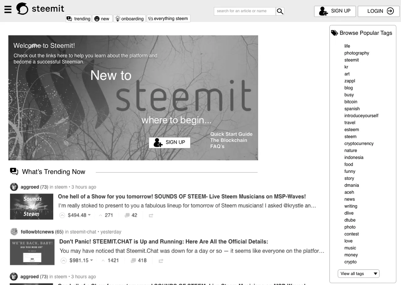
- We are creating a familiar aesthetic that will require little learning, in transition from non-user to logged in user.
- We are creating a few tabs that instantly integrate a user into learning about the platform and what it offers.
- We create a landing image with opening onboarding and encouragement to increase a user to register.
Logged In - Returning User Home
Persona: I am a returning user and see additional personalization that is catered to my interests.
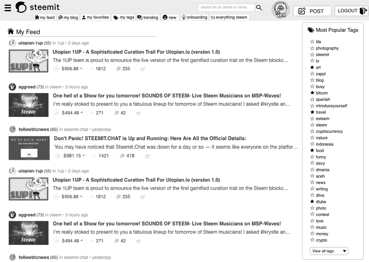
I have a series of "SMART" tabs that allow personalized content that I am customizing based on followers I favorite, category tabs I prefer, short cuts to my feed and blog, as well as curated content for easy go-to's that educate me more about steemit and how to use it. And if I am interested in a few tags that are specific to Steemit like Dlive and Dtube theres a tab.
I care about my content as this is a content-driven site so I've surfaced the list/feed to something i can easily scan without the additional columns and clutter.
I have a search tool that allows me to search for a follower, tag or article title easier.
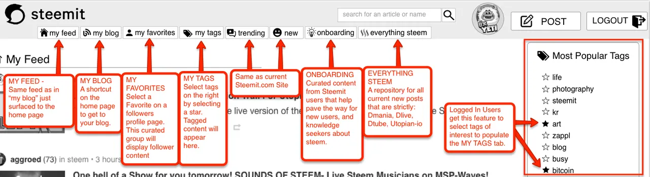
Conclusion:
When logged in, additional personalization happens. You have tabs that cater to your content for sorting. You have specific tabs that cater to your favorite users, and your favorite tags. You have an onboading tab that is a curated tab for Everything you need to know about starting out on steemit. It will have anything from Learning Steemit 101, to how get started generating quality content, to building a follower base, to how does delegation work, what do bots do, how do I use my SBD dollars, what does powering up mean, how do I buy steem with my SBD. This will be a tailored list of helping articles that will be pre-selected to get you where you need to be. I’ve seen some really great ones here by @themarkymark, @maneki-neko and @jerrybanfield just to name a few.After this last review of comments, I will be moving onto the "My Blog" Page and "My Wallet" Page.
Focusing on
- How to favorite a follower
- How to view my analytics of my status, voting power, bandwidth, etc
- What does my profile page look like when I'm Viewing it.
- What does my profile page look like when another user is looking at it
- Inserting Notifications and where
- Stats about other users in the content feed.
THANK YOU
Comments from so many Steemians that deserve credit here again, thanks for your assistance. It’s you that use the UI and you are the voice that allows me to help shape this community, and empower my creative energies to work hard and into the nights on rebuilding these pitch proposals.
@aggroed, @themarkymark, @velimir, @fredrikaa, @fulltimegeek, @brandonp, @geofftk, @fourfourfun, @dlew, @venalbe, @grizgal, @shawnvanderveer, @dedicatedguy, @datascience, @mitneb, @edicted, @jlordc, @arcange, @spiritualmax, @makerhacks, @isnochys, @dlew, @mikesthoughts, @rock220, @daan, @davidshaw, @rawdawg, @yogajill, @mcblessing1, @patrice, @princessmewmew, @kerlund74, @yabapmatt, @ma1neevent, @poeticsnake @shadowspub, @folken, @whatsup, @kubbyelizabeth, @freedomexists, @shawnvanderveer, @bbrewer, @kurtgrey, @swolesome, @flemmy, @reewy, @leonard17, @syednur47, @amisteem, @memocorredor, @outtheshellvlog, @moreseke1, @travissilvers699, @artizm, @mafi001, @queenbee12, @blusky, @jerrybanfield, @gomovies, @theversatileguy, @theb0red1, @thecryptogold, @strangevision, @atmosblack, @drmake, @tattoodjay, @futurethinker, @rondak, @ashleykalila, @jpederson96, @therealwolf, @thebugiq, @minatubo, @el-cr, @thewayiseeit, @princessdharmy, @crystalpacheco30, @aleksandar.vasic, @gcamkerten
Your comments, criticism, pain points, and praise help drive successful change.
Thank you. For anyone I left out, thank you as well. don’t forget to leave your comments below, and upvote if you liked the design work and the direction. To the corporate steemit team @ned @pkattera @andrarchy I would love for you to review my series and in depth exploratory UX research, testing, and revisions and to upvote, resteem, comment as well. All of it helps.
If you'd like to revisit this series you can check out Parts 1, 2 and 3 below.
Part 1 of this Redesign Series can be found here
Part 2 of this Redesign Series can be found here
Part 3 of this Redesign Series can be found here
If you liked what you read, Please don't forget to Upvote, Resteem, and follow me. There's much more great design work to come.

@theUXyeti - This is me! Hilarious, funny, ex reality tv guy, loves app and web UI, competitive card player, scuba instructor, dart thrower, MTG player, WSOP player, gamer, hearthstone mechanic exploiter, sports handicapper, Geek of all trades.
How to find me
Steemit: www.steemit.com/@theUXyeti
Discord: TheUXyeti or TheUXyeti#5698
Dtube Channel: https://d.tube/#!/c/theuxyeti