Steem Sincerity is a project I post about under my @andybets account. It is an API service to try and help solve some of the spam problems on Steem.
One of its API functions allows you to query up to 100 accounts, and have the classification scores quickly returned.
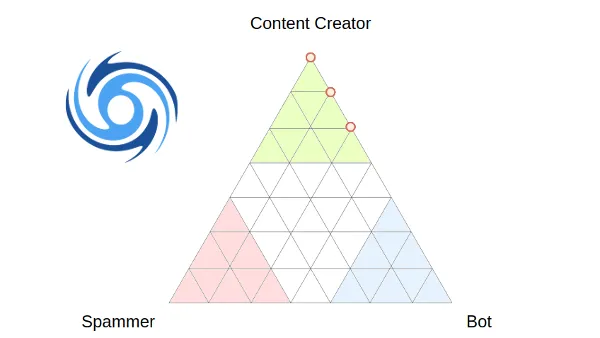
Each account is given a probability of being a:
- Content Creator - an account providing value to Steem through their posts and comments
- Spammer - an account posting mainly spam or very low-value content
- Bot - an account operated by software
As a pure API though, it's not directly very useful for most users, so I have added an interface to the SteemReports website so you can see this data presented in a graphical form.
The probabilities add up to 100%, so I use a Ternary Plot to show the relative likelyhood of accounts belonging to each class. You can add up to 100 accounts to the list, and any that has a record in the Sincerity database will be added to the chart. Hovering your mouse over each point will show the name(s) of the account(s).
Because of the algorithm currently used, there are only 36 possible positions on the chart that an account can appear, so some positions may contain several accounts.
Here is an example showing the current classifications of the top 20 witness accounts plus steemreports. A couple are missing because the witness accounts haven't posted anything recently.
Please note that classification is only as good as the Sincerity training data allows it to be, and I am working to collect much more data to improve classification in the coming weeks.
I would be happy to hear about any big misclassifications though, as they may give me information to help improve future results.