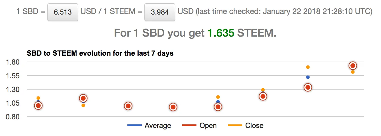
One of the most common requests for steem.supply has been a chart for the historical SBD to STEEM conversion (by "historical" I mean a reasonable amount of time, like 7 days). So, after digging up a few API providers, brushing up on my Google chart skills, adding a few functions to the steem.supply codebase and drinking a delicious cocoa and cinnamon concoction I made myself (the secret being adding a dash of cocoa milk, if you really want to know), here we are, with a new feature.
The chart is displaying the last 7 days ratios for SBD and STEEM, or how much STEEM could you get for 1 SBD. The days are calculated in UTC, starting at 0:00. Hovering over points will display the exact price and date. If you want to highlight a specific series, just click on the line in the legend.
There are 3 series: average, open and close.
- average - the average price for that day
- open - the price at the beginning of that day
- close - the price at the end of that day
As you will see, some very interesting trends and correlations can be made with only these 3 numbers.
For instance, today we opened high:
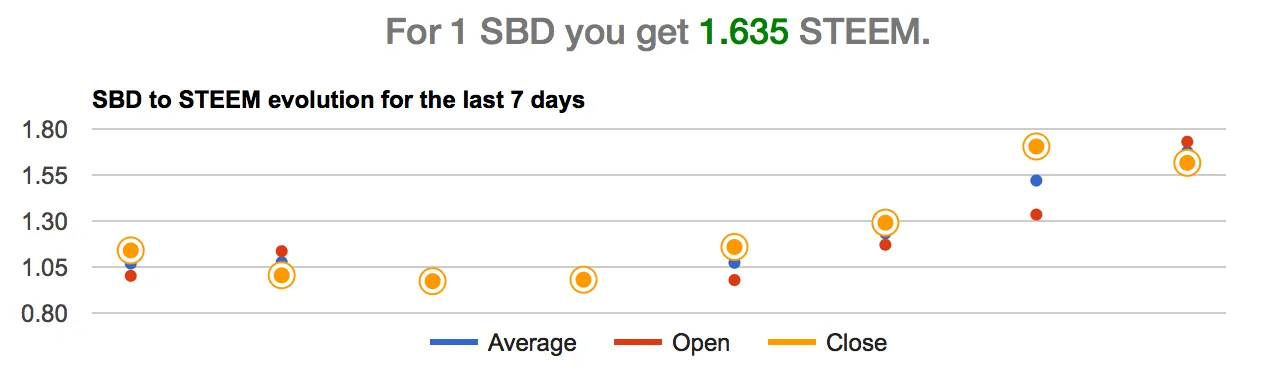
but we're going to close lower:
As always, looking forward to your feedback, criticism and suggestions.
I'm a serial entrepreneur, blogger and ultrarunner. You can find me mainly on my blog at Dragos Roua where I write about productivity, business, relationships and running. Here on Steemit you may stay updated by following me @dragosroua.

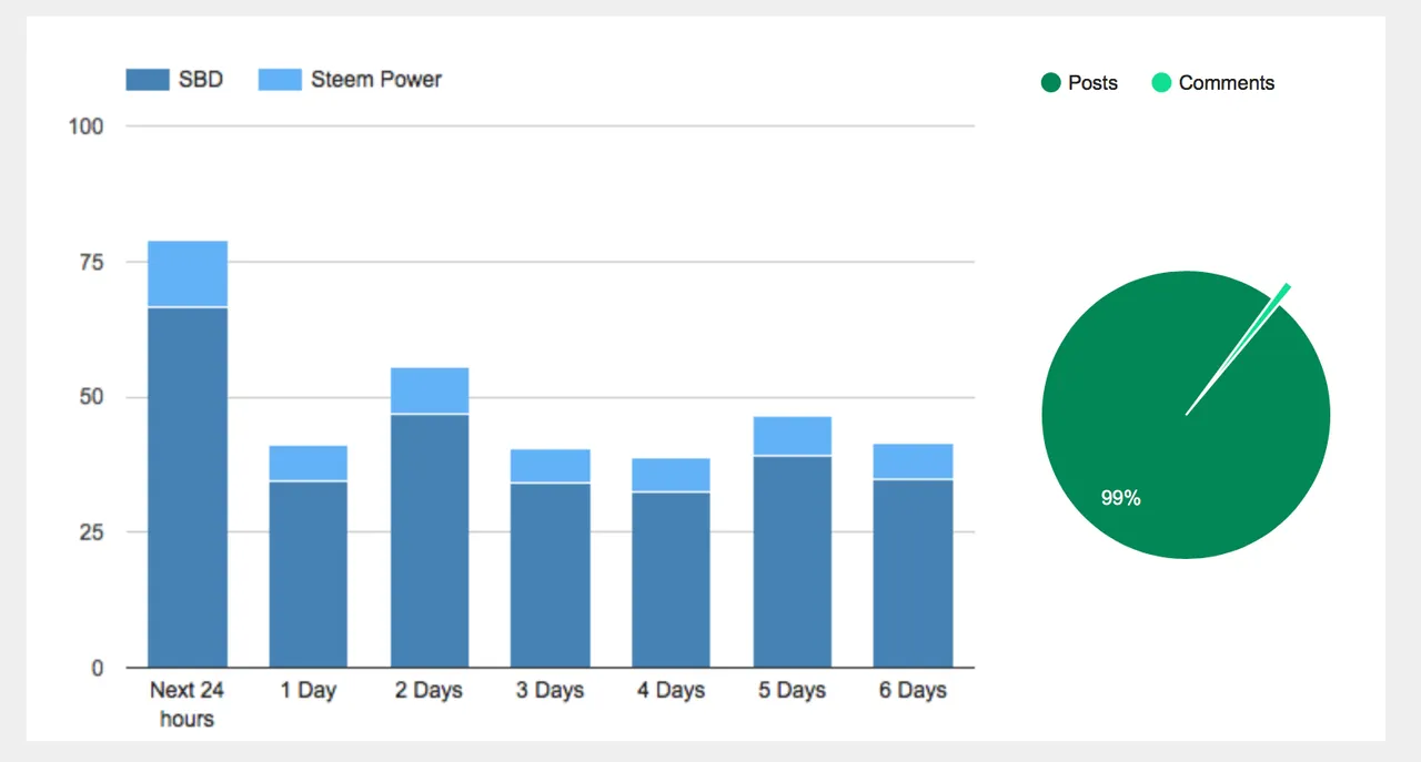
Wanna know when you're getting paid?
|
I know the feeling. That's why I created steem.supply, an easy to use and accurate tool for calculating your Steemit rewards |