Among the legends that surround Malaysia like stars in sky since the old times, the legend of Mahsuri and her curse on the land of Langkawi that spanned for centuries is probably one of the more remembered ones. Mahsuri was a victim of injustice and false accusation, prosecuted to death without her being able to defend her innocence. Her last words was;
"Oh Lord, the Almighy the All-Seeing, I accept this death if it is indeed the truth, but if I am innocent, I forbid my blood to reach this Earth, and I curse the land of Langkawi to be unquiet and barren for the next seven generations!"
You can read the rest of the story here, the story is in Malay but could easily translated.
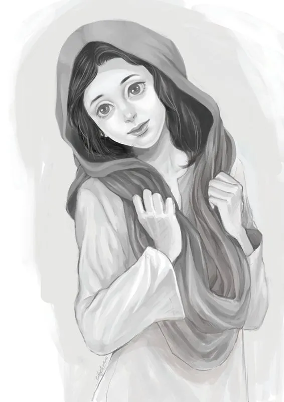
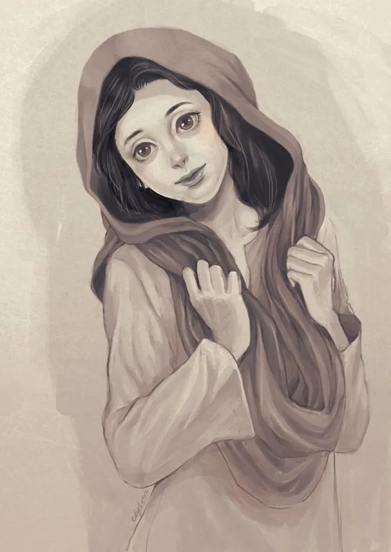
Grayscale: This is one of the more important illustration I've done, I remember I tried to emulate coloring style from a matte environment artist that inspired me during that time (I think it's Nerdiesid?, a local concept artist). In my personal opinion, this method could be very effective for some time-consuming artwork. Instead of starting the painting process using colors like usual, I paint everything in grayscale. It is good since I could focus on the details without letting myself to worry about colors yet.
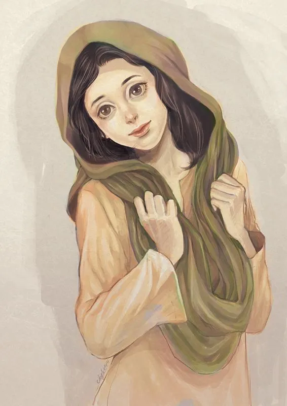
Color: I created a new layer in Photoshop and set the Blending Mode to Color mode. It is somewhat similar to Overlay mode but not quite. During this stage I experimented with colors on the grayscale painting. This is what the layer look like when it is set to Normal mode.
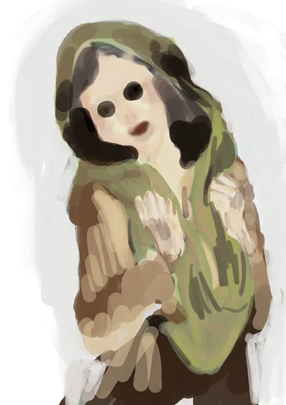
Mood Enhancer: This is what the painting will look like without the Color layer (the step above), but enhanced with a layer of Gradient Map (Blue, Red, Yellow). My usual opacity setting for this step usually around 4%~21% depending on the artwork. For this artwork I set the opacity of the Gradient Map to 14%.
Note: After the painting look more or less 'complete', I usually do extensive corrective process where I created tons of layers to correct and enhance the image. I don't want to be too preoccupied with 'perfection' from the get-go, it will only make me feel frustrated when the result don't match up with the time and effort put into the artwork. If the end result doesn't match the visual I had in mind or the standard I craved for, I leave it alone and proceed to another new beginning. I have this habit of if I kind of like the result, I will tend it to completion eventually, no matter how long it will take. Like this artwork, it took me 4 years to get back to where I left off (in anger) and finish it off for good.