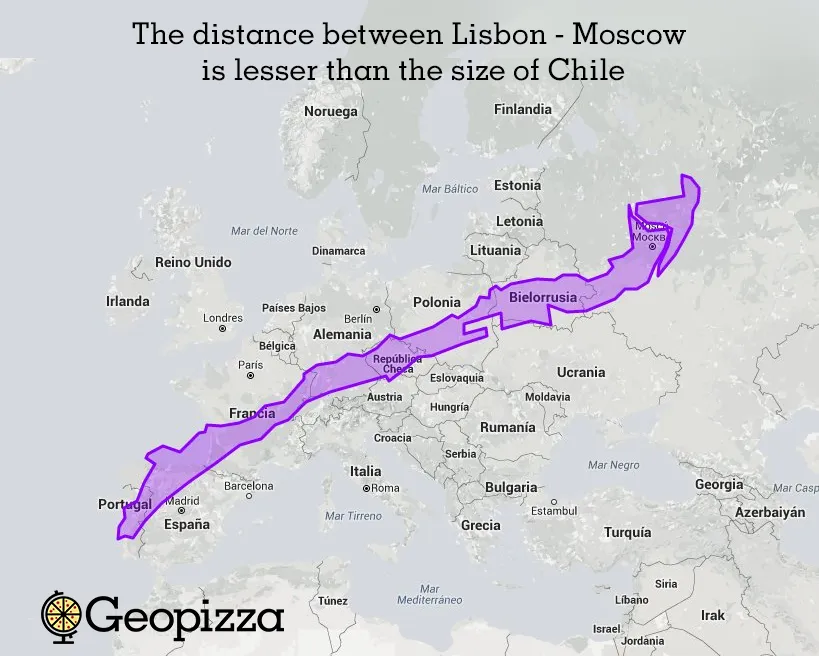
It may not look so obvious, but some countries are way bigger then they actually look like!
Some map projections like Mercator - which its used for Google Maps - distort the size of the globe, making look like the countries on the north are bigger then usual, and the countries close to the equator line, seems very tiny compared to the ones close to the North Pole.
A good example of this distortion is Greenland, which in Mercator projection looks like the size of Africa.
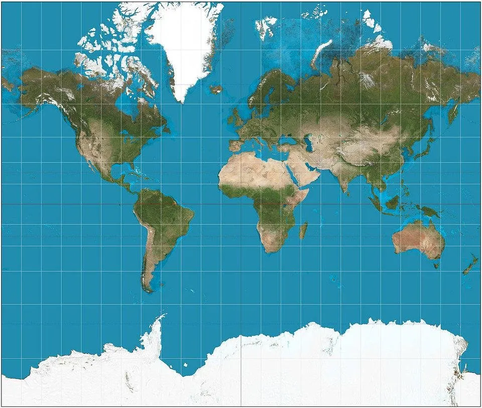
But in reality, Greenland is much smaller!
You can confirm this looking other projections, like the Gall-Peters projection.
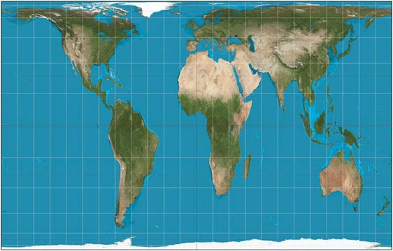
But of course, every map has it flawns, the Gall-Peters doesn't enlarge areas as much as the Mercator projection, but certain places appear stretched, such as near the Equator.
The Winkel Tripel Projection it's closer to reality.
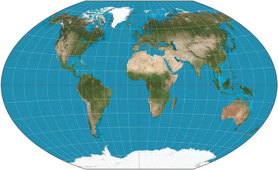
But even the Winkel Tripel projection has distortion in the close to the North and South Pole - it's just lesser then the Mercator.
This image was made using the interactive site https://thetruesize.com/ that makes possible to see how the Mercator Projection distort countries in real time!
Source of the projections: Wikipedia