At the beginning of this project I didn't really know anything about @sndbox.
As a practice, whenever I do any sort of custom work for people I like to get to know them a bit better so I can tap in to their energy and do my best to fit the brief.
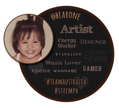
I scrolled down their page and found their Introduce Yourself post and noticed some similarities in our vision at SteemPh.
Instantly I was inspired - especially by the idea of having a physical space with dedicated team there to recruit and support. Can we please be your partners in Asia? 💕
Further mouse action landed me on one of the best explanation of Steemit I've ever read.
Ok! I'm in! I like these guys. Win or not I'll be following their progress and cheering them on.
Without further ado, here are my submissions for the
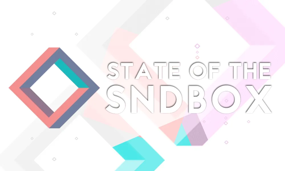
⭐️ State of the Sndbox Monthly Thumbnail Competition ⭐️
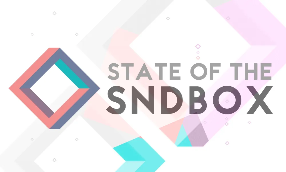
This is the first draft. I wanted simple but didn't want to go too simple. It makes it easy when you love the colours you're working with. I wanted to go with the slight grey in the background to make the colours pop.
The big coloured boxes on this design represented a newbie coming into Steemit. As they learned something new their colour changed, until they morphed into the beautiful complex logo.
I should also mention the small boxes represent Steemians new and old wondering around and eventually finding each other.
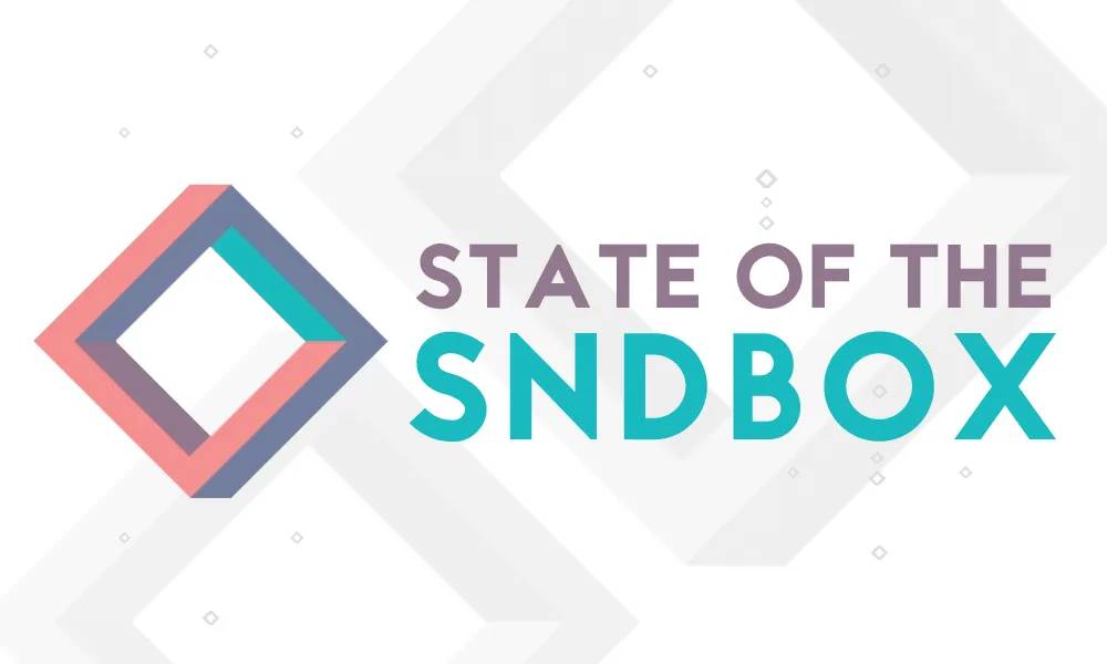
My final submission feels like its anticipating greatness and hidden surprises within this project. Bright spots of colour - I love colours!
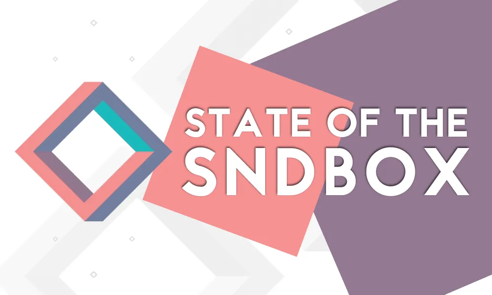
Ok I lied. I was about to hit post when I felt drawn to do 1 more variation. I like this one best I think.
Which one do you like best?