We all perceive the globe we call home slightly different. For many of us, we see an image of a spinning globe. We can give thanks to the classroom globes, called terrestrial globes, for this. But classrooms often teach another perception of the earth, a two-dimensional image of the globe fanned out, called the Mercator projection. But did you know that these images both are problematic? That’s right. Our perception of our very own home isn’t exactly correct.
The Big Debate
Some of the first big arguments about our perception of the earth persist today. Many ponder the question still of whether the earth is round or flat, and this has been debated since the 3rd century BC. Many methods have been attempted to try to prove the solution, including circumnavigators who travelled around the earth on grand expeditions in an attempt to settle the debate and discover the truth about our earth.
These expeditions seemed like the nail in the coffin on the flat vs. round debate, but they weren’t. Not fully, anyway. Some still debated. Then, we put man on the moon and saw through his eyes what our home planet looked like, detailed by curved edges all the way around. Our earth from the moon was clearly spherical, but it still didn’t quell the question of our perception. When we stand and look, our surroundings are flat. When we look out at a horizon, we don’t perceive the same curve that we see in images from the moon. Even understand the United States’ geographic relationship to another country aside from those in the Americas becomes complicated. We see travel much like we see in a game such as Super Mario, where we travel laterally to reach our destination and rescue the princess from the castle.
Mercator’s Map
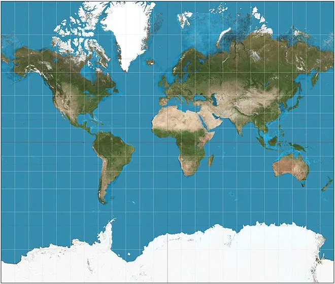
Gerardus Mercator did the work for us in 1569 by using mathematics to derive a two-dimensional projection of a cylindrical object, our earth, to understand the distances between places as a straight-line course. His map put Alaska as the far left and Russia and the Bering Sea as the far-right axis, and it’s the one we’re most familiar with two-dimensionally.
Mercator’s work was only the beginning. After he created his map, navigators and cartographers alike continued to add to the map to help create a stronger perception for others. They added things like the equator, which isn’t actually representative of anything physically and is an imaginary line that was created solely to help with our understanding of the earth. In fact, the equator isn’t even at the center of the earth on a two-dimensional map, but is so on a spherical map.
Markers for the North and South Poles were also added, and it drew a major con to Mercator’s method. Mercator’s flat projection map didn’t leave space for the poles to be marked, as they can only be marked on the spherical view. But these cartographers and navigators, understanding the importance of knowing the Northern direction for the purpose of navigation, still found a way to add markers for the poles on the flat map.
So, we came to adopt this further-developed Mercator’s map because it was the best we had. But there were problems with it that we wouldn’t fully realize until we got a grasp on the sizes of actual geographical lands.

Mercator's Projection
Big Mistakes
Mercator’s map is far off from the reality of the lands on our world. For example, North America appears to be larger than Africa. In reality, Africa is three times larger than North America. Africa is also much larger than Russia, but on the map Russia is clearly larger. The same is true for Greenland, a country 1/14th the size of Africa, but yet is a similar size to the entire continent on Mercator’s map. Africa is far larger than we perceive it to be because of the mistakes on Mercator’s map.
It would seem that the northern hemisphere is looked at through Mercator with a magnifying glass, and there are numerous examples aside from those already listed. The truth is, our perception of the earth is completely off, and it’s time for a new perception entirely.
In Defense of Mercator
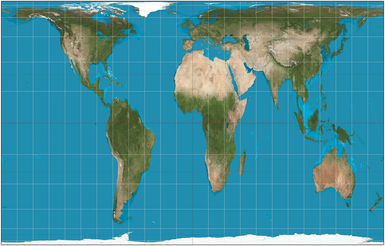
Mercator wasn’t a bad guy. He was working with the tools and information he had at the time, and led us to a pretty ground-breaking piece of cartography at the time. His major problem was his choices of what to distort. When you’re taking a sphere, and adapting it to a two-dimensional projection, you have to distort something. Mercator distorted the hemispheres to accommodate, while others choose to distort things like distances instead of country size. This results in a much different map, such as the one made by Galls-Peters.

Galls-Peters Projection
Gall-Peters is not the end of the problem, in fact, some argue that it’s a worse depiction. After all, what makes North, North in an infinite space, and why does the map have to be a rectangle. Still, we don’t have an accurate perception of the earth.
Who knows, we may never know.