Muy buenas a todos, personas de Hive. Vengo de vuelta de un enorme hiatus de mi actividad online, en donde por tontearías y escusas baratas como suele ser de costumbre, no escribí ningún post, y no es hasta mas recientemente que me estoy motivando a continuar con mi aventura aquí en Hive.
En esta bendita ocasión, mi redebut viene con una bonita ilustración que creo demuestra bastante bien el que tanto he progresado en este tiempo en el que no estuve muy activo.
Hello everyone, Hive people. I come back from a huge hiatus in my online activity, where due to nonsense and cheap excuses as usual, I did not write any posts, and it is not until more recently that I am motivating myself to continue with my adventure here on Hive.

On this blessed occasion, my redebut comes with a nice illustration that I think demonstrates quite well how much I have progressed in this time in which I was not very active.
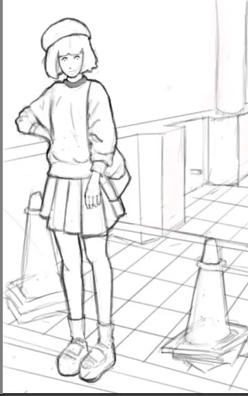
Aquí el boceto; Una chica algo linda en un paisaje urbano. Me hace recordar mucho a como eran los dibujos de un artista llamado Pantsu Ripper (No busquen los de ahora)
También, tal vez notaran que la intensidad del color del lineart cambia en algunos aspectos. Es algo deliberado, y es para llamar mas la atención de las personas que vayan a ver el dibujo. Mientras mas intensidad, mas llamativo. Lo mas intenso es a lo que yo quiero que las personas mas vayan a prestar su atencion.
Here the sketch; A rather cute girl in an urban landscape. It reminds me a lot of what the drawings of an artist called Pantsu Ripper were like (Don't look for the current ones)

Also, you may notice that the color intensity of the lineart changes in some aspects. It is something deliberate, and it is to draw more attention from the people who are going to see the drawing. The more intensity, the more striking. The most intense thing is what I want people to pay the most attention to.
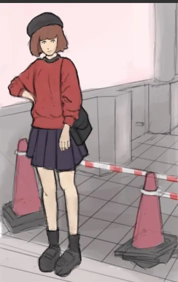
Ahora dejamos los colores base, y si se fijan, al igual que en el anterior, la chica tiene colores mas intensos que el fondo. Quiero que le prestes atencion a la chica mas que al fondo, y es por eso que tiene colores mas fuertes.
Now we leave the base colors, and if you notice, as in the previous one, the girl has more intense colors than the background. I want you to pay attention to the girl more than the background, and that's why it has stronger colors.
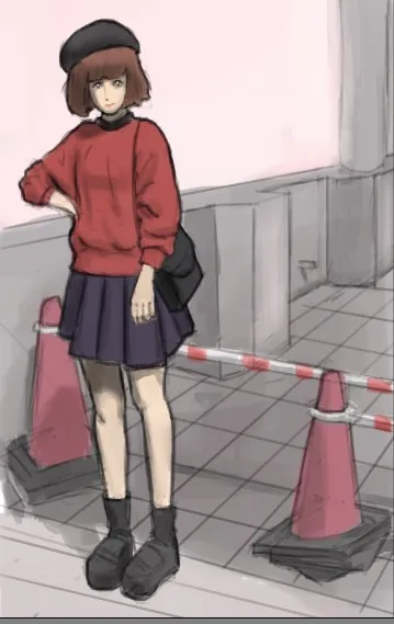
Ahora, dejamos las sombras. Reconozco que no soy el mejor en ello, pero poco a poco se va mejorando. Aunque probablemente la mayoria de las personas no podrian identificar los problemas a simple vista.
Now, we leave the shadows. I admit that I am not the best at it, but little by little it is improving. Although most people probably wouldn't be able to identify the problems with the naked eye.

Ahora añadimos algunas luces sutiles. Es un paso necesario, naturalmente.
Now we add some subtle lights. It is a necessary step, naturally.
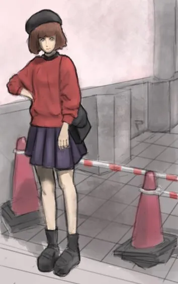
Para que el dibujo no se sienta demasiado plano, añado algunas texturas al fondo para que se logre transmitir mejor una sensacion de coherencia respecto al material que se busca imitar, que en este caso es el cemento y el concreto.
So that the drawing does not feel too flat, I add some textures to the background so that a sense of coherence can be better transmitted with respect to the material that is sought to be imitated, which in this case is cement and concrete.
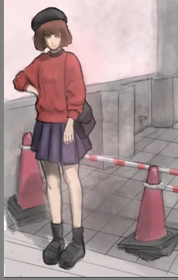
Ahora añadí algo luz gradiente para que exista algún tipo de variación con respecto a los colores planos. Son aburridos. Y este tipo de detalles ayudan a hacer que la ilustración se vea un poco mas viva. Hacer la comparación con el paso interior, añadiendo un detalle tan simple hace que la ilustración se vea mejor, siempre es gratificante.
Now I added some gradient light so that there is some kind of variation with respect to the flat colors. They are boring. And these types of details help make the illustration look a little more alive. Making the comparison with the interior passage, adding such a simple detail makes the illustration look better, it is always gratifying.
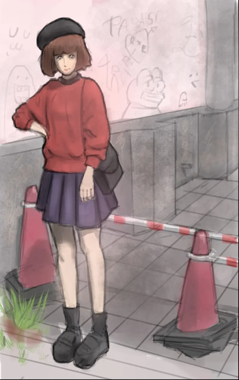
Y por ultimo, añadimos algunos detalles en las partes con espacio muerto en la ilustracion, y por dios que bien se ve. O mas bien, tiene cierto carisma.
El programa utilizado para ilustrar esta pieza es Krita. Muchas gracias por leer!
And finally, we added some details in the parts with dead space in the illustration, and by god it looks good. Or rather, he has a certain charisma.

The program used to illustrate this piece is Krita. Thanks so much for reading!