Practicing my values and lighting. I'm not really into using colors beyond black/white/gray because I prefer monotone styles but I will confront the demon of called coloring some other time. Below is just a sample of the different coloring styles I used. I wouldn't say the Now and Before are an improvement outright, it's more like me picking a different manner of coloring and this affects the visual style.
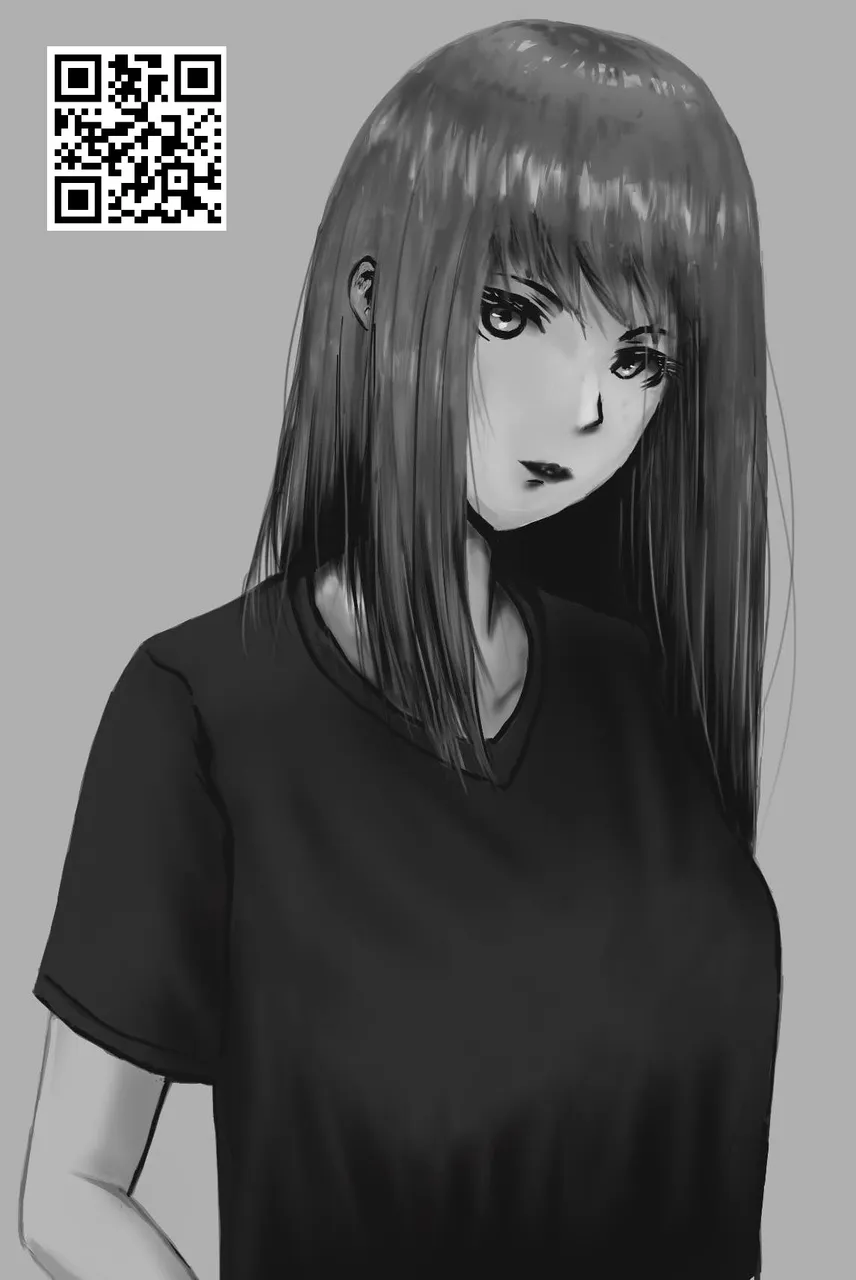
When it comes to style, I initially wanted to do a manga coloring with plan colors and lack of airbrush use but due to being more ambitious, I ended up wanting to learn semi-realism and mixed up what I learned from doing the two. It's not really that obvious but my art styles feels like having an identity crises of wanting to keep it simple but my itch to make it look better takes the step further and eventually deviating from manga to manhwa coloring style.
Well now I've fulfilled my word count quota just to make it look like I made some effort under this post, I'll end it here.
| Now | Before |
|---|---|
| 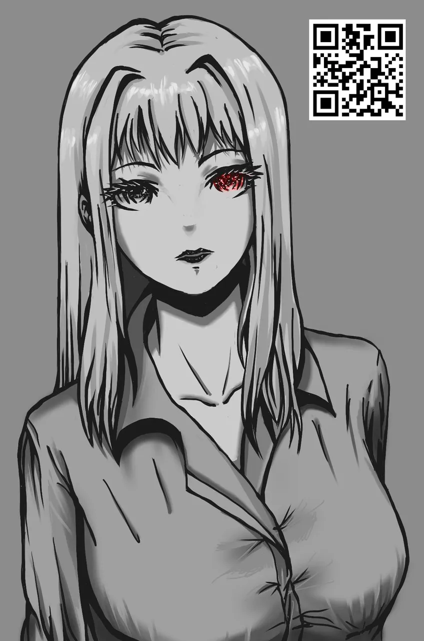 |
The QR code I use as a watermark leads to my @artofadamada account on Hive as a landing page whenever I share my work across other social media. I doubt I'd get a significant reach as I am now but if I can get more people curious about where that QR code leads, hopefully it converts to more sign ups on the platform.
My other social media pages: DeviantArt, Instagram, X