Today's new Wikileaks are fascinating because they expose, again, how 'intelligence' agencies cannot make good art.
Nobody who works for these shadowy agencies has any idea how to design anything. I want to know why.
Let's begin by deconstructing, for example, the logo for the Information Operations Centre. Featured in today's leaks:

Zeus. There's so much going on here, I'm not sure where to begin.
So, there's a old-fashioned door key. Underneath that, there's an embarrassed eagle on top of a warped-looking world filled with ones and zeros. Then there's some kind of red lighting bolt running through the eagle's neck.
What the fuck does this mean?
Why is the eagle so embarrassed to be there? The 'artist' seems to be trying to communicate something complex. It would be easy to dismiss this as random clip-art, but I feel there is more to it.
The words 'stealth', 'knowledge', and 'innovation' are obviously satirical. And the eagle knows it. Look at his eyes. He cannot believe he is there.
It reminds me of the 39 Renaissance Babies Who Cannot Believe meme. This eagle Cannot Believe either.
The CIA's logos restore my faith in the world's artists. Clearly all of them, every single last one of them, no matter how poor, refuses to work for the CIA.
Thank you, artists.
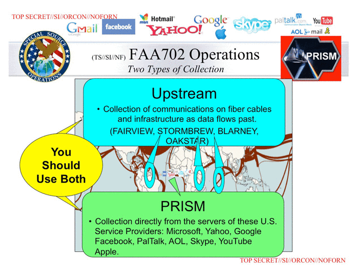
I'd like to leave you with this slide, from the PRISM leak. This is an example of the kind of graphic design work going on at the NSA. I don't want to say anything about this one because it speaks (screams?) for itself: