Congratulations to everyone who entered the first Steem Photo Awards (spa)!
The theme for July 2017 was PORTRAIT.
Thank you to everyone who entered the #steemphotoawards correctly. There were a few enteries that didn't follow the entry criteria, but hopefully they follow the rules in this month's Steem Photo Awards (August), which will be announced shortly.
Congratulations again to the winners and be sure to follow them to see more of their fantastic photos!

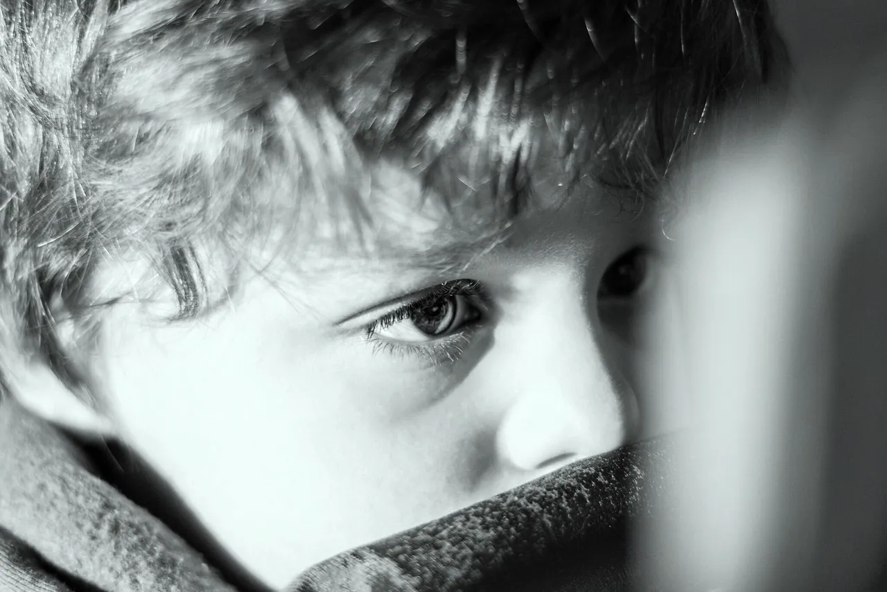
Image by @dijana969
1ST PLACE PRIZE WON: 50 SBD
Judges notes
The composition of the child's eye was well aligned with the centre of the image, both vertically and diagonally. The use of a shallow depth of field at f1.8, blurred the ipad in the foreground evoking a sense of depth, reflecting the stare of the child looking at the endless screen of possibility.
Finally, contrasting shadows and highlights were perfectly exposed, allowing for a well balanced skin tone. The lack of color was refreshing as my eye wasn't distracted by stray colors. Overall, this is an excellent capture of a child absorbed in the moment. Congratulations to @dijana969 for capturing a great portrait.

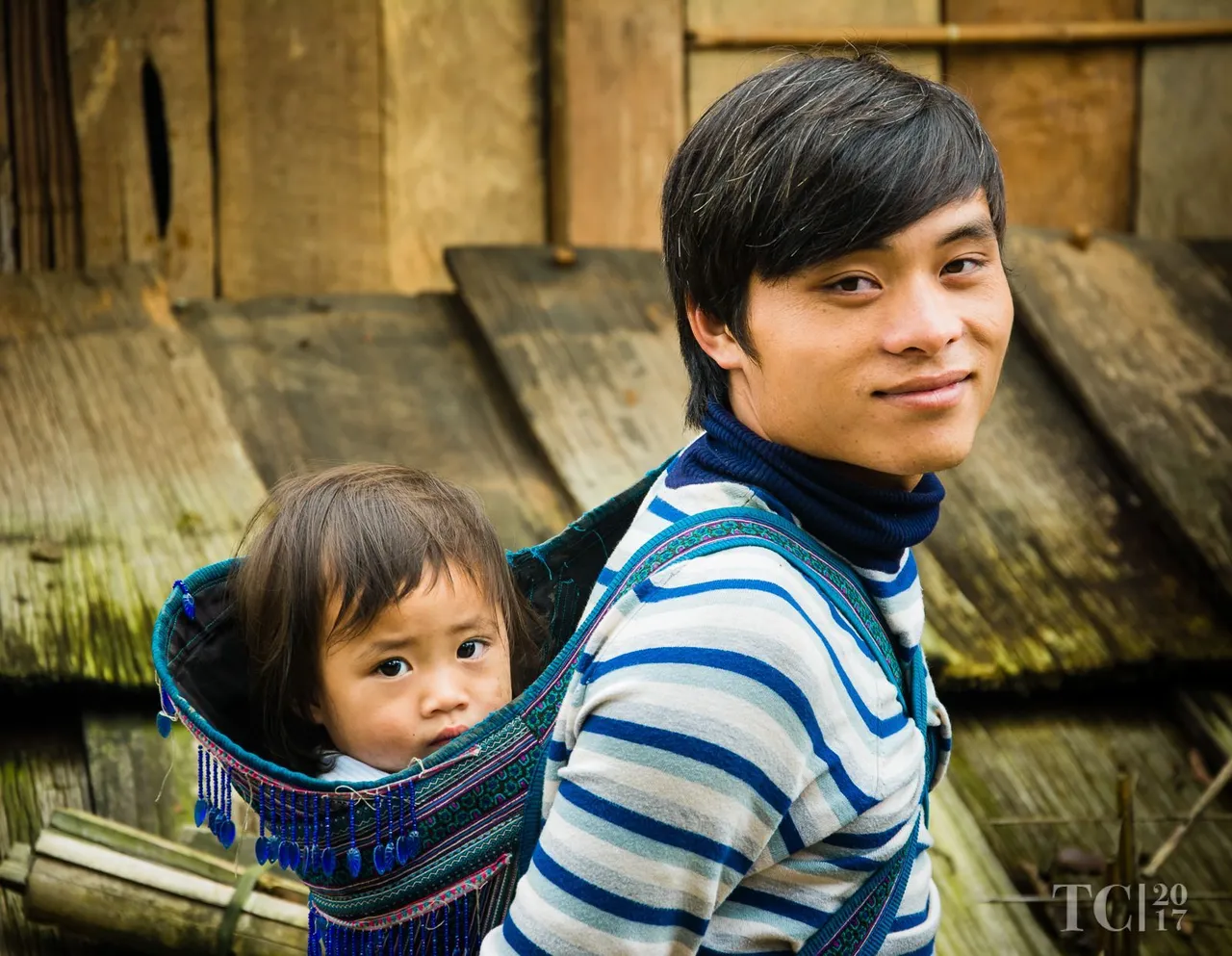
Image by @faceofbear
2ND PLACE PRIZE WON: 25 SBD
Judges notes
@faceofbear the use of overcast light was well used here. There are no harsh shadows on either face and the eye contact between the photographer and the people is spot on. The warmth of the white balance creates a freshness and healthy glow, making the people 'pop' out of the frame, a soft vignette also contributes to this.


Image by @mrwanderlust
3RD PLACE PRIZE WON: 15 SBD
Judges notes
@mrwanderlust this is a great image. I liked the use of an aperture of f5.6 as it led to a beautiful background blur, it seems as though there was plenty of space behind the subjects which helped seperate the people from the background. The striking color of the wardrobe against a cool color temperature in background proved to be a winning formula.
There were a few things that let this image down though. The person in the background is quite distracting from the two males in the foreground. I would have like to see a vertical crop of the individual on the right hand side, which would have contributed to more of an interesting, less distracting image. The choice of metering mode really contributed to a well exposed image which is one of the reasons why this image has placed so high. Great job.


Image by @faceofbear
4TH PLACE PRIZE WON: 5 SBD
Judges notes
@faceofbear I thoroughly enjoyed the sense of fun portrayed in this photo. The choice of a wide angled lens at a shallow depth of field made for an interesting perspective that captured the joyous emotion in the scene. The color captured in the reflection proved to only add to the strength of this image.
Even though the composition is good, I would have liked to have seen more of the face to include the chin. I would have liked to have seen this image taken from a different nearby location. For instance, if the girl would have been facing more of the yellow wall in the background (by being on the otherside of the rail), it would have contributed to a higher placing photo. By changing the location you would have ended up with less grey in the reflection, contributing to a more vibrant image.

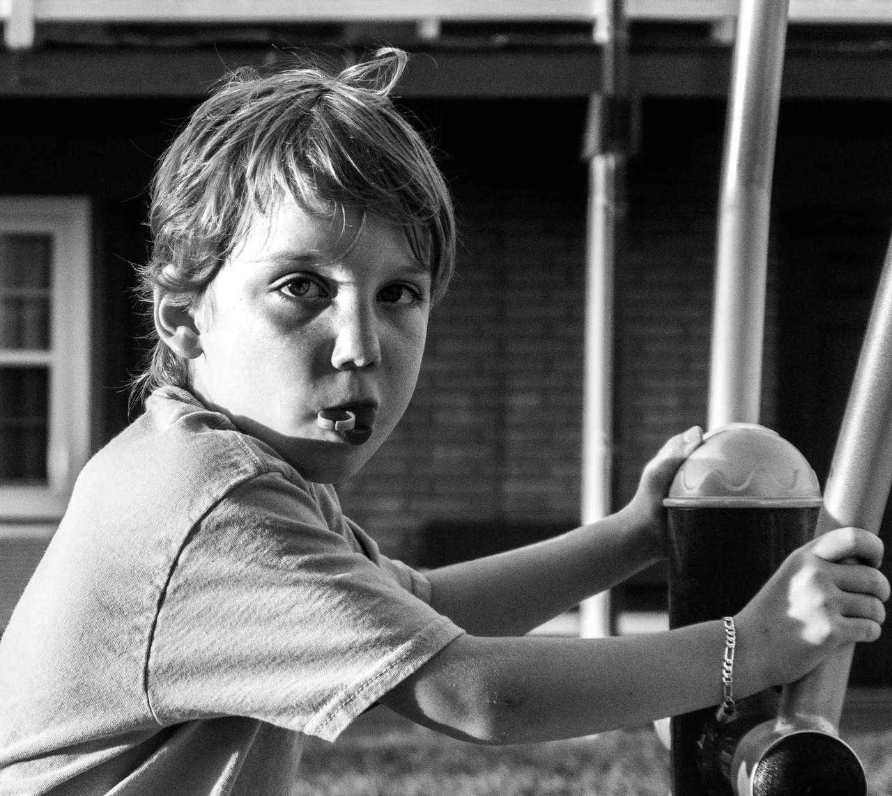
Image by @chrissymchavez
HIGHLY COMMENDED PRIZE WON: 5 SBD
Judges notes
@chrissymchavez, I feel you captured the cheekiness of the child in this photo. Black and white was a good choice as it enabled you to remove the distracting color of the bricks in the background. The position of the eyes was well balanced with the rest of the scene and proved to be a good reflection of composition.
I would have liked to have seen a slight edit to the child's face by lifting the shadow areas to reveal more of the right eye. Also his right hand needed some extra space between it and the edge of the frame. Overall though, you have captured a child that I'm sure has a lot of energy, making it a good photo.

@myday is a qualified imaging educator and professional photographer. Having photographed many genres, the feedback provided on each winning image is meant to be constructive and should not be taken personally.