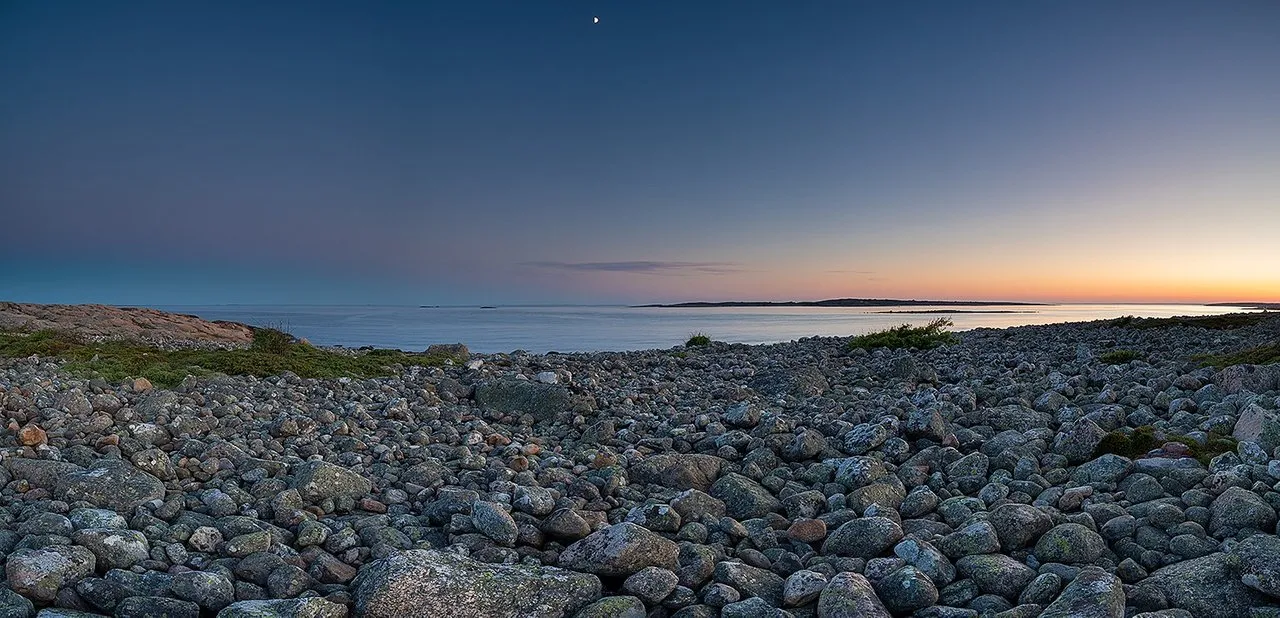
One of my favorite artists (Iron & wine) sings in one of his songs that "no one looks away when the sun goes down", but if you do; you can see the night creeping in from the left. (South)
When editing this image in Lightroom I became aware of something I've not thought of before, most of the top sliders and the curves tool actually do the same things with you image. If you first ramp up the contrast, then lower the highlight and shadow's they will actually contradict each other. If you on top of that go for an "S-curve" in the curve tool you will actually just introduce a third way of adding contrast.
Now; only one of them is actually necessary as they all do precisely the same thing, add or lower contrast.
So for this image I have only pushed the contrast up a bit and concentrated on the colors.
The result is a "clearer image"
What are your thoughts to this?
Cheers, Erlend
 Steepshot