Last week I left off the post intimating that there might not be more to show as far as new concept art is concerned with my ongoing MISSES comic book/graphic novel series. And while that's still true, after looking through more folders I decided there was at least enough for two more weeks worth of posts, including this one.
 Click On Image
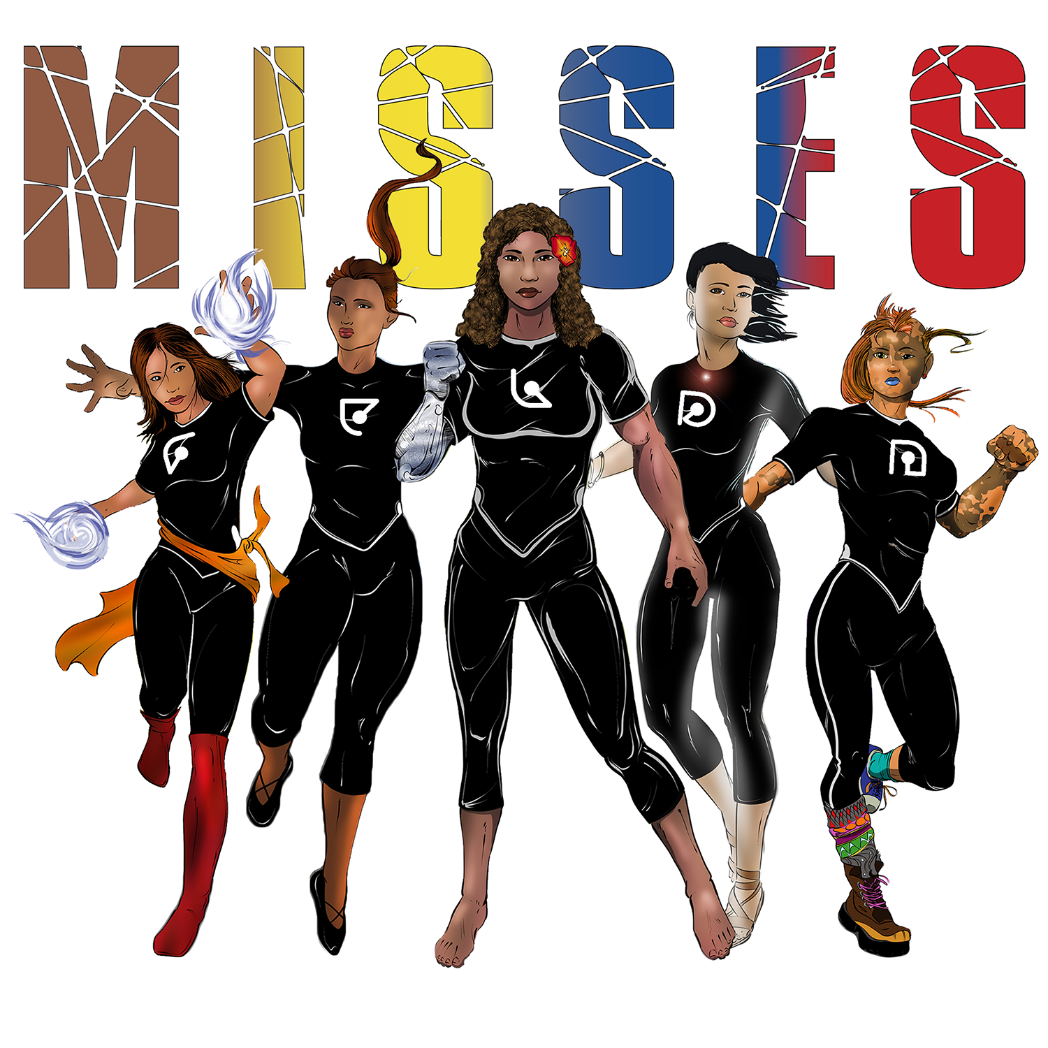
From left to right: MISS Fire, MISS Time, MISS Lead, MISS Place and MISS Match.
Meet Team MISS
Shortly after all initial five characters were finished, I decided I wanted to have them all together in one image as Team MISS. They will fight and function as a group as the stories unfold, and so I wanted to see what they would like together.
That meant cutting each character our of their own image and creating a new one. It also meant dealing with backgrounds in each character image which then caused me to rue asking for them in the first place, because it seemed like more work to get rid of the different colors and styles of background than had they been only white.
Even though it took longer than I wanted to spend on the project, I think it turned out fairly well.
Obviously, if someone were going about intentionally creating such an image, they would draw all of the characters in concert and in consideration of one another. Even if they did draw them on separate layers or something, the idea would be for them to compliment one another, while each one stands out.
In the case of the image I created, each character was a standalone image, so their posing, running, standing, falling, etc., is all separate. Even so, despite the fact that there was not a conscious intent to put them together in one, I think the image works relatively well. If you don't stare at it too long, that is.
Okay, Stare At It
One of things I notice right away is that the uniforms are not, well, uniform. To of the characters don't have the white outline around the collar, and then the little blip at the hips are not consistent. The intent there is that the top overlapping the pants form a 'M', which you can sort of see on MISS Match at the far right.
Another thing is, MISS Place, second in on the left, looks the most "out of place" with her hand extended beyond MISS Fire. No one would run like that, but she doesn't look like she's standing either, so anyway. As I said, it looks cool until you stare at it too long.
A Few More Things
It's probably not all that glamorous to talk about logos/titles and uniform symbols, but I'm going to do it anyway, because there was some thought put into both. In other words, there is more to it than just me liking the way things turned out.
Logo/Title
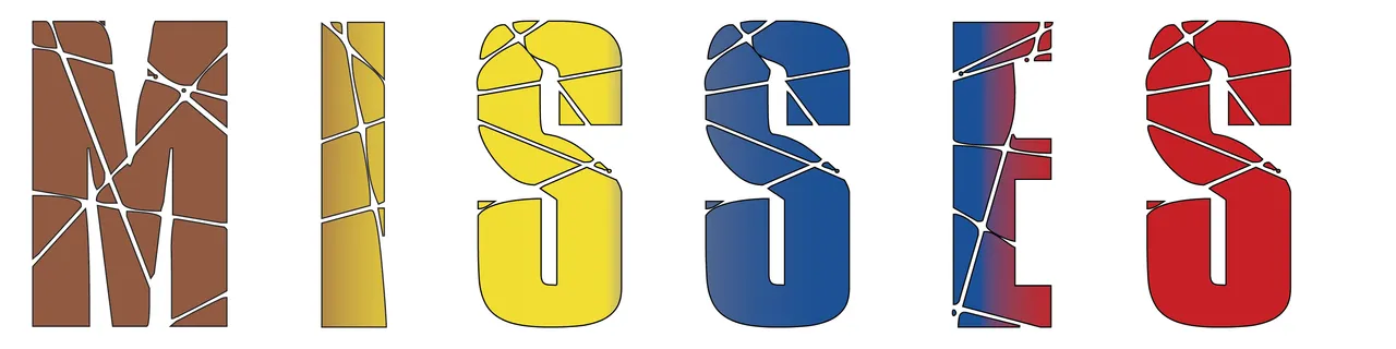
I haven't really talked about the MISSES logo, or title. If you've paid attention to it at all, hopefully you've noticed a couple of things—the more obvious perhaps being the fact that the letters are all different colors, but flowing in a spectrum from brown to yellow to blue to red. That's intentional.
MISS has different meetings. There's the term Miss, as in a young woman, and then there's the acronyms I've been employing. MISS, as in the Millennial Institute for Social Sciences, and MISS, as in the motto or mantra—modesty, intelligence, spirituality, strength—that the young women and their mentors subscribe to. MISSES also has double meaning—the plural of Miss, so the girls as a group—and the extended acronym—the idea that modesty, intelligence, spirituality and strength elevate society.
The colors have been stretched over all six letters in the title, but they mostly correspond to the MISS and the concepts they represent. When I went looking for colors to go with modesty, intelligence, spirituality and strength, brown, yellow, blue and red were some of the colors that supposedly matched up with those concepts (there were some variations between sources).
If you'll remember back to MISS Lead, I believe it was there that one of the sketches of her had an M on the uniform. The M was formed out of four different pieces, meant to represent each aspect of a MISS, with the level of mastery of each aspect indicated in each piece of the M. I dumped the idea after thinking about how it probably wouldn't be something that each girl might want others to know, especially enemies in the middle of a battle. So, the Ms were removed, but the concept of MISS levels remains, and is now reflected in the title.
The other thing about the title/logo is that there are fractures in the letters. Those, too, are intentional. I'm not going to reveal why they are there, but it probably wouldn't take a lot of guessing to determine what those fractures could mean. And just like MISSES has two meanings, so does how the fractures are applied.
Uniform Symbols
These still may be subject to change, but I found a font called Atomic which is supposedly okay for commercial use. I wanted an alien looking way of writing that could be used as symbols on their uniforms to give them a little bit more variety and self-identity. It would be like the numbers athletes wear on their team uniform. The colors and design are similar, but their numbers are different. It helps to identify them more readily.
That's what I was going for here. The symbols weren't a part of the original design (since I was thinking just Ms rather than individual letters), so I had to add them after the fact. I decided not to do it to each individual character's image, but I thought it might be interesting to see when they were placed together.
That's All For Now
I hope you liked seeing Team MISS together in one. If nothing else, I think it helps me visualize them better.
Next week, as embarrassing at it might be for me, I'm going to roll out concept art I've drawn as I've seen the characters. I think it will be interesting to see how I see them (through my limited art abilities) versus what I've been able to get from artists.
Until then...
Enjoy!
If you're interested in seeing all of the individual character reveals so far, you can follow these links: MISS Inform, MISS Able, MISS Peak, MISS Fire, MISS Time, MISS Place, MISS Match, MISS Lead, Wrong, and MISS Ion, or you could look through the MISSES tag here.