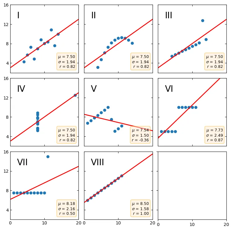
TL'DR:Anscombe's quartet is a group of datasets (x, y) that have the same mean, standard deviation, and regression line, but which are qualitatively different. It is often used to illustrate the importance of looking at a set of data graphically and not only relying on basic statistic properties.
Do you know Anscombe's Quartet?
The (x, y) Dataset
x = [10, 8, 13, 9, 11, 14, 6, 4, 12, 7, 5]
y1 = [8.04, 6.95, 7.58, 8.81, 8.33, 9.96, 7.24, 4.26, 10.84, 4.82, 5.68]
y2 = [9.14, 8.14, 8.74, 8.77, 9.26, 8.10, 6.13, 3.10, 9.13, 7.26, 4.74]
y3 = [7.46, 6.77, 12.74, 7.11, 7.81, 8.84, 6.08, 5.39, 8.15, 6.42, 5.73]
x4 = [8, 8, 8, 8, 8, 8, 8, 19, 8, 8, 8]
y4 = [6.58, 5.76, 7.71, 8.84, 8.47, 7.04, 5.25, 12.50, 5.56, 7.91, 6.89]

datasets = {
    'I': (x, y1),
    'II': (x, y2),
    'III': (x, y3),
    'IV': (x4, y4)
}
The Visualized Chart
Sometimes it's not all about the quantitative...
Anscombe's quartet is an interesting dataset in which many data points align resulting in a positive correlation, but when viewed as data plotted distributions, it shows drastically different scatter plots. It is an interesting chart within the field of data science; I view it as a mathematical exercise of being cheeky, humorous with its ability to hide how wide of a divergence between qualitative data vs quantitative data. Good shit, Francis Anscombe, good shit.
Viewing the raw numeric data by itsself, you won't find any statistical deviance as the comparison to x <-> y1:3 and x4 <-> y4 shows the same mean of 7.5, the same deviation of 1.94 with a regression of 0.82 positive. So really, comparing datasets of x on a purely number crunching quantitative numeric plot seems almost boring.
...but you gotta drip in that qualitative bruh.
When you plot the distribution of that badboy out though, it looks kinda funny. Like "Oh I see what you did there Francis you sneaky lil tart." Looking at x4 and seeing that sly little 19 dropped in there to get that regression line spiking positive. Little things like that make this quartet way funner to look at using graphs. My dumb human-monkey brains like them visuals way more than the sorta largeish datasets of numbers.
I found the dataset unique enough to create a blog about it anyways. Data Science sure has me diving around some interesting charts. If you want a couple cool websites to look at for this kinda jazz, check out matplotlib gallery or check out the Data Visualization Catalog for some cool charts.
But I'm not entirely quite done with this blog yet...
I can't do a blog without cheese-dicking some AI shit into it
...you know me...
I pasted the matplotlib code on Google Collab for Anscombe's Quartet here for anyone to simply run. Along with it, I decided to test whether a few different conventional AI's could replicate Anscombe's Quartet with a few of their own datasets. The results were quite hilarious. The AI will assure me it understands the task at hand, creating datasets which share mean, deviation and regression, but for the life of them, cant seem to complete it. I tested it with ChatGPT, along with Claude.ai and here are some results (also you can find these on the Google Collab posted above)
So it appears I have bested the LLMs again. Haha!
- Me : 1
- simple_linear_regression : 0
I even told it to calculate it first, recalculate it, and then give me the codebase to run cuz I'm a lazyass, and it still messed up.