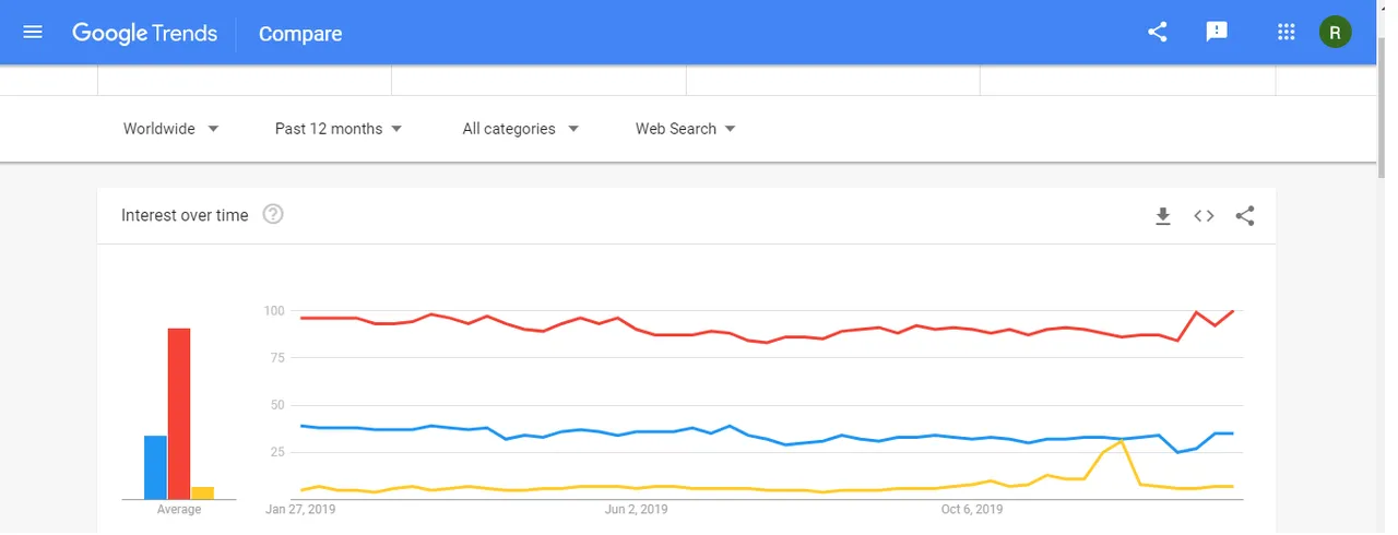
Does this google trends comparison tell us the whole story? the figure compares IEOs (yellow), ICOs (blue) and STOs (red) and seems to suggest that STOs are on the rise in terms of interest. But reality is not that simple, of course. Feel free to check out my recent blog post about this topic: https://www.roeesarel.com/post/the-king-is-dead-long-live-the-king-on-ieos-stos-and-icos.
What do you think?