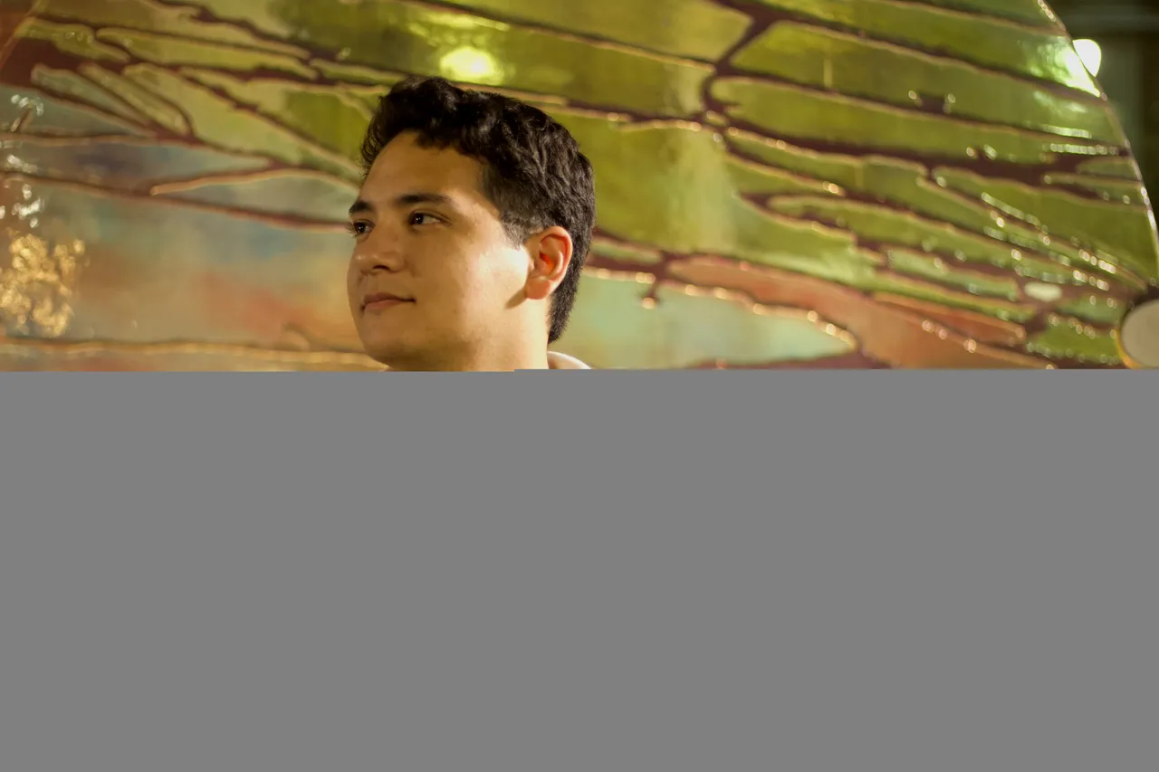
Hello all! As those of you who have read my introduction post know, one of my hobbies is photography. As a student it is not something I can dedicate a lot of time too, but I still find great enjoyment in attempting to take good pictures. Today I'd like to show you a short collection I simply call "The Nightly Faces of OSU." I am a night owl by nature, and several of my friends are too, so we often go walking around campus at night and just talk and hang out. Occasionally I'll bring my camera, and I'll snap a couple of pics of anybody who's there. All photos presented are my own. I use a simple, free, online editor to mess with the colors a bit, and I can often go overboard with the settings. If anyone has tips on ways I can improve my picture-taking and picture-editing ability, I would greatly appreciate it.
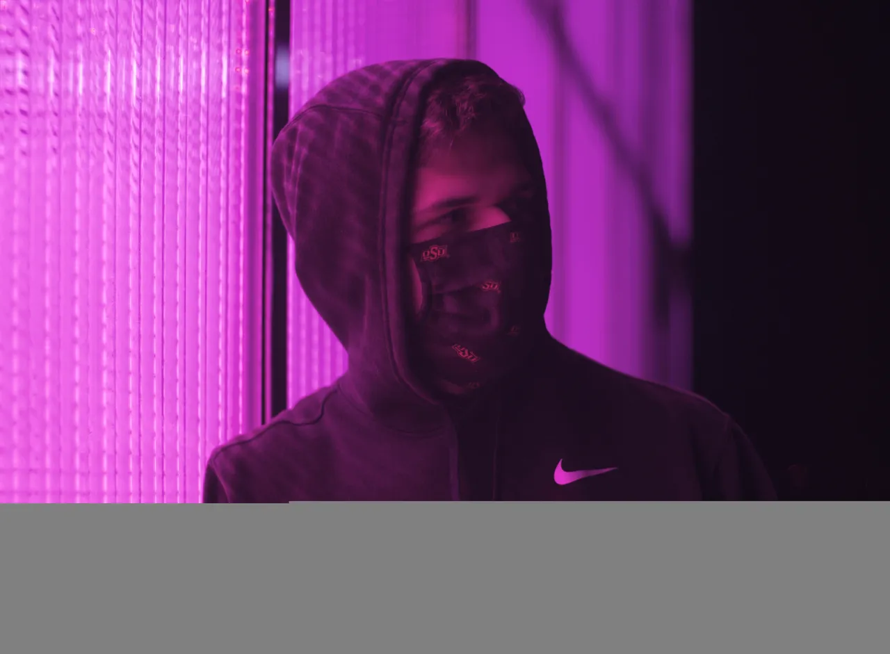
^ One of my favorite things about visual mediums is the way color can be used. I have always loved colors and color theory. Even if something is compositionally "bad," I can always appreciate good colors. I love to try and find cool colors that are "naturally occuring" (meaning I don't have to use any of my own lighting to get a better result), and a great example of that is the first picture. There is a greenhouse on campus that often lights up with the vibrant purple that you see.
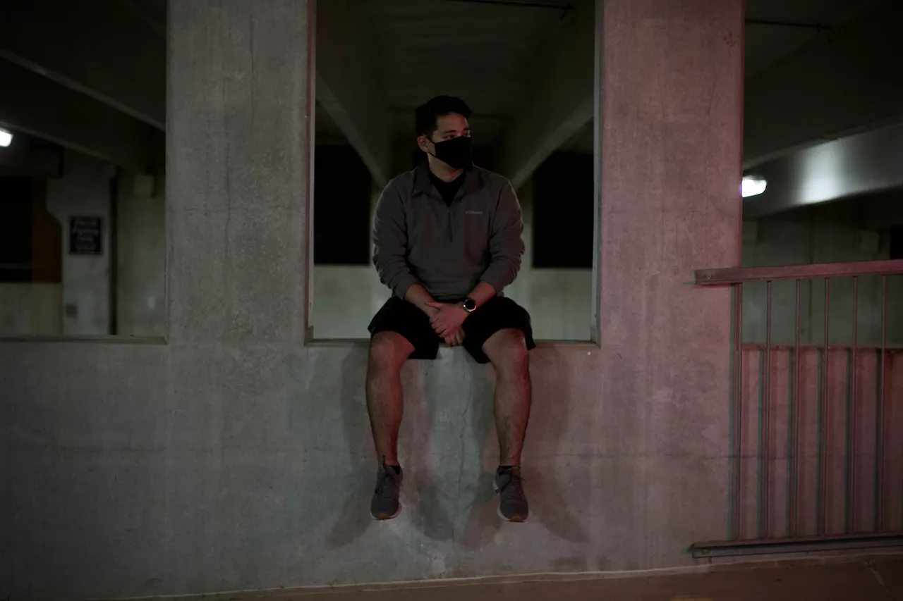
^ This one did require use of a small light because I needed to that red glow for some contrast. This pic was taken in one of the parking garages we have here on campus. I love this photo because I really like the subtle red and green tones, as well as the deep blacks in the mask, shorts, and windows.
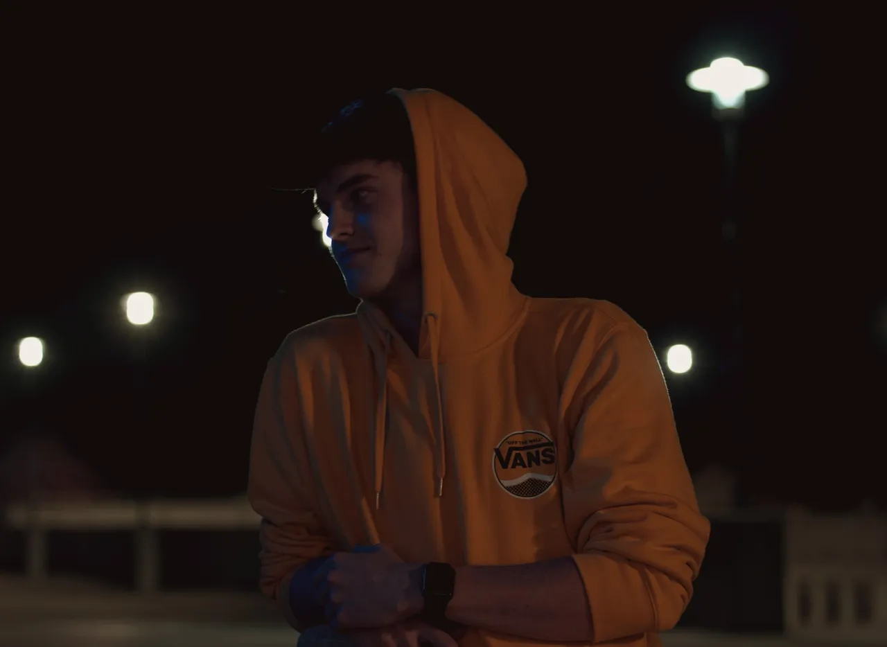
^ Personally, I am divided on this one. I edited it to the best of my ability, but the colors still look weird. The primary lighting source is a large street light which gives it that sickly yellow look. Additionally, the color from the background is hard to make work. But I think it's a good picture of my buddy, so I keep it around.
^ This was another one that was hard to edit, and there were a couple reasons for that. First off, this jacket is much less orange in real life, and the yellow did not work very well with the blue light on his face. Secondly, the light on his face creates weirdly-shaped highlights that made balancing the highlights and shadows difficult. But I think the end product turned out relatively well.
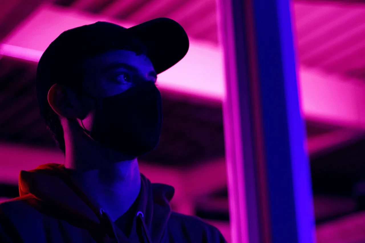
^ Now this is an example of where I went way too overboard, but my untrained eye still likes it. These are nowhere near the original colors from the RAW file, but I pushed them so far because I liked the contrast of the bluish-purple and the pinkish-red.
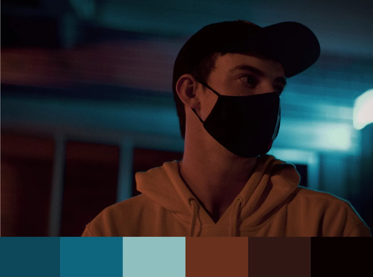
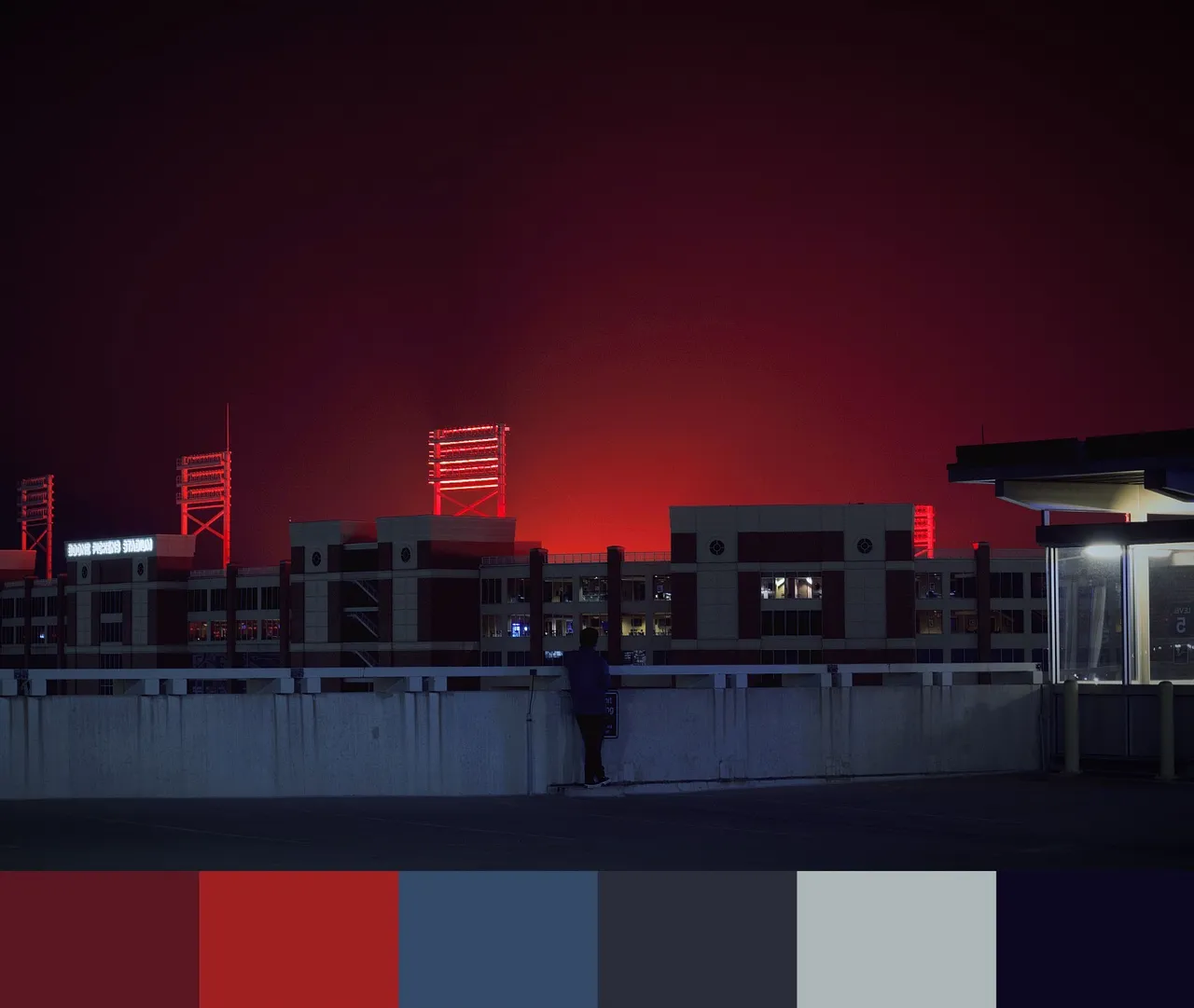
^ These last two photos were also included in my intro post, but I put them here as well because I like them quite a bit, and I have attached the color palettes to them. In the first one you can see a less exaggerated (but still exaggerated) version of the way the lights looked in the preceding photo. The last one is of our football stadium before a game day. We light all the lights up in the stadium to a bright orange, and its glow spreads out into the sky. I edited it so it looked more like a red, but I think it's still a really cool naturally-occuring effect.