Today I decided to do something different. Usually I'm posting artworks from the same author in one post as exhibitions are mostly organized that way. Only in big museums you see artworks exhibited from multiple authors.
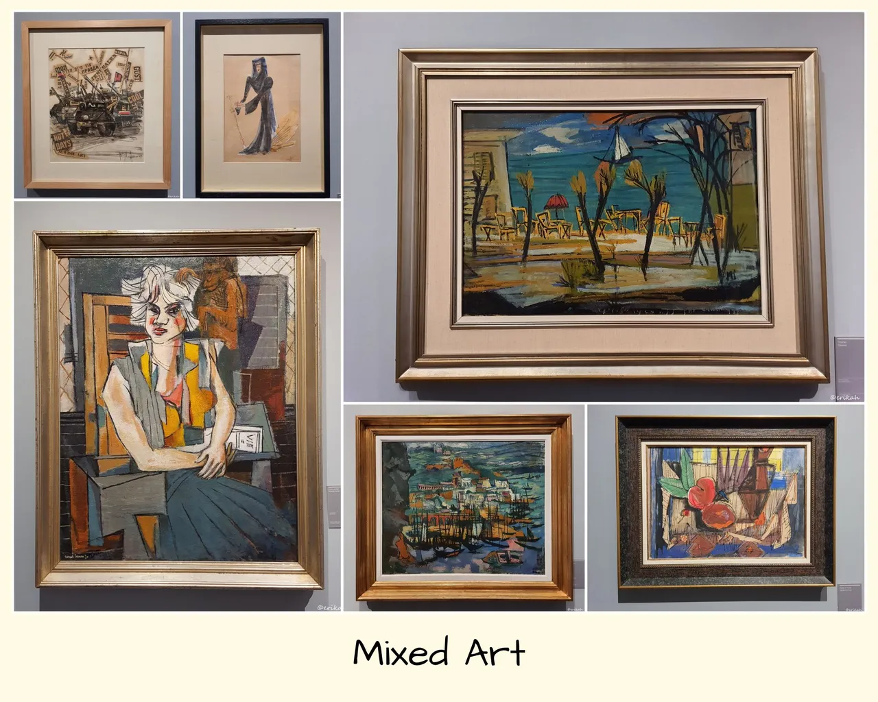
So today I have gathered different artworks from different artists and I'm going to post them together. It's going to be interesting to see different styles.
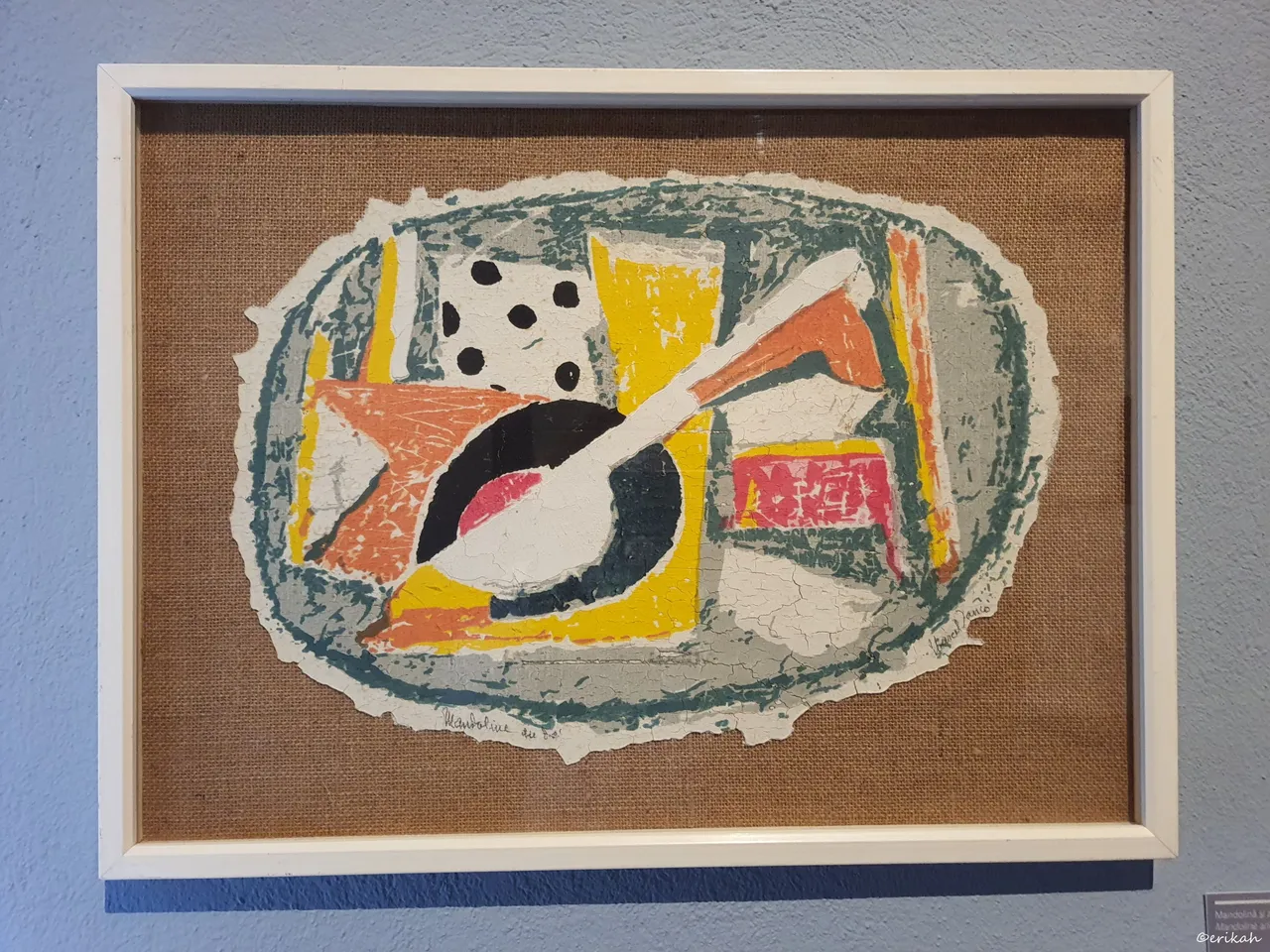
This artwork is called Mandolin and Dice, was created in the 1970's by Marcel Iancu and it is print on plaster on canvas glued to masonite. It's an interesting composition and I suppose the artist was thinking of a party as back in old days both things were needed for a good party in a pub.
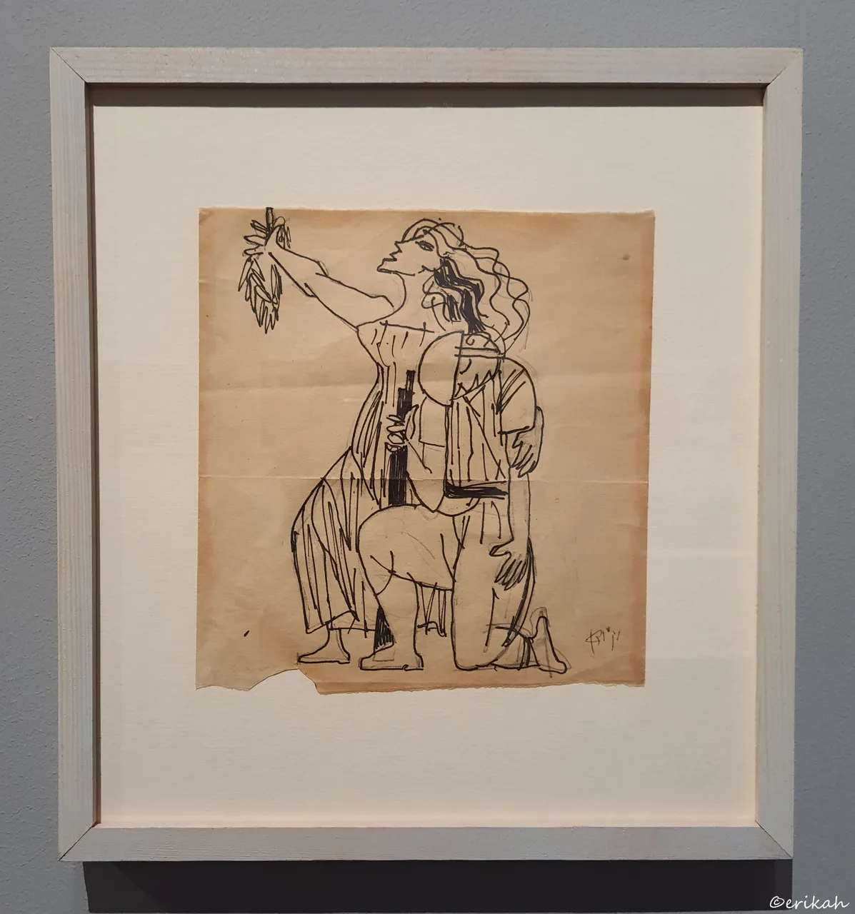
This is a strange one and I would have never guessed the title. It's called Military Parade, was made by Marcel Iancu in 1967. I've been struggling to see why this is called military parade, when I see a woman on the drawing and the only clue that may lead to the title is the helmet, but you have to be a very good observant to see the helmet. Well, never try to guess what the artist was thinking about when creating the artwork.
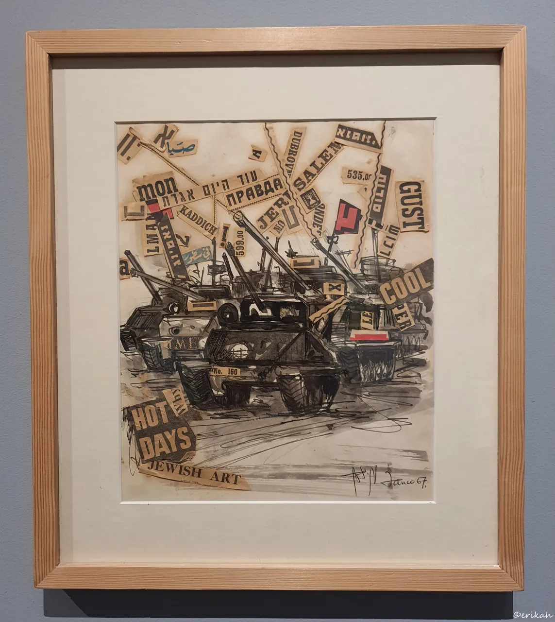
Marcel Iancu - Military Parade. Despite of what it symbolizes (which is extremely sad), I like this artwork, for what it is. It's ink on paper and old paper applied as well. It is sad that a war had to happen and so many innocent people had to die, but that put aside, I love it.
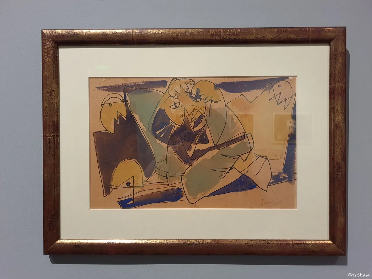
Wounded Soldier, 1948, Marcel Iancu, watercolor on paper. From artistic point of view, this is a strange one.
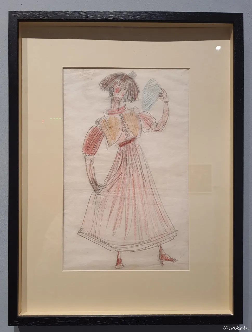
Theater Costume, Marcel Iancu, crayons on paper. 😳
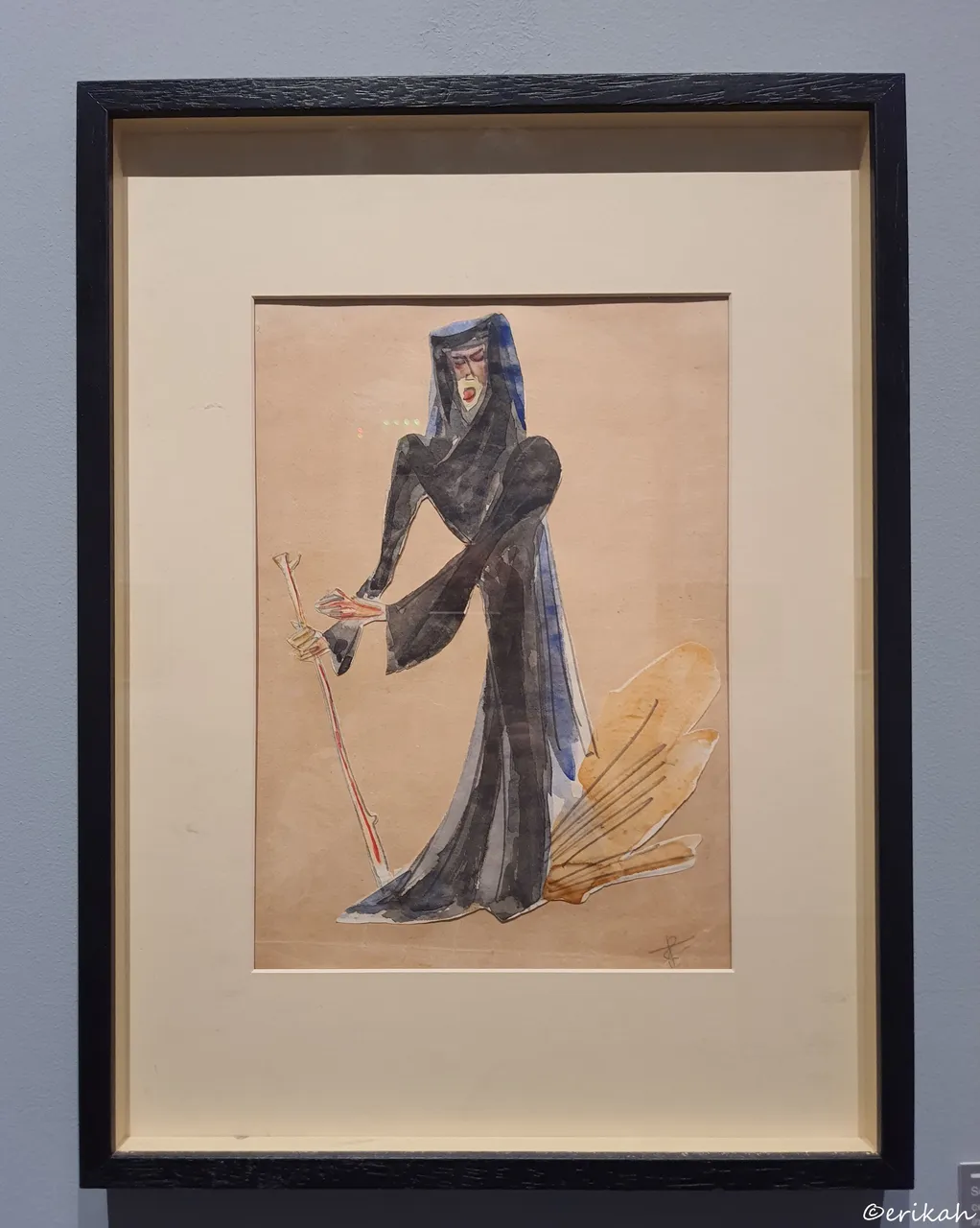
Sketch Of A Costume For The Play "The Bloody Wedding", Marcel Iancu, collage and watercolor on paper.
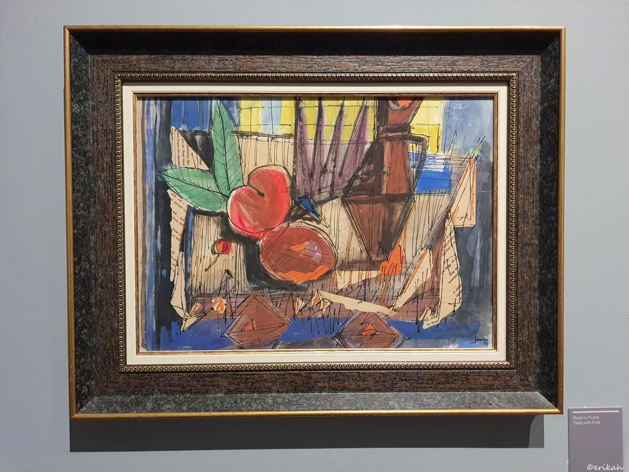
I don't know how you see this, but it was one of the pieces I loved, although it may not look like a shiny diamond. It is called Table Of Fruits, was created by Marcel Iancu and it is watercolor and collage on cardboard. The reason I like it so much is the collage part. I love old, yellow paper a lot and this artwork has exactly that. The frame is extra, reminds me of those old days, when they used these golden painted, heavy frames.
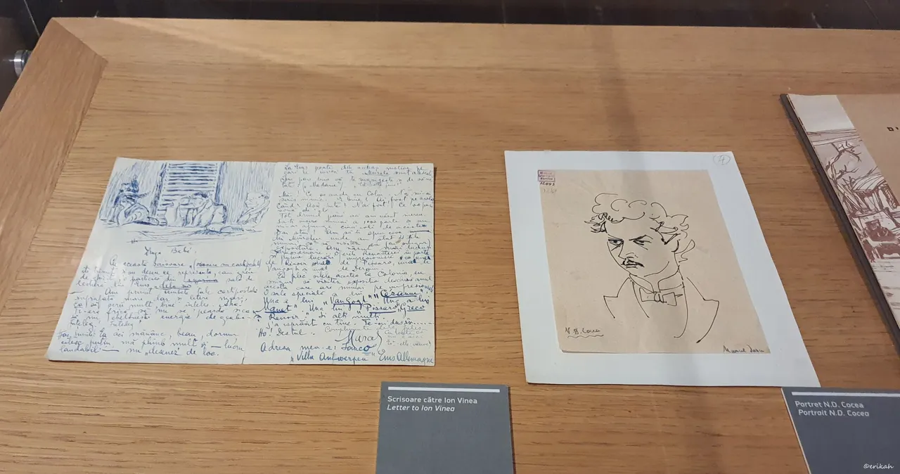
A Letter to Ion Vinea, and a Portrait of N.D. Cocea, both by Marcel Iancu. What I love here is the letter. Unfortunately we can't see the other part of the card, but I suppose it's a card. What makes it interesting for me is the drawing. Artists often did that, drew on a piece of paper, napkin, whatever they had at hand and often those sketches, drawings became very valuable. This is how you can make a simple piece of paper, or a boring card unique and also valuable.
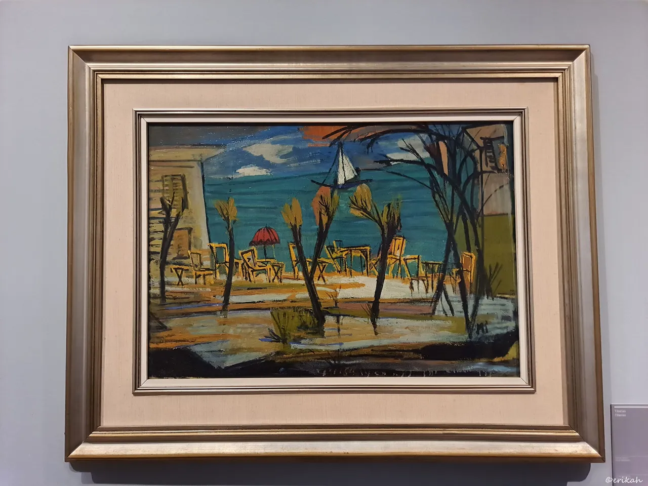
Tiberias, by Marcel Iancu, oil on cardboard.
Tiberias is an Israeli city on the western shore of the Sea of Galilee. A major Jewish center during Late Antiquity, it has been considered since the 16th century one of Judaism's Four Holy Cities, along with Jerusalem, Hebron, and Safed. source
I had to Google it as I've never heard of it, had no idea it's a city. Now I know. The painting is fantastic, it's one that I would gladly hang on my wall. What I like about it is the color combination and the style. I mean it's a bit rough, but in the good sense of the word and that's why I love it. The frame was also perfectly chosen.
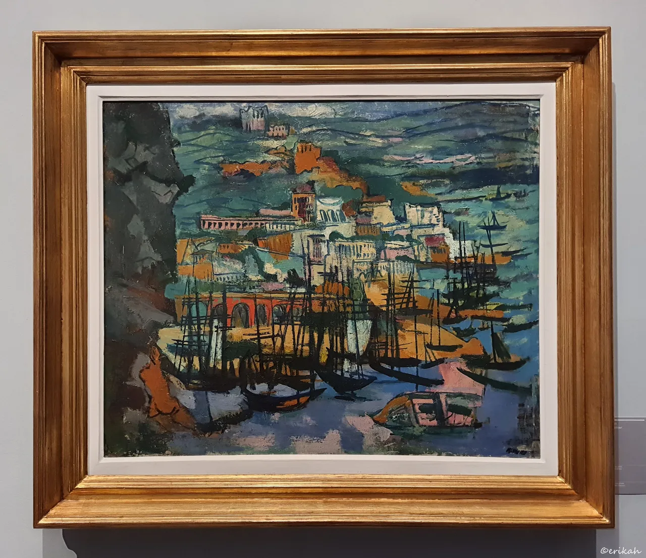
Harbour, by Marcel Iancu, oil on canvas. This is part of a private collection, there's no data about who the owner is, but whoever it is, it's a lucky person. This is another one that I would hang on my wall. Obviously we don't know how much these paintings worth as none of them is on the market, but I'm sure I would not pay the listing price 😂 Maybe one day I'll be able to create my own.
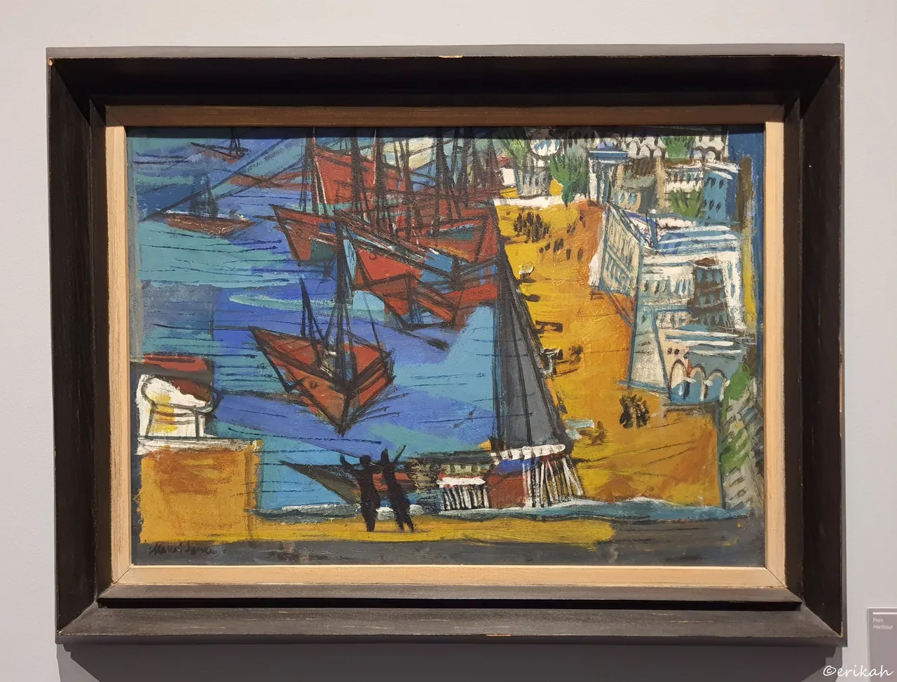
Another Harbour painting by the same author, but a different style. I'm not saying it's not good as it would be a lie and rude as well, but it's not my style.
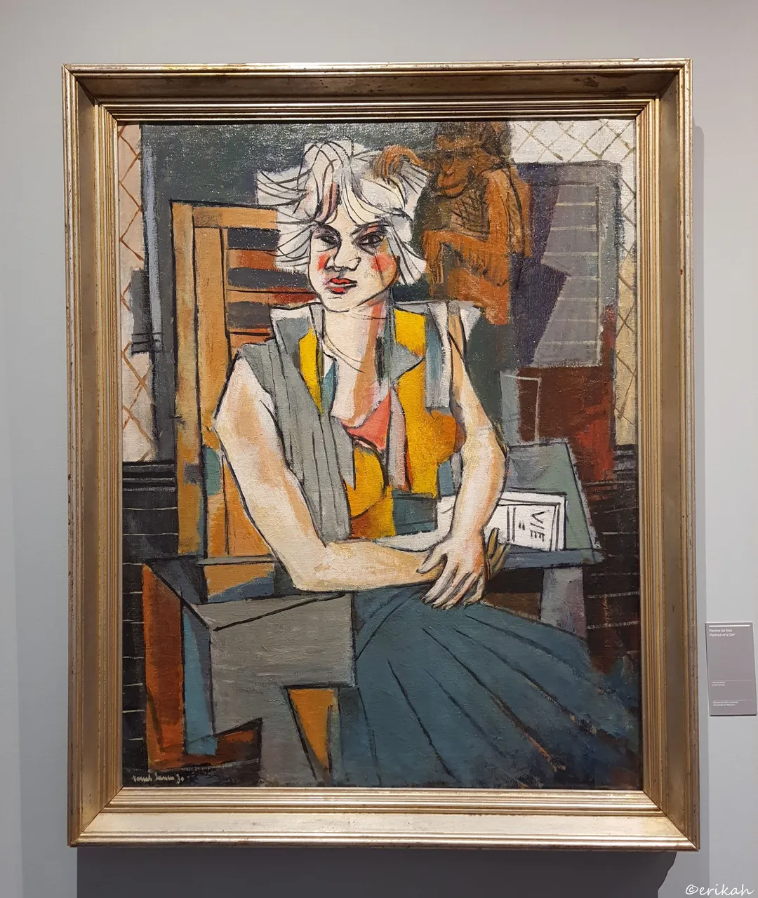
And this is the final piece from Marcel Iancu, it's called Portrait of a Girl and it is oil on canvas. I think I stared at it for a good few minutes and the reason was the girl's face. The whole painting is a bit "geometric" starting from the chair, strait lines and proper corners, but her face too, which is not a bad thing, it makes the whole painting interesting. I also liked the colors chosen.

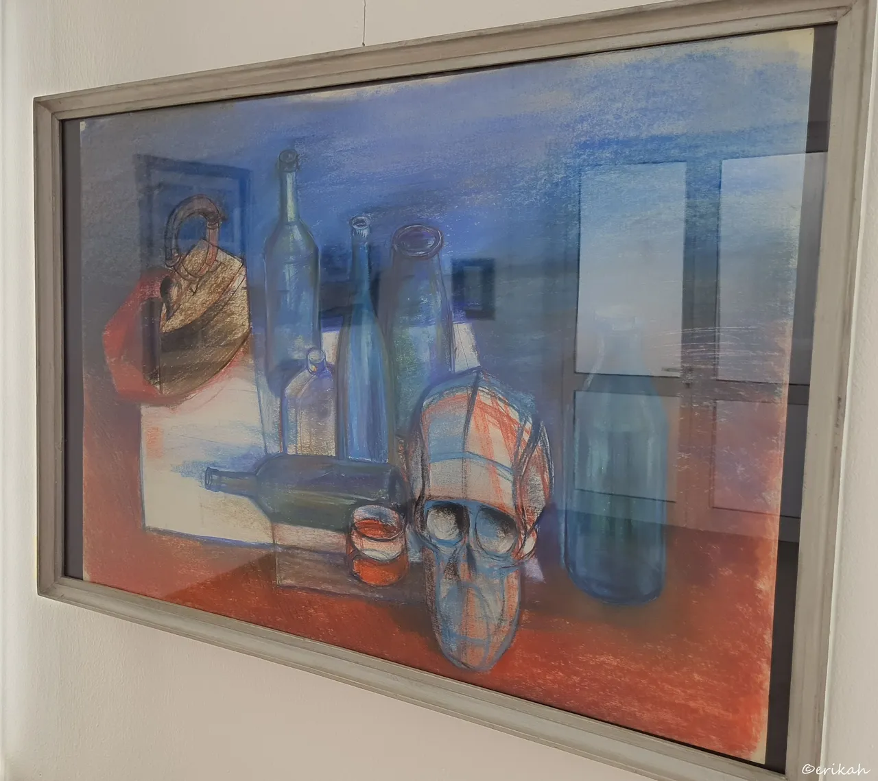
This painting is from another exhibition, it's called Still Life, the artist is Dénes Molnár and it's a pastel. The photo is not the best as I had to take it from the side, due to the strong reflections, but what I want to show you is clearly visible and that's the skull. It looks like a drawing practice that you see on YouTube videos, which makes it interesting.
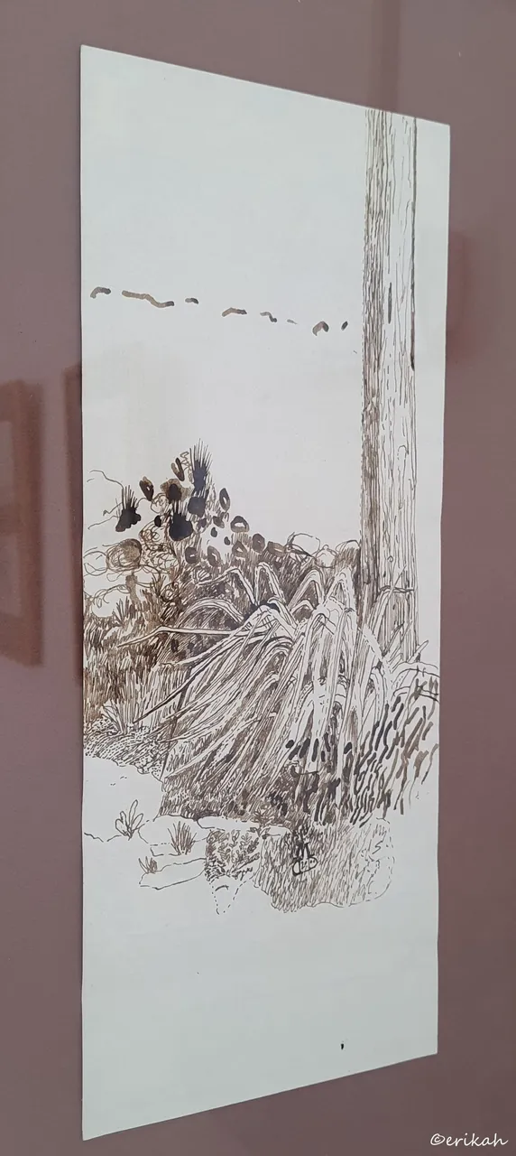
Another artwork of the same author, called Details Of The Garden, a tint drawing. Unfortunately it was under a glass and this was the best I could do. The reason I wanted to take this photo is the details. The whole scene reminds me of the times when the first frost arrives and catches the grass and other plants unexpectedly. I admire the details a lot.
So, which one is your favorite today?

If you're a newbie, you may want to check out these guides:
- Communities Explained - Newbie Guide
- Cross Posting And Reposting Explained, Using PeakD
- Hive Is Not For Me
- How To Pump Your Reputation Fast - Newbie Guide
- Tips And Tricks & Useful Hive Tools For Newbies
- Community List And Why It Is Important To Post In The Right Community
