Both realist and other styles of painting have their distinctive style in portraits and reflect interesting emotions.
I usually like very much the realistic painting, the one that when I look at it it seems that the painting is going to come to life at any moment and that an animal will come out of it or a person will start talking.
I think it's like giving real life to things while you're painting, and a lot of times people when they see a painting of mine say to me... it looks like it's going to come out. I just reply... I don't notice it except when I look at it from a distance, it's a play of light and shadow that achieves that effect.
But in the history of art not everything is realism, there have been many styles and very interesting ones, by the way.
On my walks, I usually pass by places that I already know and that change their art exhibitions very often and I like to see what's new, to walk around and admire the art, it always has something to say, it's an expression of the artists.
Art is a way of making thoughts, emotions and ways of thinking known, and it is often easier to do this on a canvas than with words.
In this art exhibition, of works belonging to the second half of the 20th century, I found a mixture of portraiture in colourist, surrealist and expressionist styles.
The variety was astonishing, there were not a lot of works, but there was a lot of difference between one and another, diversity of artists, styles, colours and ways of approaching the portraits.
Many of the works reminded me of very famous painters in history such as Picasso and Dalí and in others I just stared at them trying to discover the meaning. Everyone can see different things and feel different emotions when looking at a canvas.
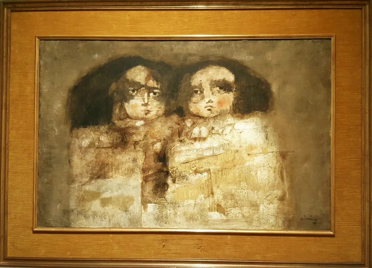
This first image belongs to an untitled work by the artist Gabriel Alberca Castaño and is a painting on canvas. The expressions on the faces of the two girls can denote loneliness, sadness, remoteness and the colour in which it is painted, sepia, brings to mind distant memories.
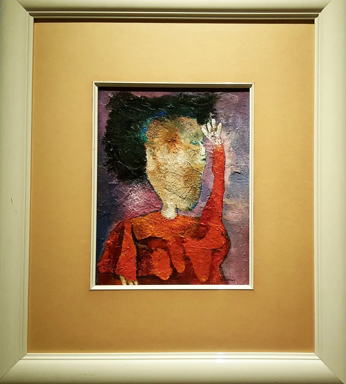
This second work called Señora expectante from 1971 belongs to the painter Felipe Orlando. I can highlight in this one, the bright colours and a very peculiar way of making the face. In addition to the use of a lot of paint, which can be seen in the large amount of impasto.
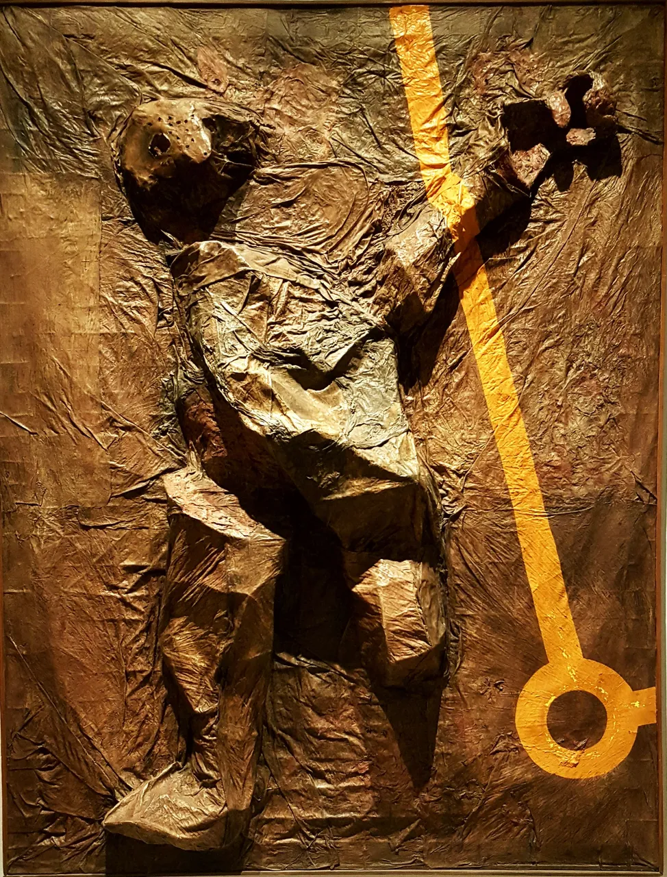
In this case the work is called El atropellado made in acrylic and other materials in relief, it belongs to the artist Enrique Brinkmann and it really looks like a man after a car had run over him, it is impressive.
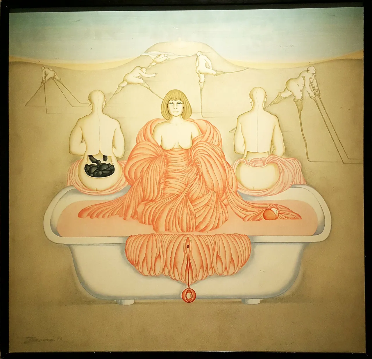
This oil painting belongs to the author Carlos Buro and is called El Baño (The Bathroom) made in 1976.
Each painting has an explanatory poster next to it, but in this case the surrealism was impressive, you can see different things or make many interpretations, every detail counts.
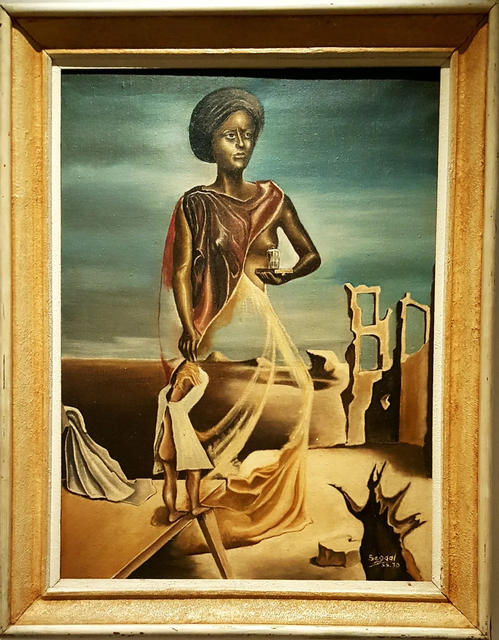
This painting reminded me of Dalí's paintings, it is painted in oil and is called Serenity of Defeat. Its author is Segaal and he made this painting in 1970. The woman's face and body definitely have that particular style of surrealism that I love and the woman's frown shows that she is not very happy despite her serenity.
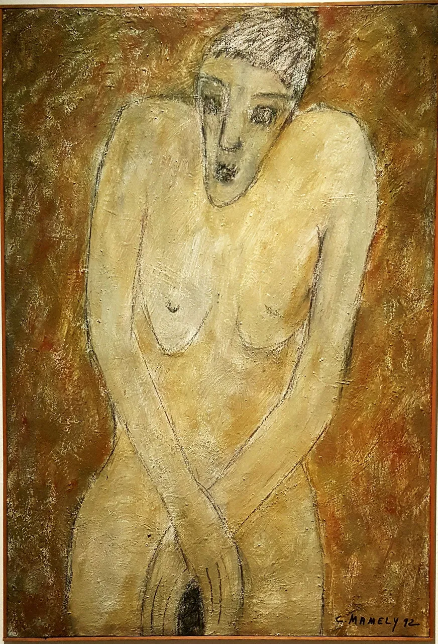
Pudor is the name of this painting made in acrylic, by the artist Concha Mamely, corresponding to the year 1992. Perhaps an important period for what the painting expresses. Although it is not realistic, nor are the features marked, the expression of the face is one of astonishment, as if the person had been taken unawares in their intimacy.
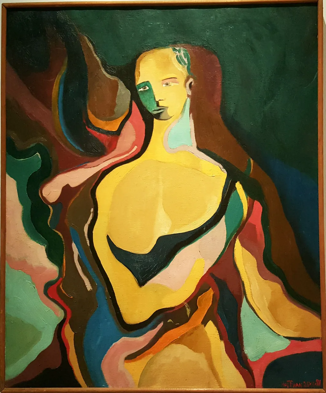
Paul Hoffman painted this oil painting called Between the Centre. It is one of the paintings I liked the most because of the theme of the colours, a colourful and also surrealistic portrait. An expression in this portrait that denotes thought, at least that's what I see, I see looking inside, analysing and waiting for something.
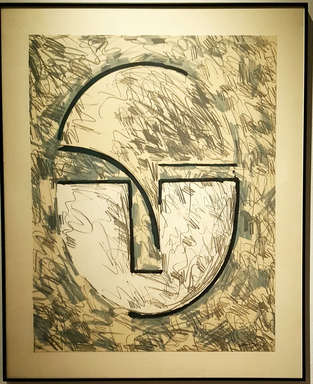
In this case we see a different style, it is a four-colour lithograph by Rafel Canogar, a somewhat particular portrait from 1986, especially Saturday in lines and geometric shapes. As you can see, each work is very different from the other.
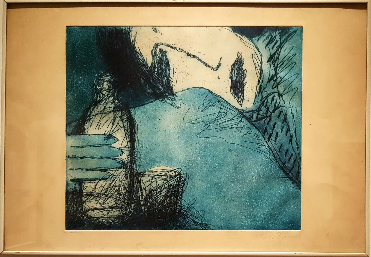
Some of them, like this one, by the author Romero, were striking because of their meaning. It is clear that you see a person and the effect of the alcohol and those bluish tones and the black stripes give a feeling of darkness, discouragement and even depression.
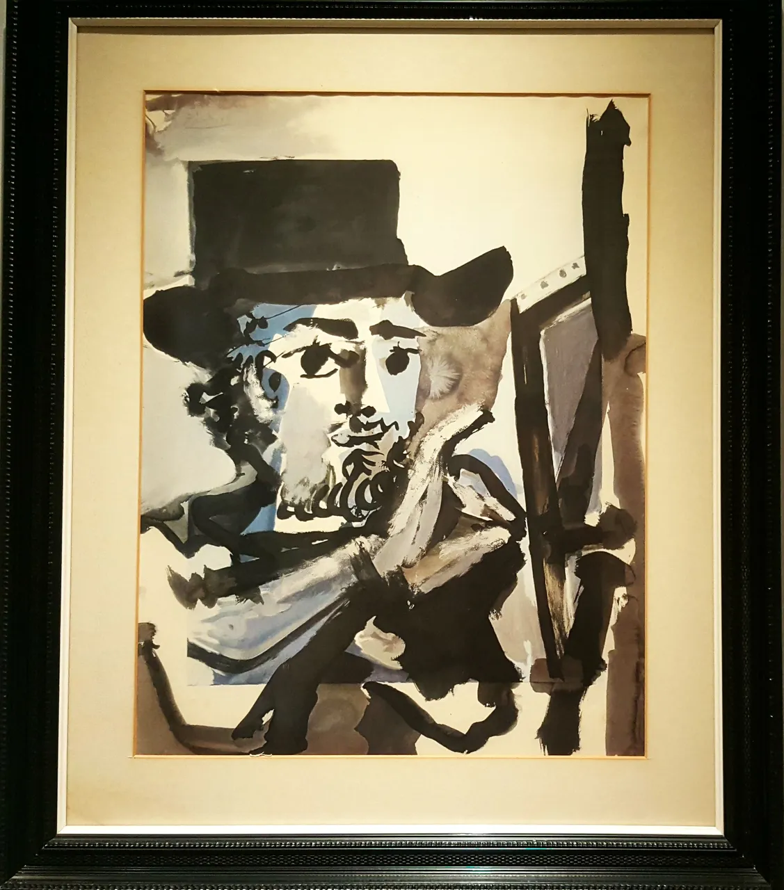
I liked this work very much because it belongs to Pablo Picasso, although it has no title. It is a silkscreen that he made between 1960 and 1969, where his technique is evident and the features of the face, in his own way, are clear, an intense look.
Each of these works has its own colour with its own meaning, its own style depending on each artist and they awaken different emotions in the spectators.
If there is one you liked the most, I would love to hear about it in the comments.
Thank you very much for watching and reading this far. Best regards and I wish you a very good Sunday. See you soon.
Amonet.
All photographs are my own.