Even though I haven't been around this community as an author before, I surely lurk around as I usually do in general on this blockchain to check out some authors and their posts. Needless to say also, it's my go to place for book reviews on Hive.
A couple of weeks or so ago, an amazing writer and an avid book reader who hangs around in these territories more often than I do, drew my attention to the post about the contest for a logo / banner design needed for the Hive Book Club community.
I eventually decided to take a break from coding and all that left side of the brain work to get the right side fired up a bit. And what would be better than some graphical wizardry to achieve that?!
Having the Hive Book Club Graphic Design Contest post bookmarked from before, I checked what's required, gathered the resources, and started working on it right away.

The Graphical Sorcery Process! |
FONTS:
I started off by picking the main font for the logo, as that is one of the important aspects considering the branding and the way I wanted to present it.
Scrolling through the fonts I had available, I stumbled upon a few candidates but none of them gave me the O I needed (Literally speaking.) Except one of them caught my eye, and it was called Dragon.
Even though it still needed a small modification for what I intended it to do, I went with it because... DRAGON! The elusive mythical creature right out of the books. Well, that and the fact it provided the appropriate mystical vibe I was looking for ofcourse.
As a secondary font, I found The Madelican Calligraphy font to go well with the Dragon main font I picked.
COLORS:
Next was the coloring aspect. I saved the color pallete provided, and I wanted to only stick to the colors that are included in the pallette, so I started matching some of them to see what colors can mix well with the others.
Despite what seemed like a difficult task to blend those colors with eachother at first. They mostly got along together alright without much of a fight worth mentioning.
I checked a few variations for the background, foreground, and the main font color. But the ones I settled with seemed to be the best fit as a theme for the community.
Because it didn't seem right to go crazy colorful, and I wanted the colors of the fonts to carry over between the logo, banner, and the divider as one theme, knowing that they might overlap over different background colors.
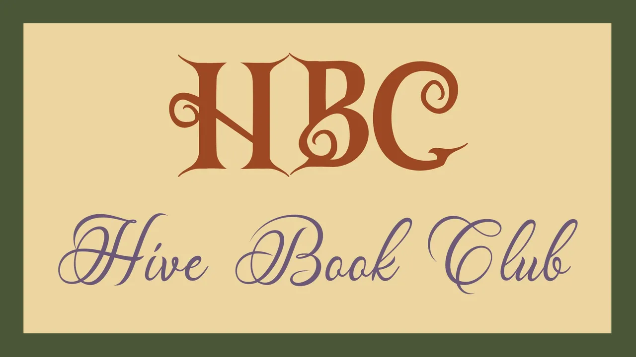
LOGO:
With the fonts and colors ready, I was able to start working on the logo.
The double Os in the word BOOK were well suited to represent a pair of eyes 👀, and they only needed a book in front of them to convey the idea of the community as a book club.
So, I forged one with a bit of details on its cover and gave the eyes a book to read.
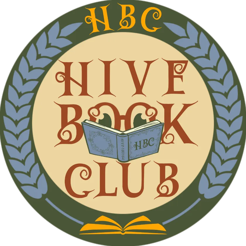
What would be better suited than embedding the act of reading a book with the name of a community that is all about reading. Huh?
I chose the wheat ears growing out of the book as a "frame", since a wheat ear symbolizes the fertility, growth, development, and nourishment of the mind that books and reading tend to bestow upon us as a side effect.
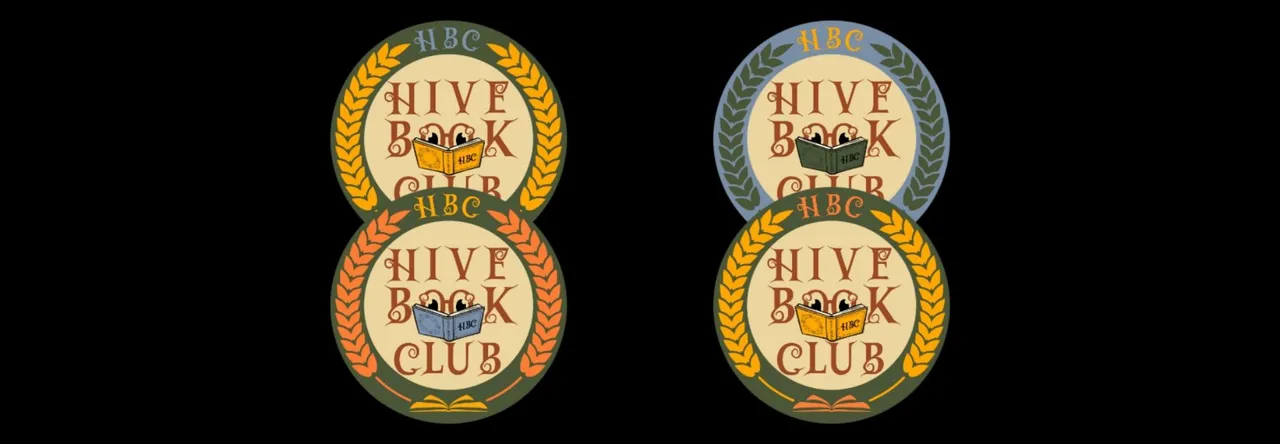 Some other color variations I tried and found plausible for the logo.
BANNER & HEADER:
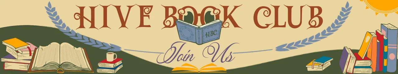
And then on to the banner, which is mostly self explanatory.
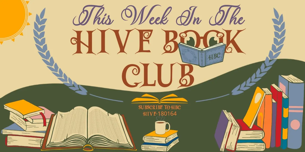
It was somewhat difficult to find copyright free stock images for different books that maintain the same style. There aren't actually many usable ones out there that are free, but I eventually was able to grab what I was satisfied with using as a base (Though they required a lot of cleaning up and re-drawing).
Eventually they were all ready to be put together for rendering the banner, with the ability for it to be customizable, as requested by the community's design contest post.
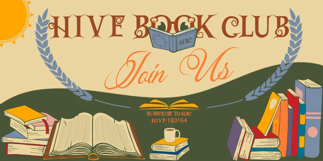 |  |
And ofcourse the community's main page profile header with the proper adjustments to fit the needed image size.
DIVIDER:
Lastly, I worked on the divider. Using the book logo to create a repetitive pattern to encompass the thematic logo and the HBC letters in the middle.
I created this 👇 variation of the divider where I added more of the pattern and reduced the size of the logo in the middle.
 |
But I personally like the other one I used throughout this post better.
And that concludes my participation for the design. I hope you'll like it as much as I enjoyed making it!
Cheers!
NOTE: All the images shown in this post are reduced in size. The raw images are all 350 dpi with the requested sizes.
Credits: | |
|---|---|
| Stock Images Used: • Girl Reading Book By OpenClipart-Vectors • An Open Book By farbklexhexe • Collage Drawn Books By OpenClipart-Vectors | Android Mobile Apps Used: • Ibis Paint X • PicsArt • LogoMaker : Logo Creator |
 |
Your Friendly Discord Bot For Your Hive Community And Delegations Curation Rewards Distribution Needs! |