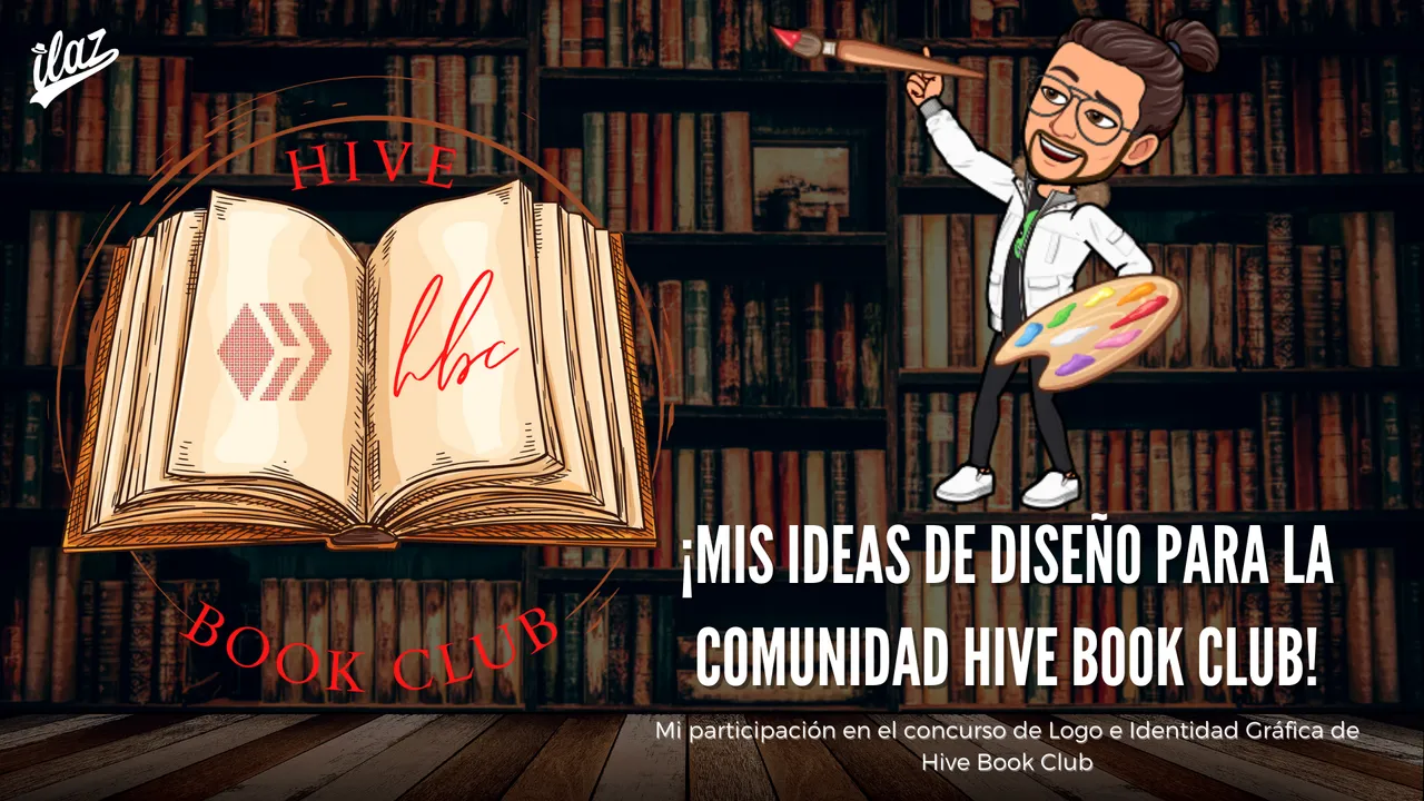
¡Bienvenidos de vuelta a mi blog, chicos! El día de hoy les traigo un post para participar en el concurso de la comunidad Hive Book Club en el cual buscan una nueva identidad gráfica pues tuve como una especie de ataque artístico que me hizo inspirarme y dejar salir todas las ideas que tenía en mi mente para ello, entonces, vamos a darle.
Los detalles del concurso pueden leerlos en este post, para los interesados.
Welcome back to my blog, guys! Today I bring you a post to participate in the Hive Book Club community contest in which they are looking for a new graphic identity because I had kind of an artistic attack that made me get inspired and let out all the ideas I had in my mind for it, so, let's go for it.
The details of the contest can be read in this post, for those interested.

Mis ideas para participar | My ideas for the entry

A pesar de que no soy diseñador y realmente no tengo casi conocimiento sobre el diseño, me he acostumbrado a utilizar demasiadas cosas épicas de la herramienta Canva; creo que una gran parte de las personas que hacemos vida acá en la blockchain de Hive han utilizado la misma herramienta por su facilidad de uso.
Entonces, divagando hace un par de días, al haber visto el anuncio del concurso, decidí estudiar un poco el concepto y desarrollar esta idea para la identidad gráfica de la comunidad:
Even though I'm not a designer and I really have almost no knowledge about design, I've gotten used to use too many epic things from the tool Canva; I think a big part of the people that we do life here in the Hive blockchain have used the same tool for its ease of use.
So, rambling a couple of days ago, having seen the contest announcement, I decided to study the concept a bit and develop this idea for the community's graphic identity:
Idea del Logo | Logo Idea
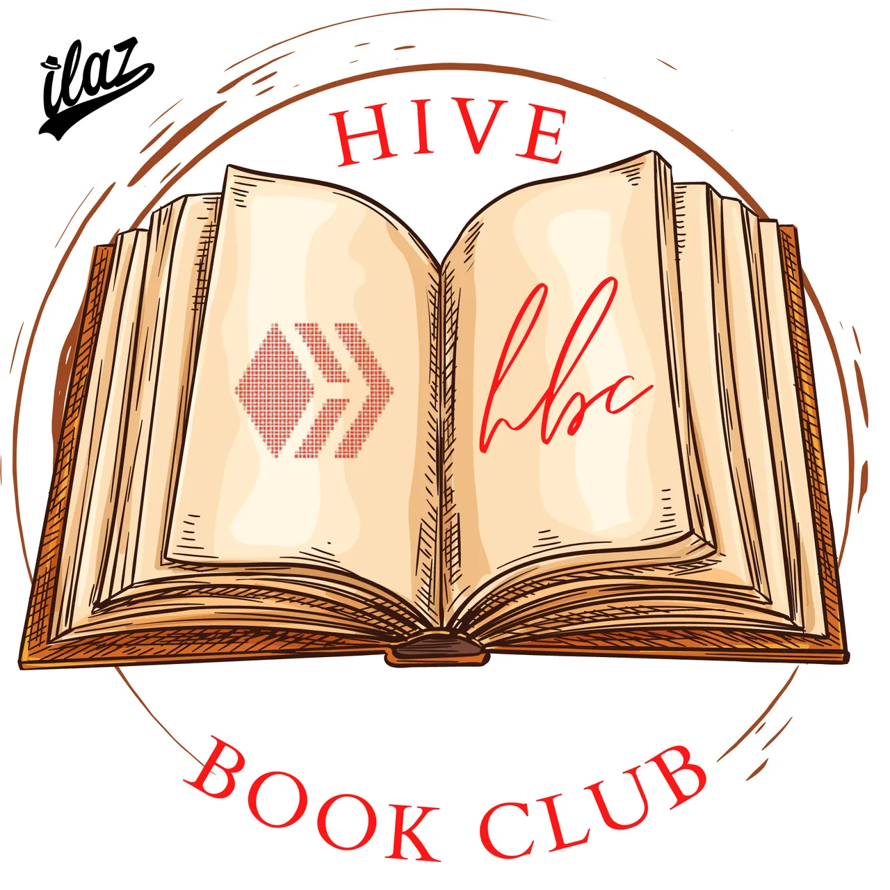
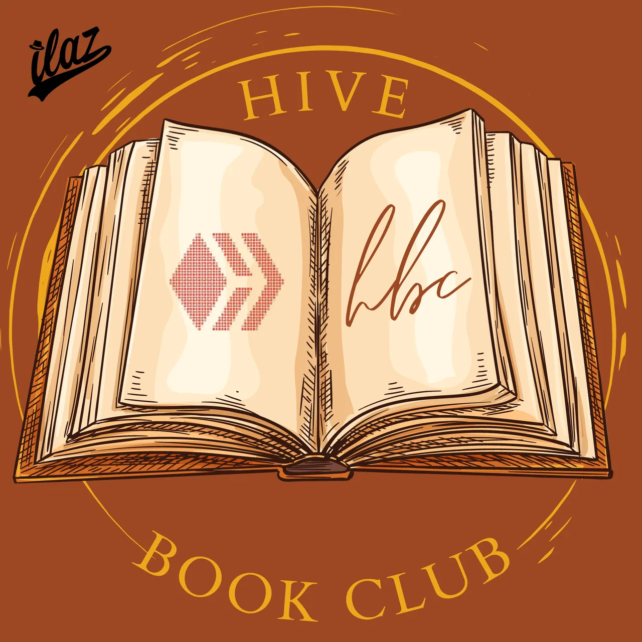
Al principio diseñé este logo, por supuesto no había utilizado todavía los colores que exigieron de la paleta que querían, pero sí creé la parte más importante que era la identidad gráfica o el concepto detrás del logo, decidí poner el logo de la blockchain y las siglas HBC como si fuera una firma dentro del libro porque la idea para mí de cualquier logo es mostrar de qué va lo que representa de la manera más óptima.
Entonces, ese libro era todo lo que necesitaba, luego vi los espacios para el logo y la firma y posteriormente decidí colocarle el círculo alrededor para dar la sensación visual de profundidad que le faltaba para verse más profesional.
Una imagen sobria, un mensaje y concepto resumido.
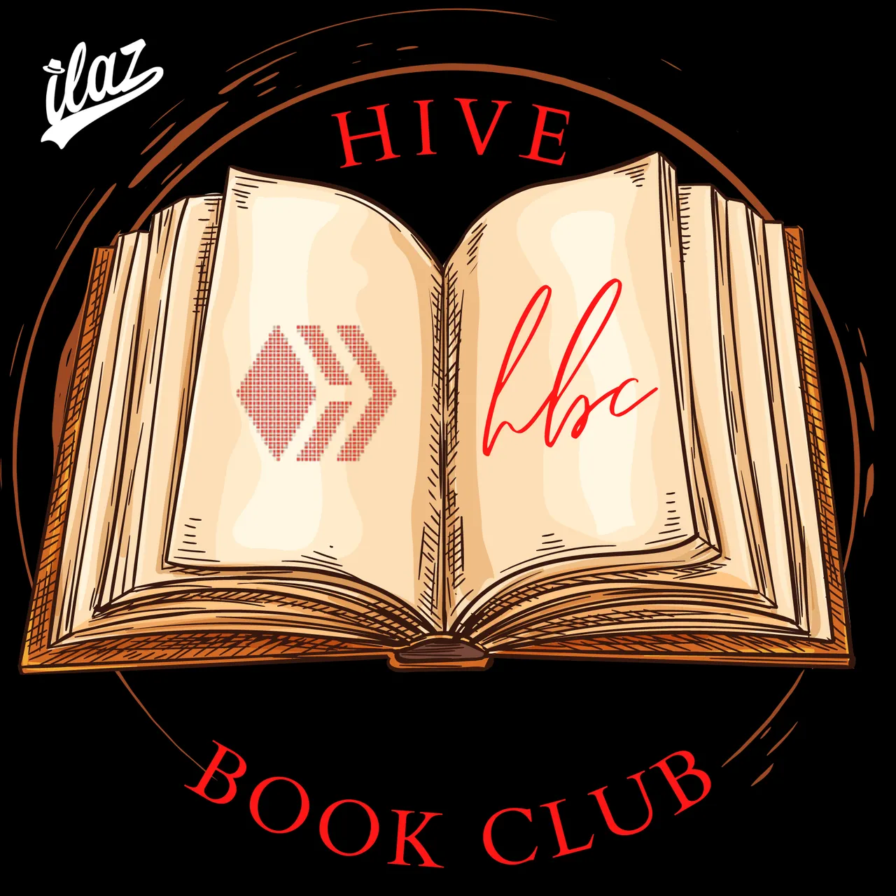
Posteriormente coloqué los colores que se requerían de la paleta de colores y surgió lo siguiente:
At the beginning I designed this logo, of course I had not yet used the colors they demanded from the palette they wanted, but I did create the most important part which was the graphic identity or the concept behind the logo, I decided to put the blockchain logo and the acronym HBC as if it were a signature inside the book because the idea for me of any logo is to show what it represents in the most optimal way.
So, that book was all I needed, then I saw the spaces for the logo and the signature and later I decided to place the circle around it to give the visual sensation of depth that was missing to make it look more professional.
A sober image, a summarized message and concept.
Then I placed the required colors from the color palette and I came up with the following:
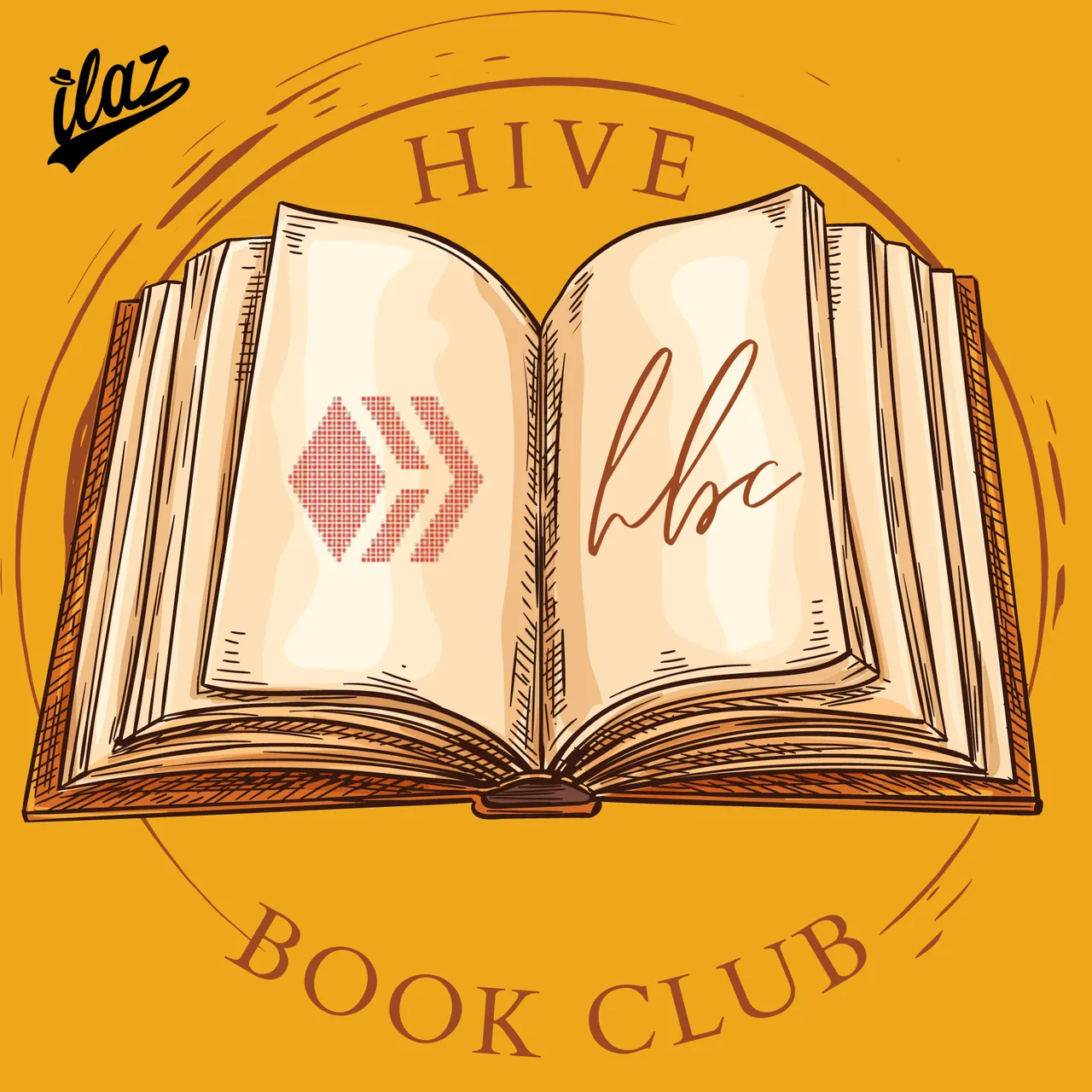
Esta combinación de colores es mi favorita, sin lugar a dudas.
This color combination is my favorite, hands down.

La Idea del Banner | The Idea behind the Banner
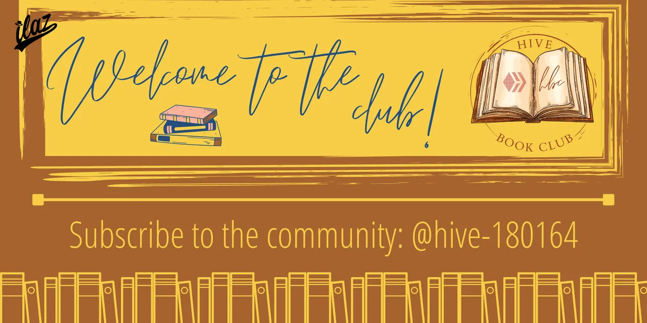
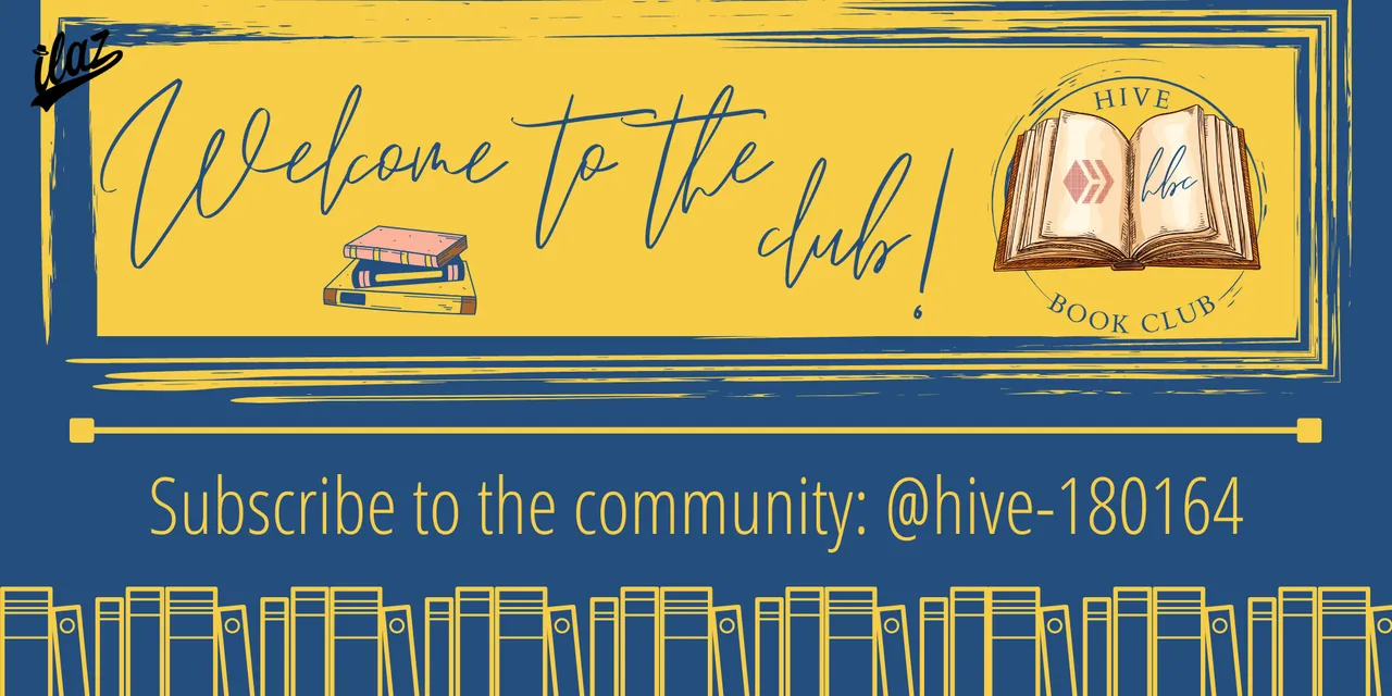
Cuando empecé a trabajar el banner decidí utilizar de una vez los colores de la paleta que el equipo detrás de la comunidad colocó en el reglamento para no perder la idea ni perder mucho tiempo.
Para la fuente utilicé la misma que está en las letras que tienes las siglas HBC dentro del libro del logo, se llama Emitha Font la cual simula una letra como si fuera una firma, ese concepto me gustó y por eso coloqué las palabras «Welcome to the club!» como si fuera la firma de una persona.
When I started working on the banner I decided to use the colors of the palette that the team behind the community placed in the rules so as not to lose the idea or waste a lot of time.
For the font I used the same font that is in the letters that have the initials HBC inside the logo book, it is called Emitha Font which simulates a letter as if it were a signature, I liked that concept and that's why I put the words "Welcome to the club!
Me guié en esta imagen del equipo de la comunidad para hacer la parte de los libros de abajo, pues me gustaban esos elementos visuales y decidí cargar bastante fuerte de elementos el banner para que tuviera poder y presencia, que se notara aún en dispositivos pequeños.
I was guided by this image of the community team to make the part of the books below, because I liked those visual elements and I decided to load the banner with a lot of elements so that it would have power and presence, even on small devices.
La Idea del Separador | The idea behind the Divider


Continuando con el concepto de la identidad gráfica que quería darle a la comunidad, decidí hacer estos separadores, súper minimalistas, solo utilizando el nombre de la comunidad con el mismo tipo de fuente como si fuera una firma elegante, dos íconos de libros para no cargar mucho el separador y unas líneas que asemejan los bodes de libros clásicos o las esquinas de las estanterías.
Continuing with the concept of the graphic identity I wanted to give to the community, I decided to make these separators, super minimalist, only using the name of the community with the same font as if it were an elegant signature, two book icons to not load the separator too much and lines that resemble the classic book bodies or the corners of the shelves.
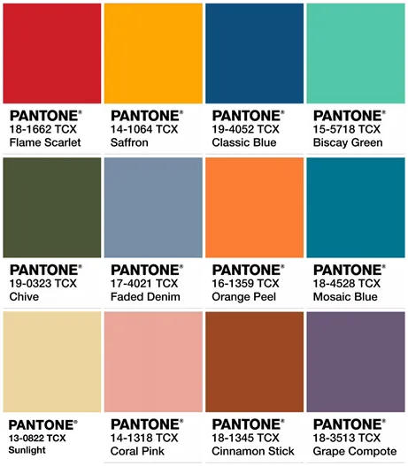
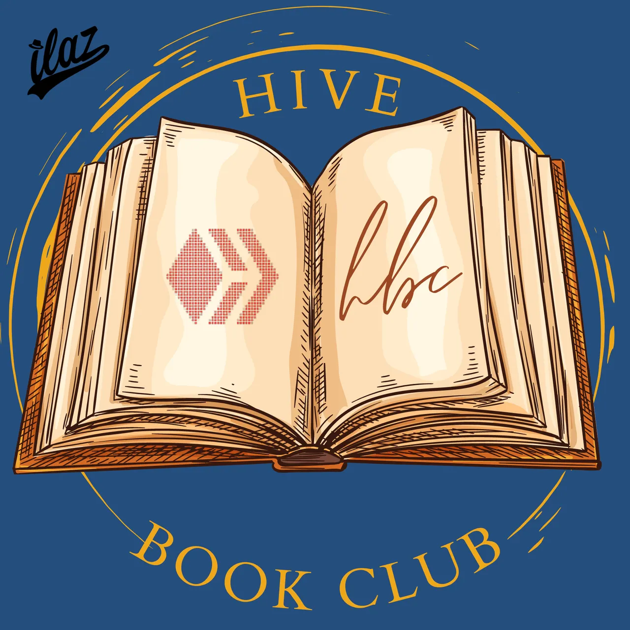
En todos los elementos utilicé el color base que pidieron e hice un diseño con el color azúl que formaba parte de la paleta porque siento que hace mejor contraste con el amarillo que formaba parte de la paleta también, entonces lo coloco acá solo como sugerencia, sin embargo no siento que se vea mal ningún color de fondo.
In all the elements I used the base color you asked for and I made a design with the blue color that was part of the palette because I feel it makes a better contrast with the yellow color that was part of the palette too, so I put it here just as a suggestion, however I don't feel that any background color looks bad.
Palabras Finales | Final Words
Siento que estos concursos nos llevan a salir de nuestra zona de confort y realmente cada vez que consigo una manera de hacer algo diferente a lo que acostumbro, siempre me pueden ver activo.
¡Gracias al equipo de la comunidad (@hive-180164, @macchiata, @jauregui98) por hacer este concurso! Y espero que esta participación esté acorde a lo que ustedes buscan, cualquier cosa, estoy a la orden.
I feel like these contests push us out of our comfort zone and really every time I get a way to do something different than what I'm used to, I can always be seen active.
Thanks to the community team (@hive-180164, @macchiata, @jauregui98) for doing this contest! And I hope this participation is in line with what you guys are looking for, I'm at your service.