
Today I thought I should create something to use in my bullet journal. The journal is for another time, as I just started that a few days ago. I bought some index cards as I imagined these could be used to create small artworks on to stick in the bullet journal rather than drawing or painting it on the paper inside the journal.
So where does one start? I have seen amazing artworks from artists using this technique, but I just wanted to create some simple but nice things for the journal. I thought a sun would be good to start with to get familiar with the technique. I used 2 different markers, both black fine liners but one with a smaller point than the other.
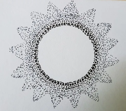
The picture above is from the second last picture I took where it looked closest to what I wanted to achieve. Here's the first picture:
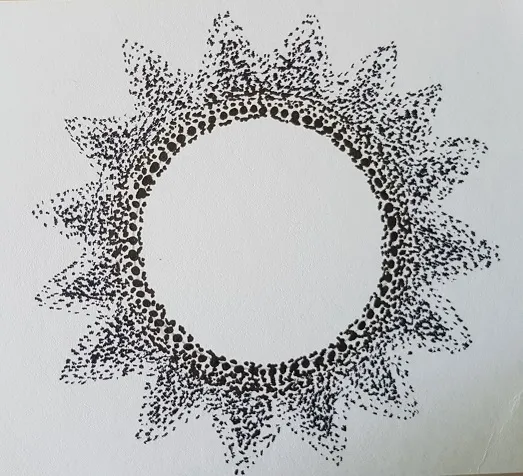
I started with a circle using the thickest fine liner and from there I started to work my way out with smaller dots. After that, I started marking the sun rays but as you may notice, I didn't nail that off quite well.
I started to attempt to create some sort of depth in the sunrays by darkening the middle of the rays, as you may see half of them is done, the other half not. Let me share once more the first picture as that was the next step.
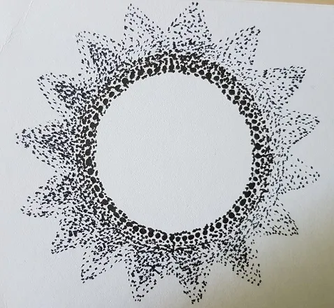
I thought it looked nice here, looking back I should have stopped here, but I didn't. This was the end result after adding more dots at the outlines of the rays:
Which one do you think is better? Is less more in this case? Or do you prefer the last one? I have to practice this technique obviously, but for now I'm happy with this result and can add it in my bullet journal.
Have a good Sunday and of course, stay safe...