Edited in Canva Pro.
Sources and Materials
Below are the materials I used in this art.
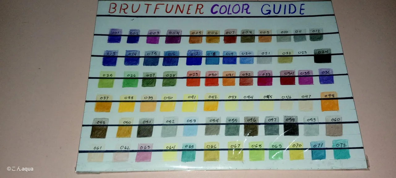
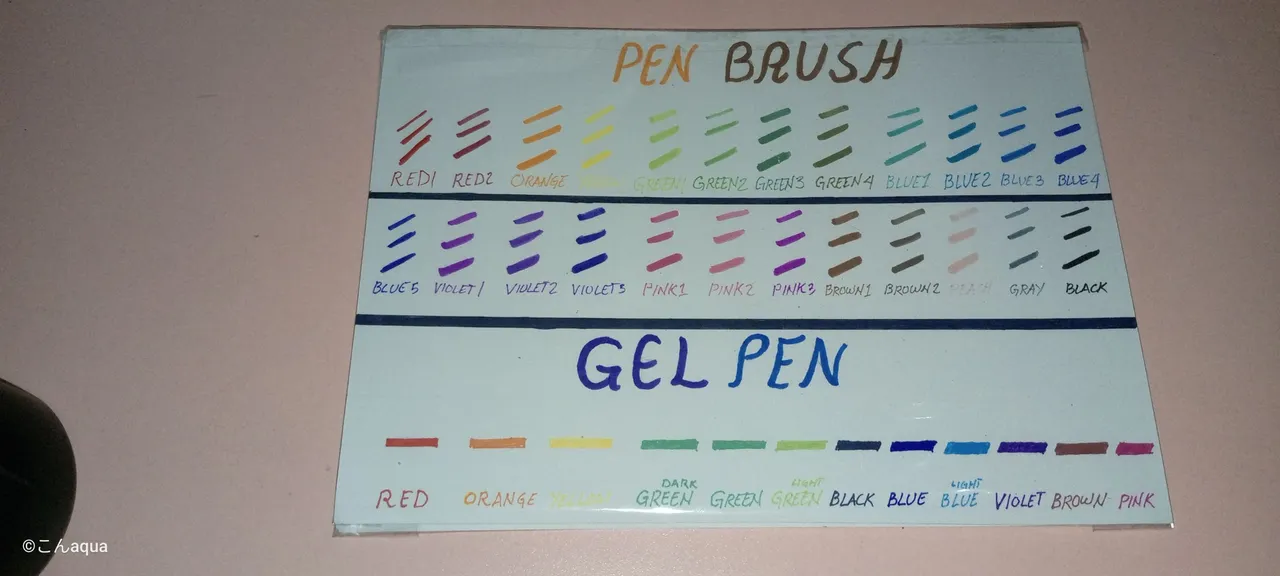
Photo taken using Tecno Spark Go.
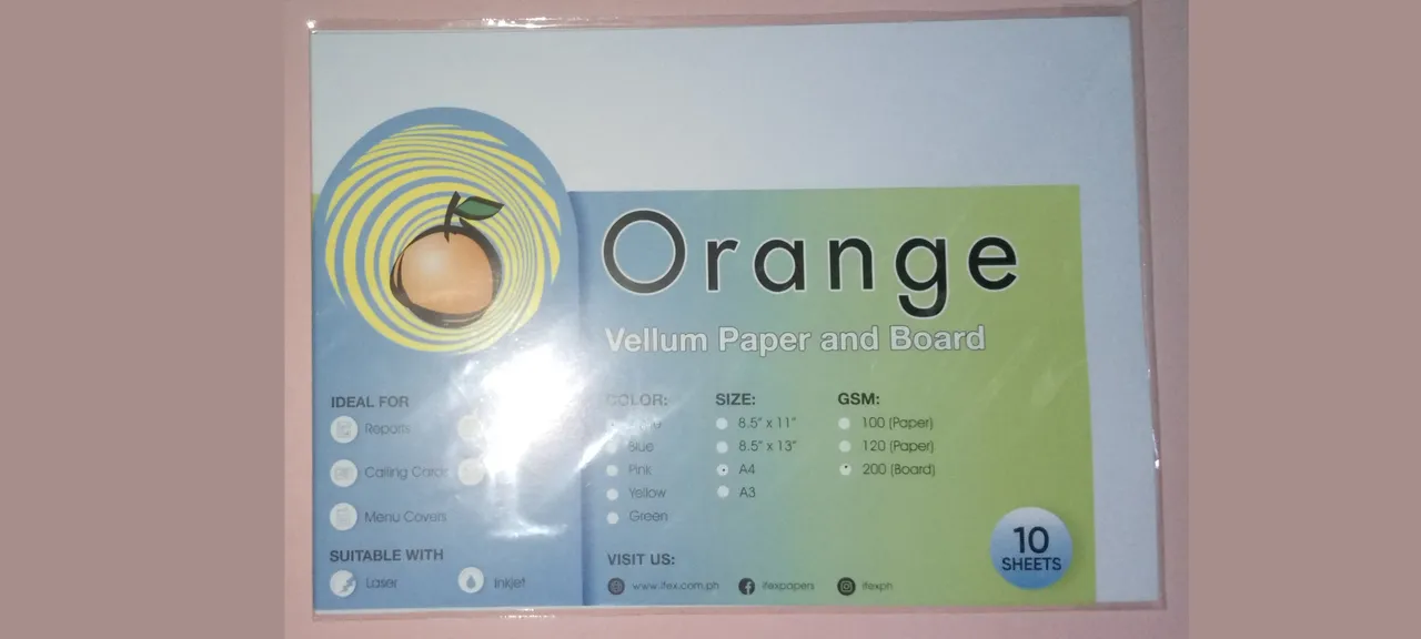
Photo taken using Tecno Spark Go.
My medium of choice. Vellum paper/board is good on colored pencils. It is smooth and yet the colors attach to it quite good. I'd like to describe it as a smoothness of a Bond paper while having the color attachment of Oslo paper.
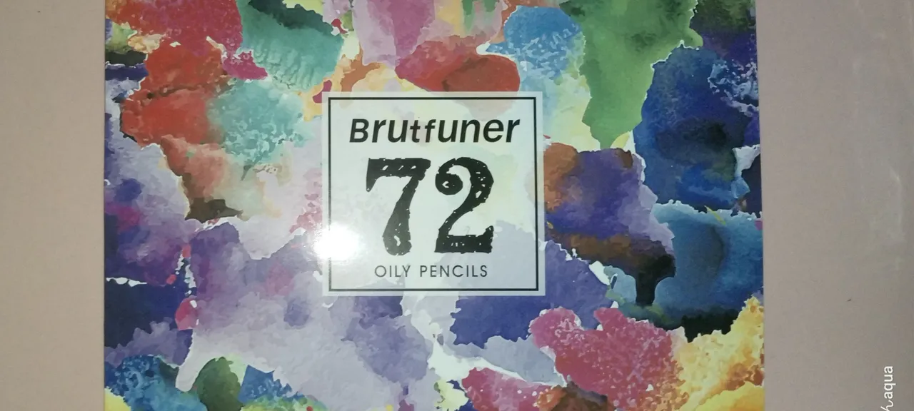
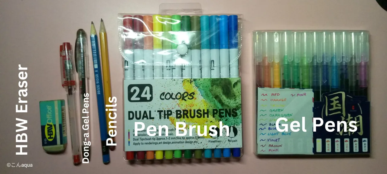
Photo taken using Tecno Spark Go.
- Brutfuner Oily Colored Pencils: Brutfuner is a good cheaper alternative to Faber Castell. The colors are a bit limited even if it's 72 pcs but still good enough to have a good range of color combination.
- HBW Eraser: A cheap and trusty eraser.
- Dong-a Gel Pens: Quite affordable at like $1 each but the quality is super good. Doesn't bleed and lasts a long time.
- Pencils: Needed for drafts. You're not required to use this specific ones. Just use what is available.
- Pen Brush: One side is brush and the other is pen tip. It is also a generic affordable one at around $5 on Shopee. One disadvantage is that they brush of the pens are inconsistent. Some of them are hard tips and some are soft. Although, it is still good for coloring or highlighting parts.
- Gel Pens: I bought this for like $3 on Shopee. Good when using colored lines along with the inking stage. It bleeds but the color is consistent even if you do multiple layers. Good colors for small objects or areas.
The other two photos below came from Splinterlands and was used as reference for the character coloring.
Photo from Splinterlands that came from my account.
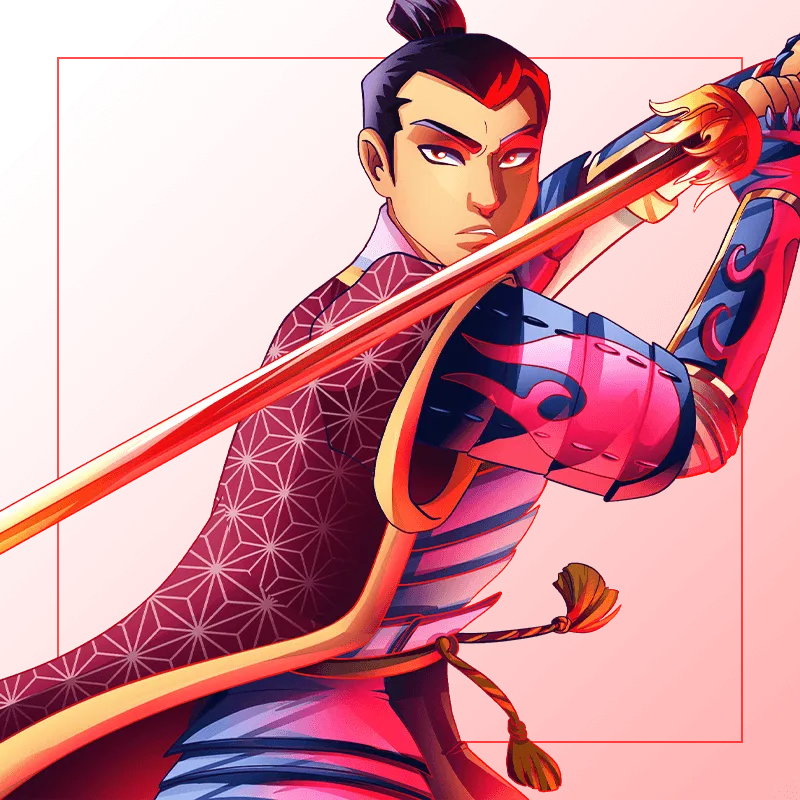
Photo from Splinterlands that came from my account.
You can check this link on another post for a more detailed description on how I use them.
𝕴𝖓𝖙𝖗𝖔𝖉𝖚𝖈𝖙𝖎𝖔𝖓
This is a happening most of the time in my games. My opponents uses Tarsa and Tenyii Striker while I use Lorna Shine and Dumacke Exile. So, why not put it in a more visual context?
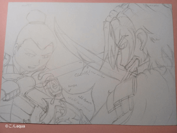
Step 1 Draft and Ink
I felt this would be more complicated than normal so what I am going to do is combine the usual Steps 1 and 2. I'll do the pencil draft and then ink it until I complete the whole ink stage.
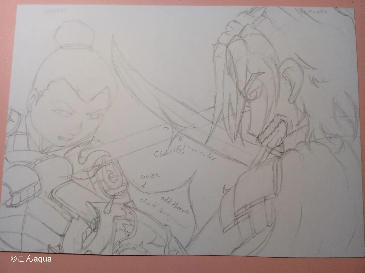 Photo taken using Tecno Spark Go.
Initially, I was thinking of doing it a side by side while they Tenyii Striker and Dumacke Elite are crossing swords just like in the image below:
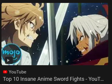
Photo from Google as a result of Google Search.
However, I thought it was too simple so I changed the perspective a bit and came up with what it is now.
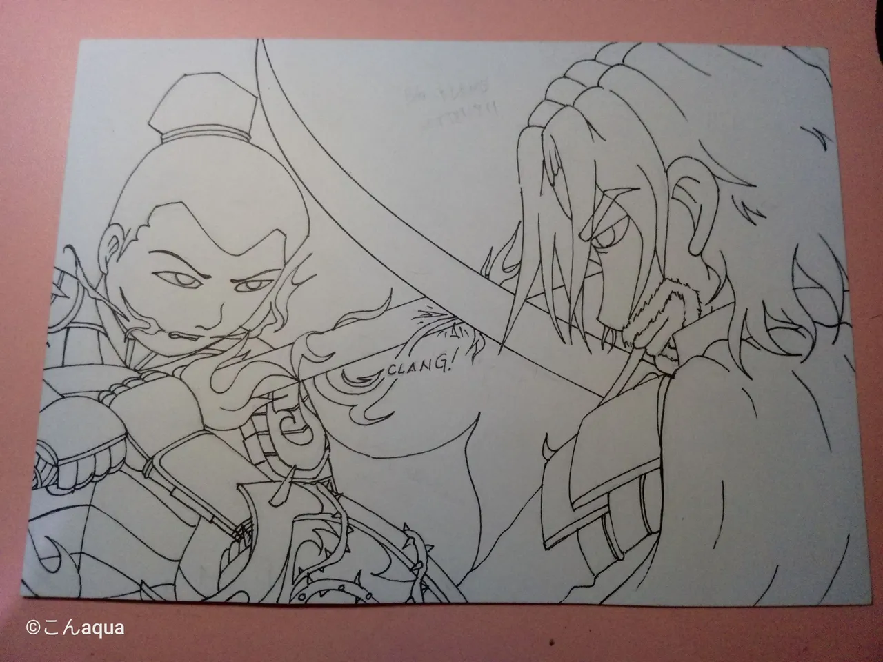 Photo taken using Tecno Spark Go.
When I know that my art will be complicated, I tend to ink it by layers. That is because the more detail I add, the more mistakes I do when doing draft. Background is the hardest for me and I tend to do a lot of erasures when doing the background. So, in order to not affect the foreground, I lay the initial ink before doing the background.
Draft 2 - Midground and Background
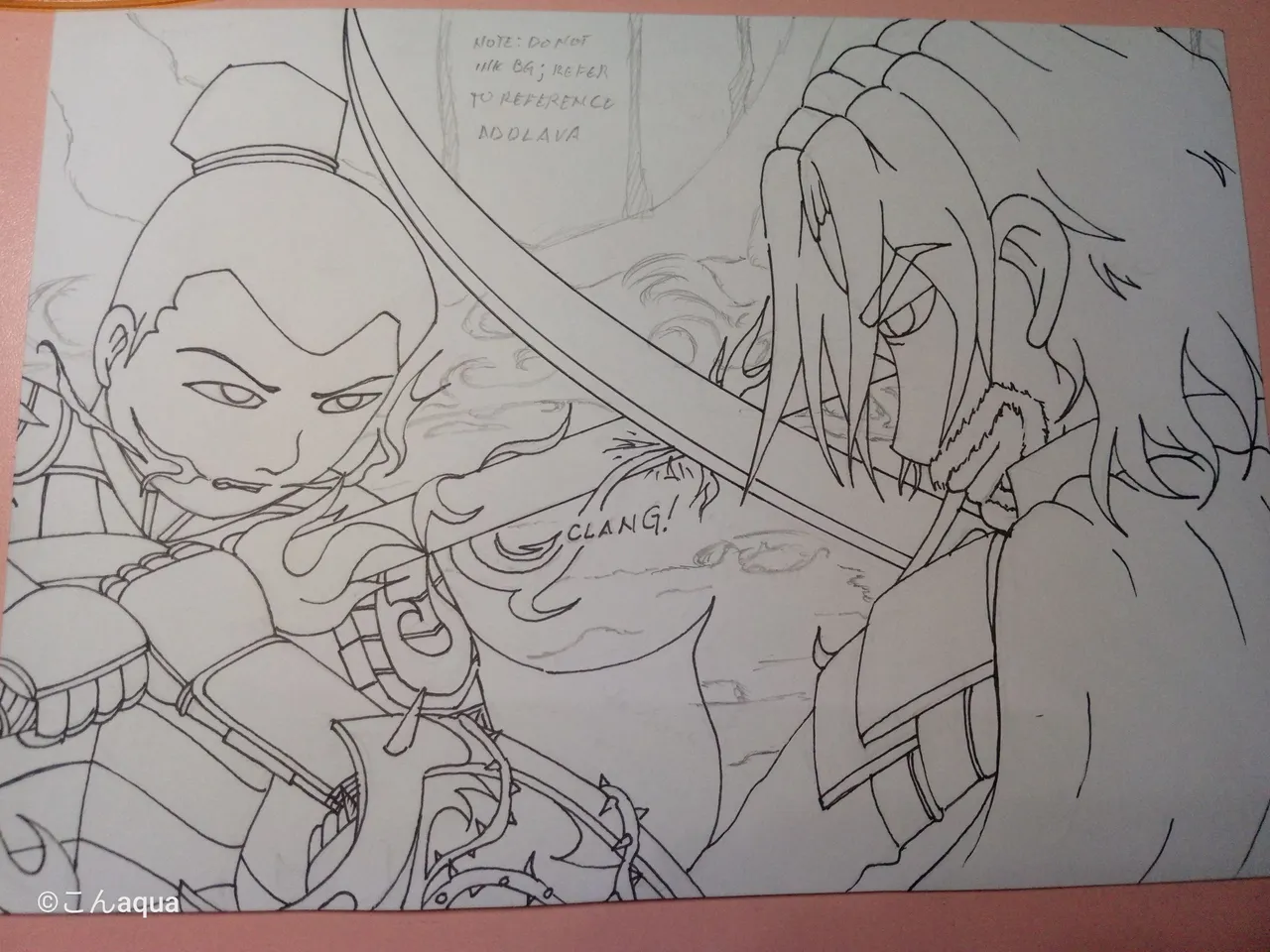 Photo taken using Tecno Spark Go used as a reference.
Since I added the flame design that I did in my previous work.
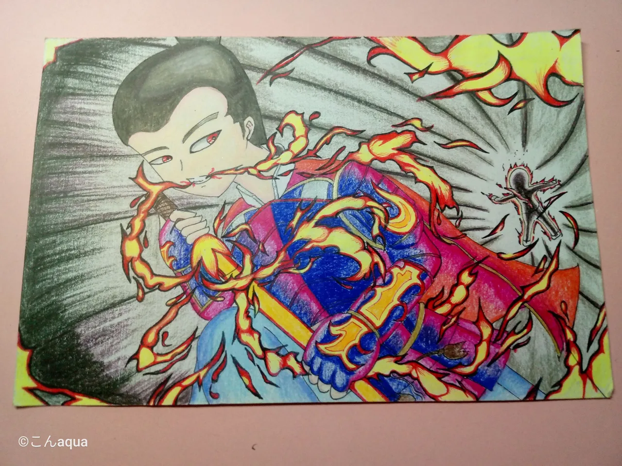
Photo taken using Tecno Spark Go.
I made a ring design here. Imagine them fighting in a circle of flame. That's the basic idea.
However, that felt too simple with just a black background so I got some references online and used this one:
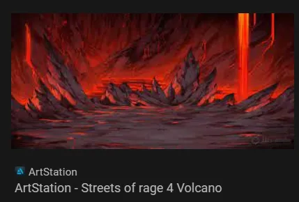
Photo from ArtStation as a result of Google Search..
Ink 2 - Midground
 Photo taken using Tecno Spark Go.
The midground is up to the fire. I wanted to add the flowing lava on the background so using black ink on that would be bad.
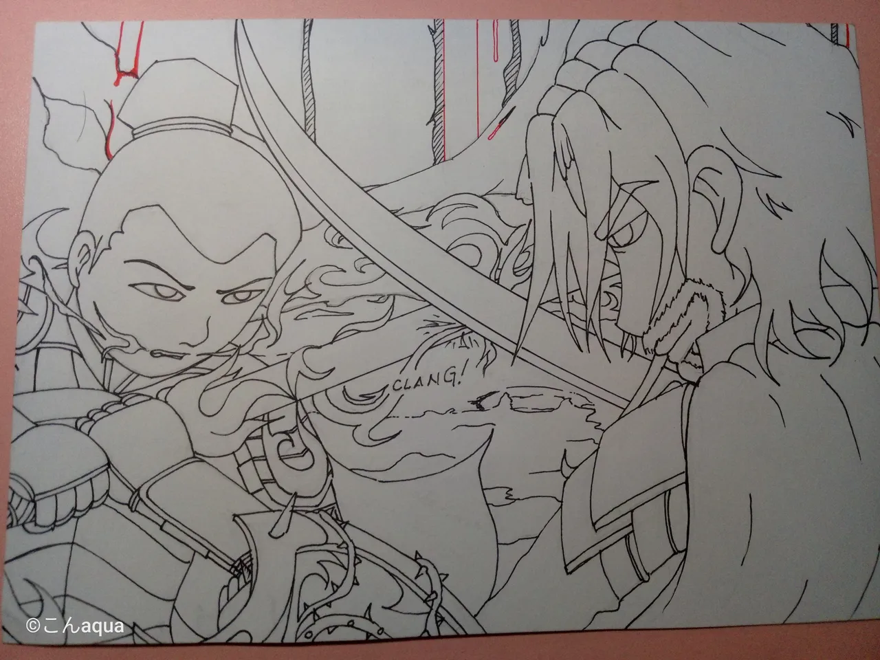 Photo taken using Tecno Spark Go.
Lastly, I would ink the background to finalize everything.
This one, while I liked it, took me probably a few hours from the concept to the finished draft and ink.
Step 2 Ink Colored
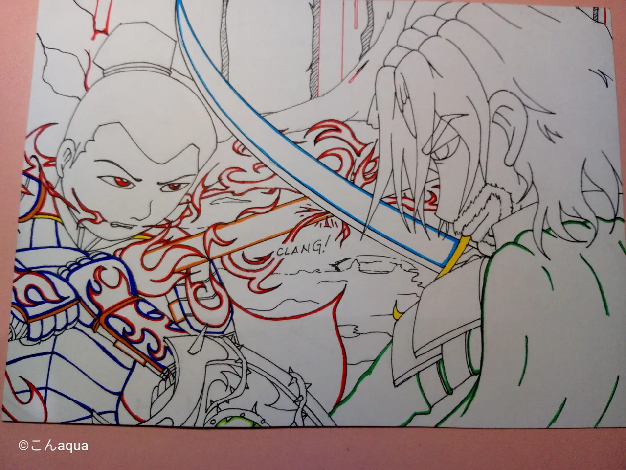
Photo taken using Tecno Spark Go.
I did not like the last one without the Colored Ink. I am not sure if it shows but I really had a hard time on that one especially on the edges. So, I am bringing it back and I actually liked it.
Step 3 Skin Colored
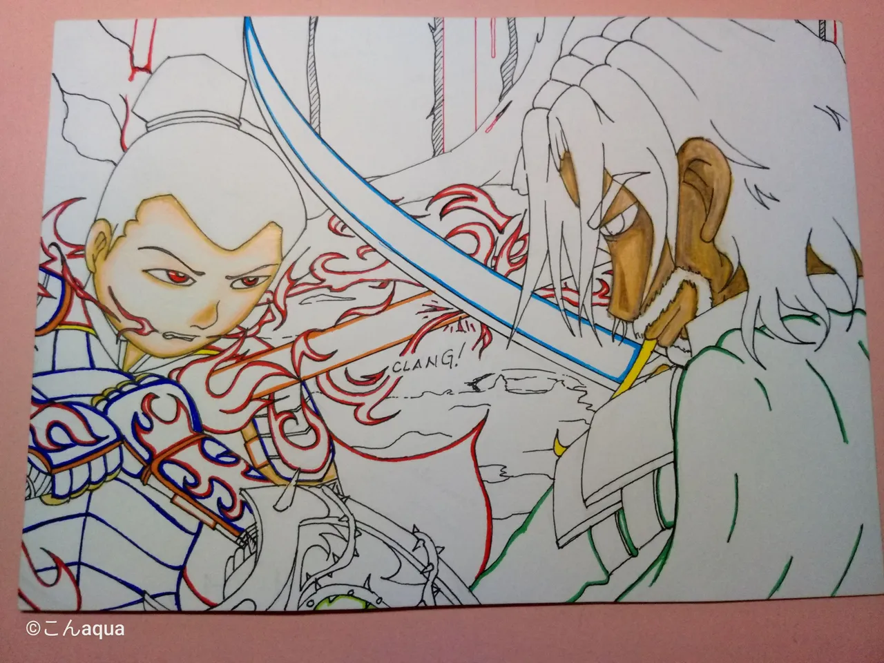
Photo taken using Tecno Spark Go.
I decided to change the skin colors for Dumacke Exile since he has a darker skin. It was very unexpected but I really like it.
Colors Used:
Step 4 Hair and Beard - Dumacke Exile
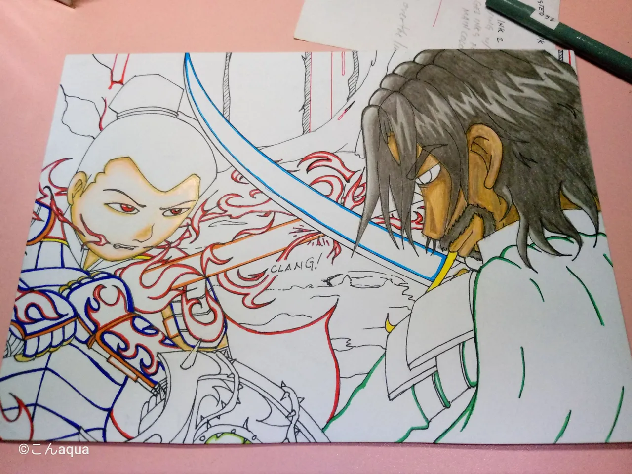
Photo taken using Tecno Spark Go.
Dumacke Exile has a brownish hair. and so I used these colors to try and make it look good.
Colors Used:
Step 5 Outfit - Dumacke Exile
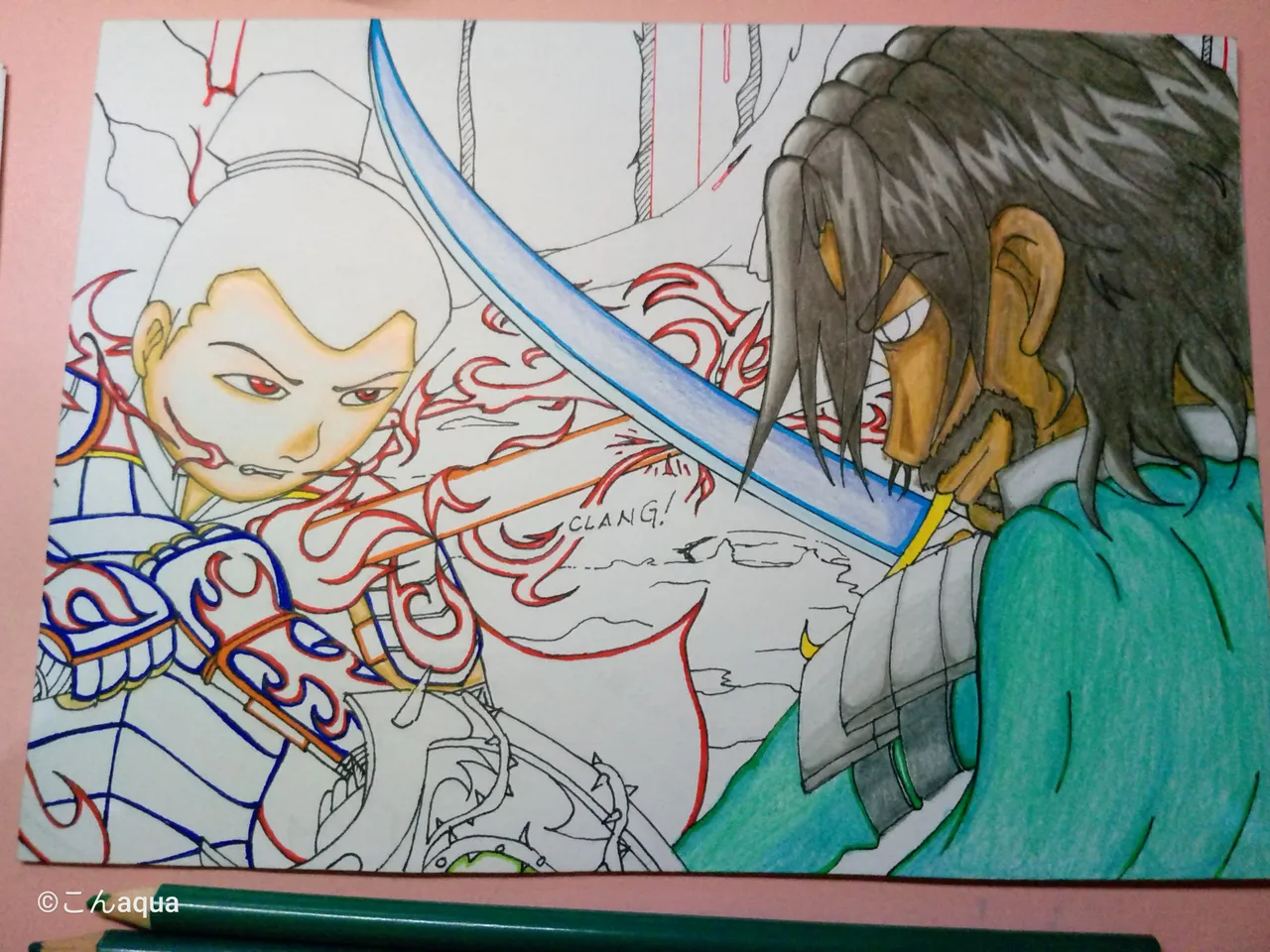
Photo taken using Tecno Spark Go.
The cape and main outfit has the same green-ish color. The armor is, on the other hand, sort of platinum so I used grays to add shadow to highlight the light part.
The sword, I did on the bluish side since I don't have the appropriate colors to copy the original one.
Colors Used:
Step 6 Hair - Tenyii Striker
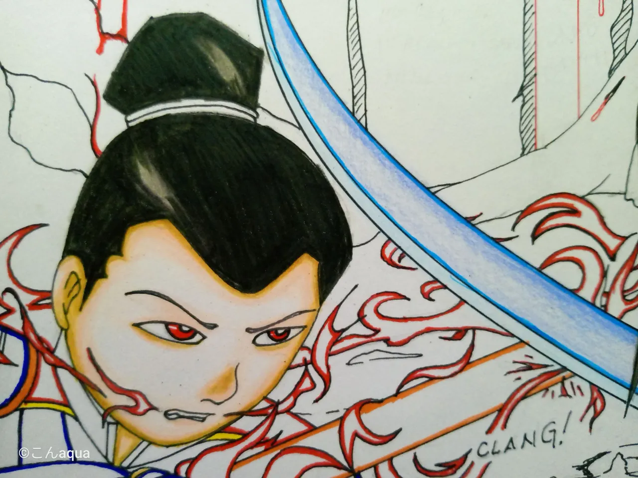
Photo taken using Tecno Spark Go.
The hair, I copied from the previous post that I made. I don't want it to be just pure black so I added strips here and there and added a few grays for the highlight.
Colors Used:
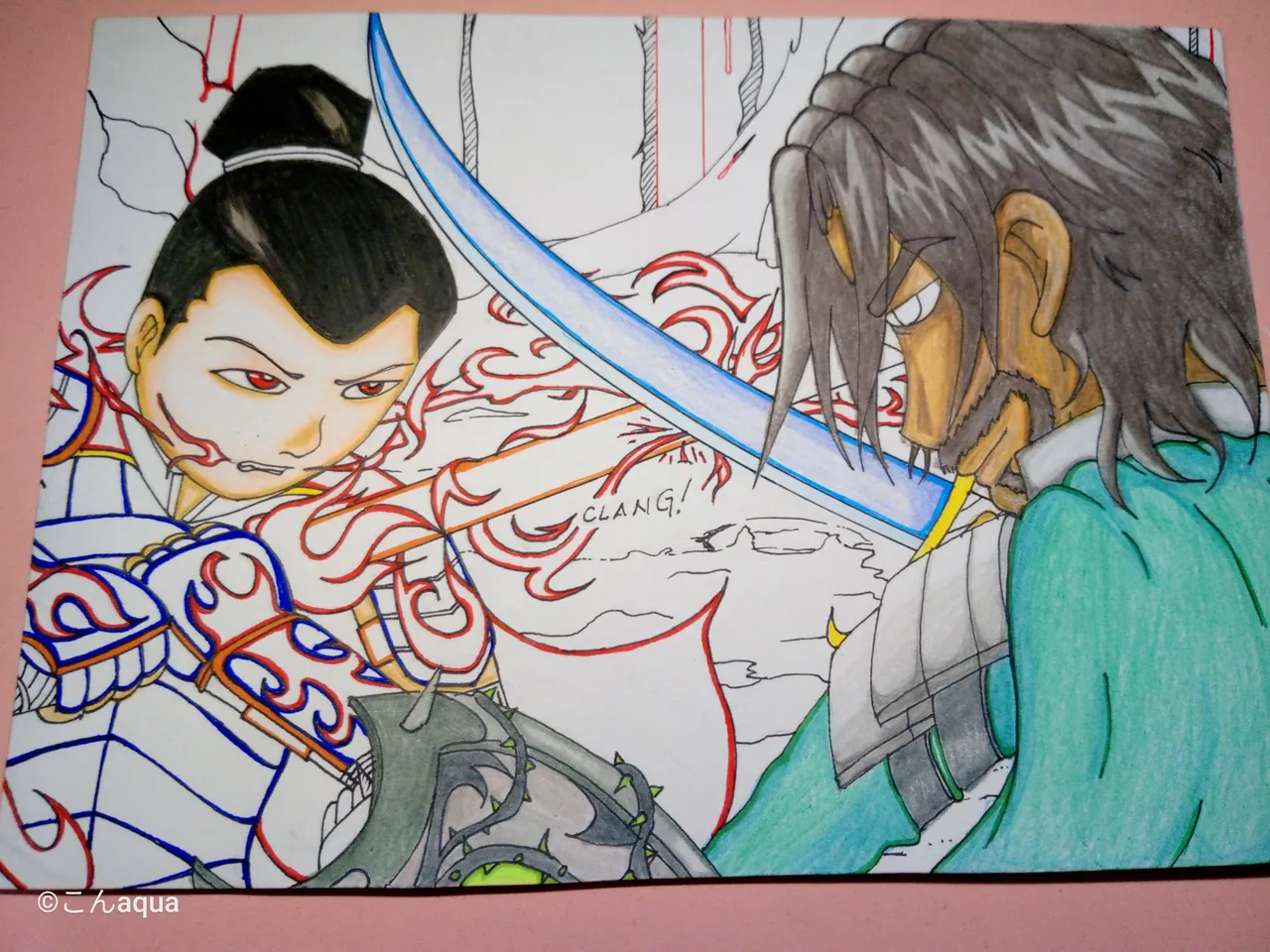
Photo taken using Tecno Spark Go.
I also forgot about Dumacke Exile's shield so I took care of it. Shield is a bit of a pain due to little intricacies but I think I made it pretty well.
Colors Used:
Step 7 Outfit - Tenyii Striker
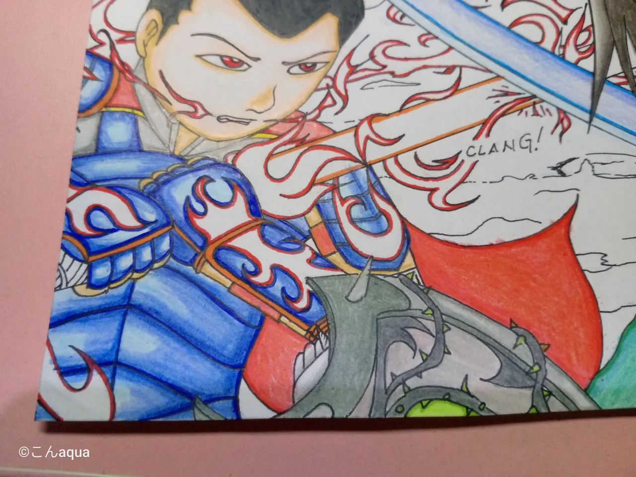
Photo taken using Tecno Spark Go.
One thing I learned from the previous art is that blue and red only works if they are in specific shades. Unfortunately, I don't have that shade in my arsenal so I just went with the blue instead. In the original art, the red part seems to be a shine from the flame and not the color of the armor. That's why I used blue as the armor.
Colors Used:
Step 8 Fire and Sword
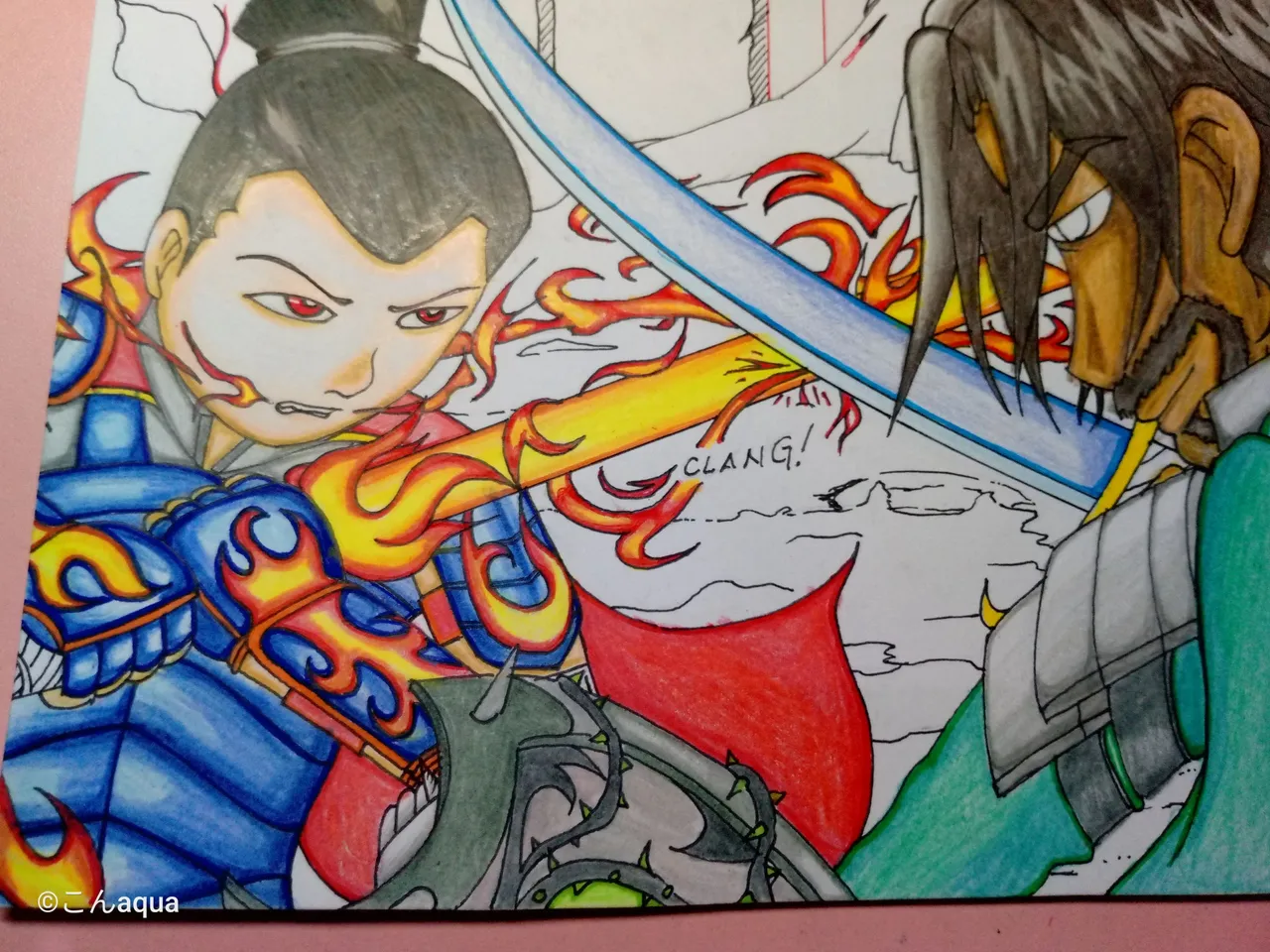
Photo taken using Tecno Spark Go.
The fire colors also came from the other post. The difference is I added a bit of orange in between the yellow and reds. I also added a red colored pencil after the Gel Pen Red. I used this on both the flame effects and the sword. Worked out great.
Colors Used:
Step 9 Background Colored
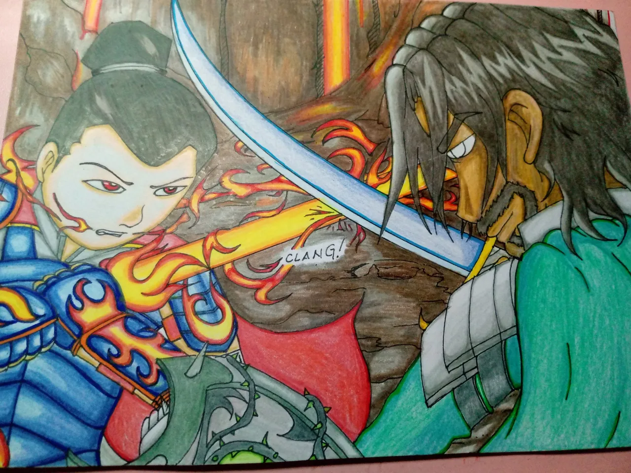
Photo taken using Tecno Spark Go.
This one is hard to explain but I got the inspiration from this:
Photo by ArtStation that I got from Google as a result of Google search..
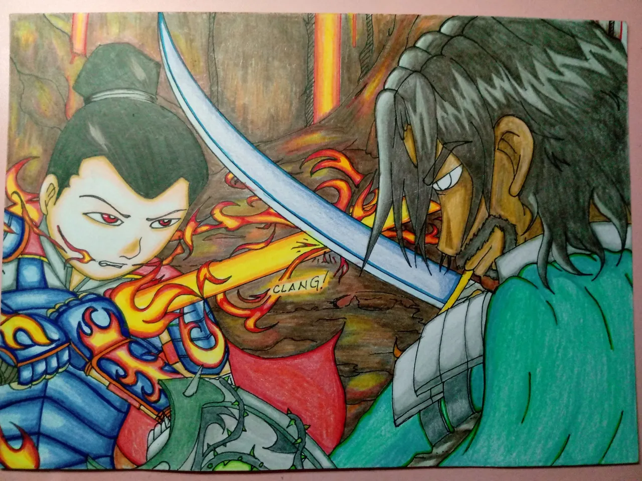
Photo taken using Tecno Spark Go.
After laying the foundation, I added a bit of reds, yellows and orange here and there. I really like this background because it somewhat looked like a watercolor painting, although, I didn't really know how I managed to do that.
Colors Used:
Step 10 Re-Ink and Final Touches
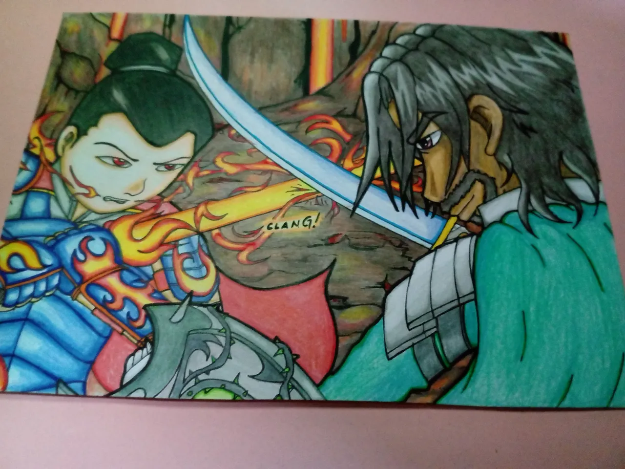
Photo taken using Tecno Spark Go.
I added a few more reds in the background with the Gel Pen Red and a black highlight for the main characters to make them pop out.
I also did the eyes for Dumacke Exile in this step. I used Gel Pen Brown and Gel Pen Black for this.
I don't know why but to me, it looked worse than before the re-ink. The background is good. The main character suddenly rubbed me off the wrong way and I really don't understand why. If you have any opinions, comment down below in order to light up some answers to this.
Time-wise, I can but it won't do good on my mental.
 Made using ezgif maker

- This post is an entry for Splinterland's Art Contest.
- Other sources that I do not own are cited under their respective photos. Photos and drawings without cited sources are mine and made for this post.
- Animated Banners and Dividers are edited in Canva Pro.
- Some of the fonts used are from instafonts.io
If you're interested in playing the game, support me by registering using my referral link here
ᕼᗩᐯE ᖴᑌᑎ ᗪᖇᗩᗯIᑎG!